Business Typeface - Fanzzine Poster
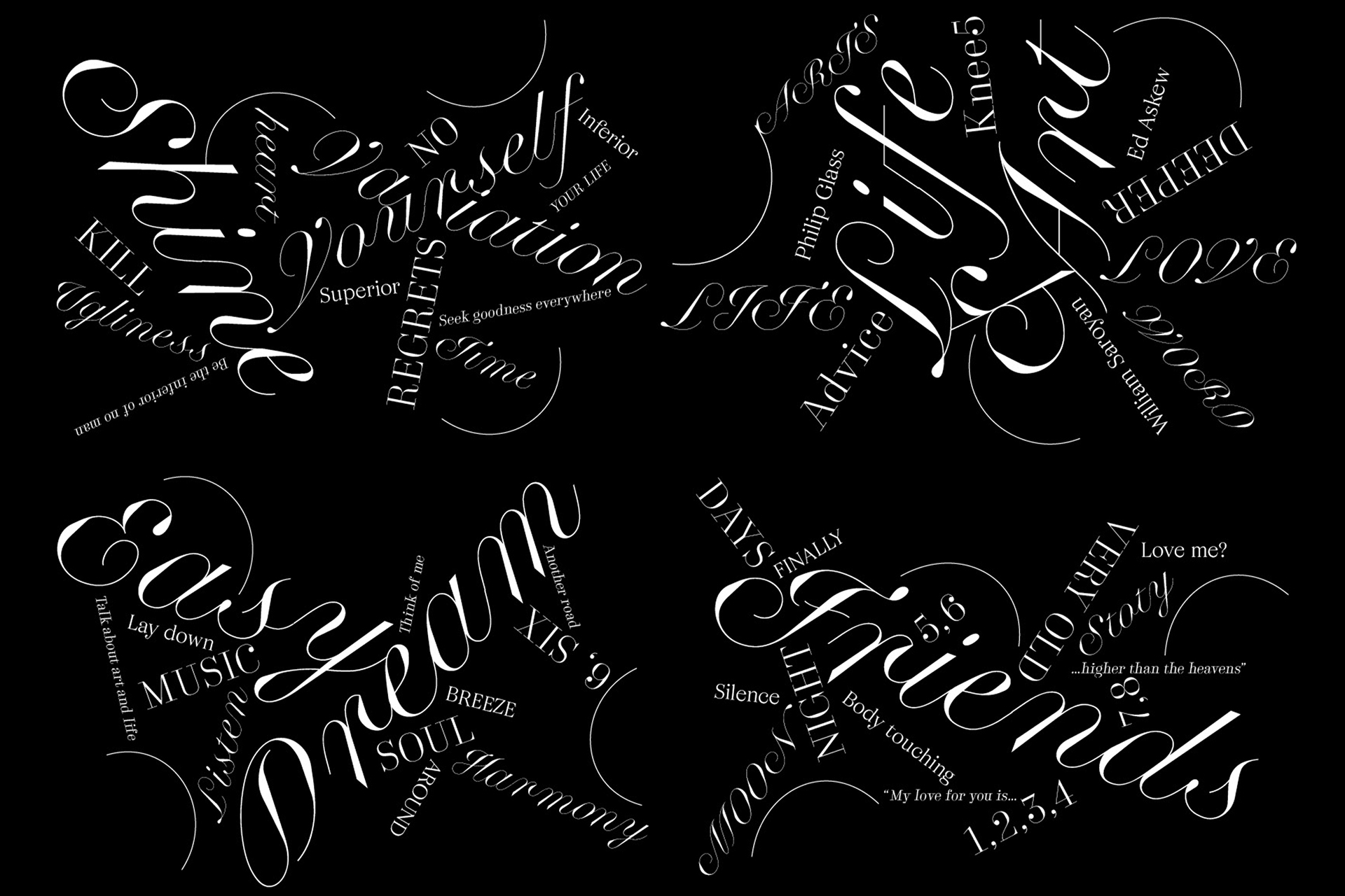
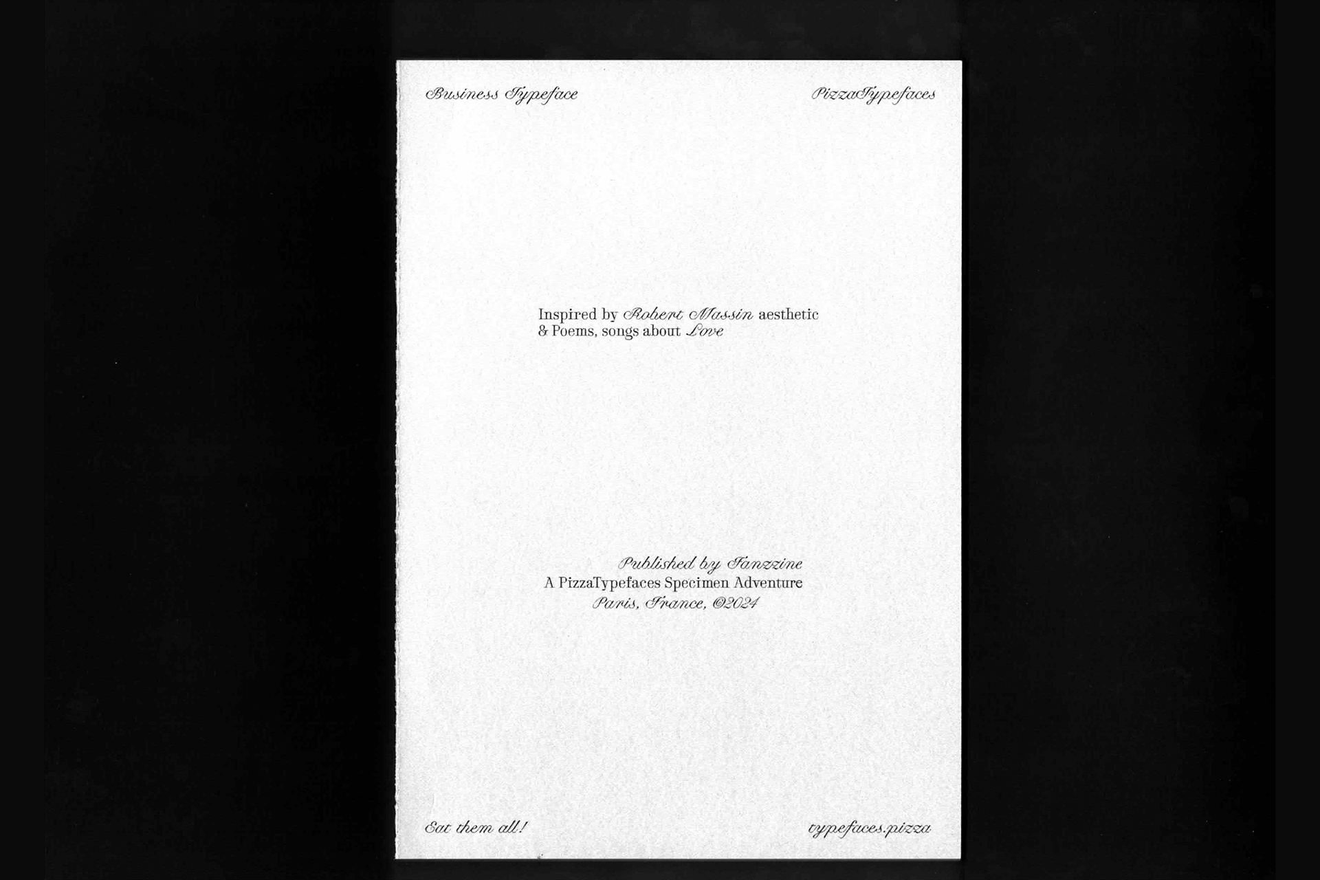
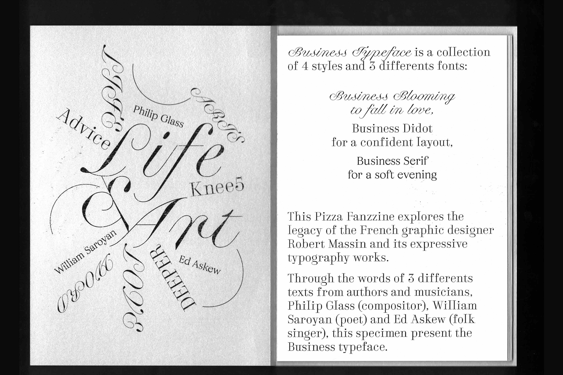
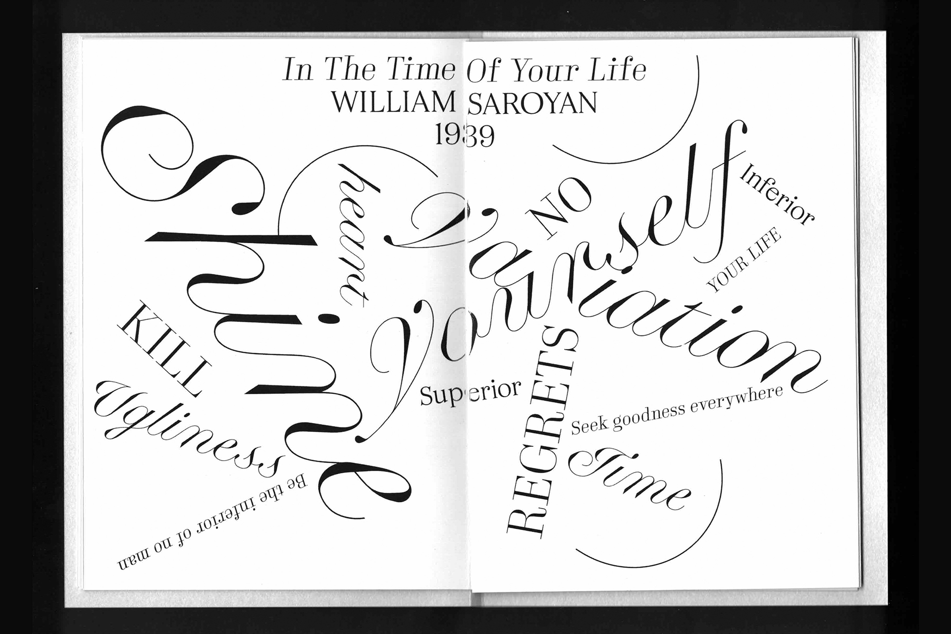
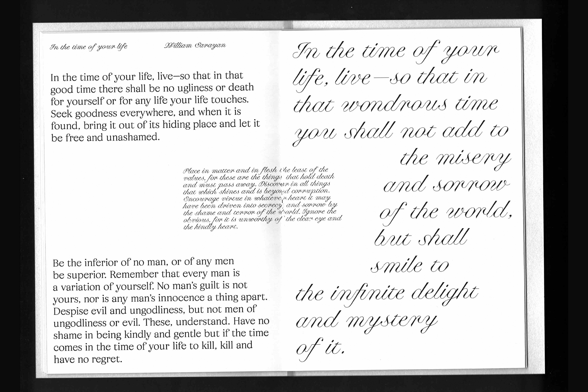
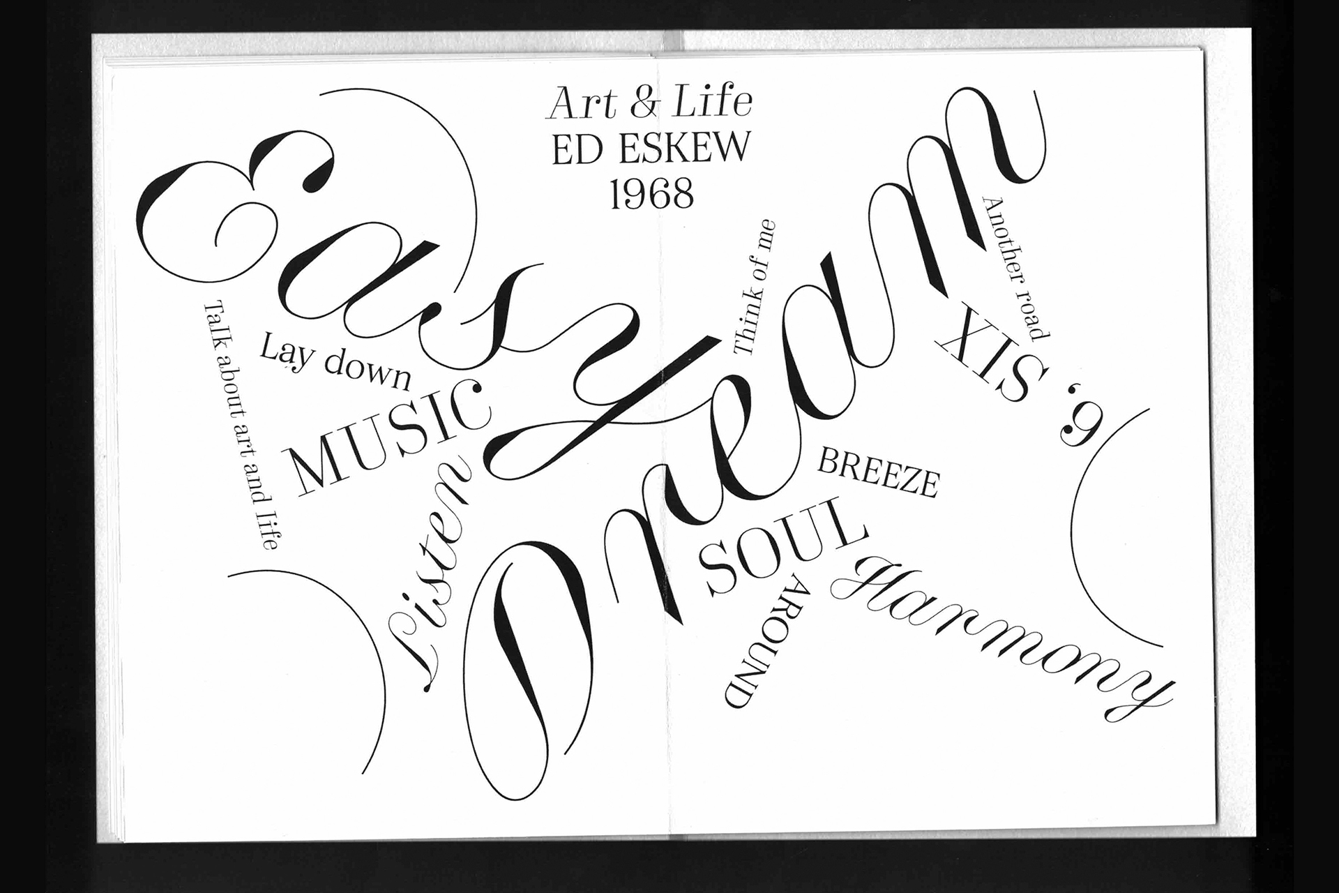
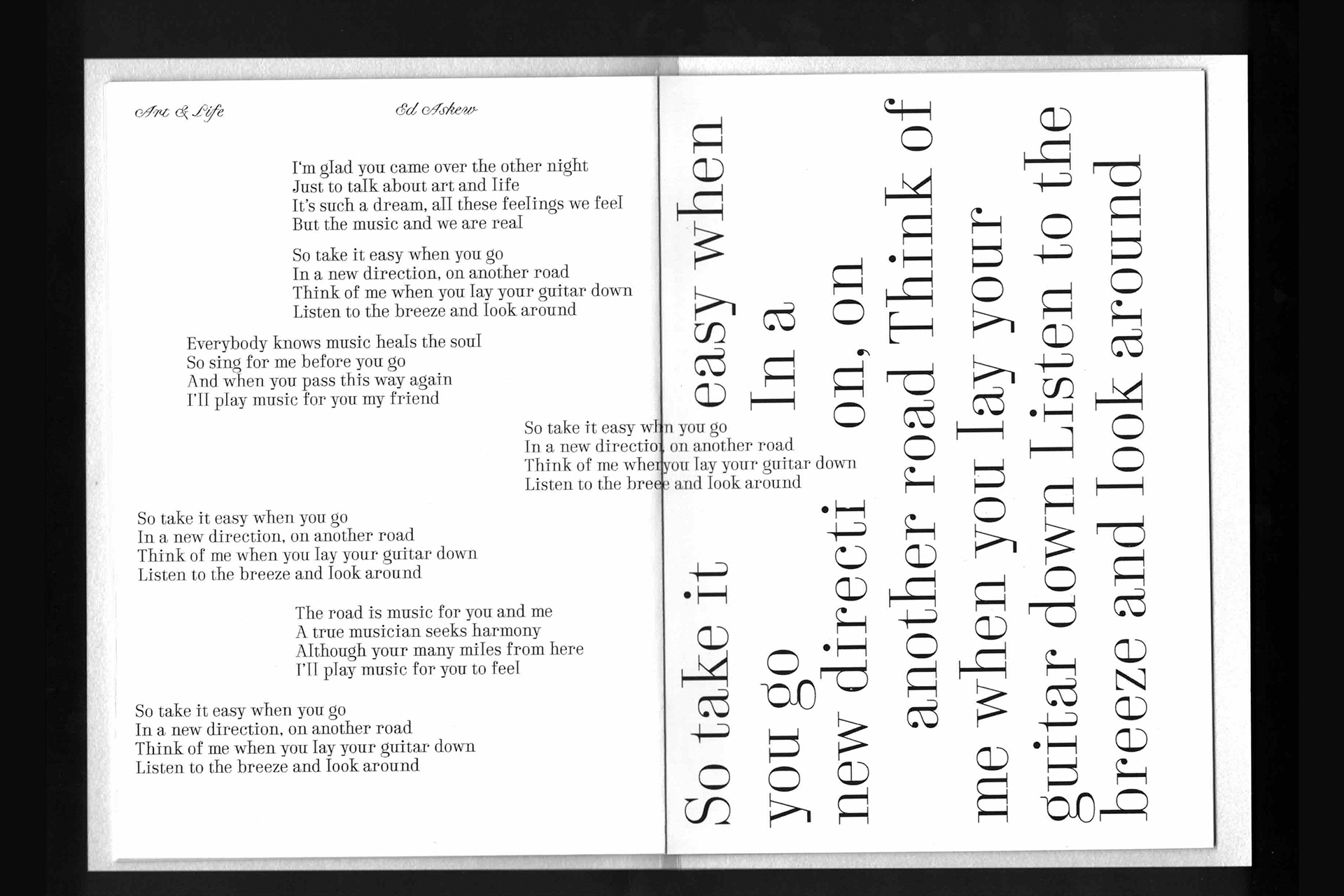
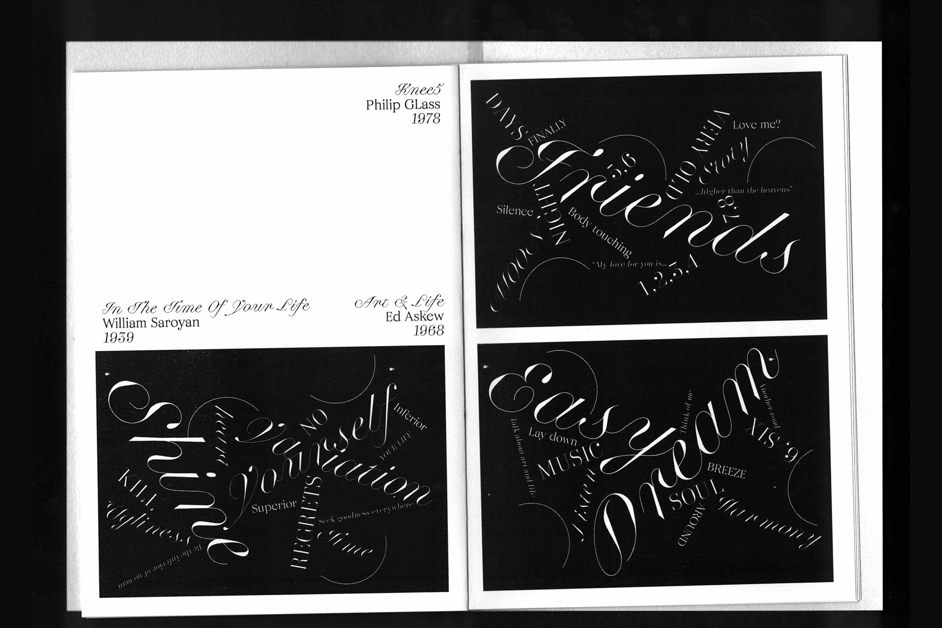
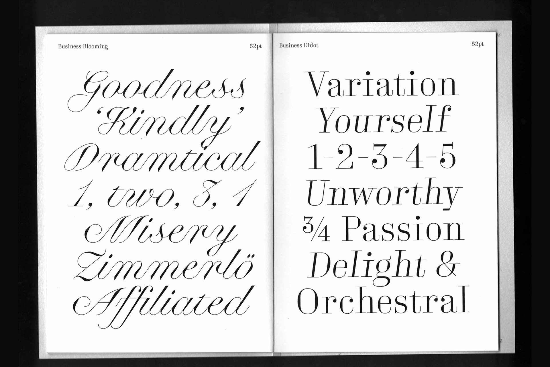
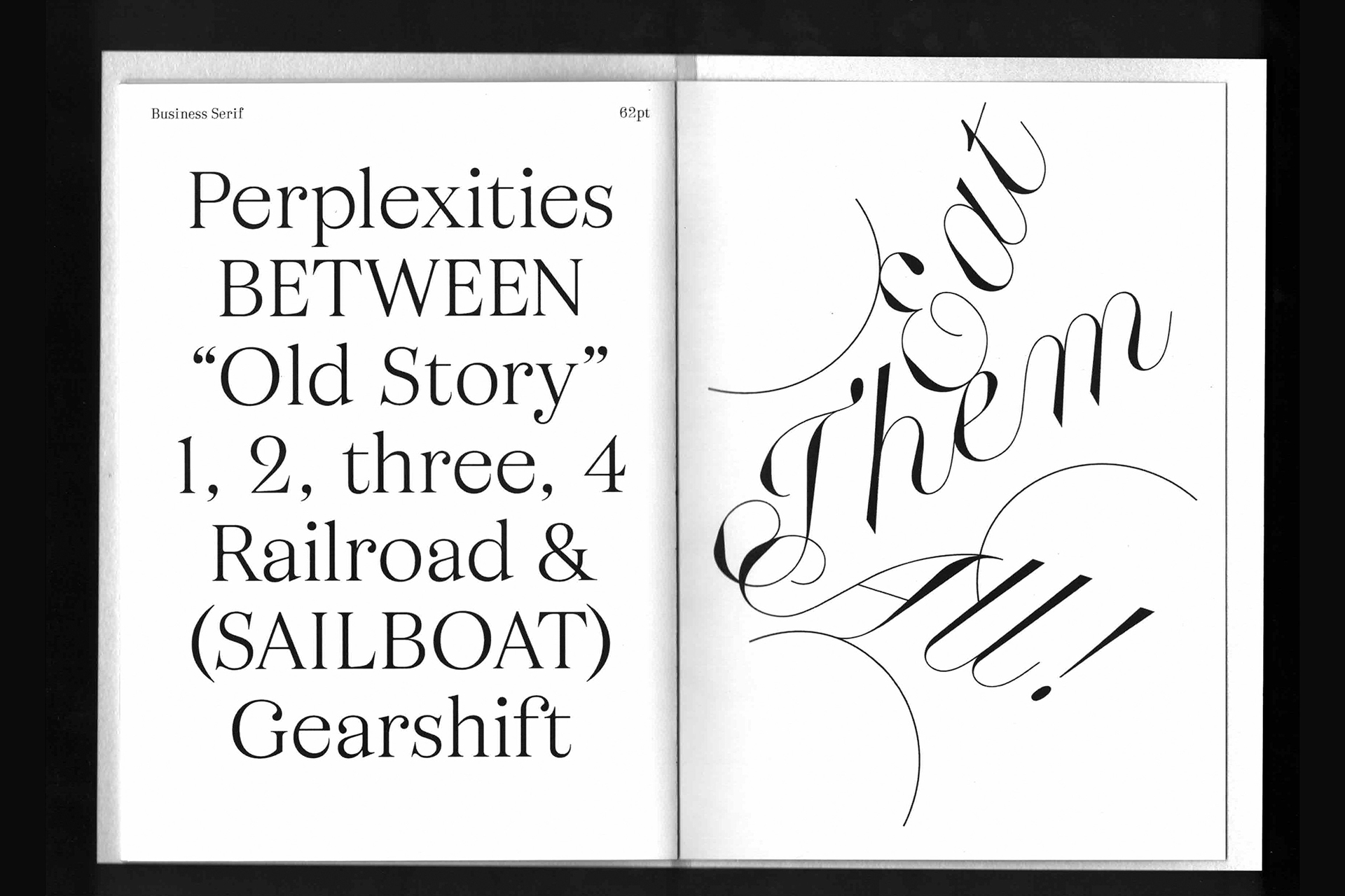
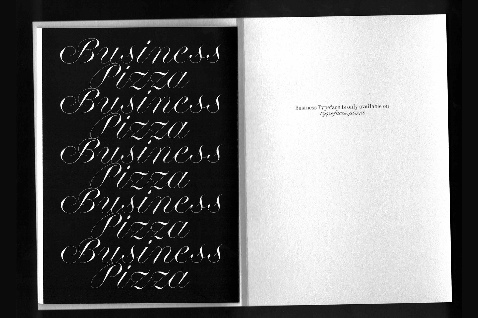
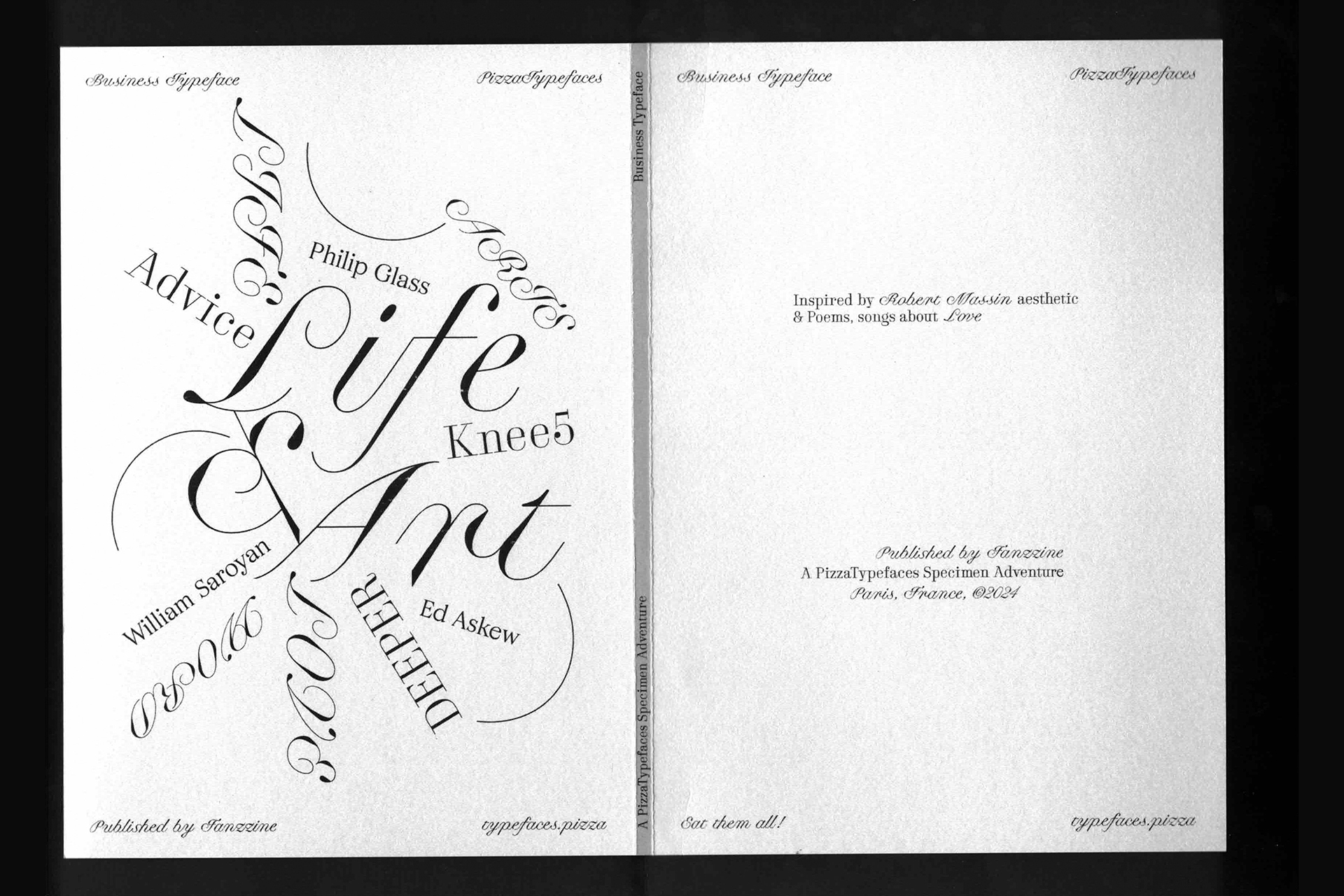
Business is a collection of three font-families including a blooming script, a condifent didot and a cosy serif. The Business Blooming contain a Optical Size variable to match the right contrast depending of the size. The Business Didot and Business Serif have both Display and Text versions.
- Business Blooming
- Display
- Backpacked
- Business Blooming
- Normal
- Quaternary
- Business Didot
- Display Light
- 3421-Magnific
- Business Didot
- Display Bold
- Demonologist
- Business Serif
- Text Light
- 4 Professionals
- Business Serif
- Text Bold
- Vegetarianism
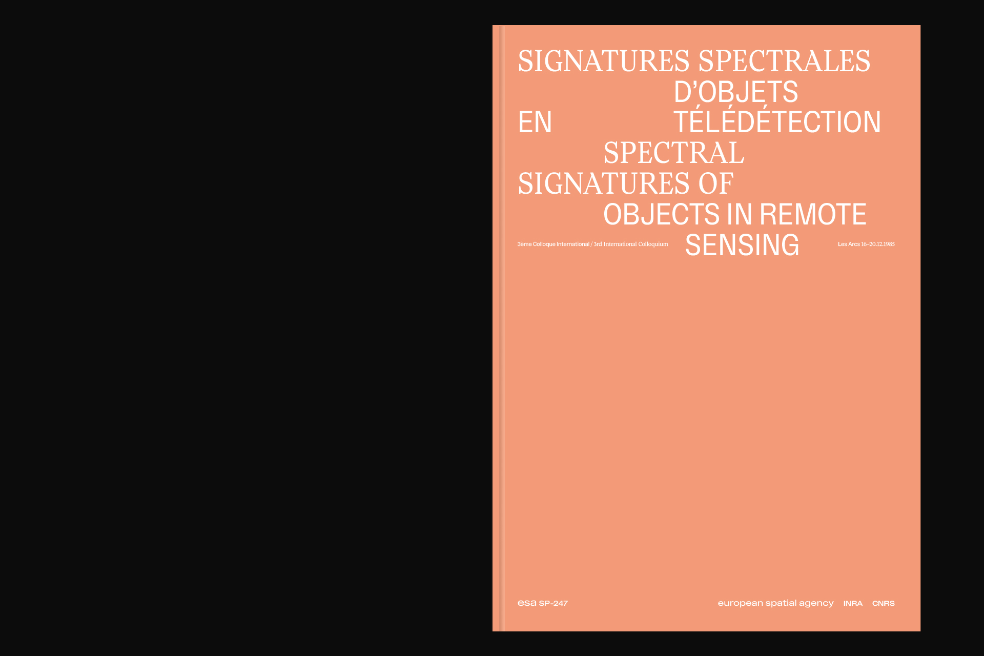
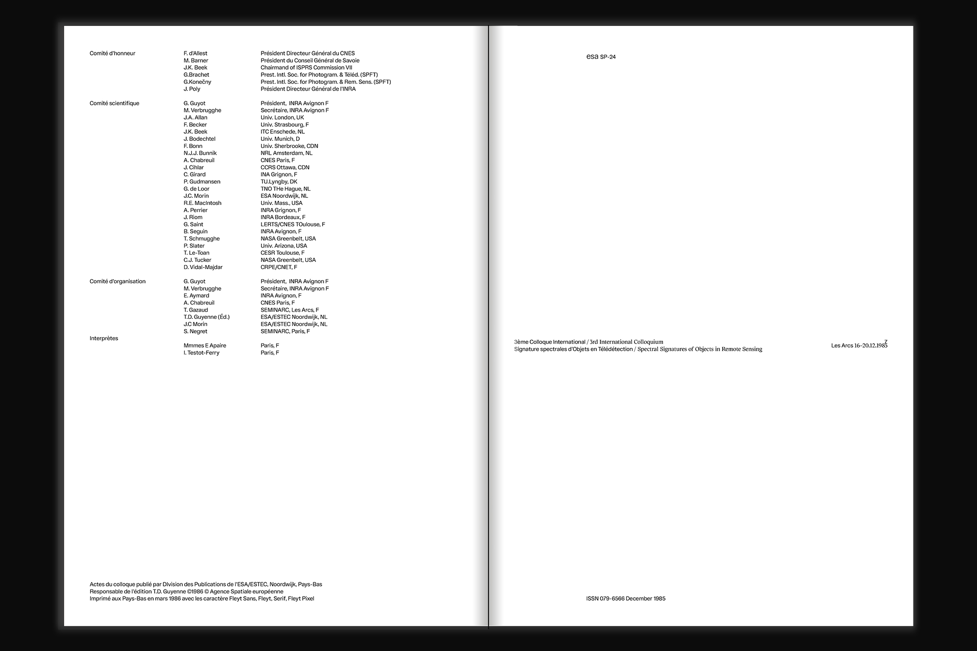
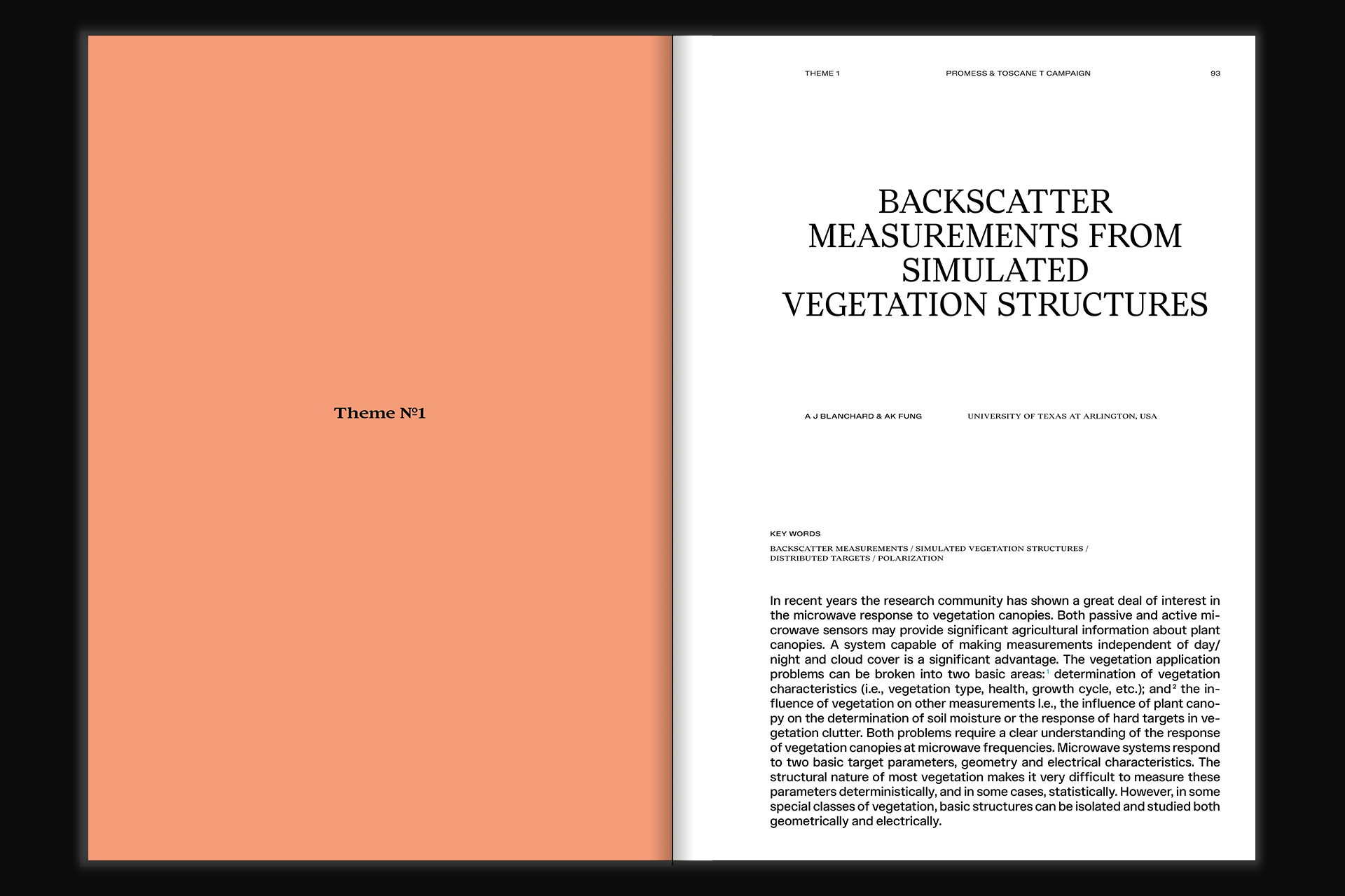
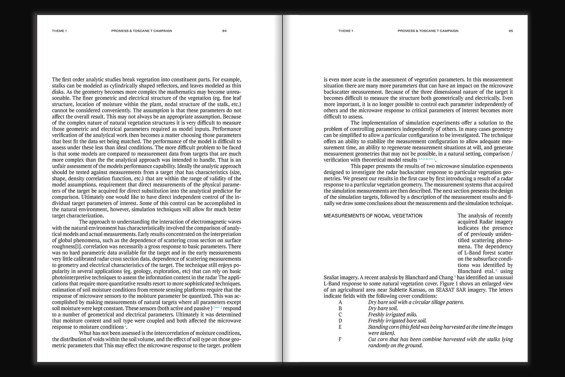
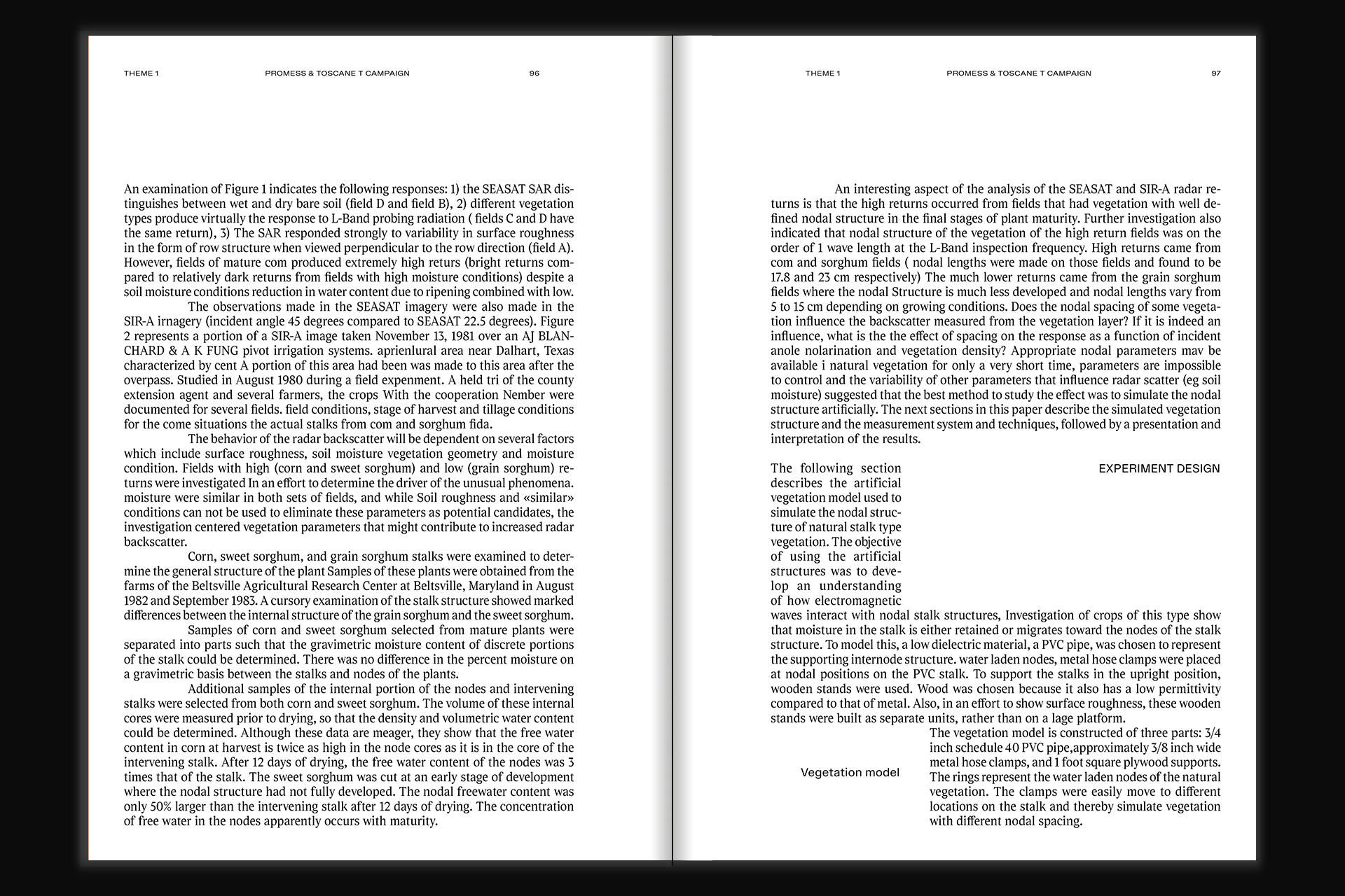
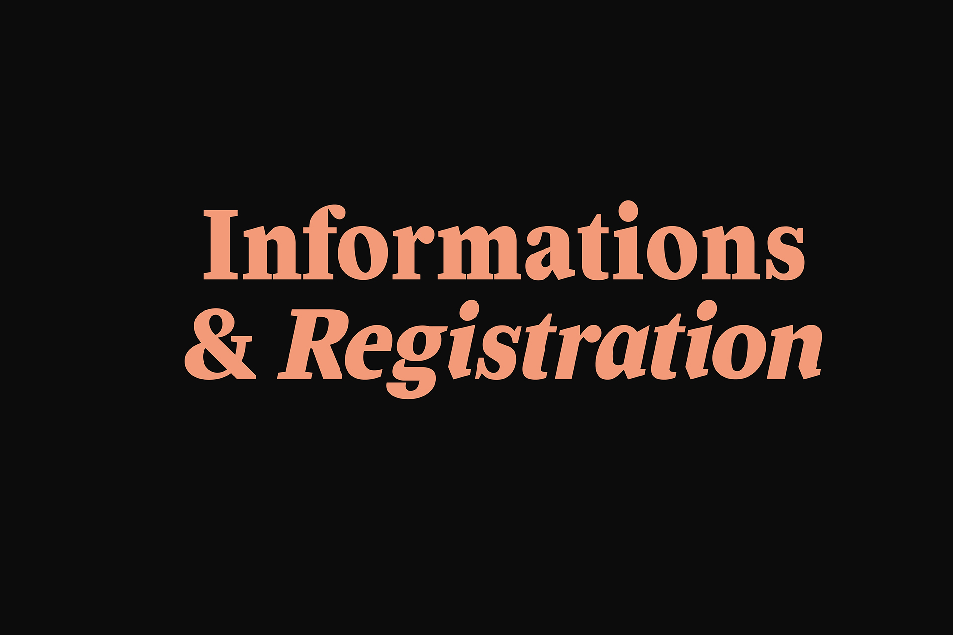
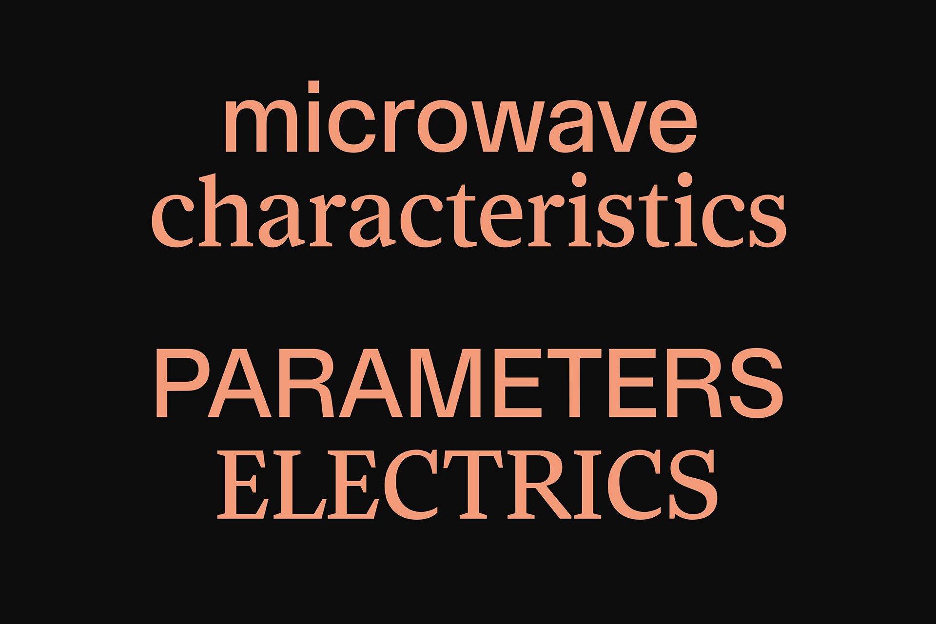
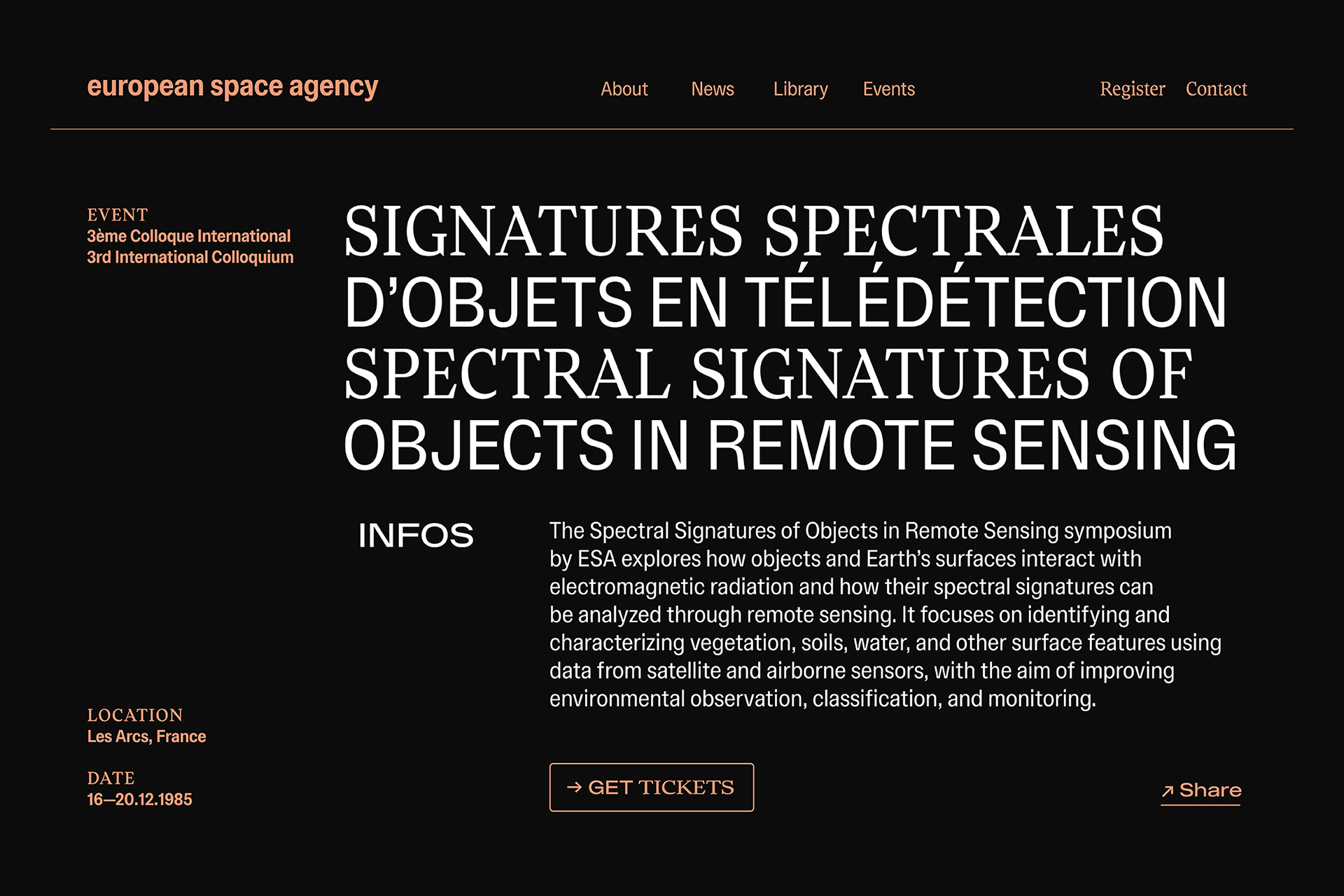
Fleyt — Redesign of the esa SP247 report
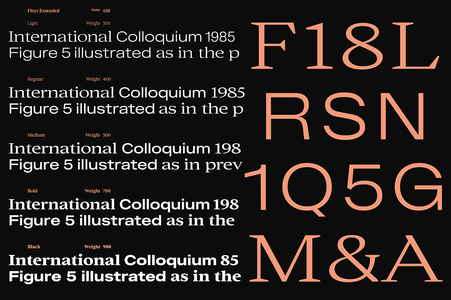
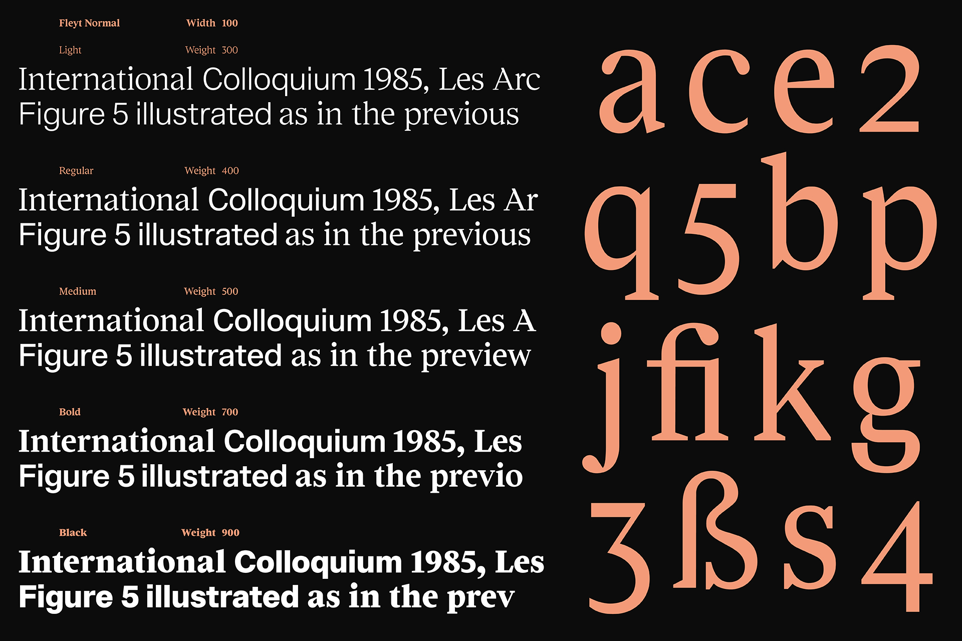
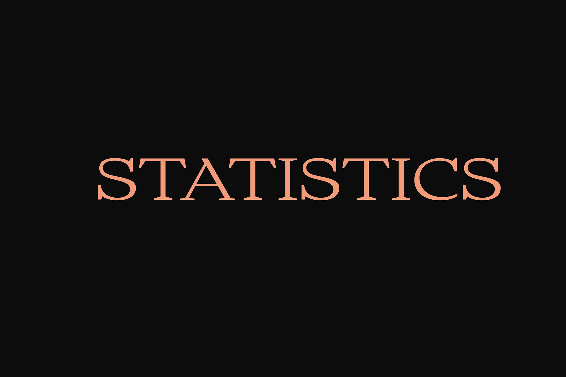
Fleyt is a contemporary type system including a Serif and a Sans-serif designed hand in hand within 6 font-families and 60 styles. Inspired by the European spatial agency’s 3rd International Colloquium Report and its beautiful cahotic layout. Fleyt is a typeface that balances precision with fluidity. Its carefully crafted forms move effortlessly between expression and functionality, delivering a distinctive presence without compromising readability. Based on the same weights, width, vertical metrics acroos al style is an equally suited to branding, editorial design, and digital environments, Fleyt brings subtle rhythm and character to every composition.
- FleytSerif
- Narrow Light
- Reinterpretations
- FleytSans
- Narrow Light
- Anaesthesiologist
- FleytSerif
- Narrow Light Italic
- Dehydrogenating
- FleytSans
- Narrow Light Italic
- Photosynthesised
- FleytSerif
- Normal Medium
- Tablespoonfuls
- FleytSans
- Normal Medium
- Teleconference
- FleytSerif
- Normal Medium Italic
- Underreporting
- FleytSans
- Normal Medium Italic
- Chromatogram
- FleytSerif
- Extended Bold
- Manchester
- FleytSans
- Extended Bold
- Roadworthy
- FleytSerif
- Extended Black
- Sketchpads
- FleytSans
- Extended Black
- Biochemical
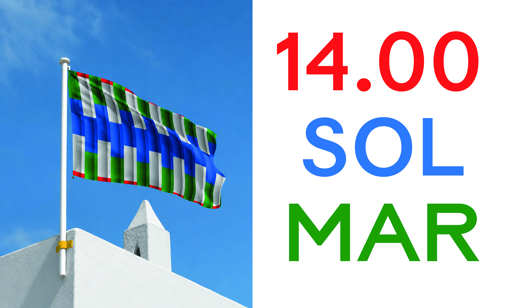
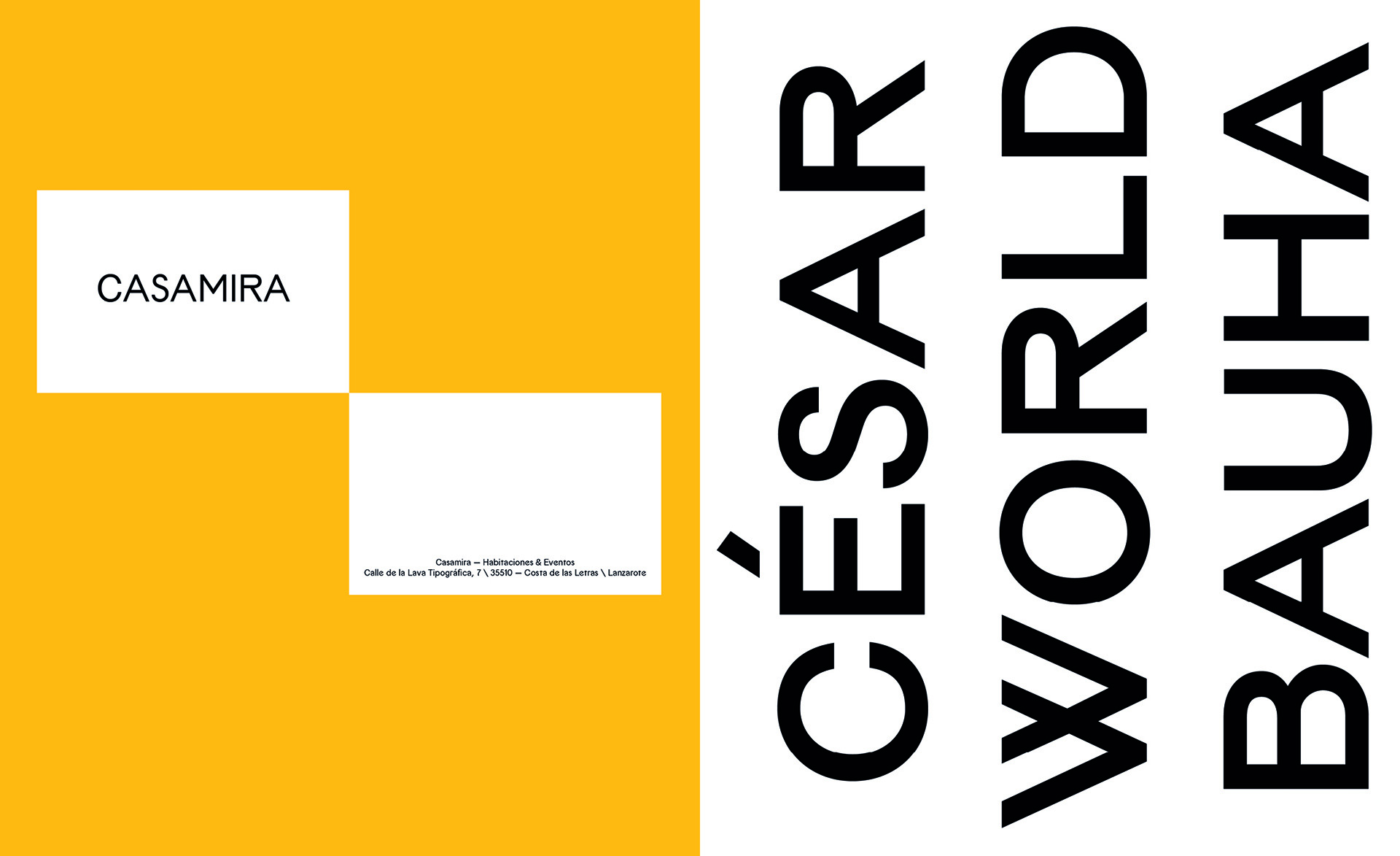
The Typeface Flag
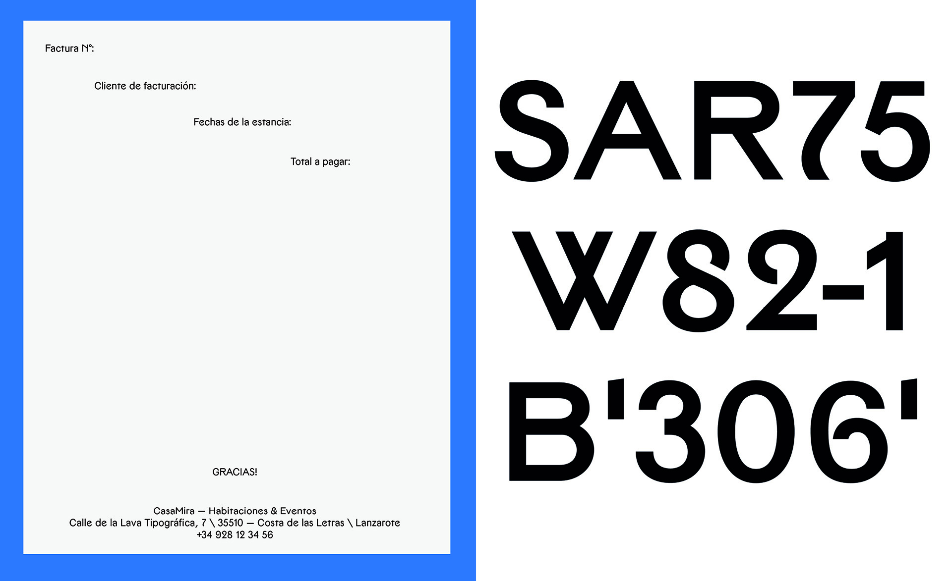
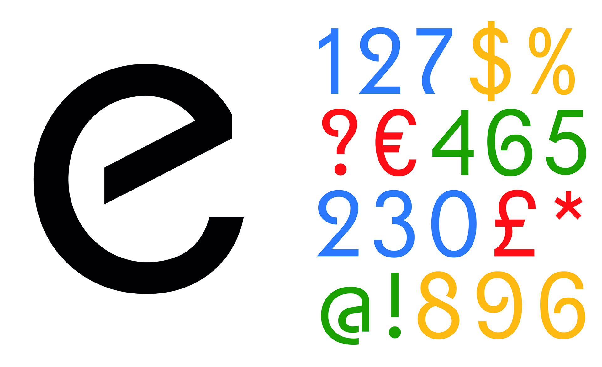
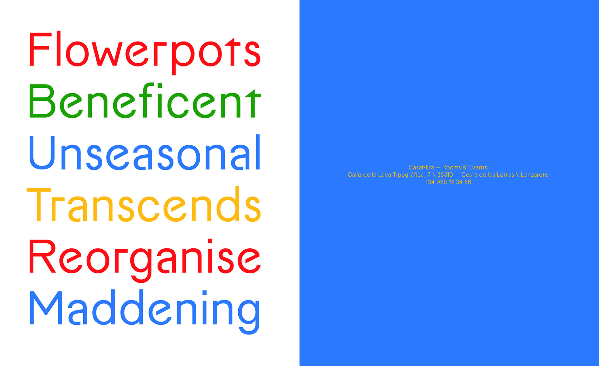
Drawing influences from Art Deco, Cesar Manrique, and the Bauhaus, Casamira is a typographic "world music." It offers a harmony that is warm yet serious—featuring balanced weight distribution, a tailored italic, and stylized numerals. Bienvenidos a CasaMira !
- Casamira
- Regular
- Overcapitalising
- Casamira
- Regular
- ECONOMETRIC
- Casamira
- Medium
- Superintendent
- Casamira
- Bold
- Amphitheaters
- Casamira
- Bold Italic
- Jurisprudential
Mobilo Typefaces — Fanzzine Specimen
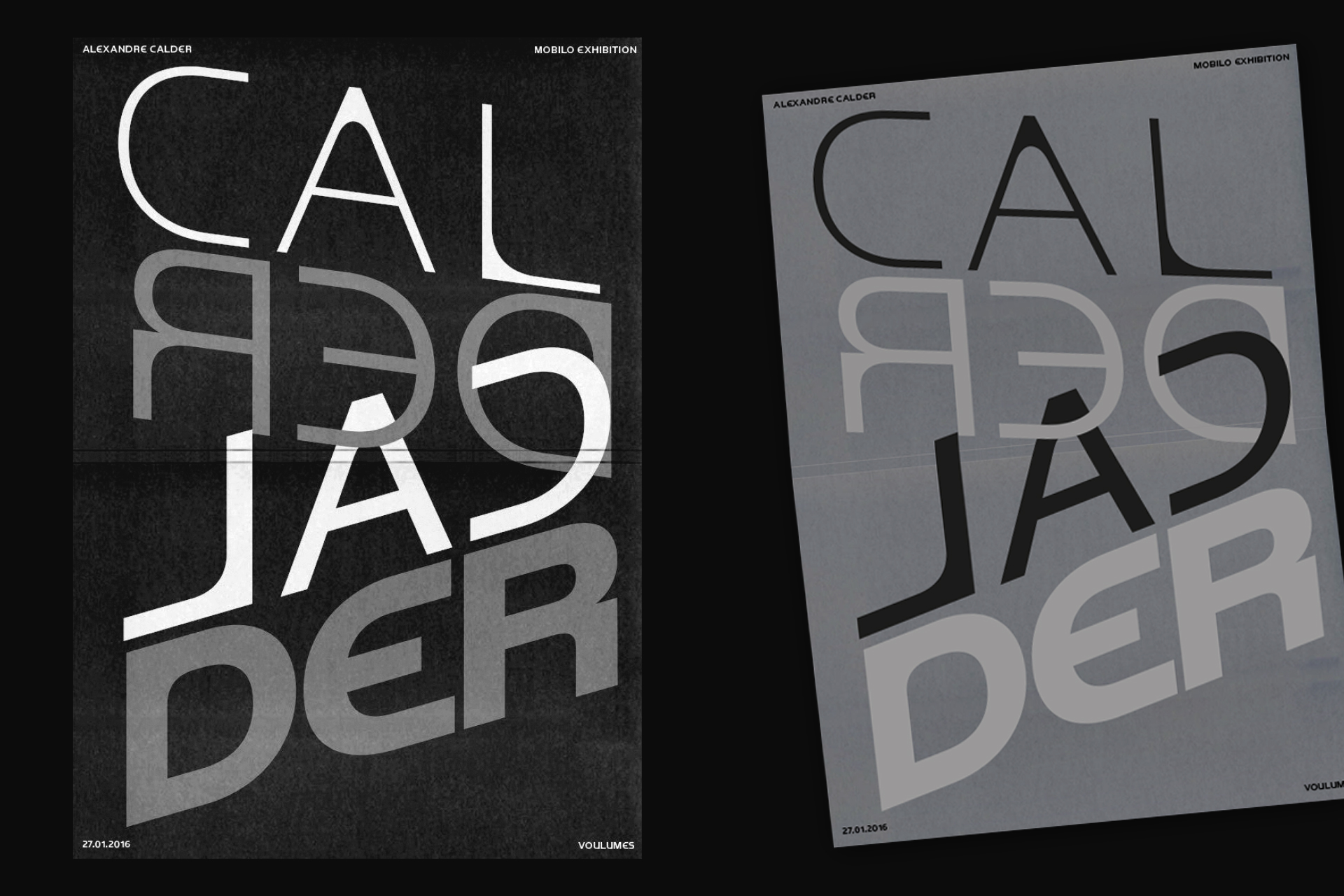
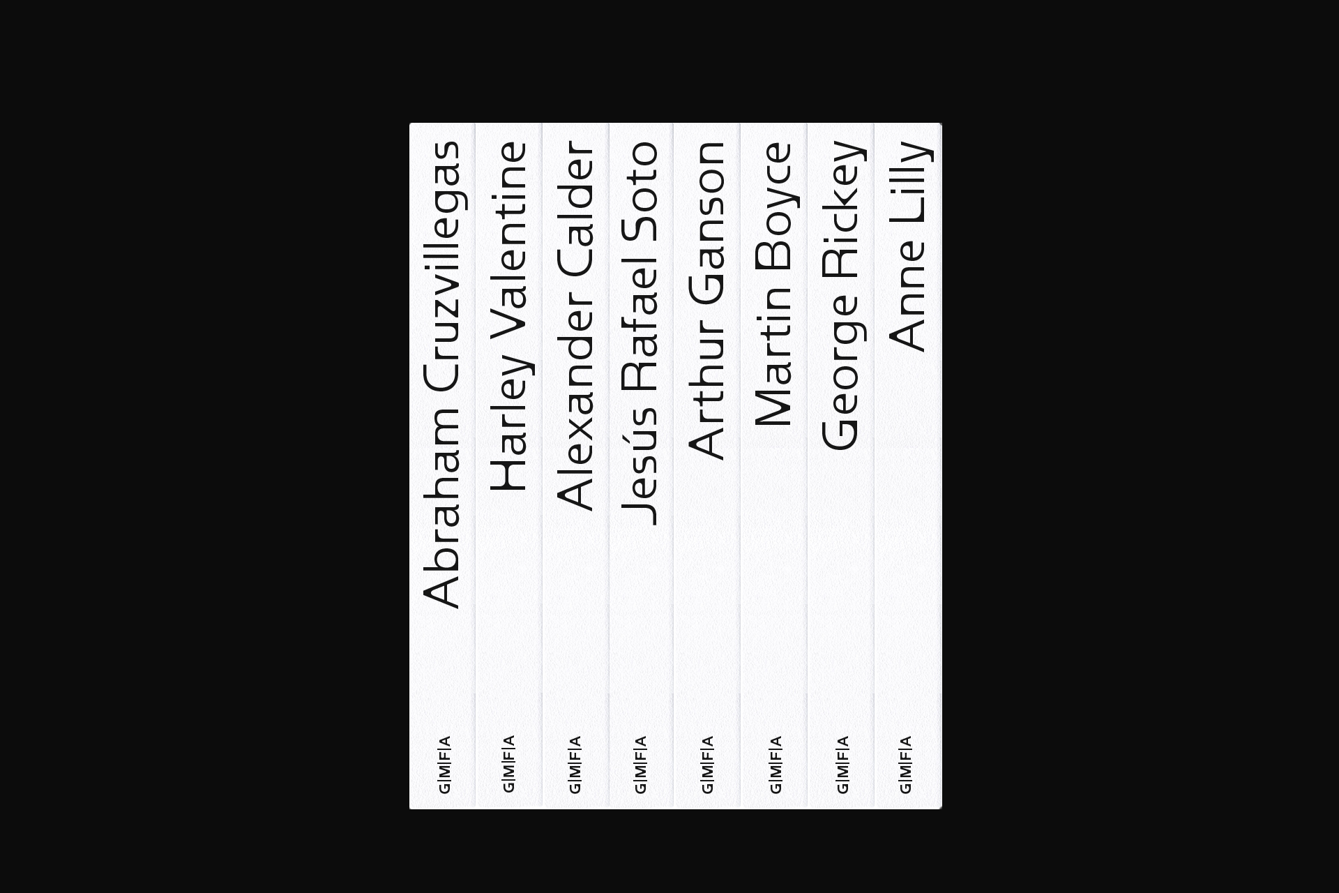
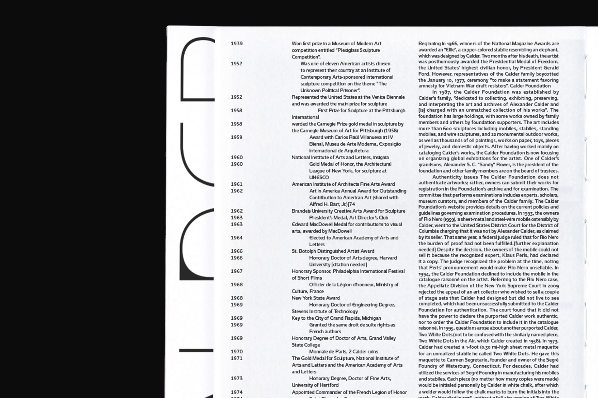
Mobilo is a font who play with the the interaction between black and white not just about contrast but as balance, presence, and absence. To “fill the white with black” is to mold the empty spaces with intention, creating forms that do not simply occupy space but define it. With some stylistic sets for bigger details.
- Mobilo
- Thin
- Depersonalizing
- Mobilo
- Regular
- Hydrodynamics
- Mobilo
- Medium
- Set 2
- Expressionistic
- Mobilo
- Bold
- (Authorizations)
- Mobilo
- Black
- Slaughterhouse
Nuqtra Variable Font
Nuqtra Typeface نقطرة عربي is a biscript typeface designed to support both Arabic and Latin languages. It is both the ripe fruit and the spicy starter of a collaboration with my native Lebanese type designer friend, Studio Nem. Nuqtra seeks to create harmony resonating across two distinct cultures. The Arabic script features a contemporary, narrow design, with an italic slanted to match the angle of the Latin. The Latin draws inspiration from the strict geometry of DIN, but takes its distance.
- Nuqtra
- Thin
- التطفل غير Creativity
- Nuqtra
- Regular
- سيمفونيات Regards
- Nuqtra
- Italic
- المتوسط الأكثر .Elec
- Nuqtra
- Bold
- 1869 مستكشفي J.H
- Nuqtra
- Ultra
- الكلى مفترس Grand
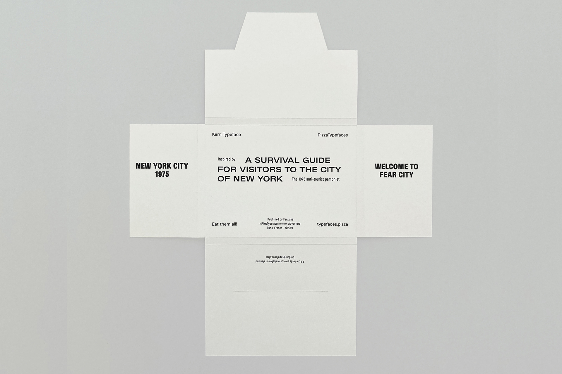
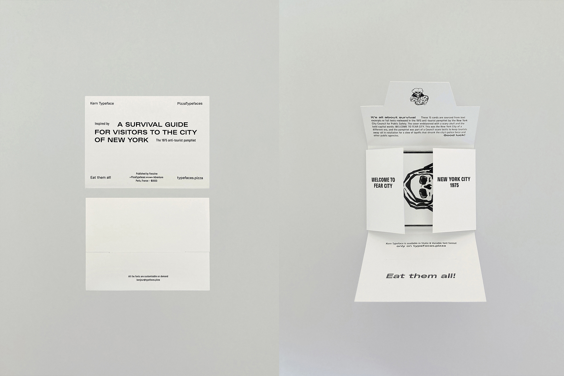
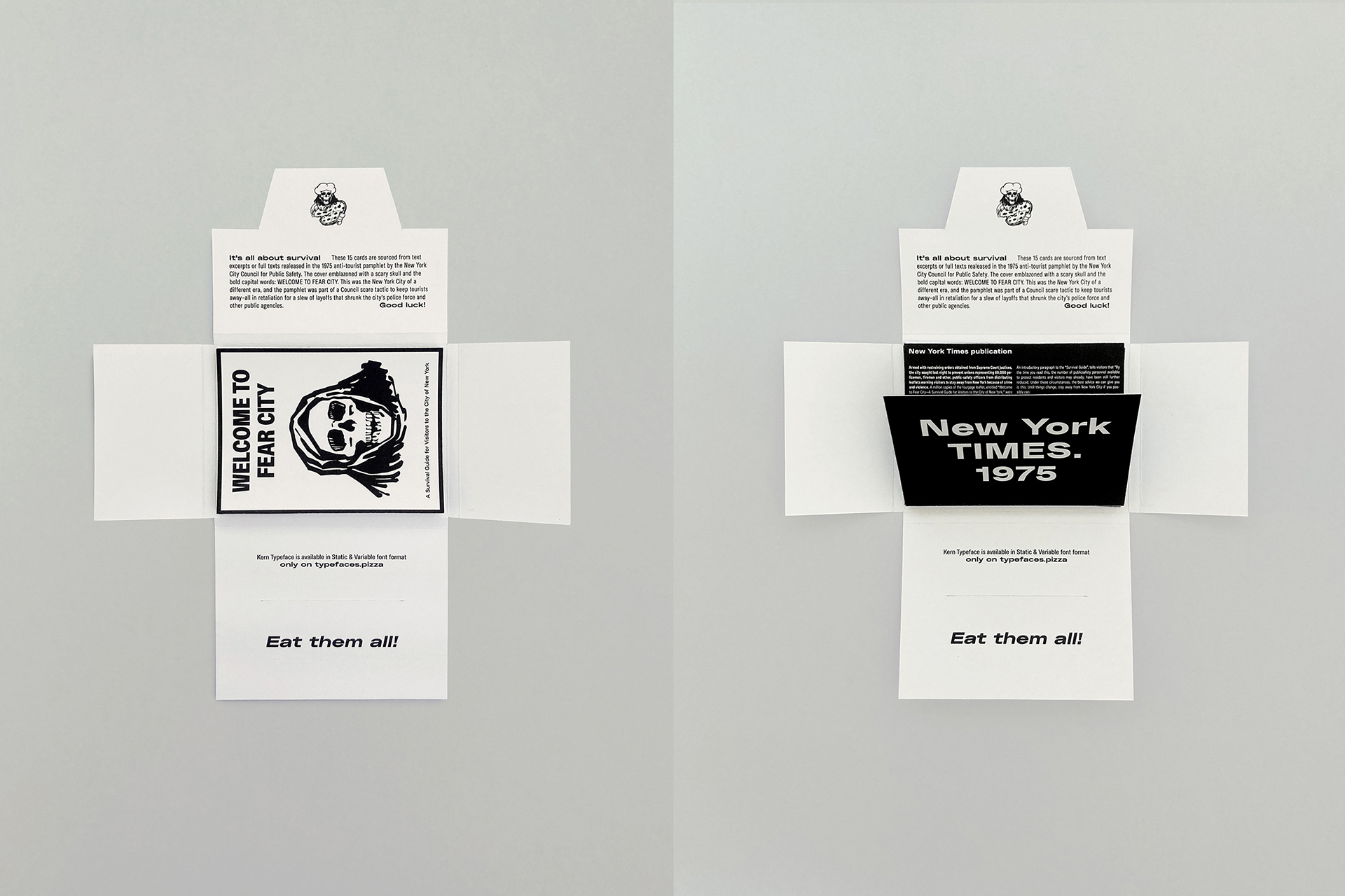
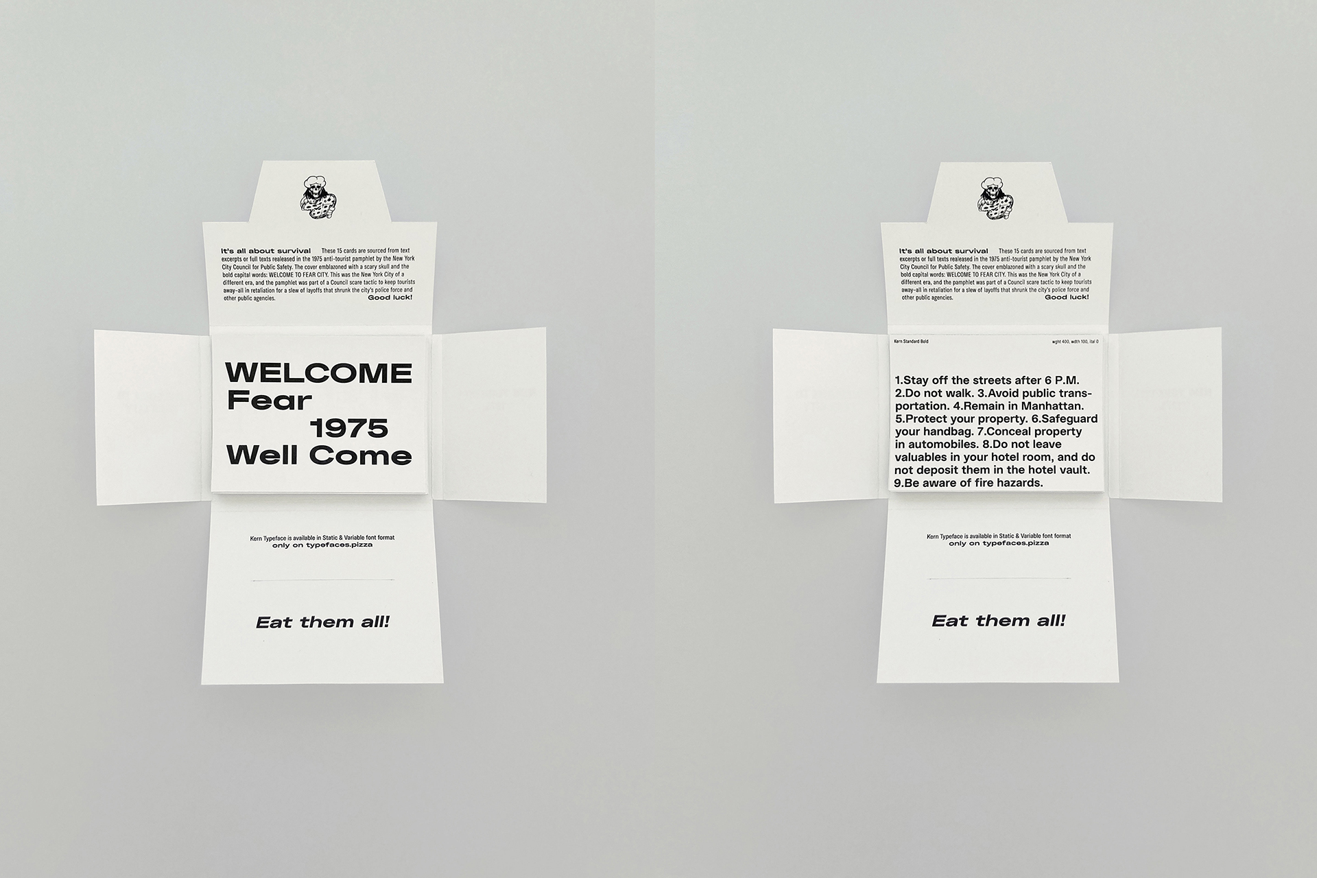
Kern Typeface — Specimen Fanzzine
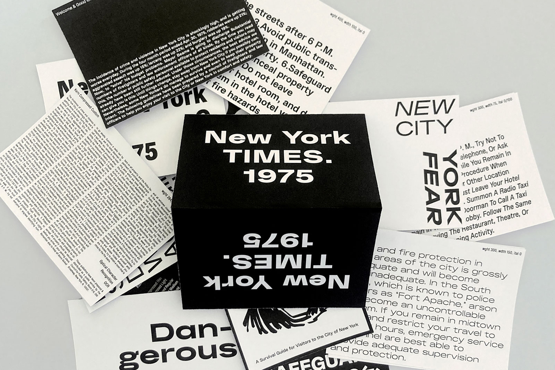
Kern Typeface is a big family, a sans-serif font. 5 Families with 12 styles each. From Thin to Black weights and Italics. It's my first Helvetica's genre font. But not so neutral. Extended through 4 years into this big family.
- Kern Compressed
- Bold
- Thermodynamically
- Kern Condensed
- Bold
- Misidentification
- Kern Standard
- Bold
- Set 2
- Risplacements
- Kern Extended
- Bold
- Undispersed
- Kern Expanded
- Bold
- Occasional
Regina Variable Font
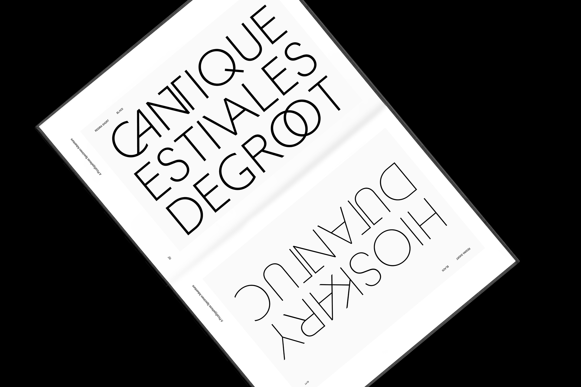
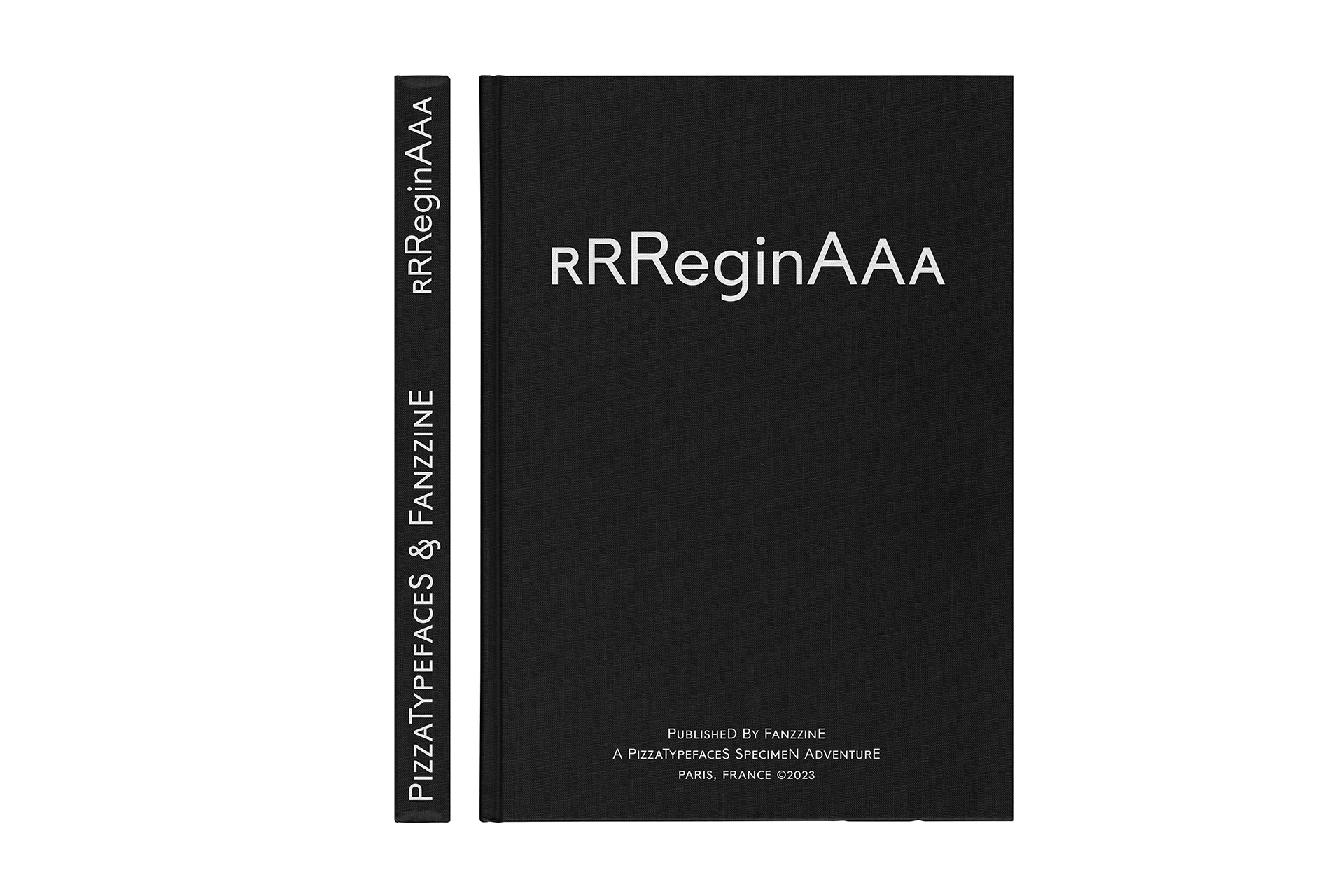
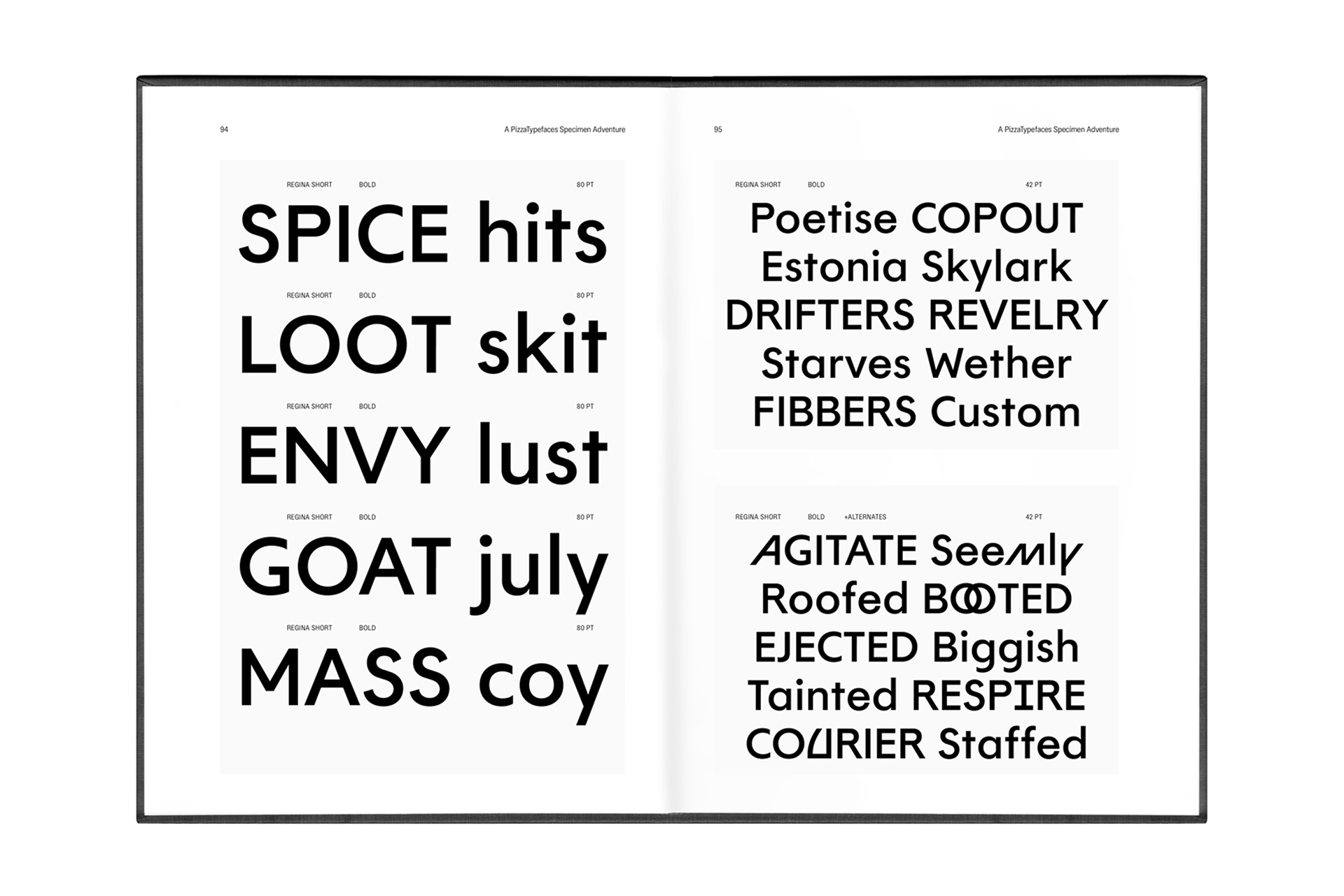
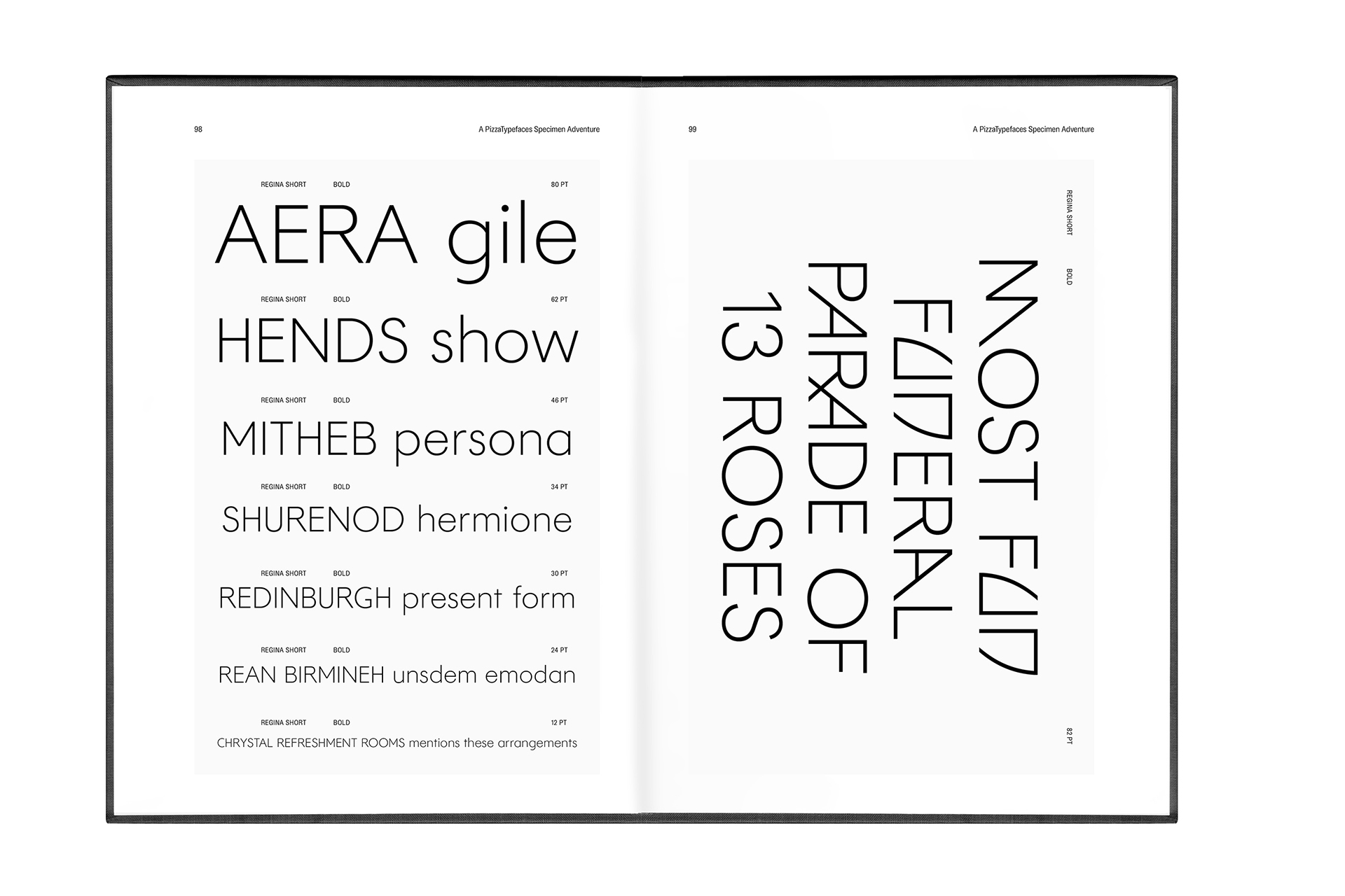
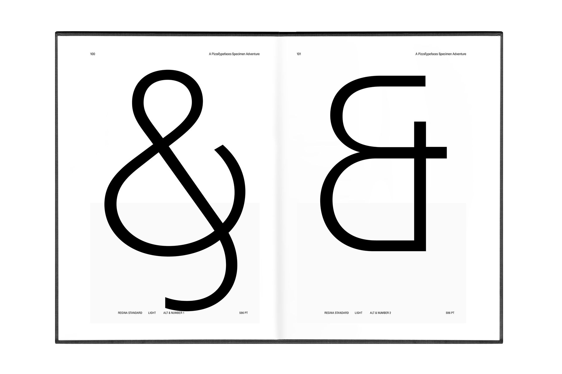
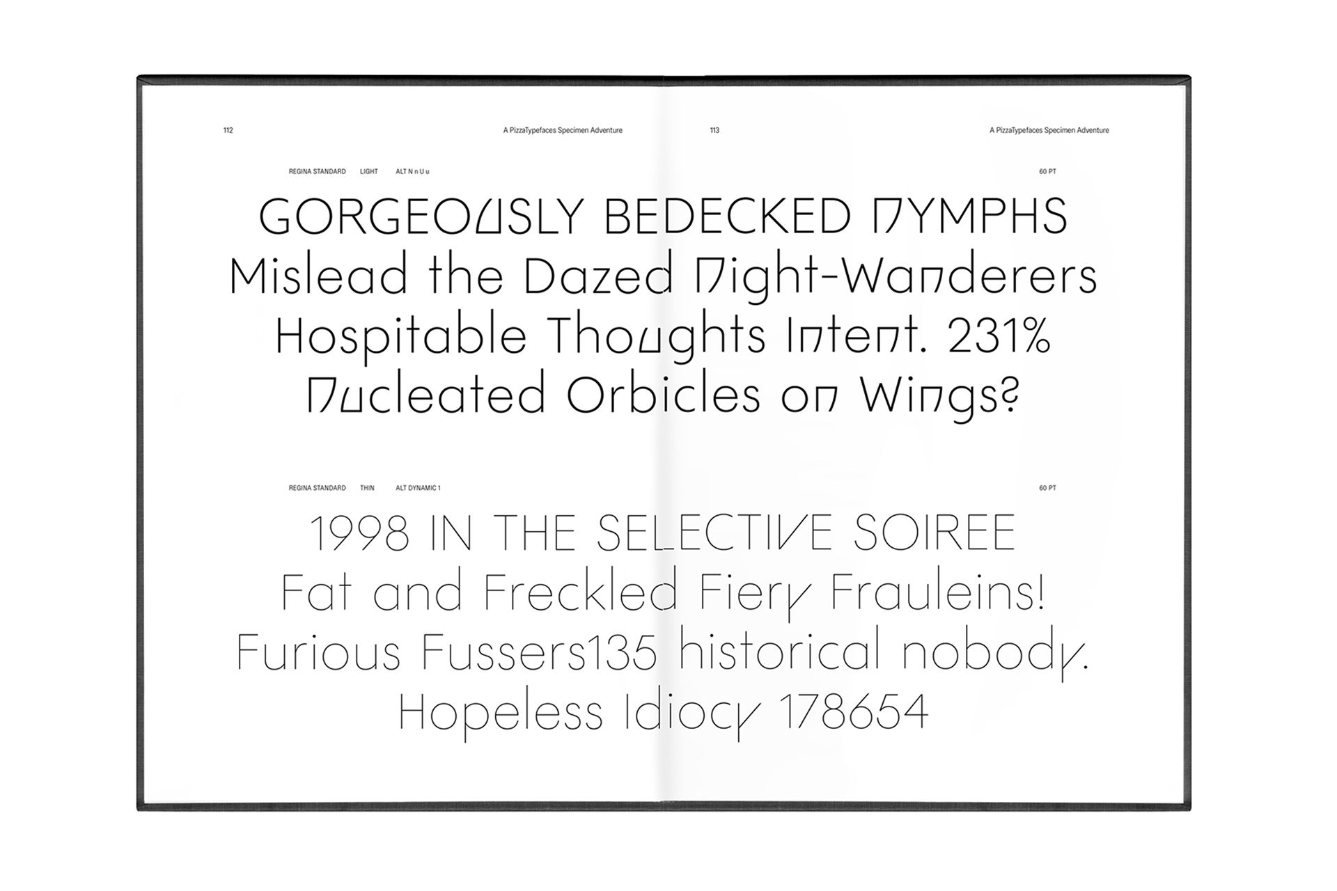
Regina Typeface is a kind of Futura but, as if the Gothic Avant-Garde had interfered. It offers more than a geometric style font with the Uppercase ligatures and specifics letters form design give it a high elegance.
Regina offers three families: the Short one with balanced x-height and Ascenders height. The Standard with an high x-height and high Ascenders. And the Tall for Futura lovers with a low x-height and high ascenders & uppercases.
- Regina Standard
- Thin
- Unincorporated
- Regina Standard
- Light
- Set 1, Set 3
- HOMEOPATHIC
- Regina Tall
- Regular
- Enthusiastically
- Regina Tall
- Black
- Middleweights
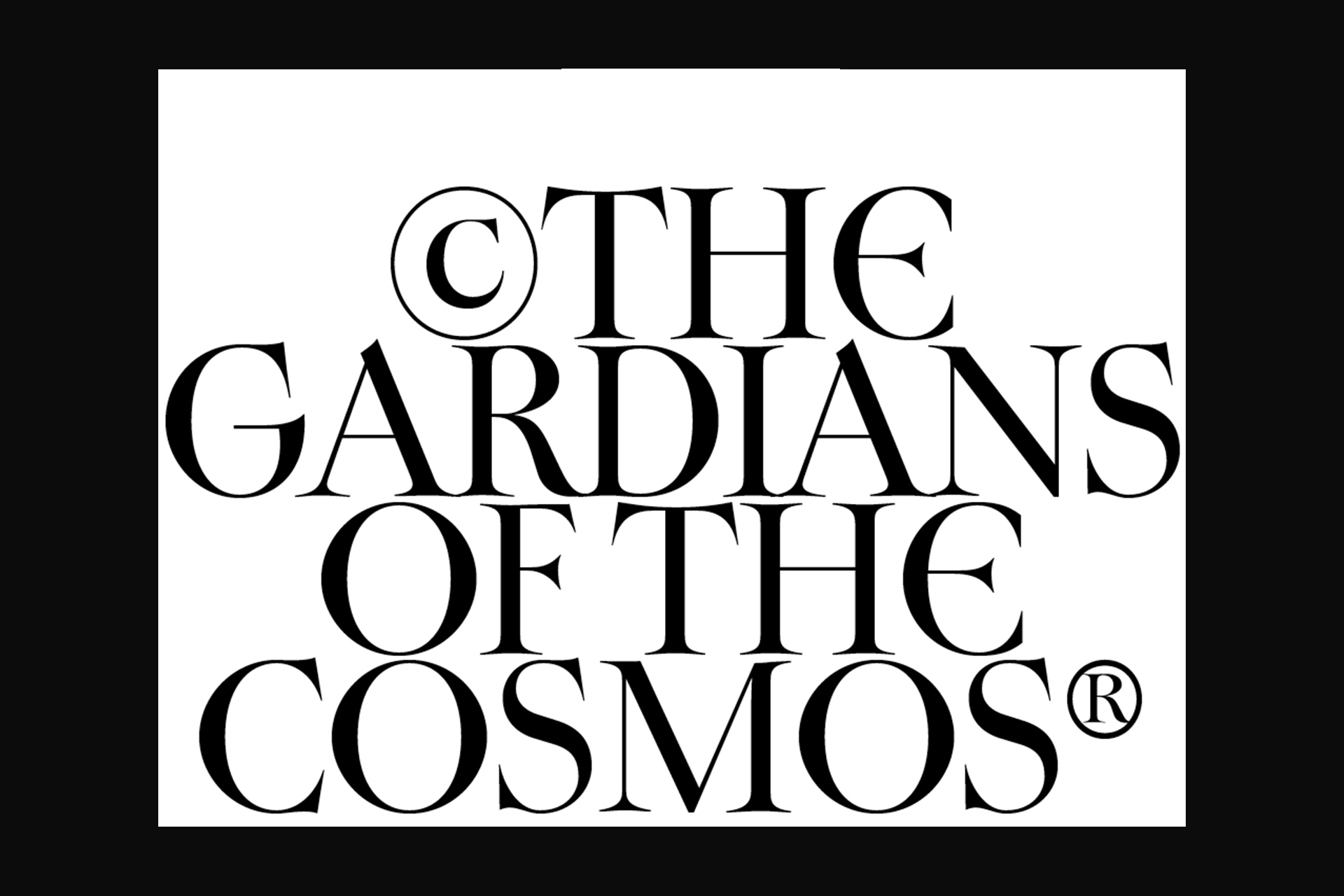
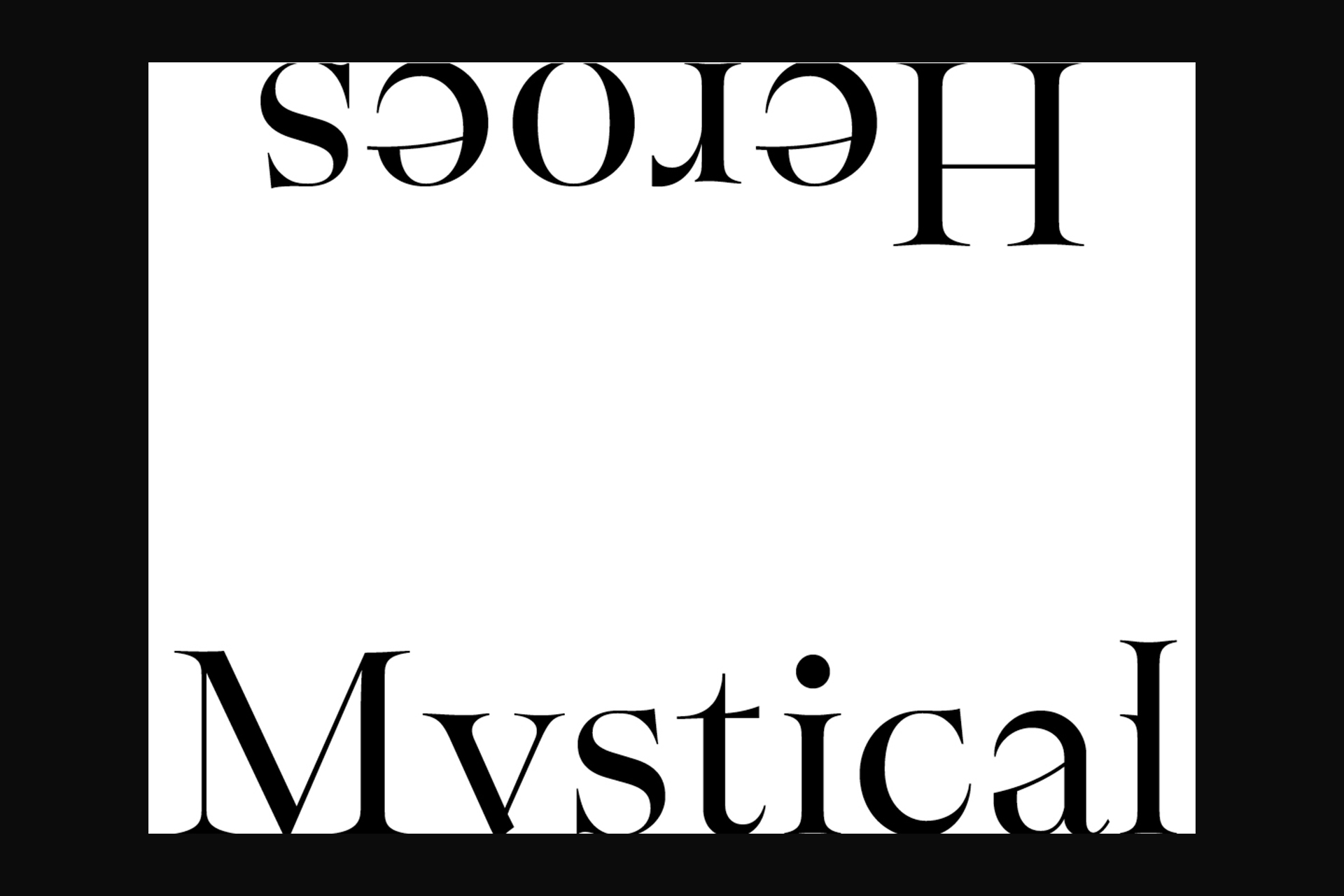
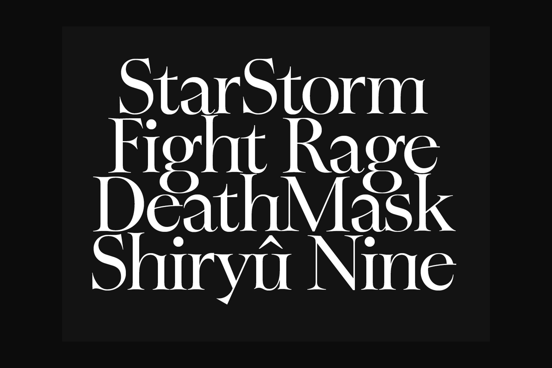
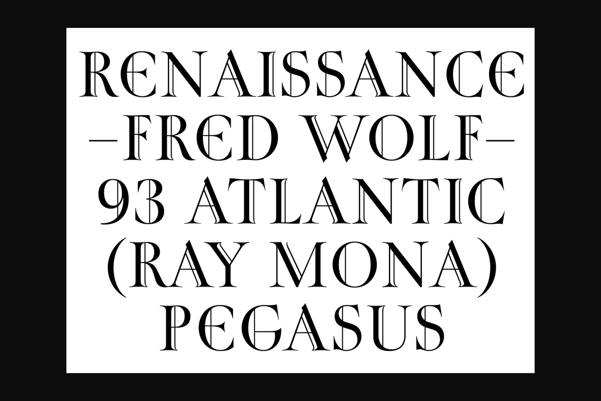
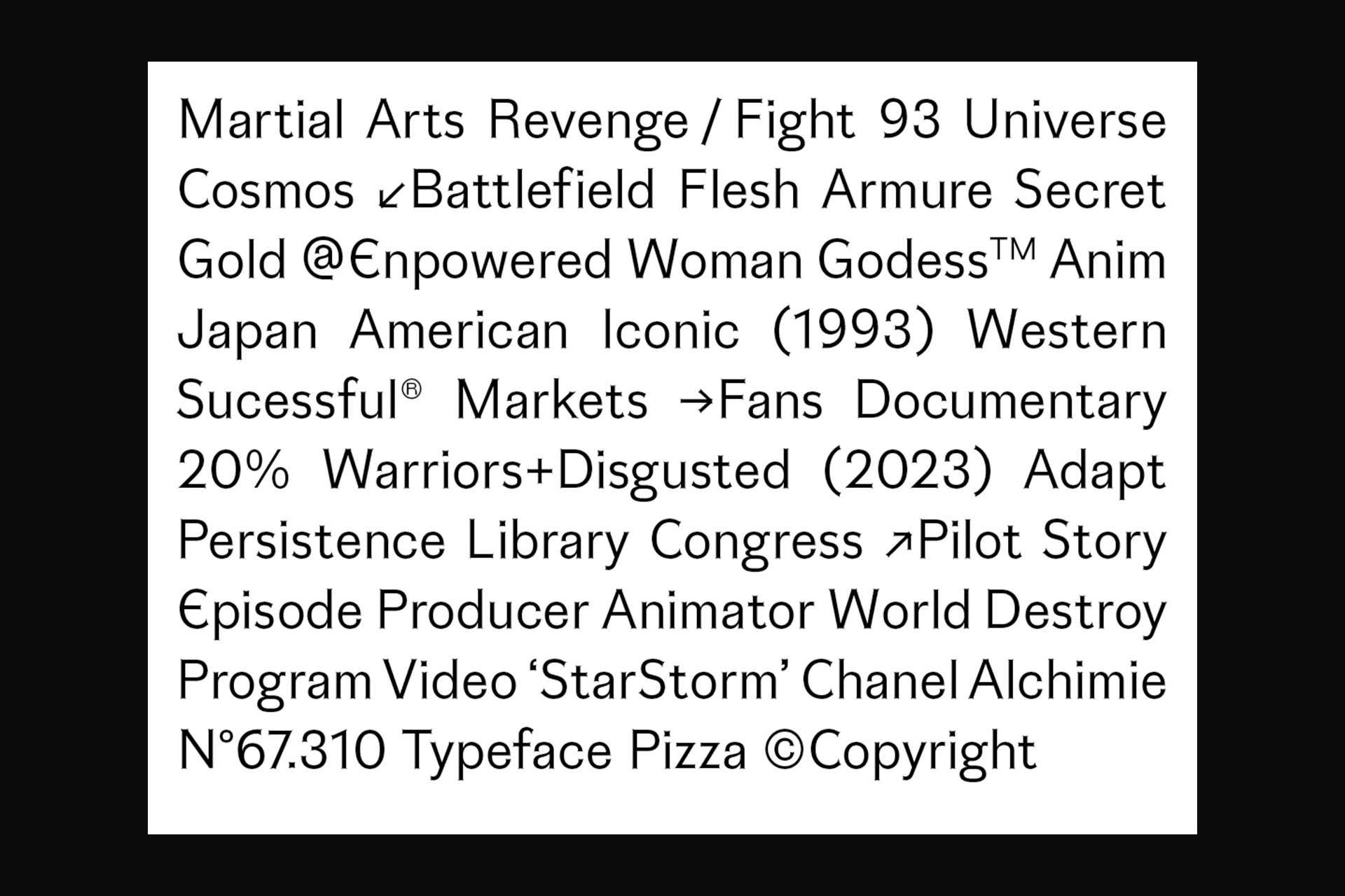
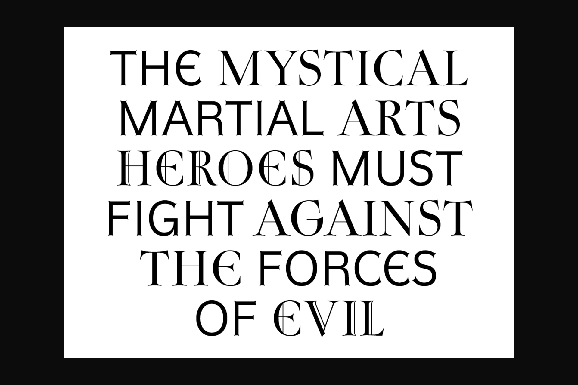
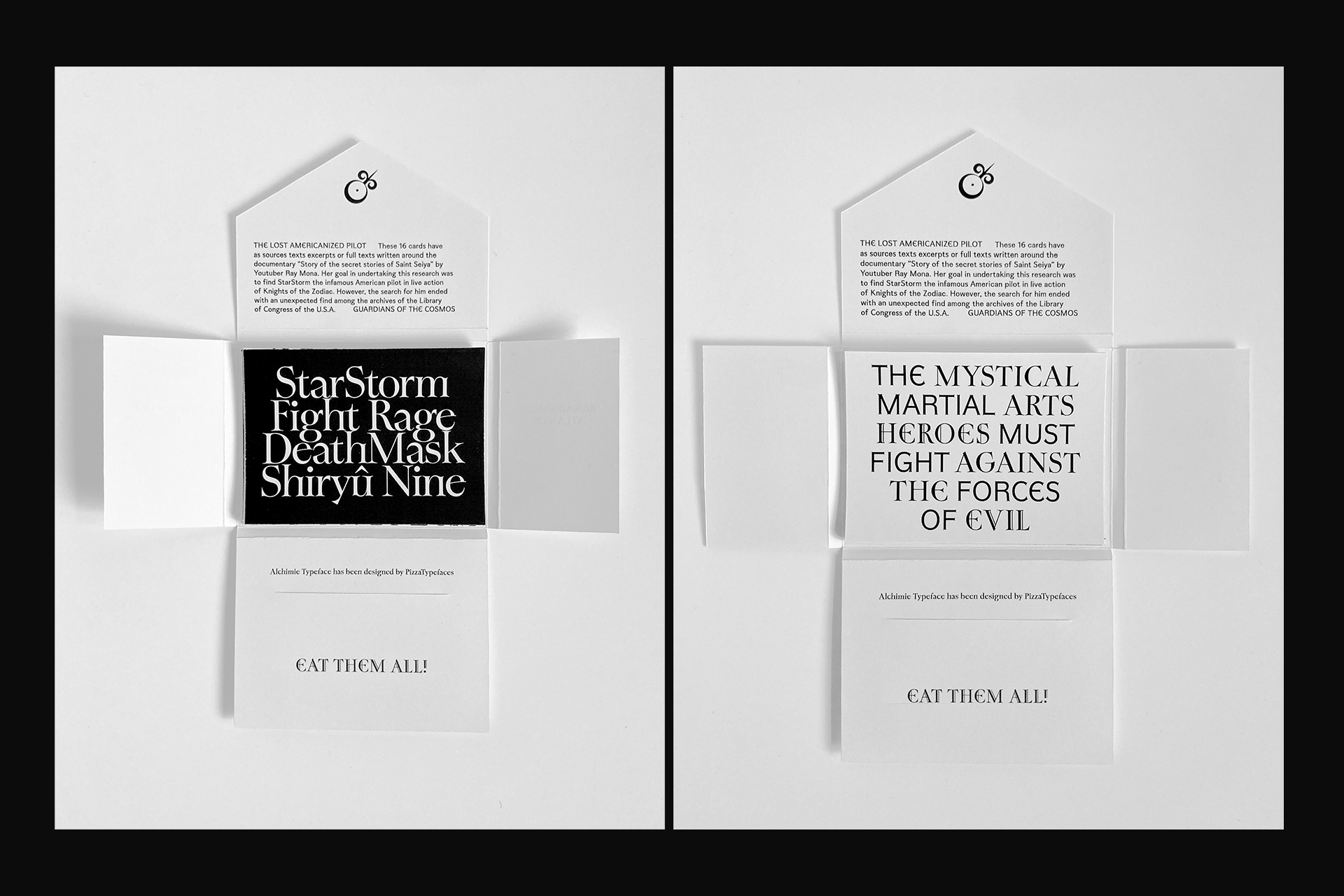
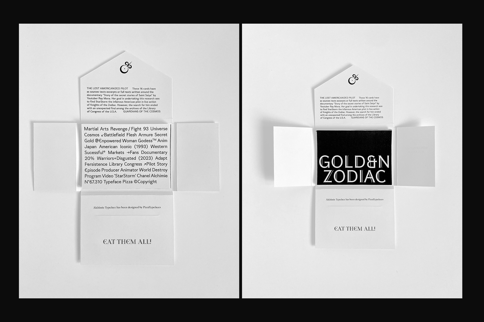
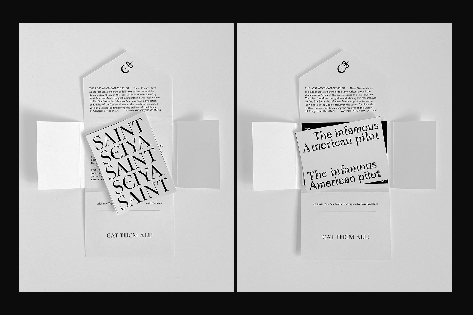
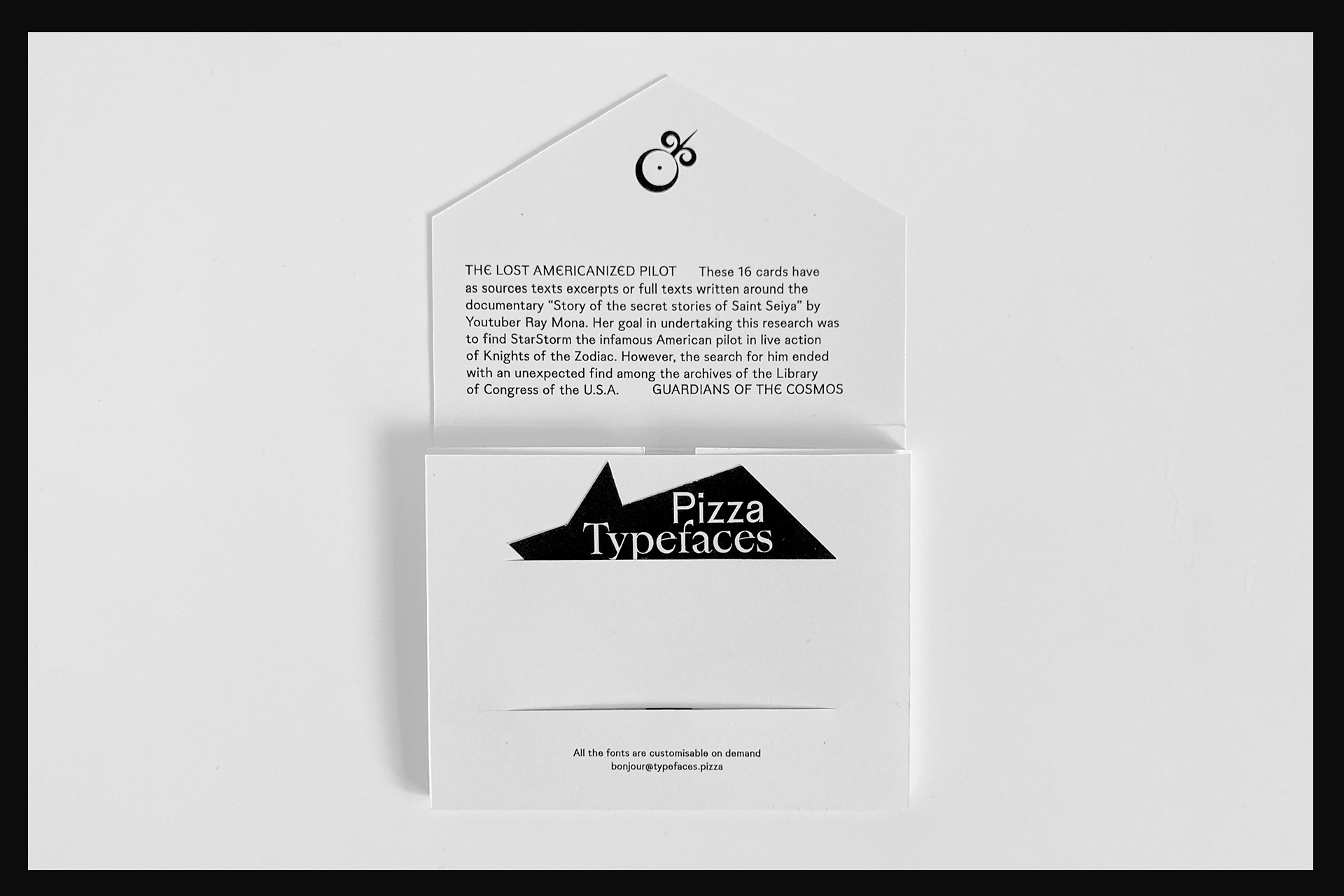
Alch Typeface — Fanzzine Specimen — Card set
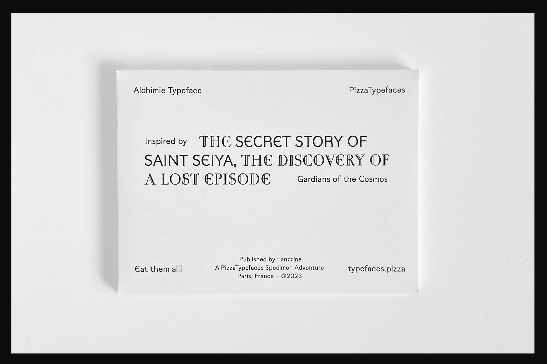
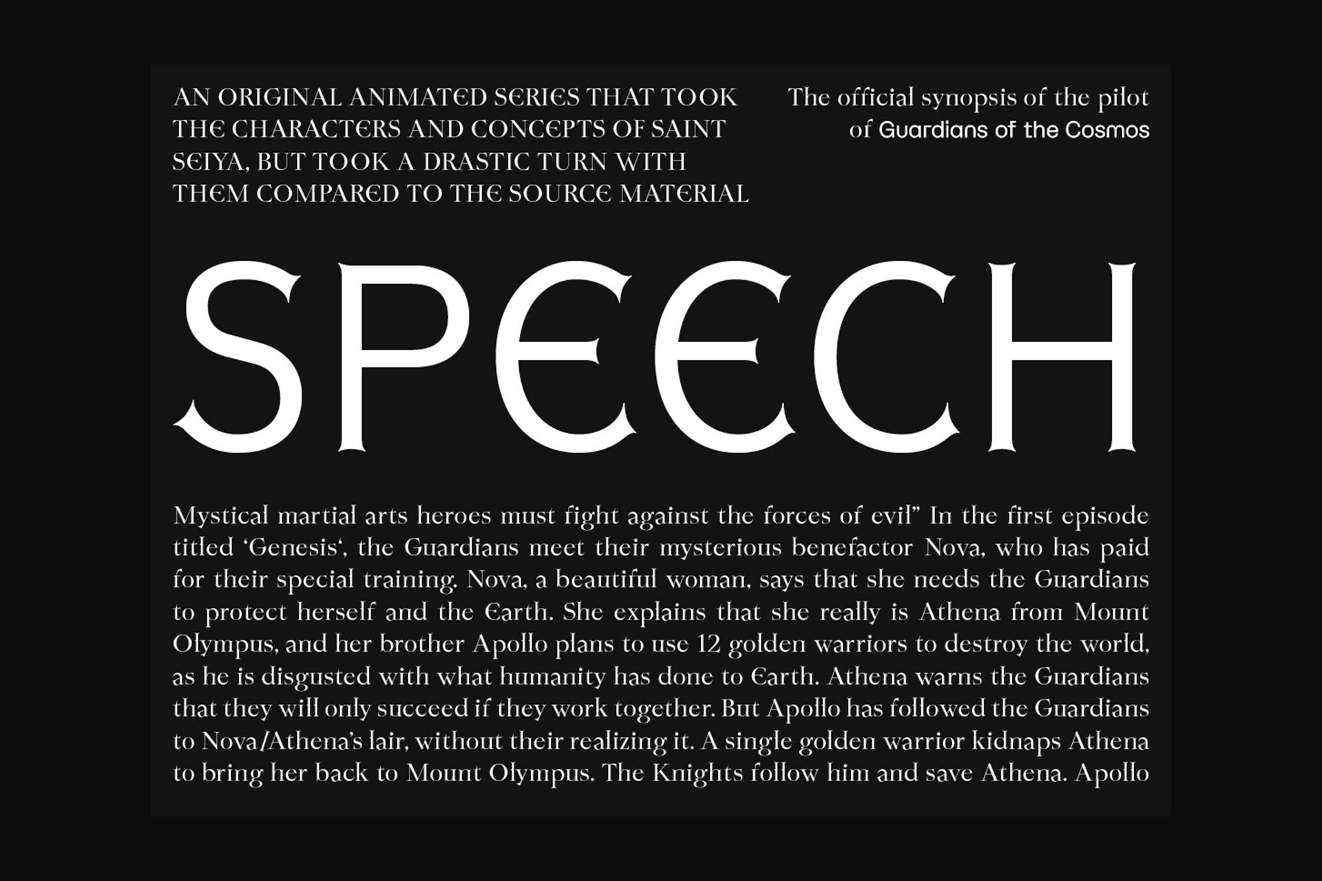
Alch typeface a variable font with Gothic inspirations. It was designed for the visual identity of a jeweler whose work blends alchemy, the Middle Ages, transformation, and a unique character. From the variable design space 4 styles has been pre registred as fonts.
- Alch
- Serif
- Archbishoprics
- Alch
- Serif Gothic
- Embarrassingly
- Alch
- Sans
- OVERSHADOW
- Alch
- Sans
- Electrodynamics
- Alch
- Sans Gothic
- Bloodthirstiness
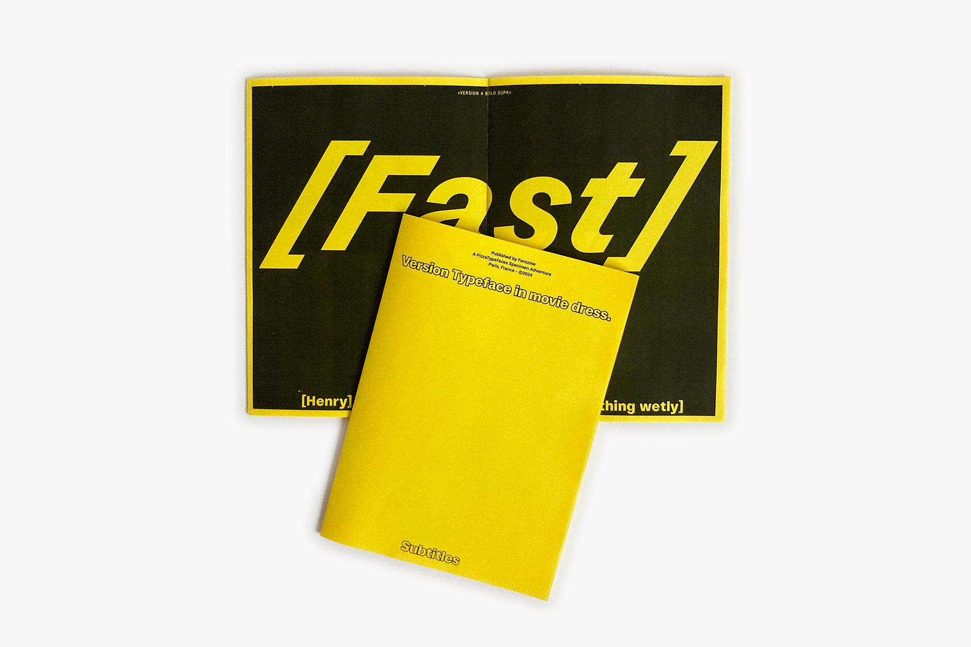
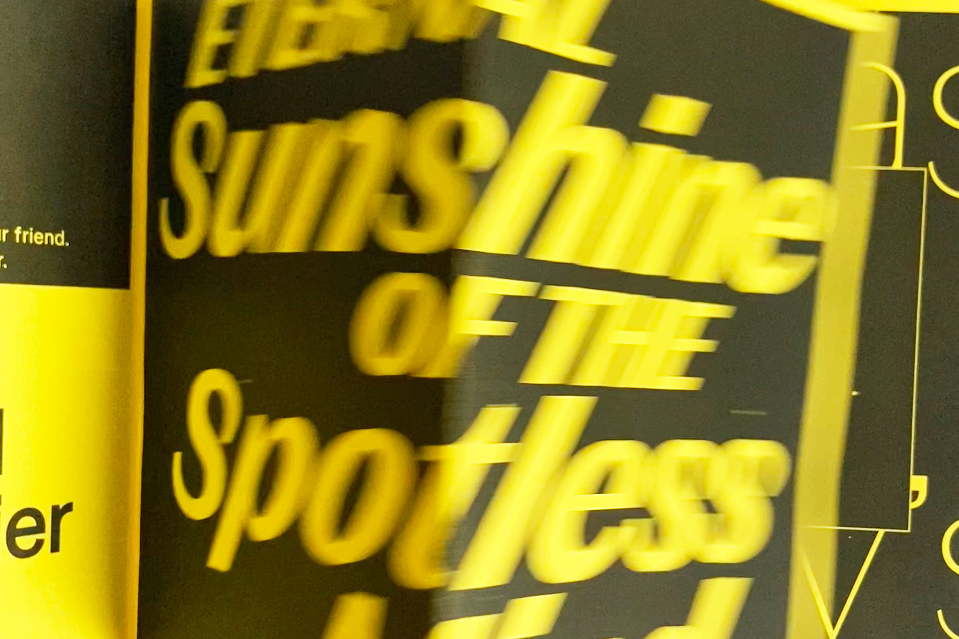
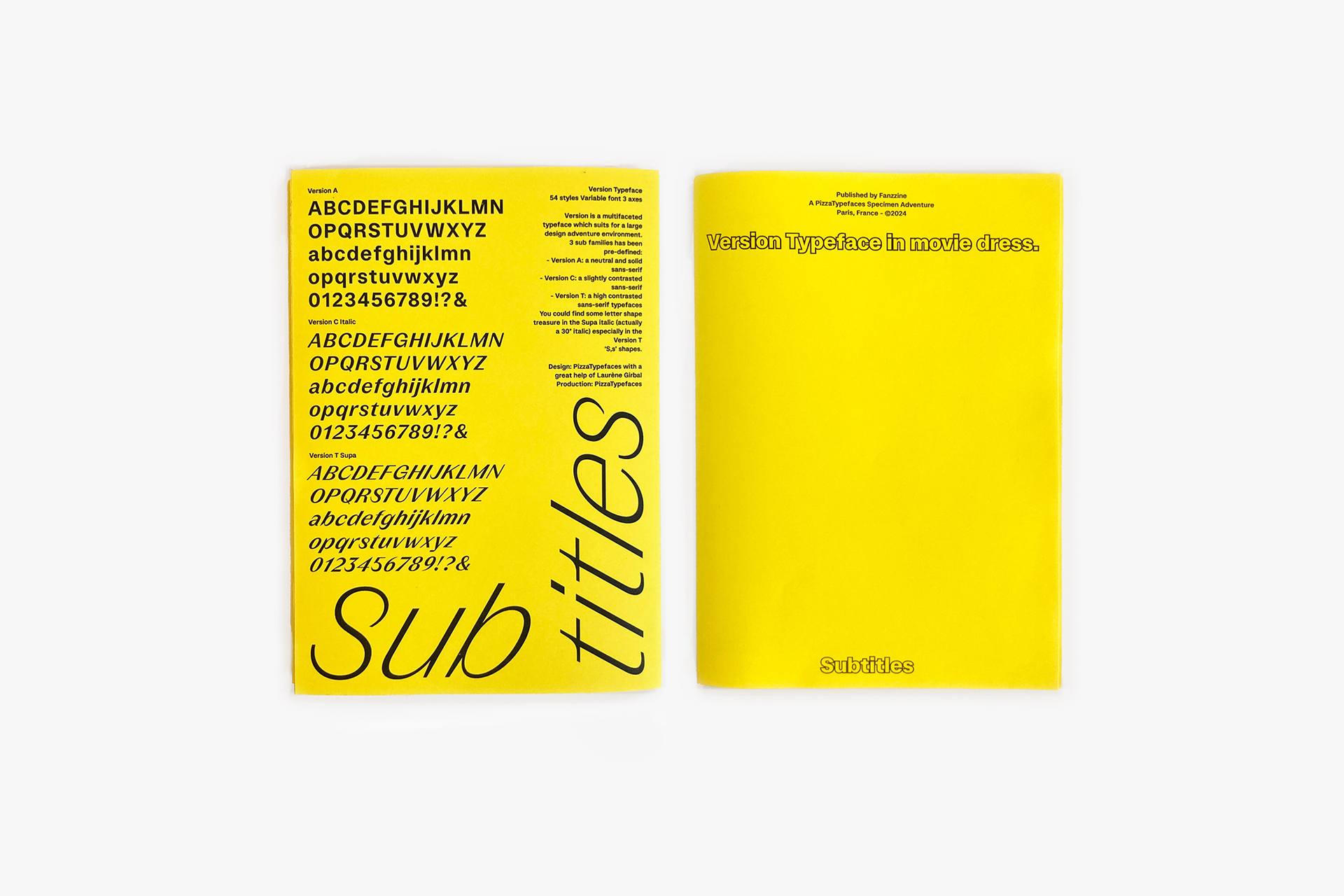
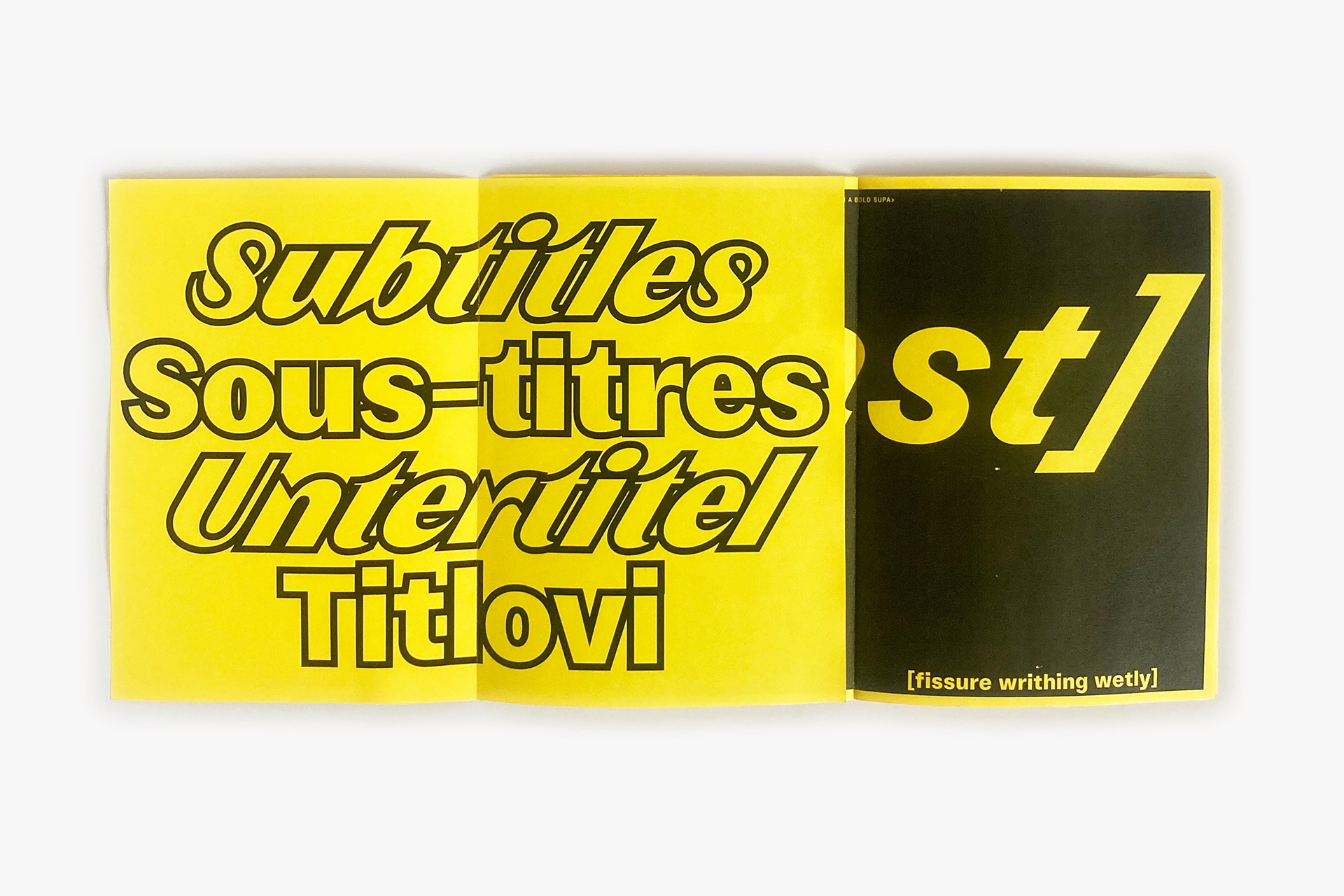
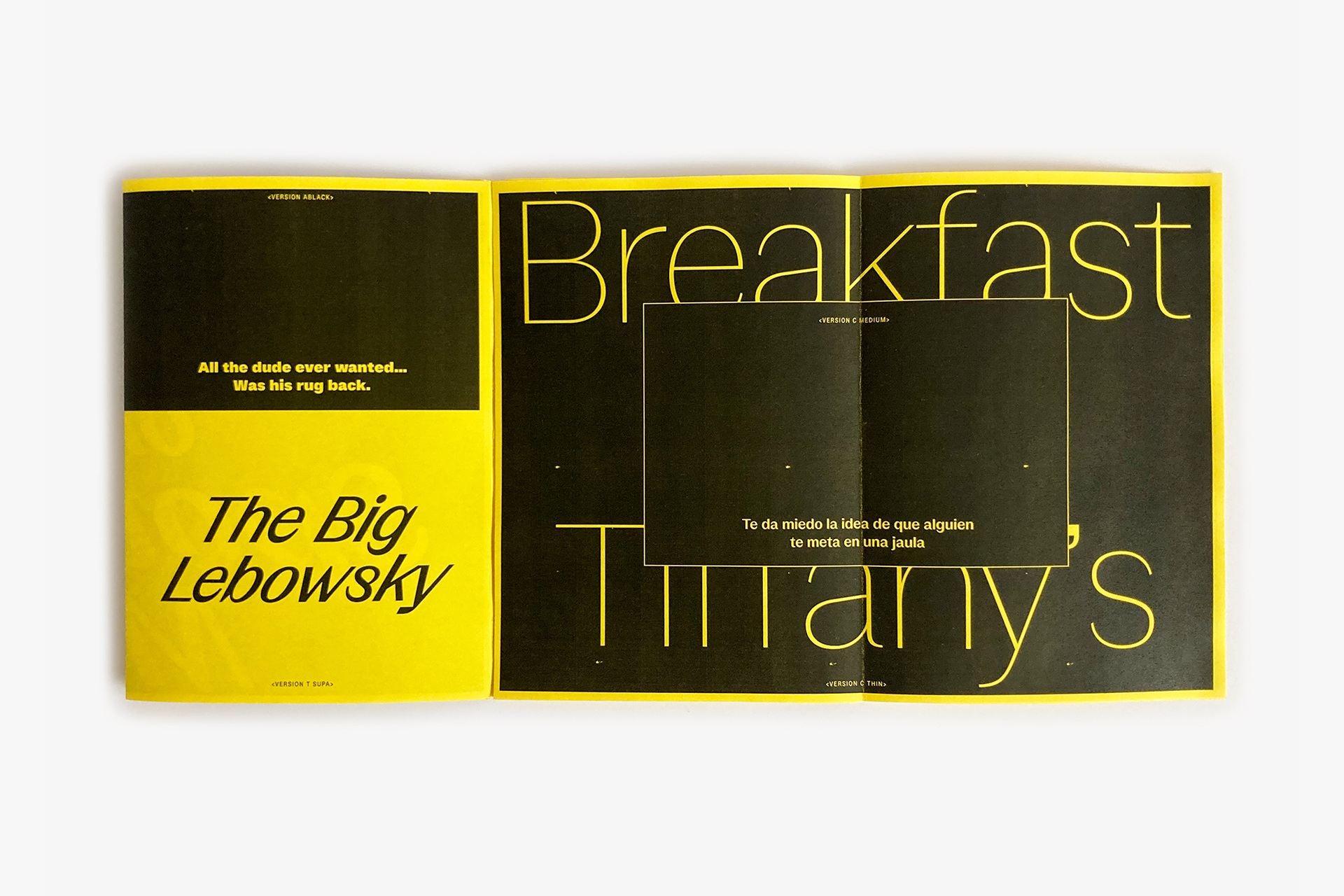
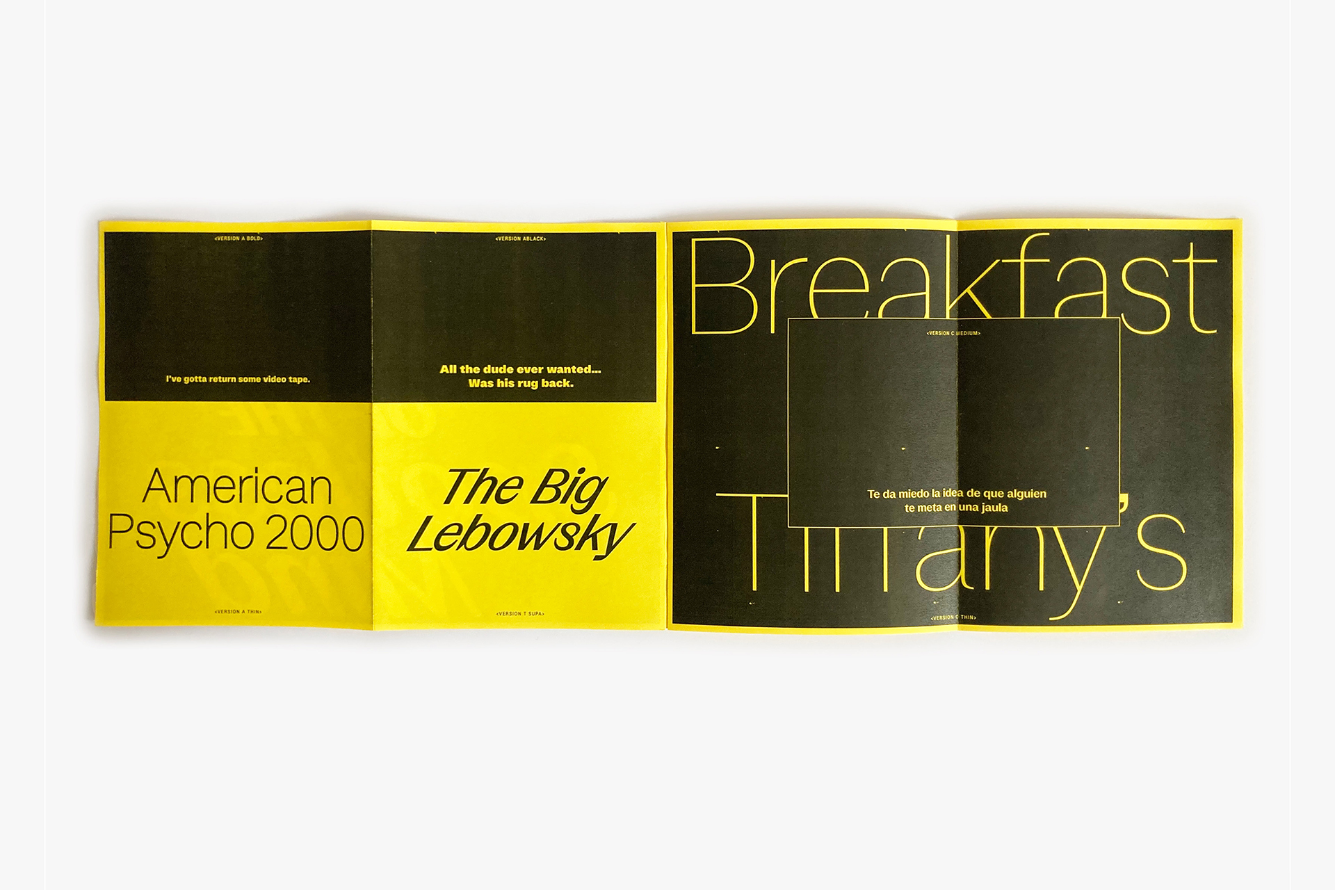
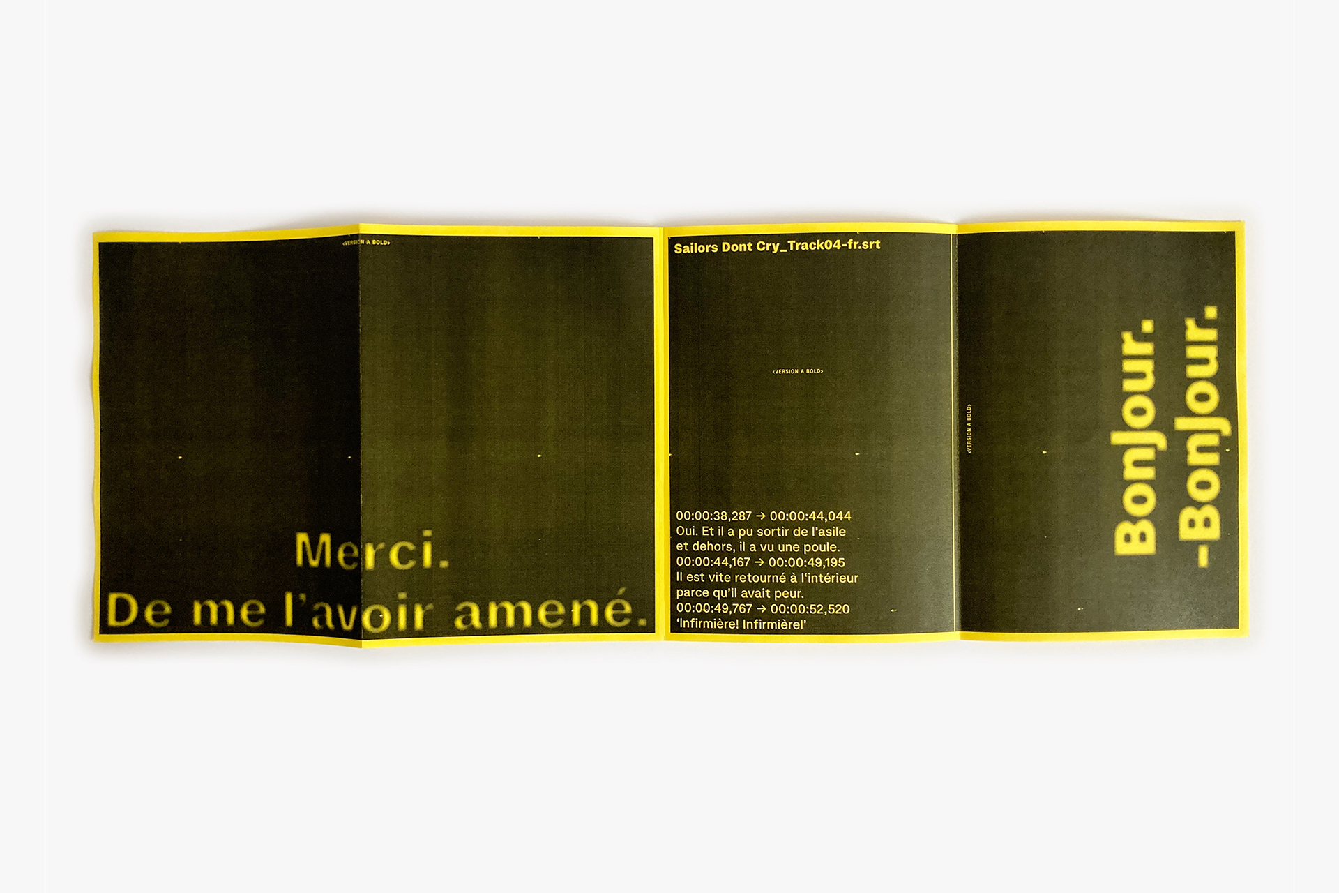
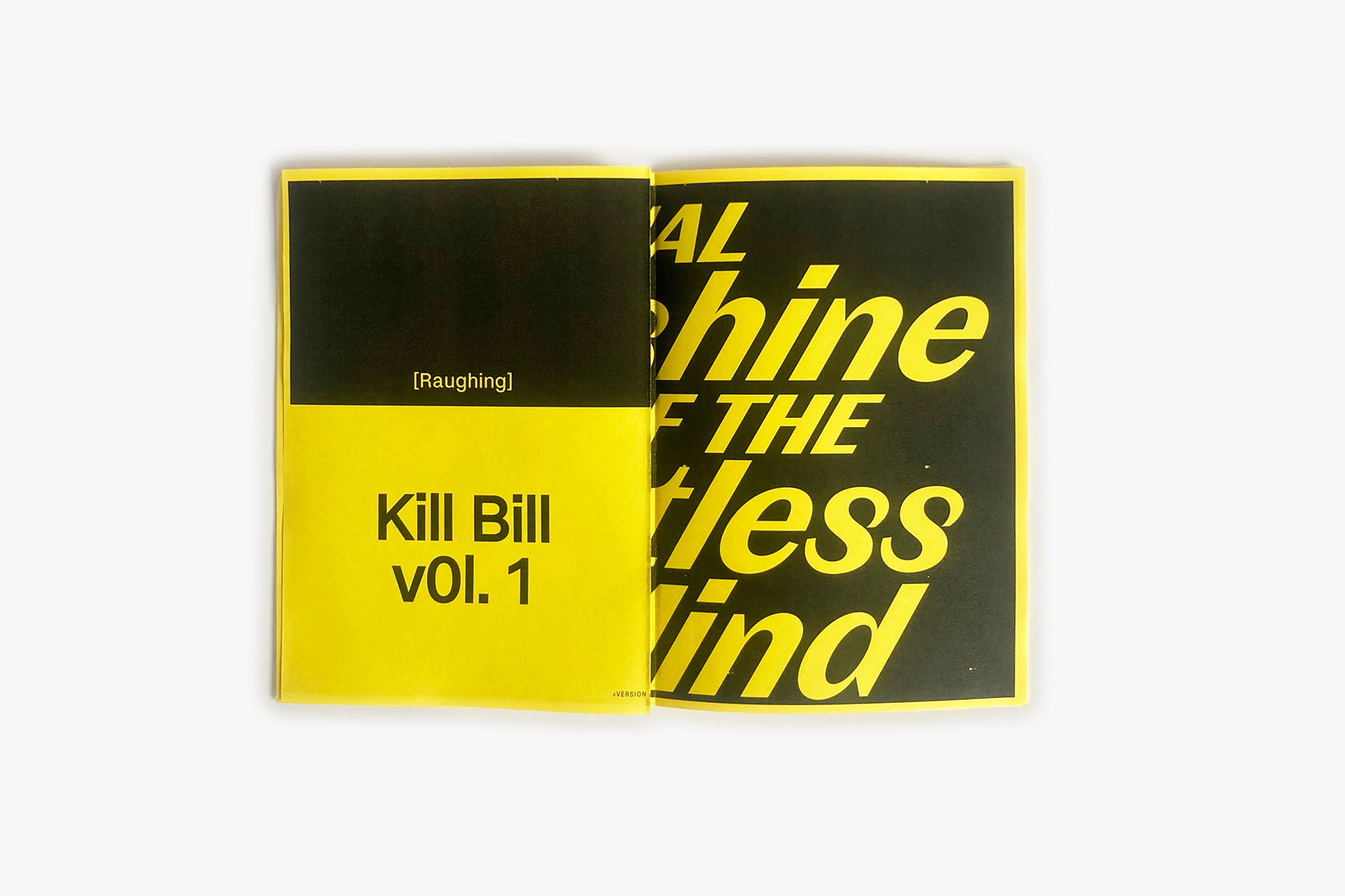
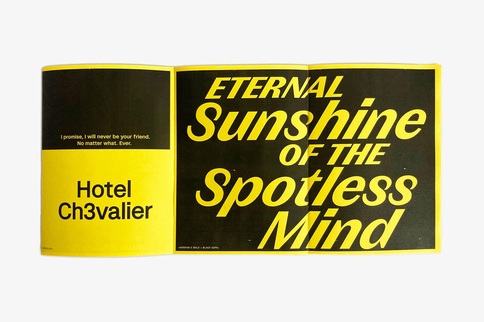
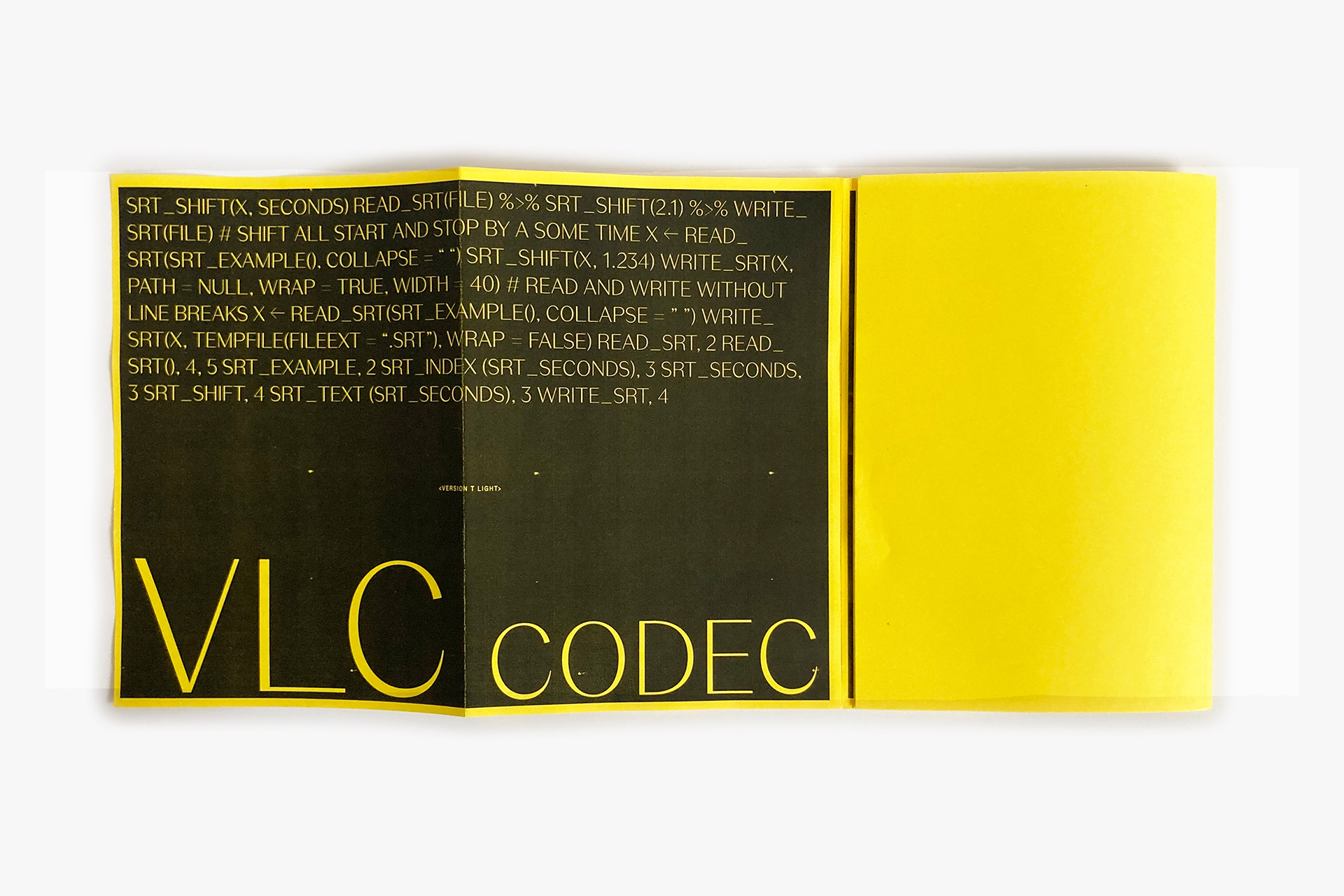
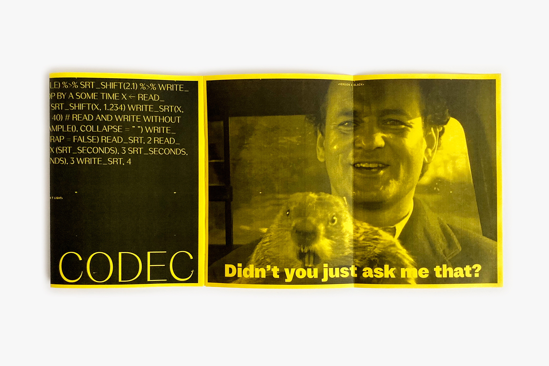
Version Typeface - Fanzzine Specimen
Version is a multifaceted 🪩 typeface which suits for a large design adventure environment.
Threee families works in contrast differences from a neutral and solid sans-serif (A) to a high contrasted sans-serif typefaces (C) with a middle one, a slightly contrasted sans-serif (C). You could find some letter shape treasure in the Supa italic (actually a 30° italic) especially in the Version T 'S, s' shapes.
- Version A
- Thin
- Unreconstructed
- Version A
- Regular
- Relinquishments
- Version A
- Bold
- Teleprocessing
- Version C
- Regular
- Authoritarianism
- Version C
- Medium Supa
- Pamphleteering
- Version T
- Black
- Sentimentality
- Version T
- Black Italic
- Optimistically
- Version T
- Black Supa
- Reminiscently
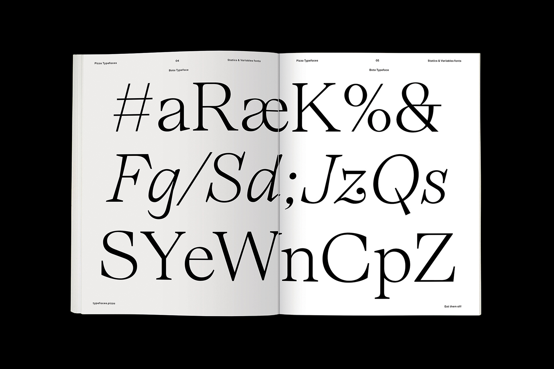
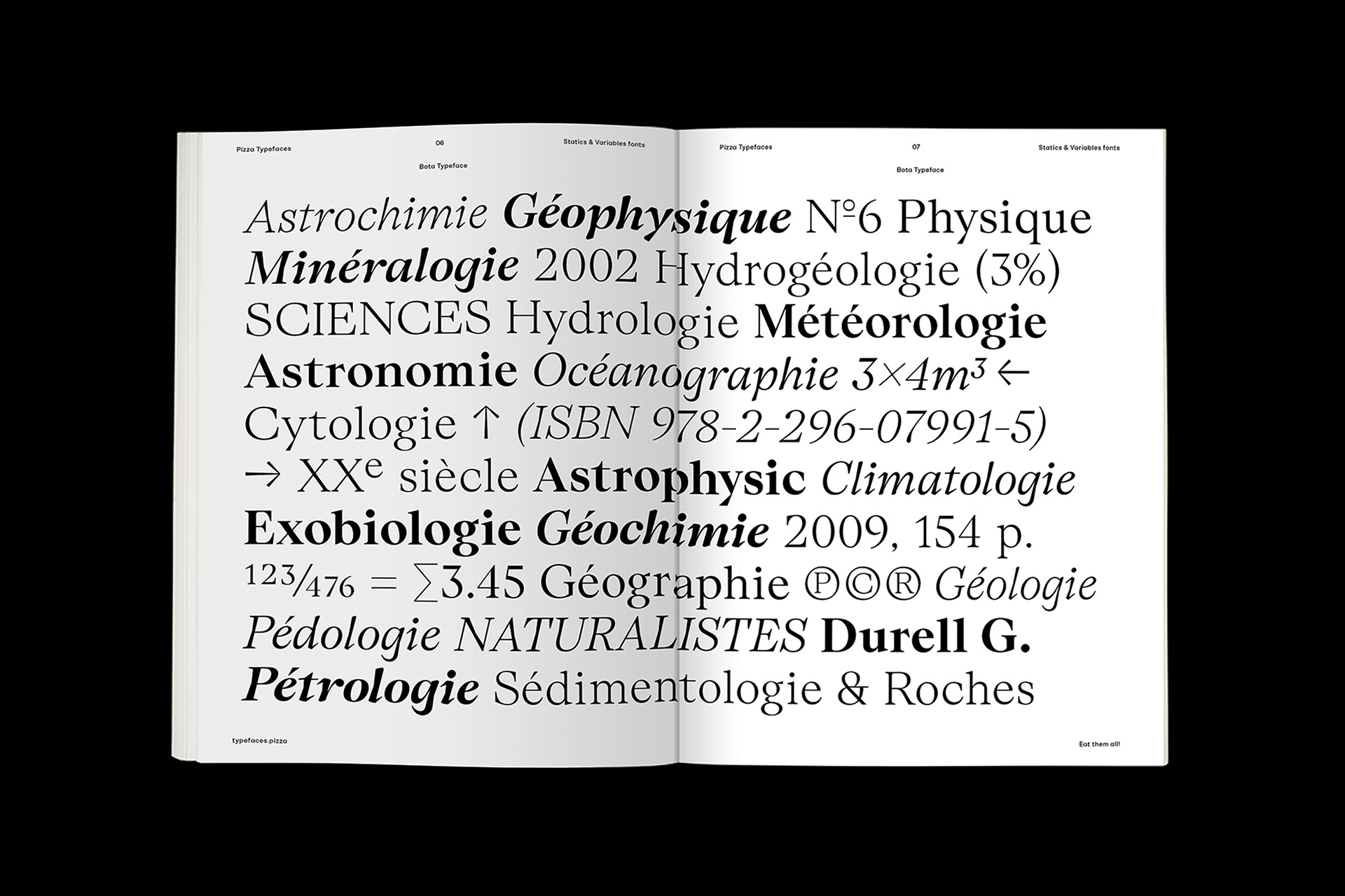
Bota Typeface - Specimen
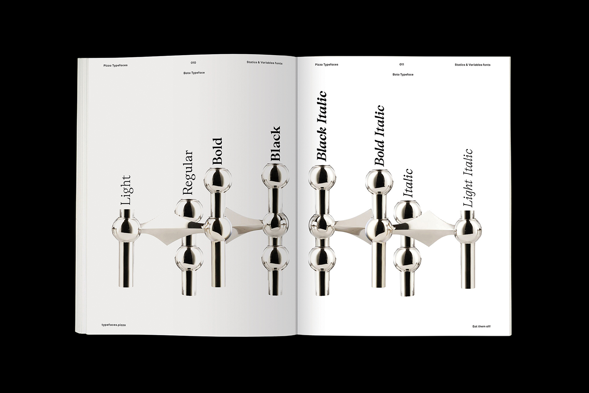
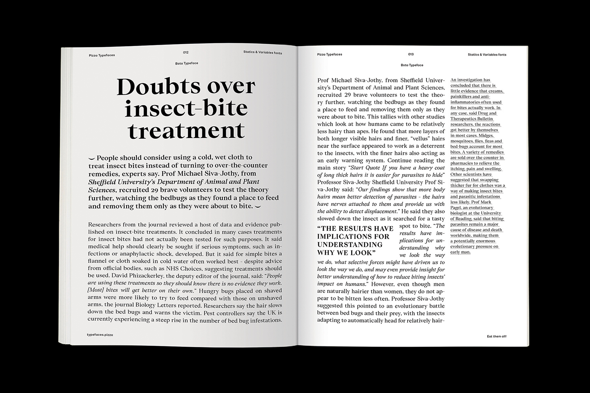
Bota typeface is a sharp serif genre. With its balanced uppercase widths from Roman capitals and calligraphic features, you can use it to stand out in upright style for an elegant look while italics are already dancing across the floor of the layout. It was originally designed for the Boissinot & Tailliez brand identity and has now expanded into a full font family. Becareful, the switch between upright and italic is brutal.
- Bota
- Thin
- Counterparties
- Bota
- Thin Italic
- Rationalisations
- Bota
- Regular
- Temporization
- Bota
- Italic
- Documentation
- Bota
- Bold
- Chronographs
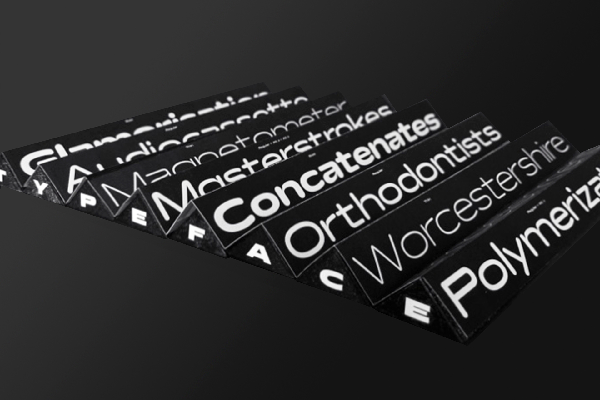
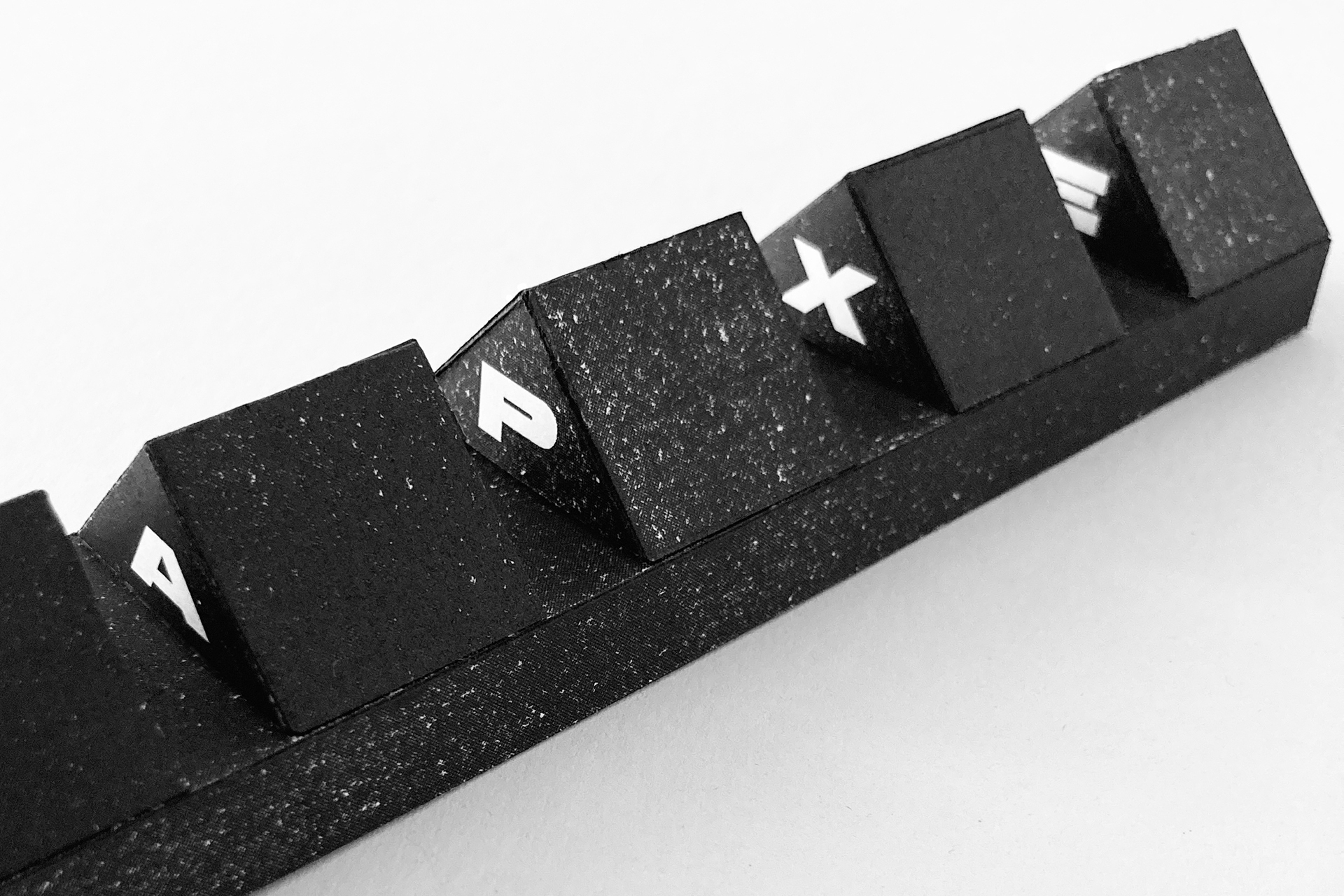
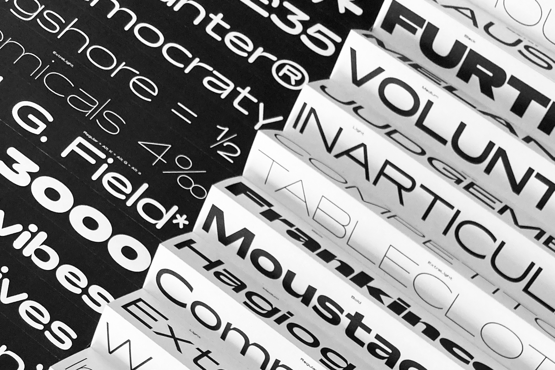
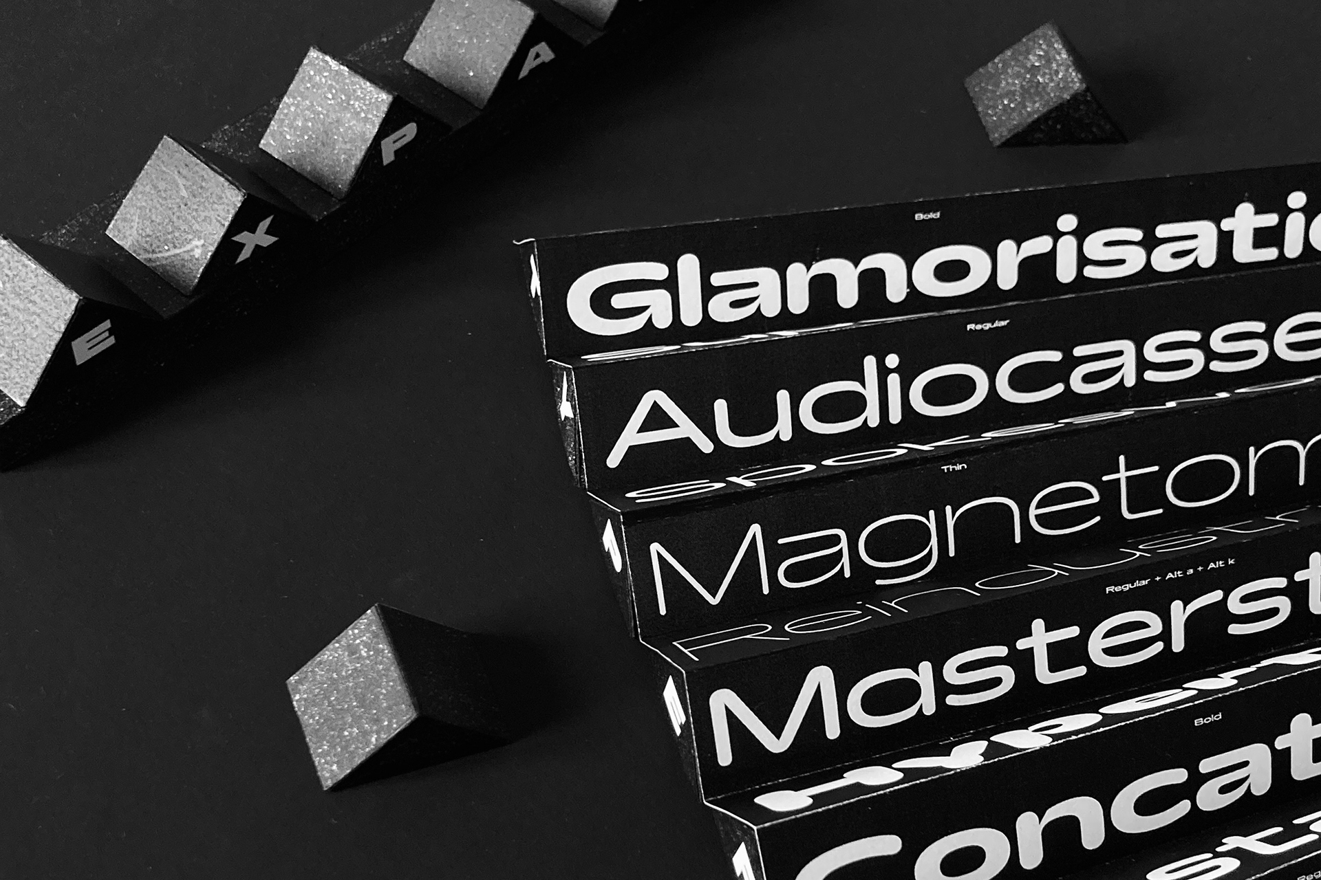
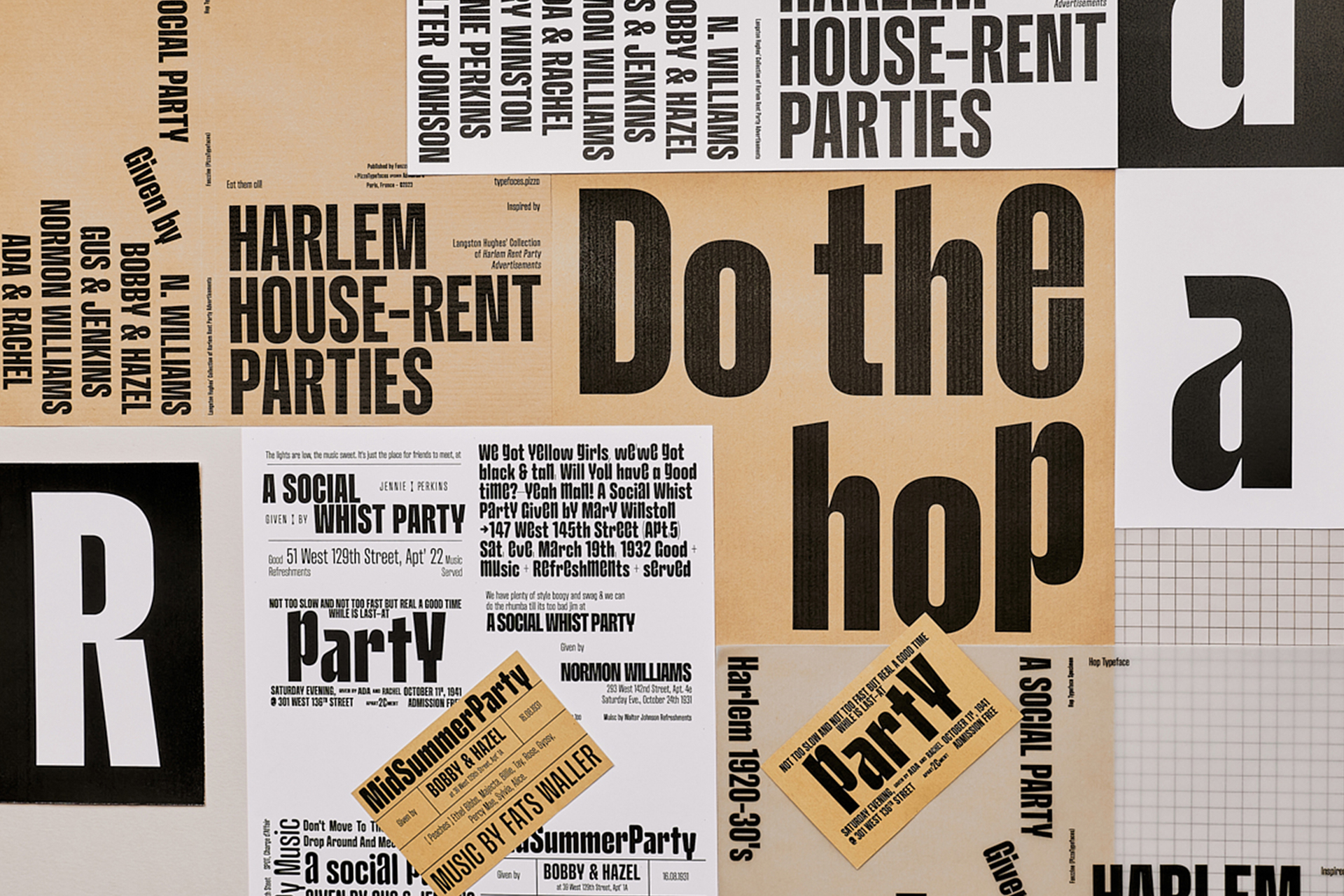
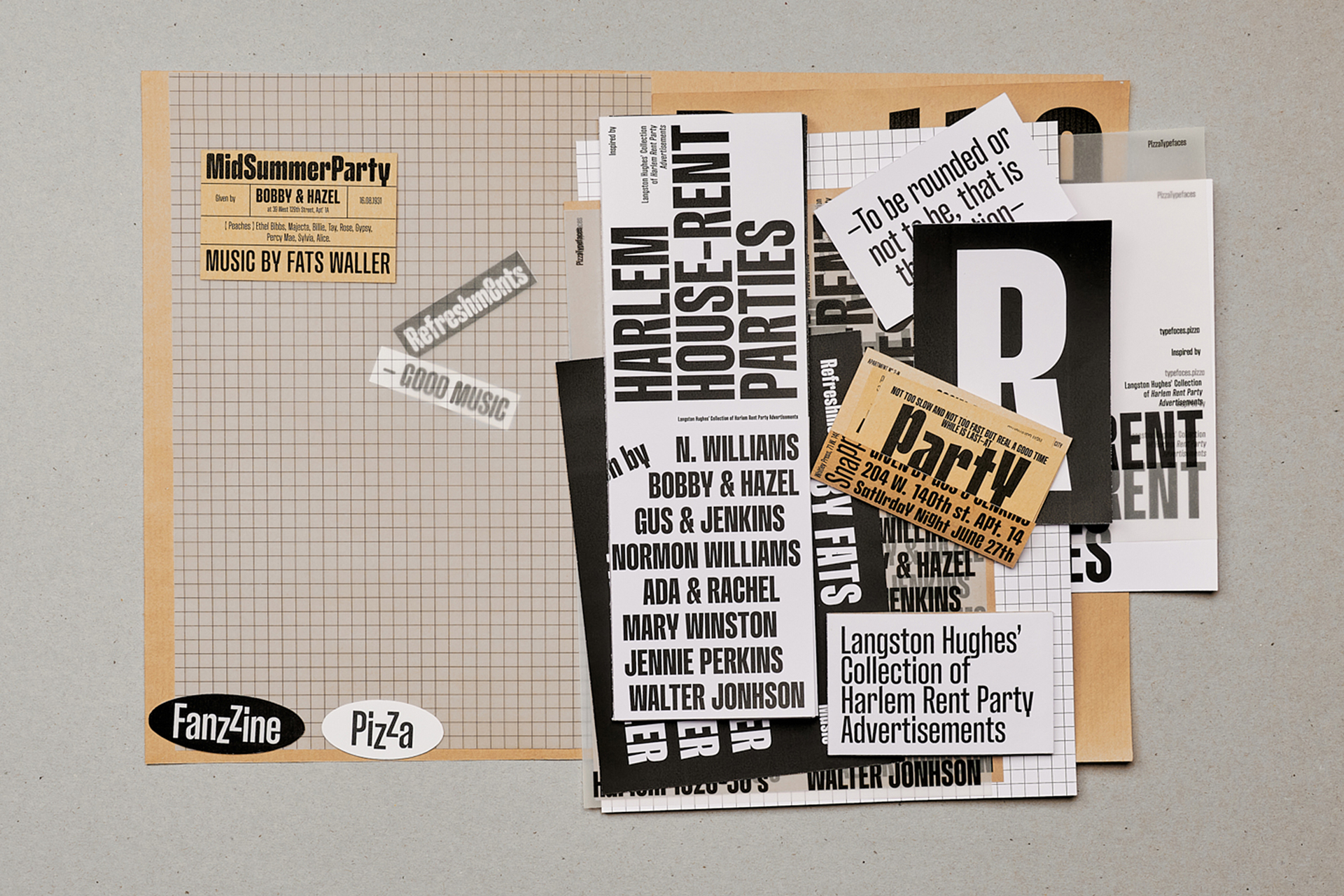
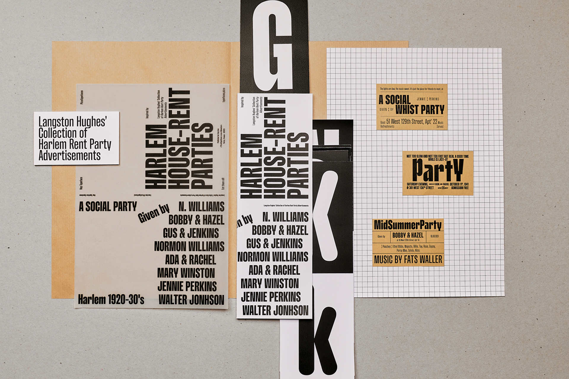
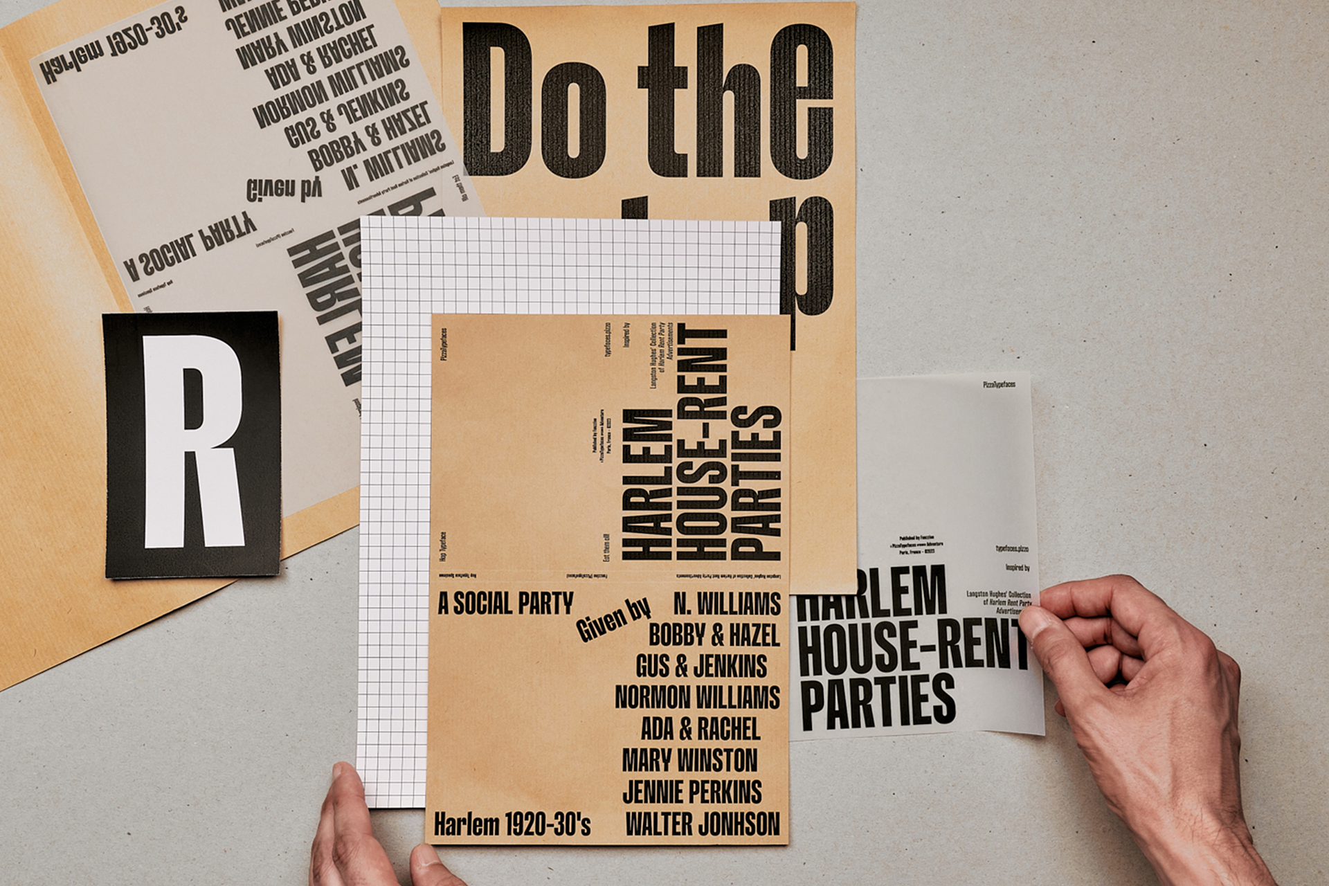
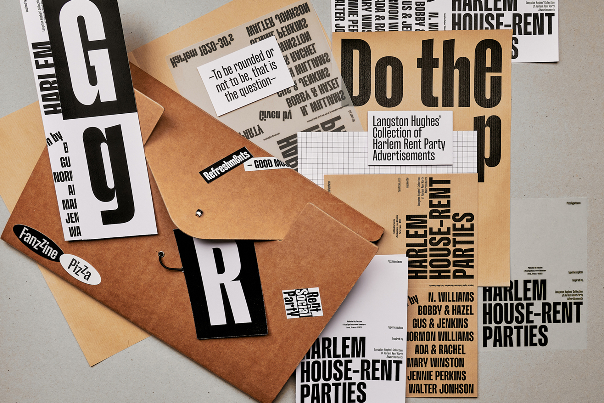
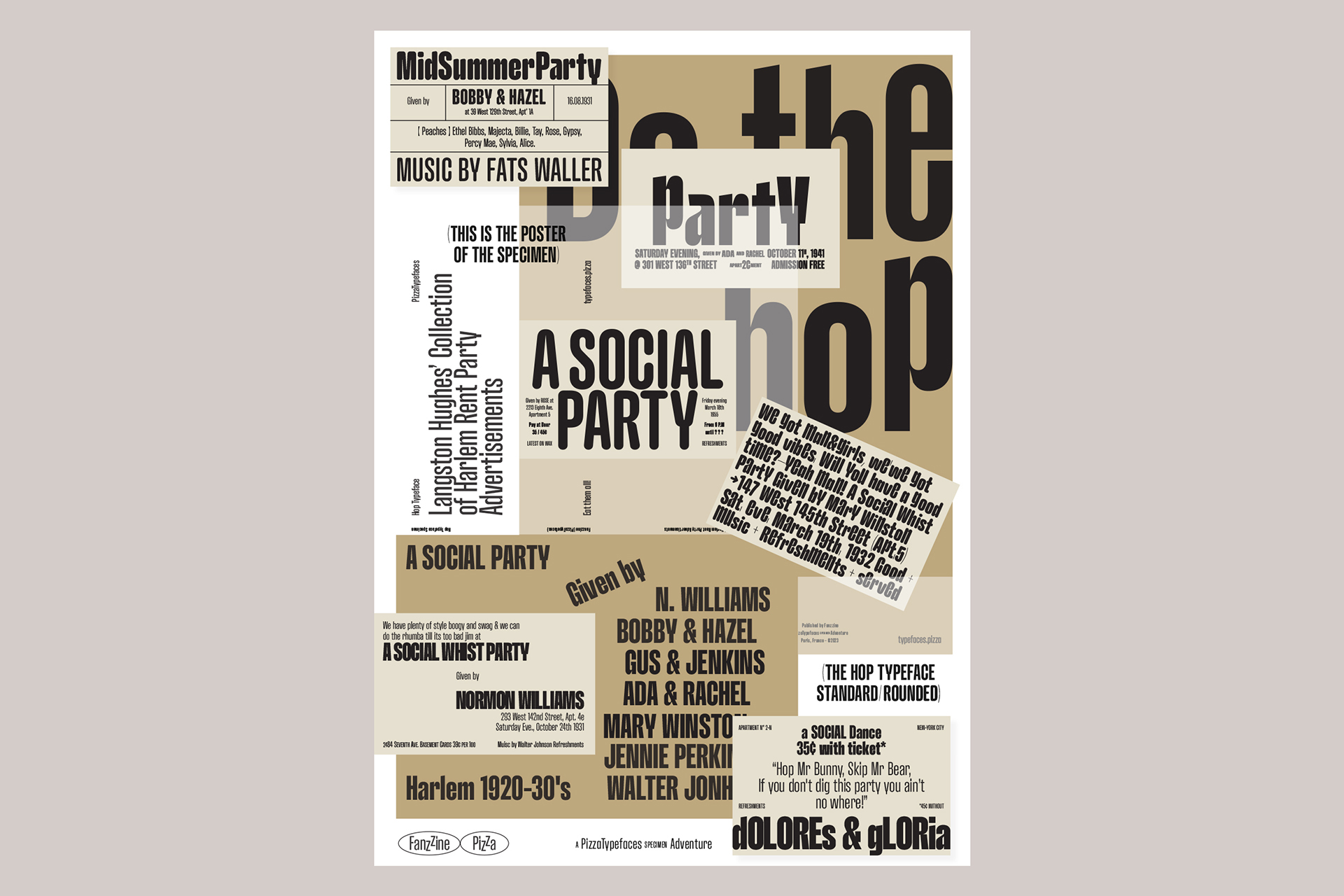
Hop Expanded — Fanzzine Specimen
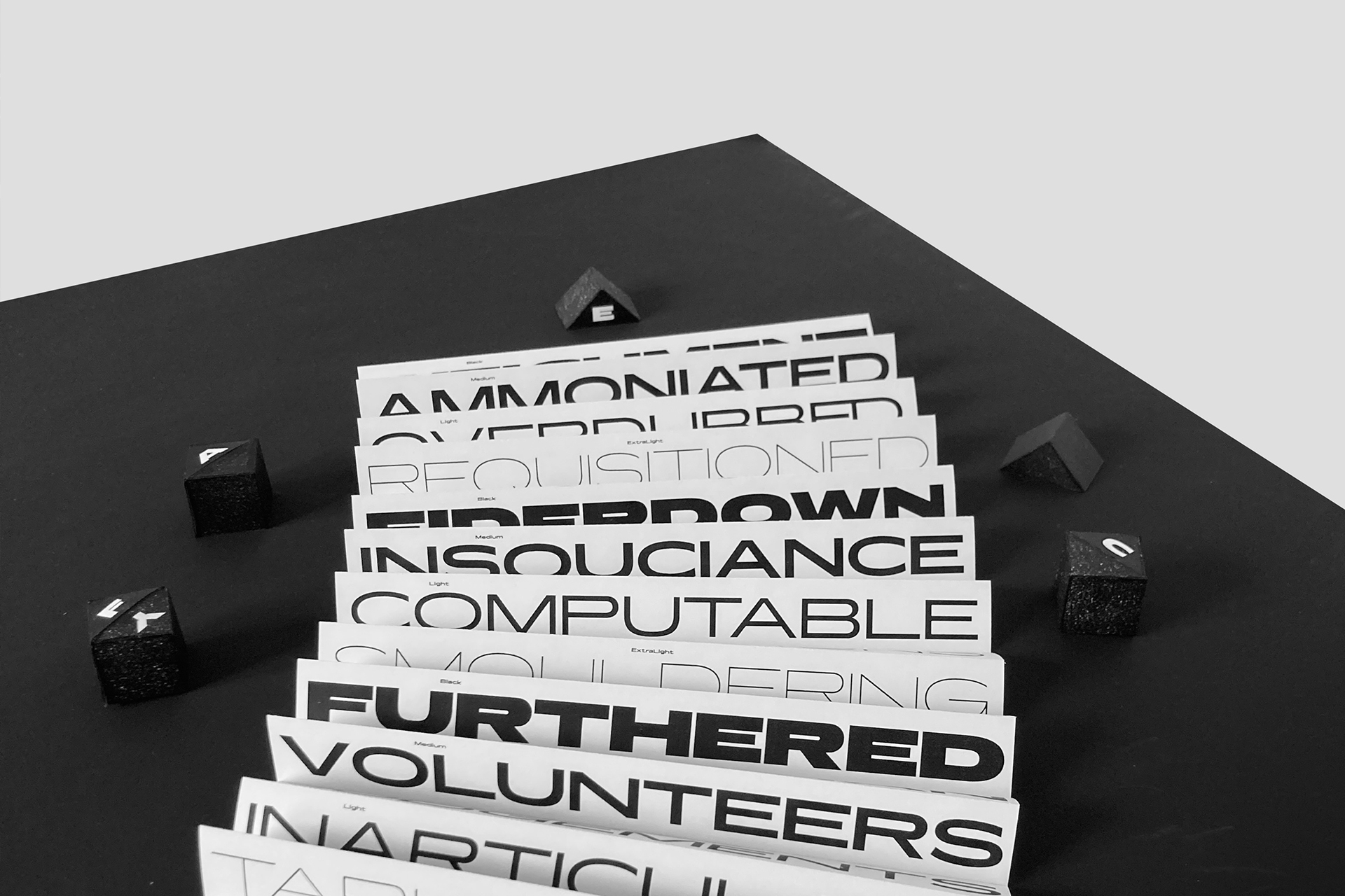
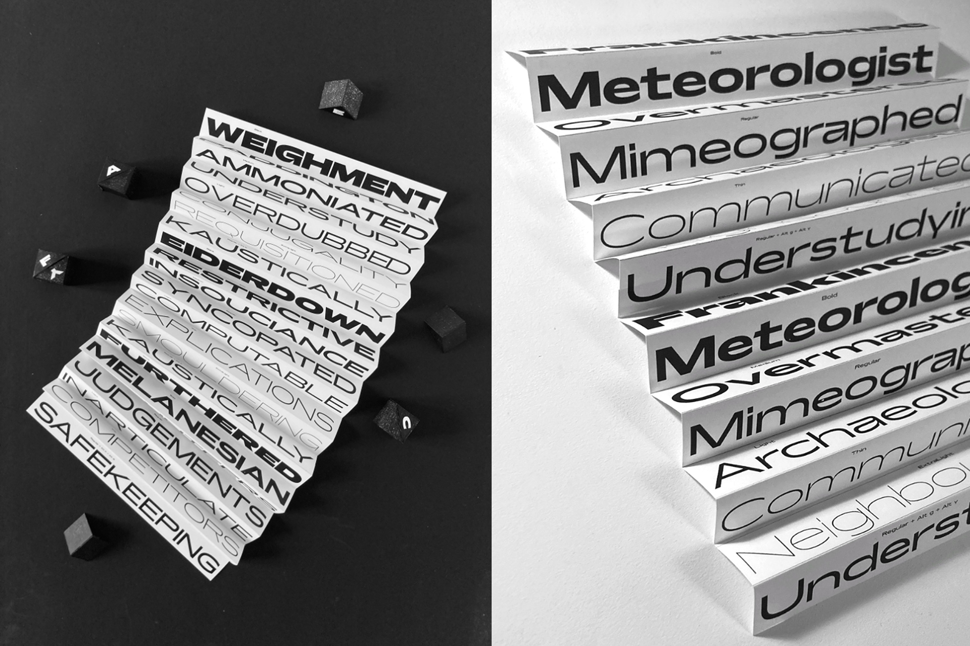
The Hop typeface is splitted into two extrems widths. Compressed and Expanded. The main features here also resides in a calligraphic approach in the connection between the stems and the bowls, offering a wide range of weights, switch to a rounded companion in all styles + alternates Up lowercase. Hop includes four families: Hop Compressed Normal, Hop Compressed Rounded, Hop Expanded Normal, Hop Expanded Rounded. The Rounded version for smooth and soft sensations.
- Hop Compressed Normal
- Light
- Savaged Chosen Unbeatable
- Hop Compressed Normal
- Medium
- Spite Skylarks Criminating
- Hop Compressed Rounded
- Medium
- Set 4
- Role Yipping Appropriators
- Hop Compressed Normal
- Ultra
- Humanity Inapplicability
- Hop Compressed Rounded
- Ultra
- LIQUIDISERS OBJECTIFIES
- Hop Expanded Normal
- Regular
- Loca 123
- Hop Expanded Normal
- Bold
- Kennedy
- Hop Expanded Rounded
- Bold
- FRANCS
- Hop Expanded Rounded
- Black
- Refocus
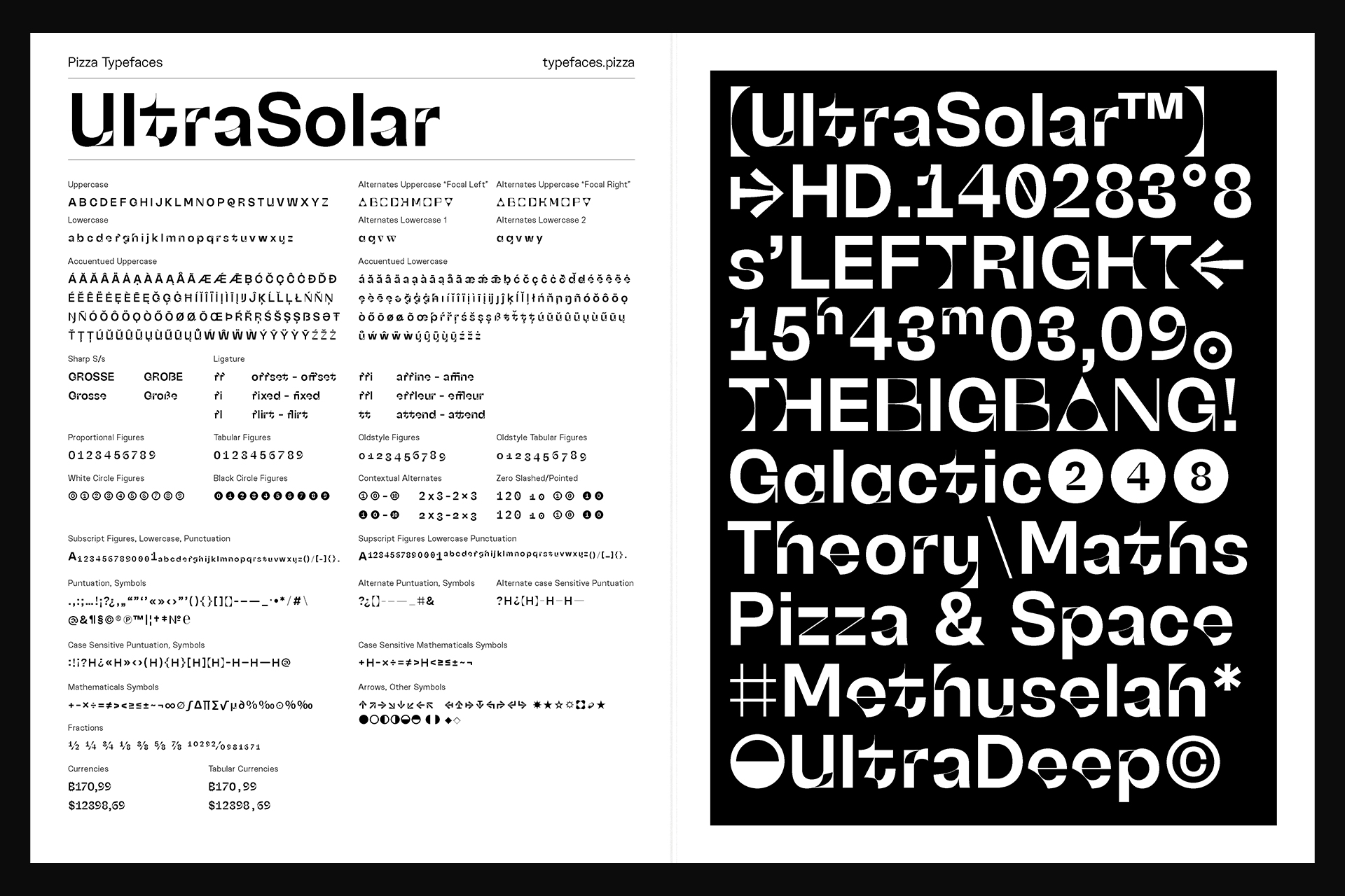
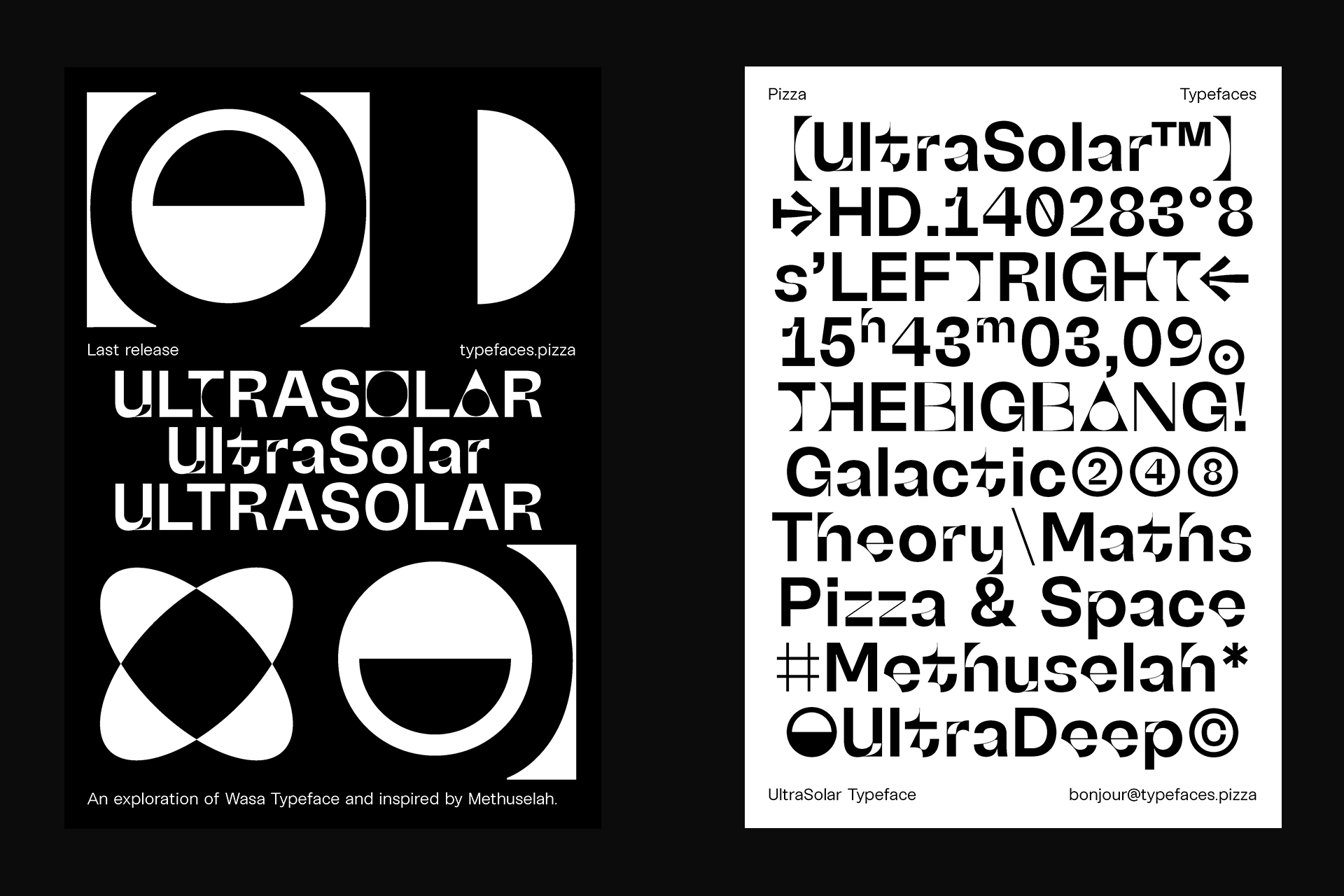
UltraSolar — 👽
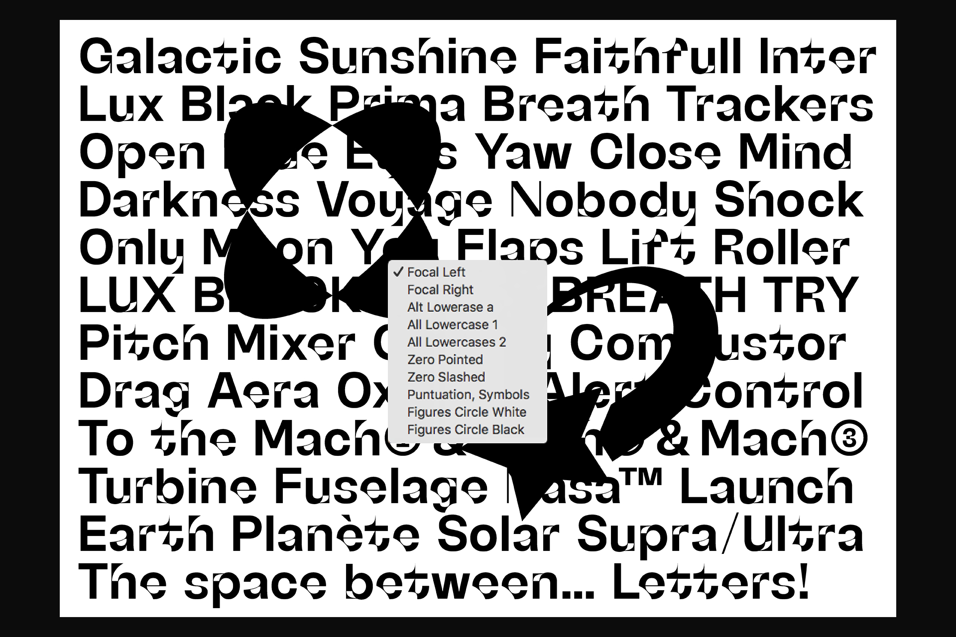
UltraSolar is in orbit, a new exploration based on the Wasa typeface and inspired by the oldest star, Methuselah. UltraSolar features new-era letterforms, a new take on inktraps, weird details, multiple stylistic sets, and a set of DingBats. Even so far from the end of our galaxy, UltraSolar, and by miracle, is still readable in small size. Better try observing it through a telescope with Focal stylistics set.
- UltraSolar
- Normal
- Characteristic
- UltraSolar
- Normal
- Set 1
- CONVULSIONS
- UltraSolar
- Normal
- ss05, ss08
- Rj&Sawerkings
- UltraSolar
- Normal
- Set 2
- GEOMETRICAL
- UltraSolar
- Normal
- Set 2
- Verkeer, 39-12
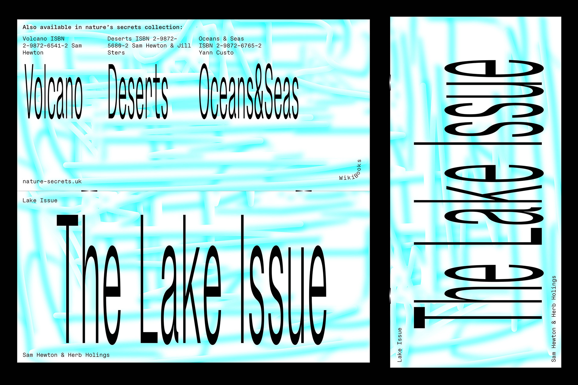
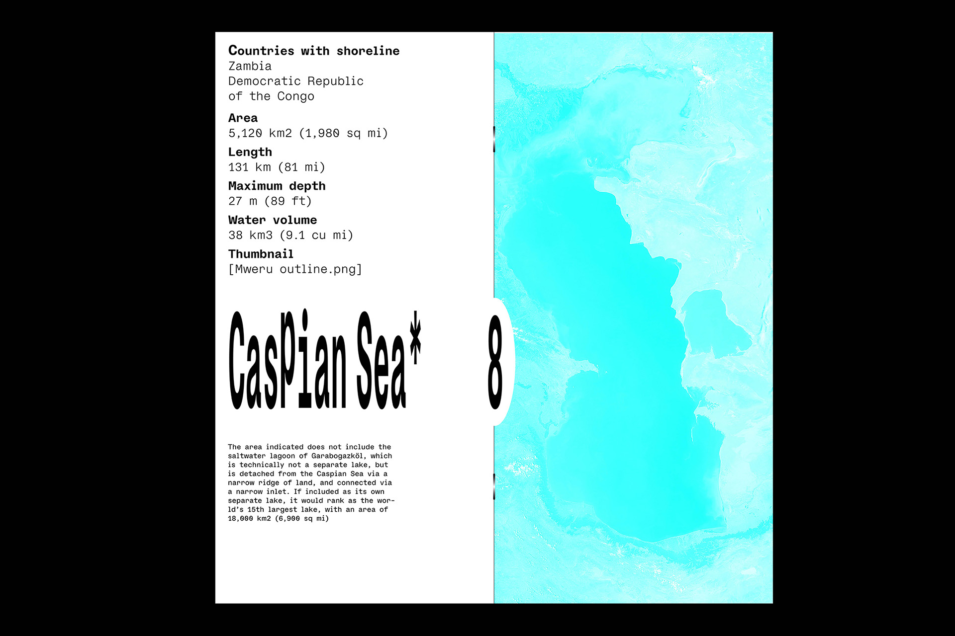
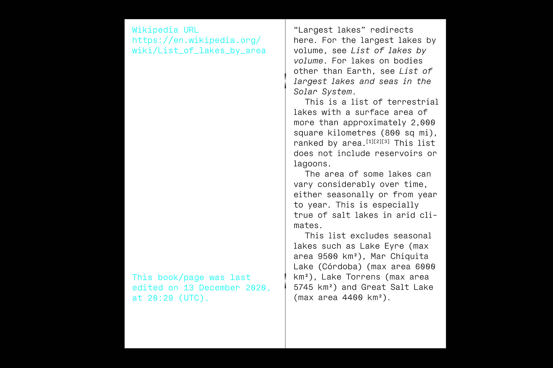
In use
Like I don't like see my typefaces wildly stretched, I did it, yes, but with some improvements :)
Shreck is a ‘Monster cut’ of ModelStandard typeface in Mono, SemiMono and Sans variations.
You can play also with the width from Compressed to Condensed in a variable font way.
Design and development of a mini website.
- Shreck Compressed
- Regular
- Them Anaesthetists Recommendatory Distinguishably Apostatise
- Shreck Compressed
- Medium
- Hyperbolize Acquitting Outmanoeuvred Somnambulating Pimples
- Shreck Condensed
- Regular
- Sawfish Retiree Chalkboard Readmitting
- Shreck Condensed
- Medium
- Set 1, Set 2, Set 3
- Reliance Penalising Jog Thoughtfulness
- Shreck Condensed
- Bold
- Unattained Schoolmistresses Returnees
Nike
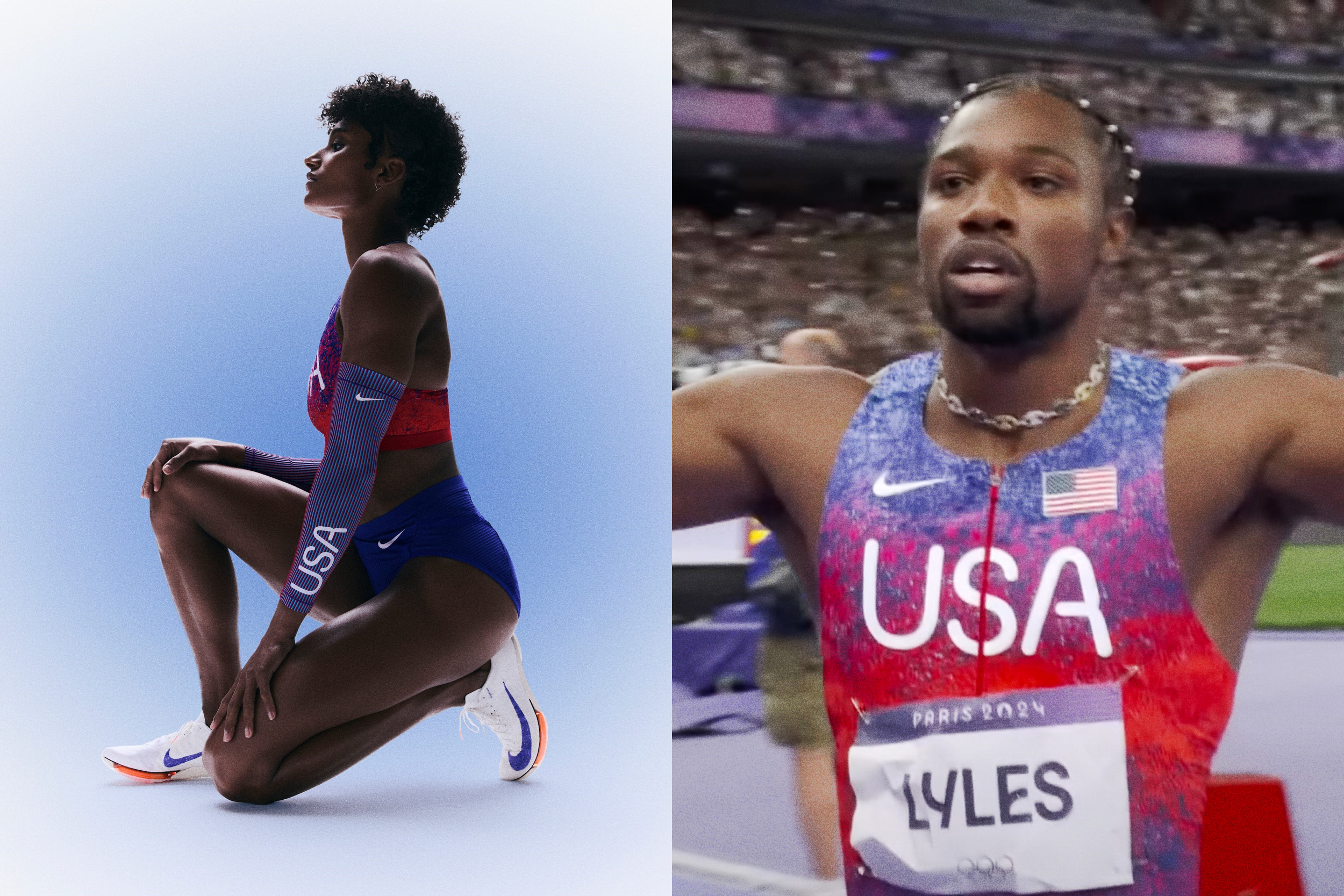
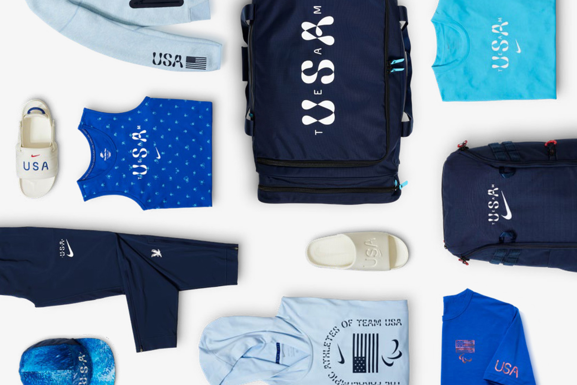
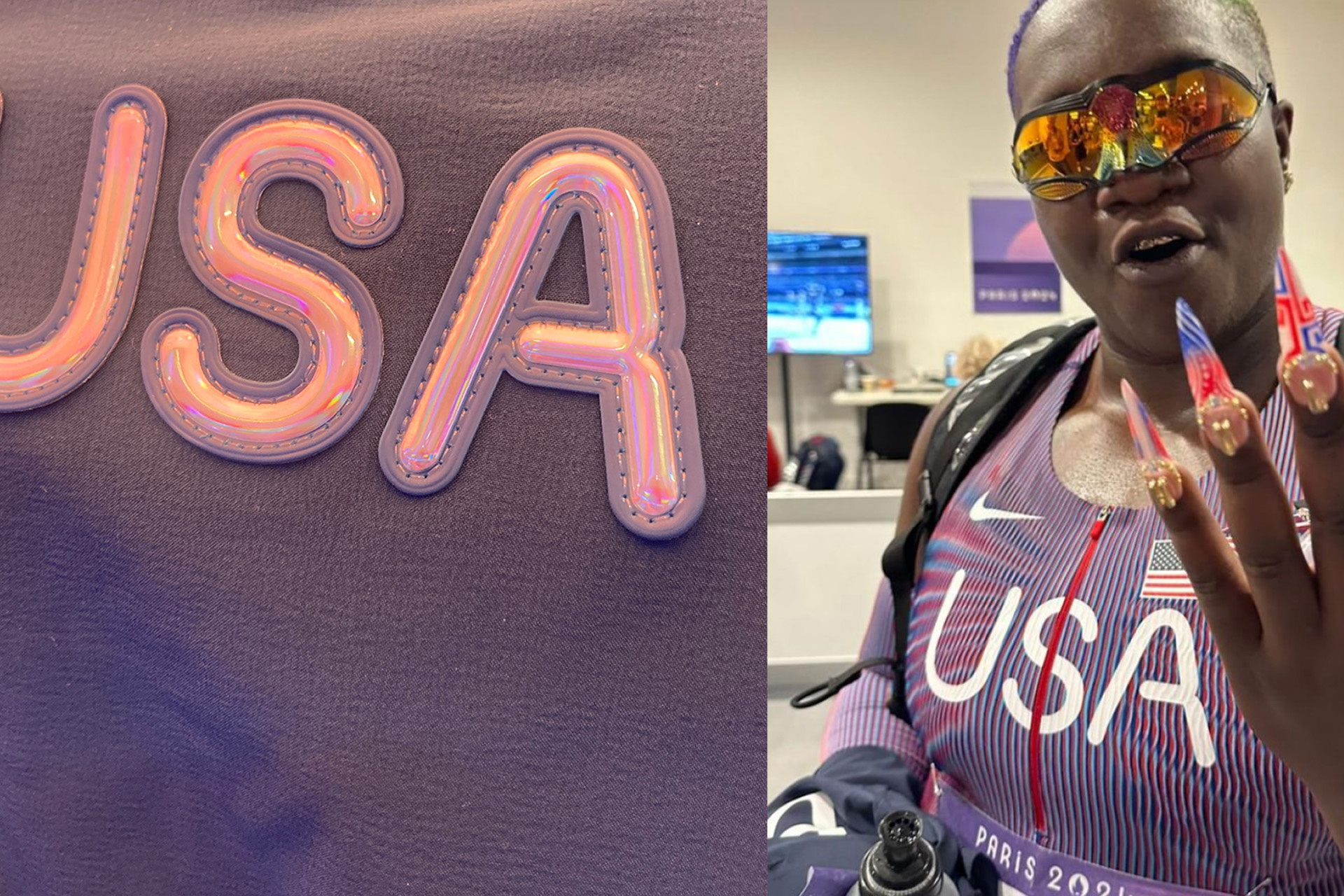
Custom variable font — Olympics Games of Paris 2024 — Nike Team USA
For the 2024 Olympics, Nike commissioned Pizza Typefaces to create a typeface expressing the energy and joy of sport. Inspired by unity, the letters are drawn as a continuous line, evoking the movement of an athlete in its motion. A variable “movement” axis allows the typeface to shift from a more restrained style to a highly expressive one. The typeface was used across Nike’s Olympic athletes uniforms, products and the Olympic Village, offering a fresh take on traditional sports typography.
Nike Variable Font

Yaelokre
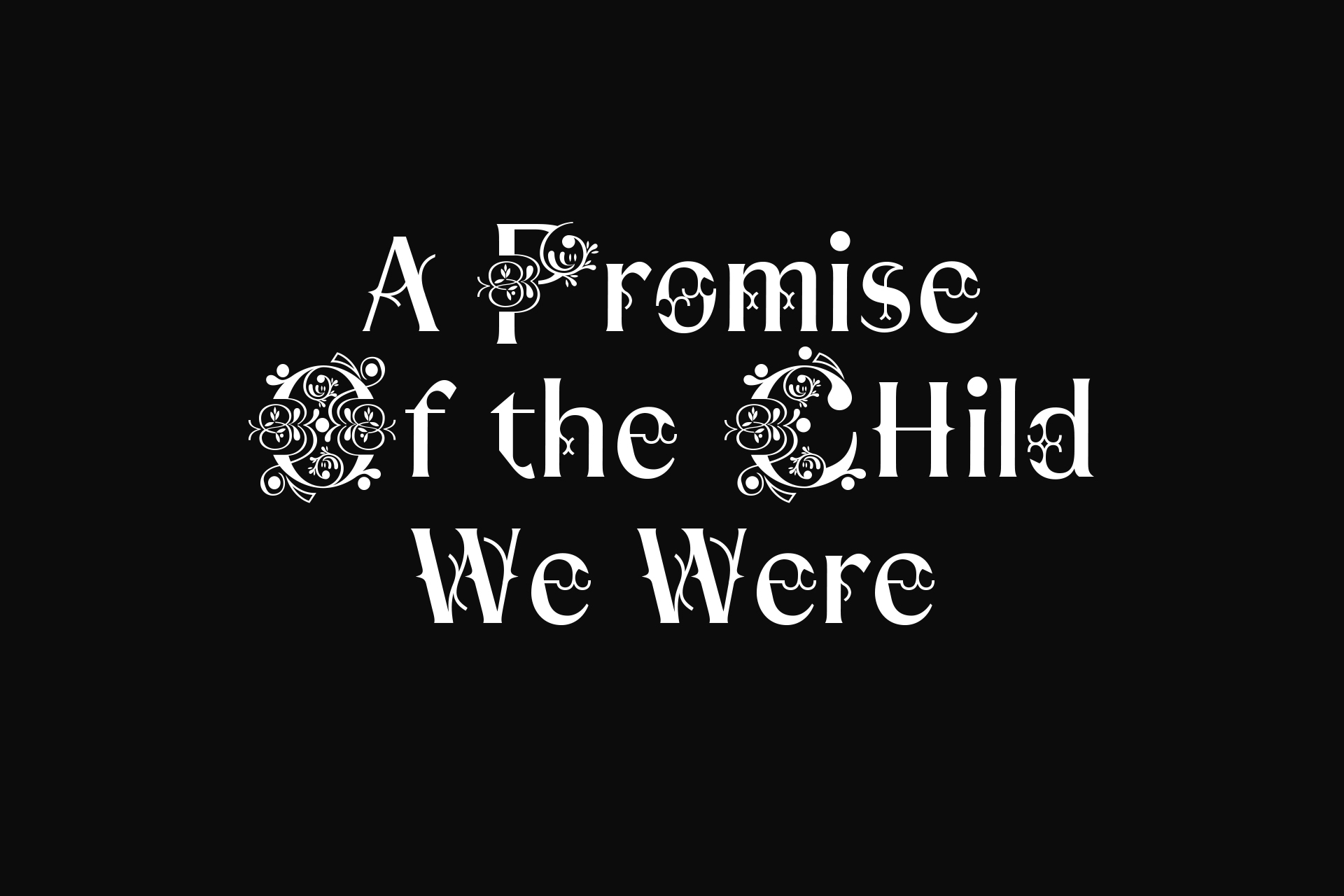
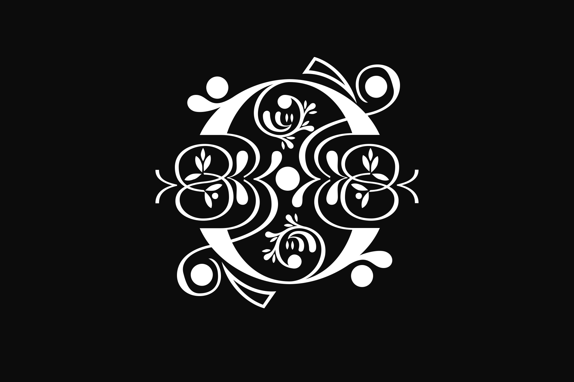
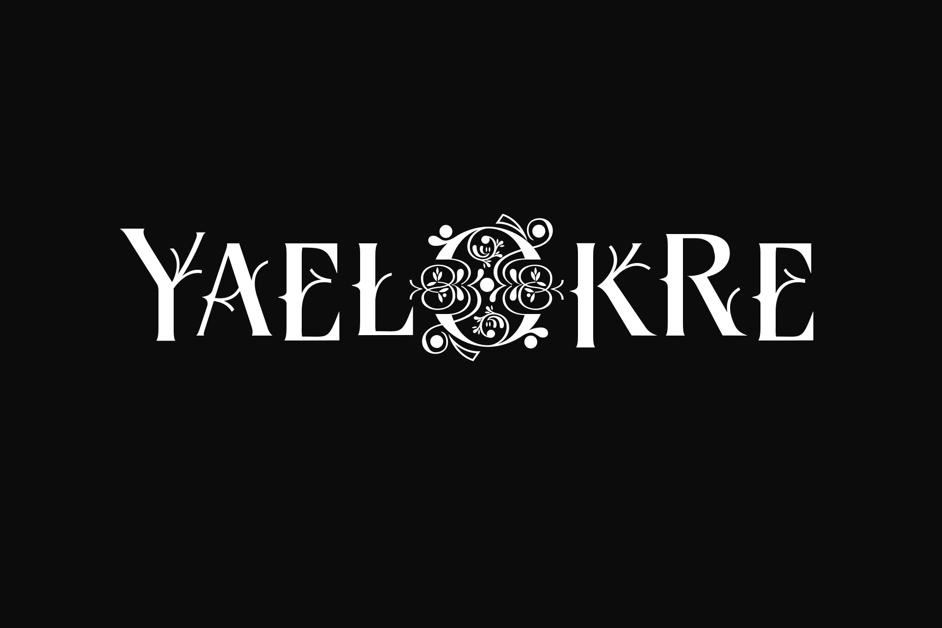
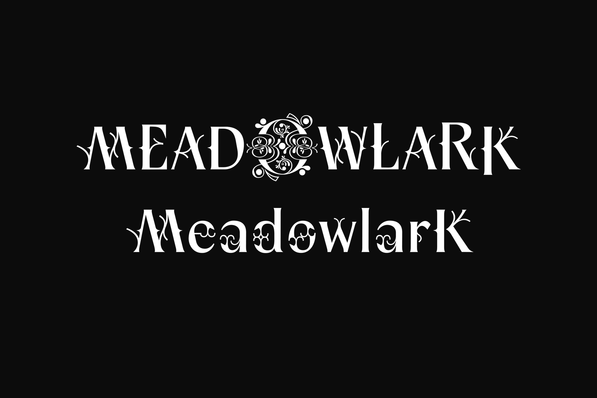
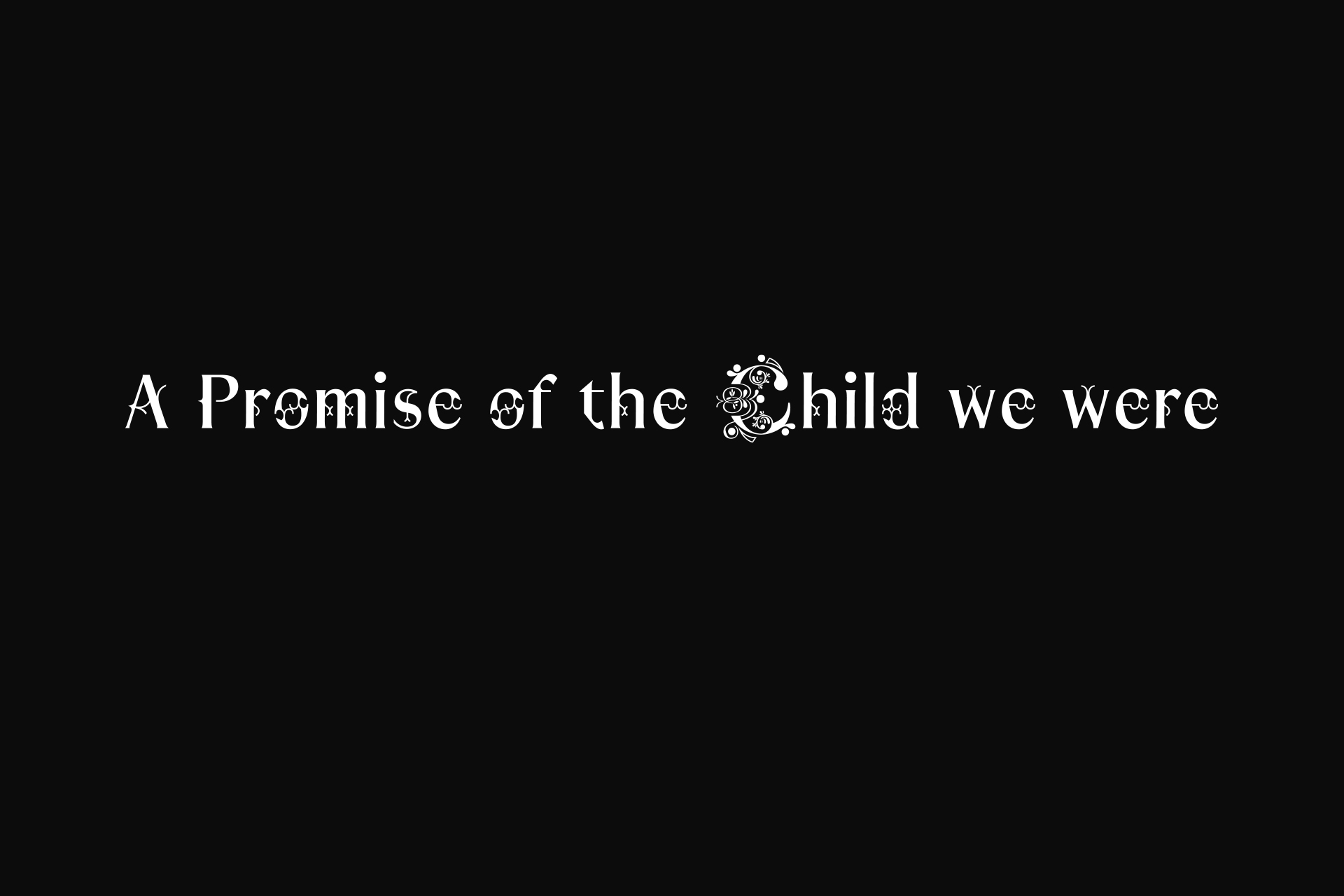
Custom font + Logotype + Logomark Yaelokre EP — Atlantic Records.
Inspired by the artist's world and a desire to evoke a dreamlike atmosphere with diverse undertones—ranging from the natural to the medieval—the typography draws on a sense of restrained whimsy, while the logomark takes its cues from Victorian drop caps.
EP Subtitle — Bold version
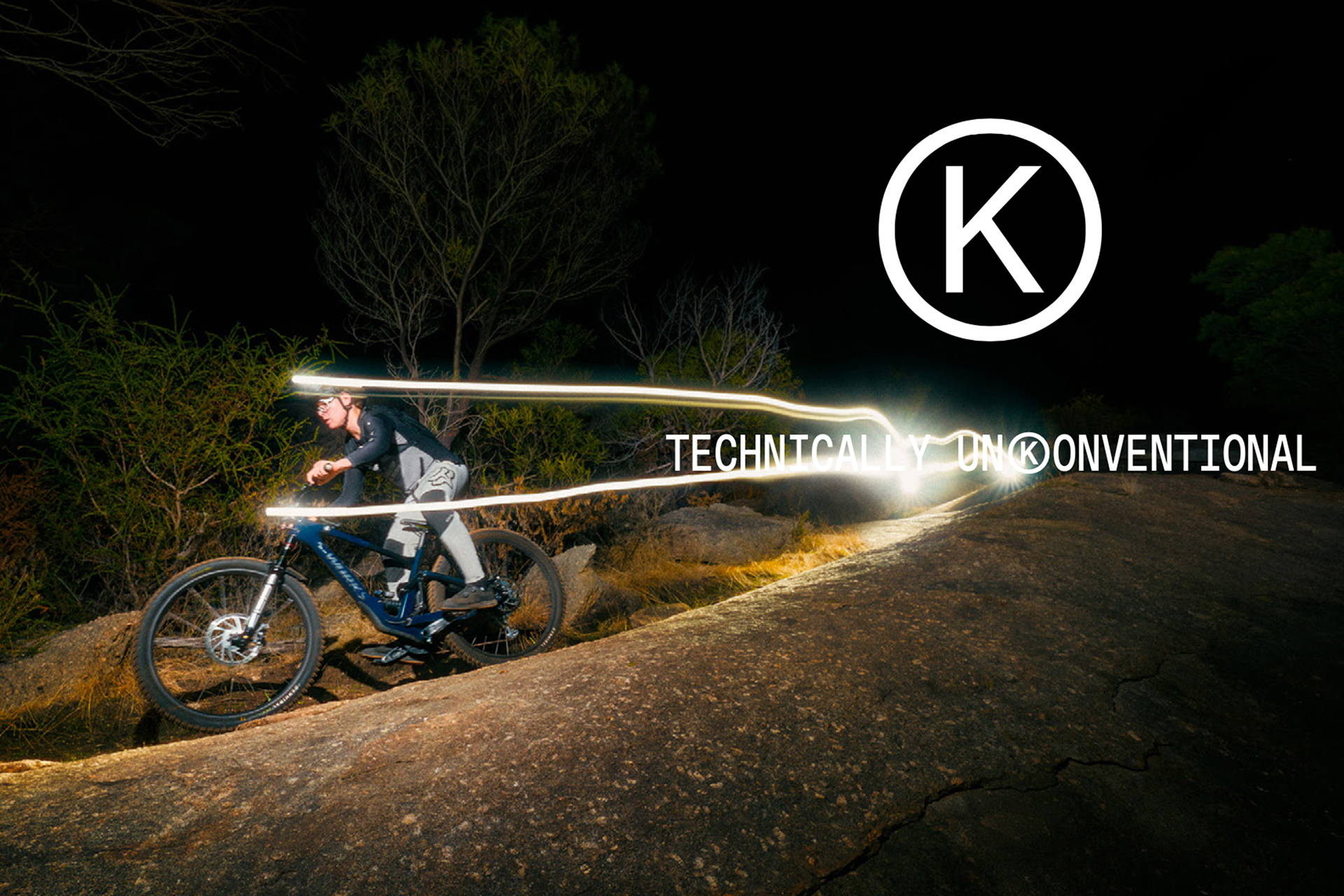
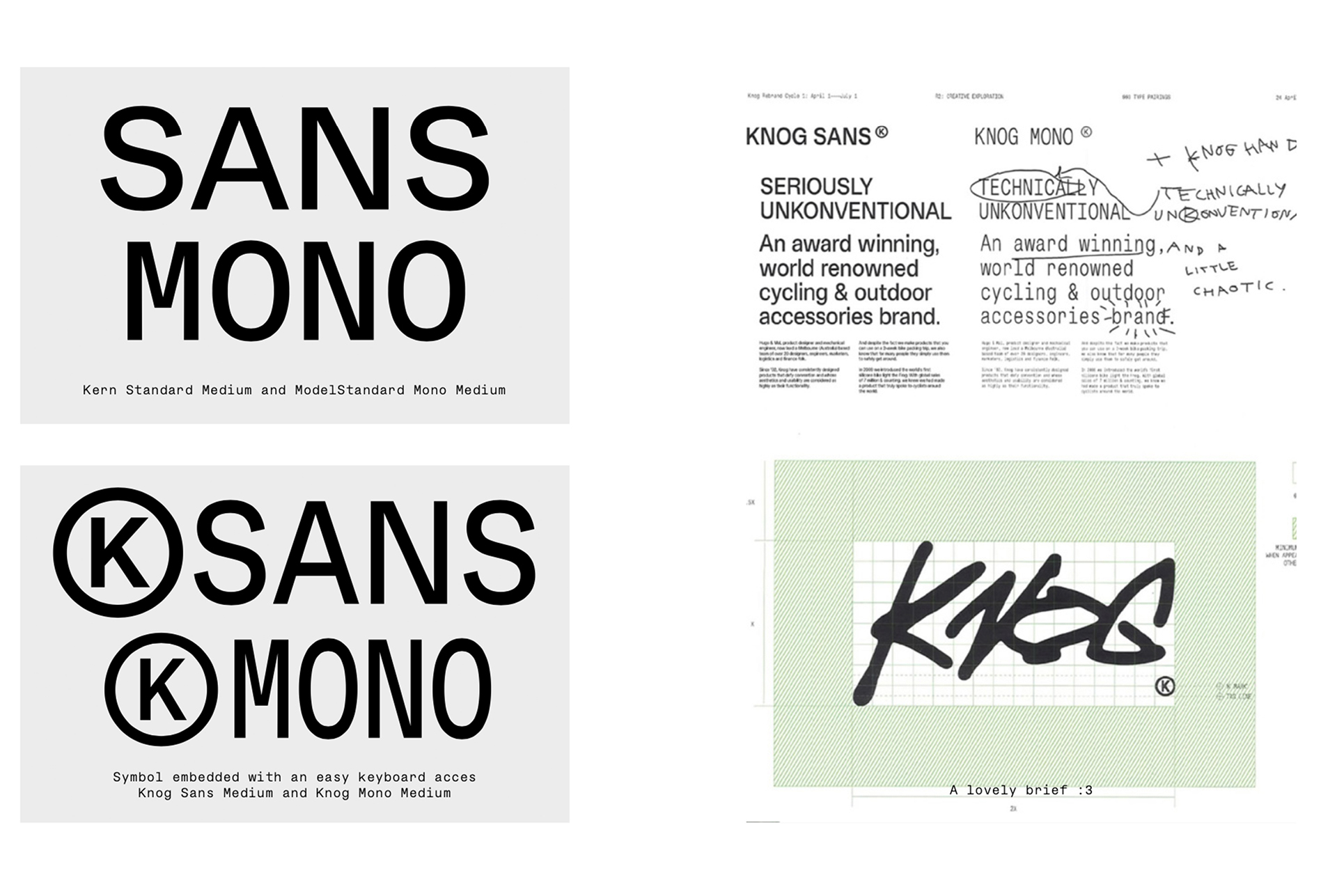
Knog
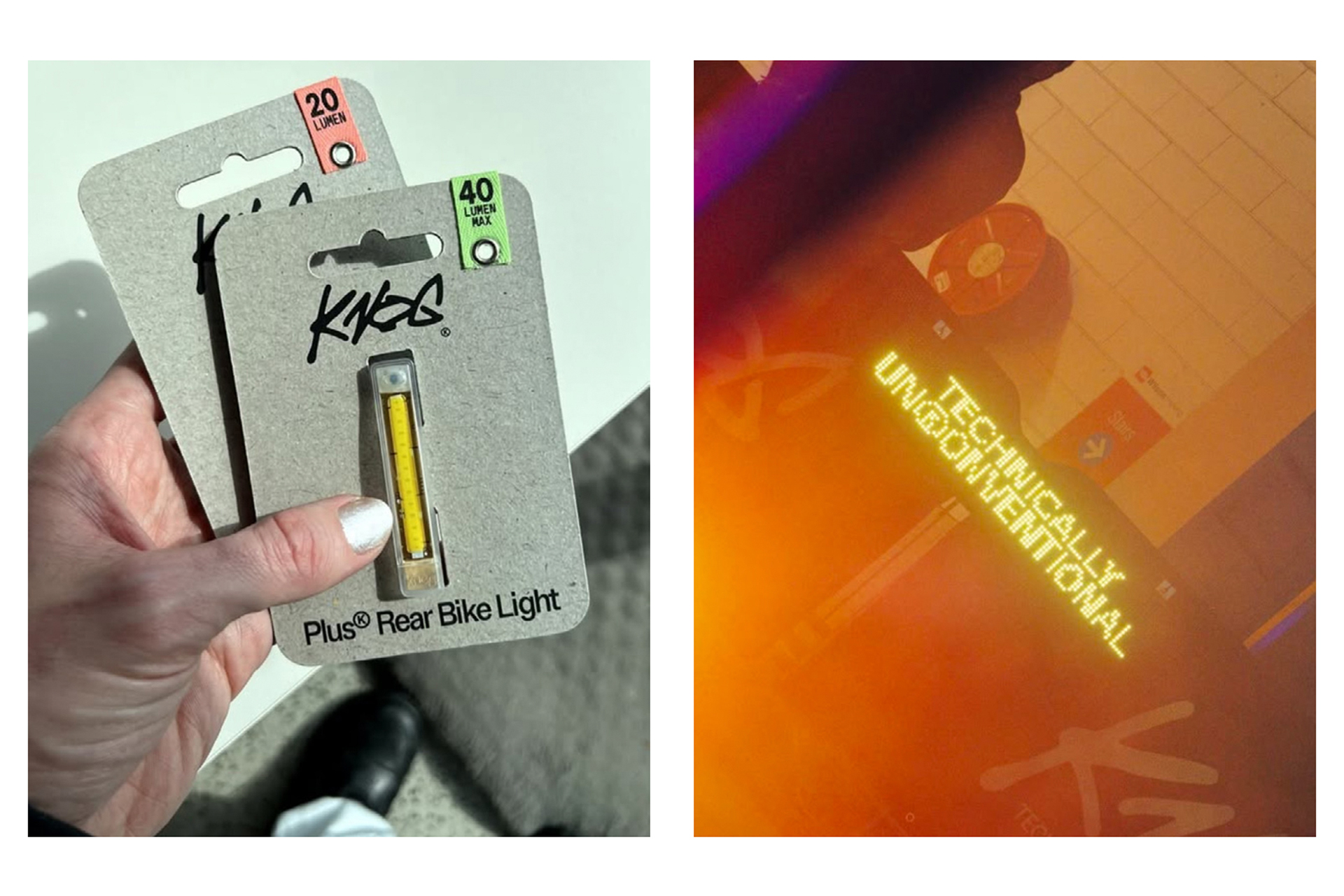
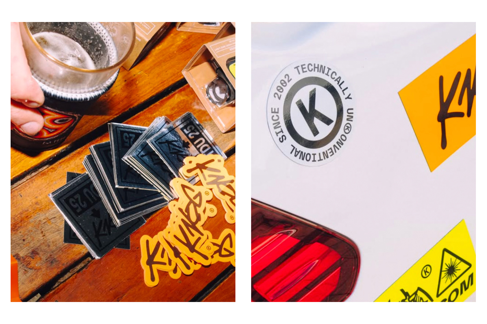
Custom versions of the Kern Standard and ModelStandard Typefaces + Creation of a logomark integrated into the font-families. Deployment of the fonts as variable fonts.
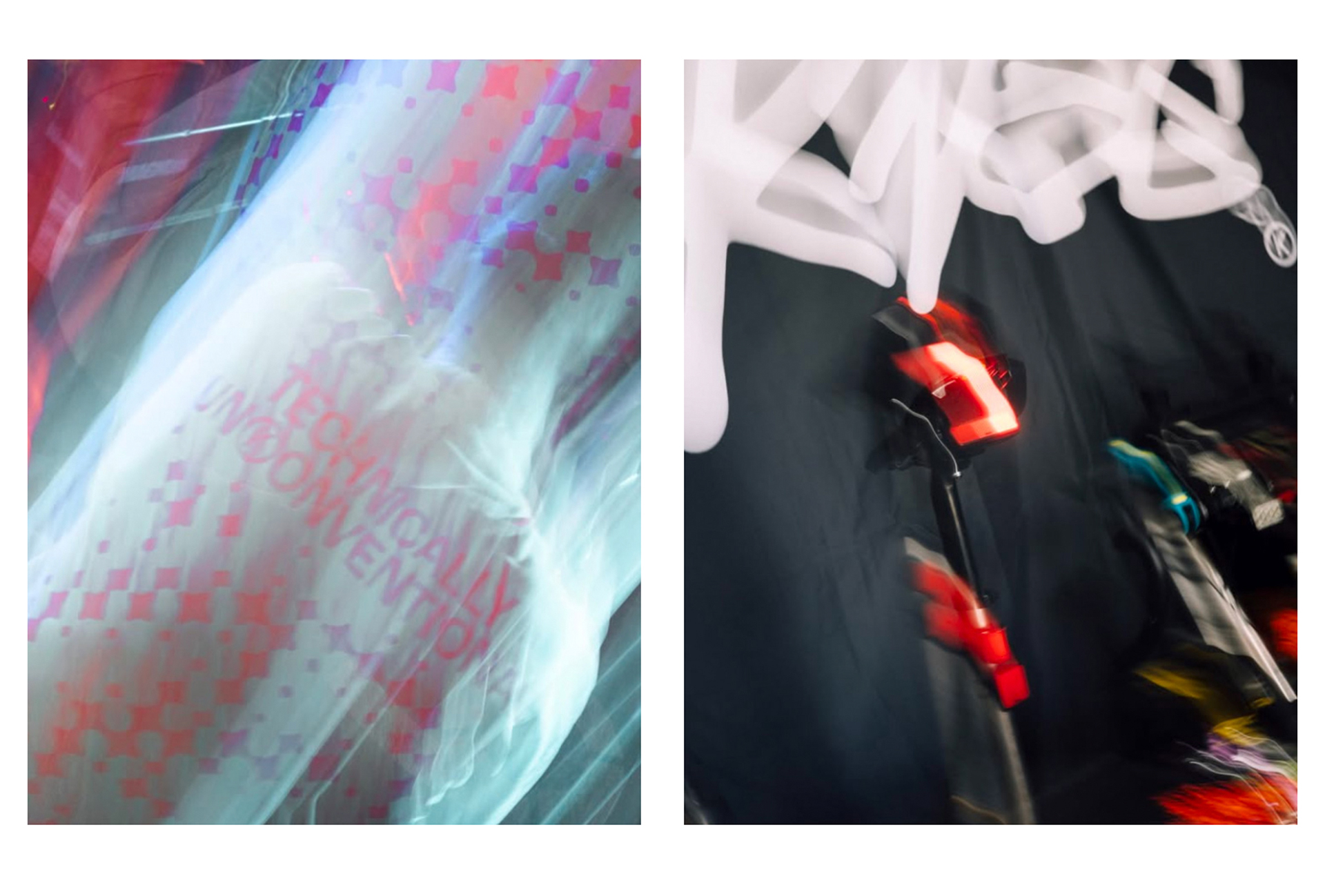
In use — Advertising
A Collected Man
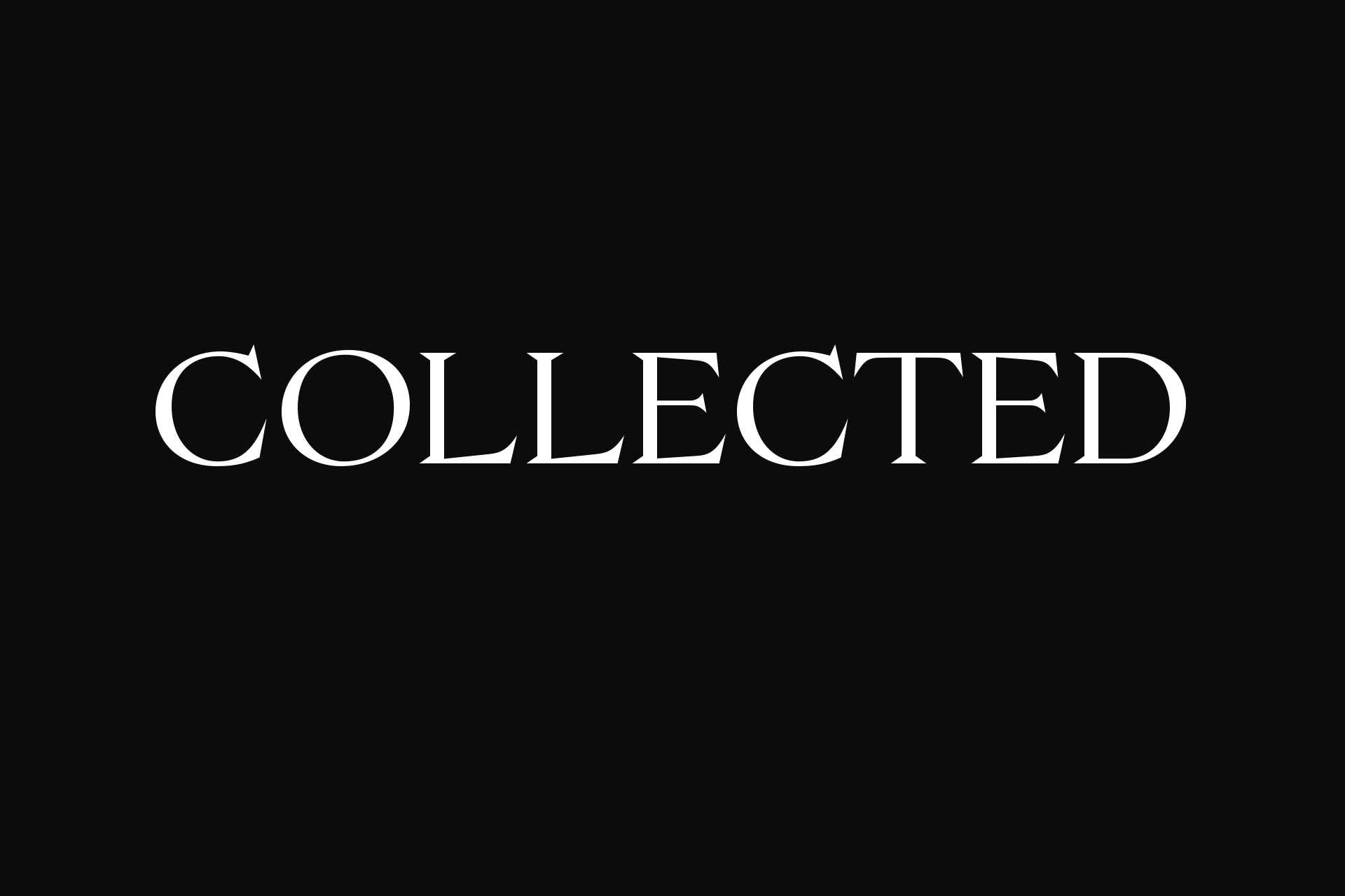
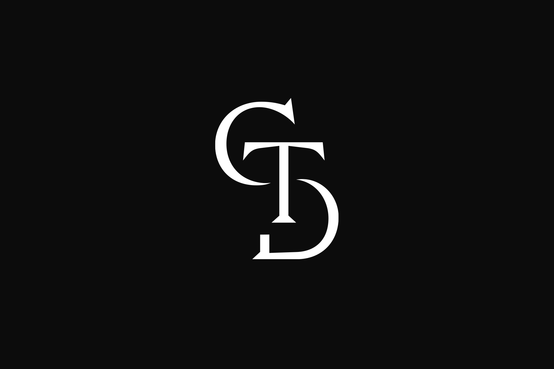
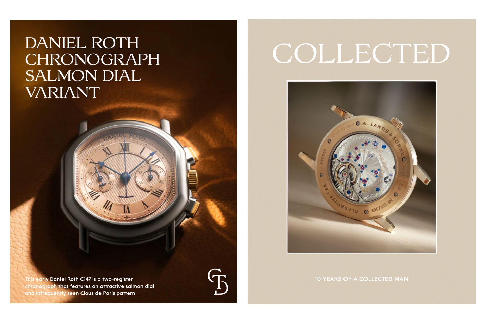
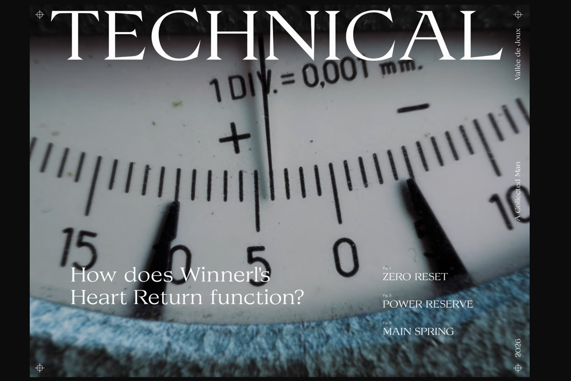
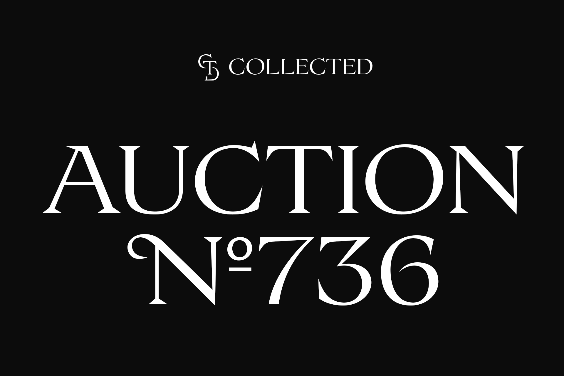
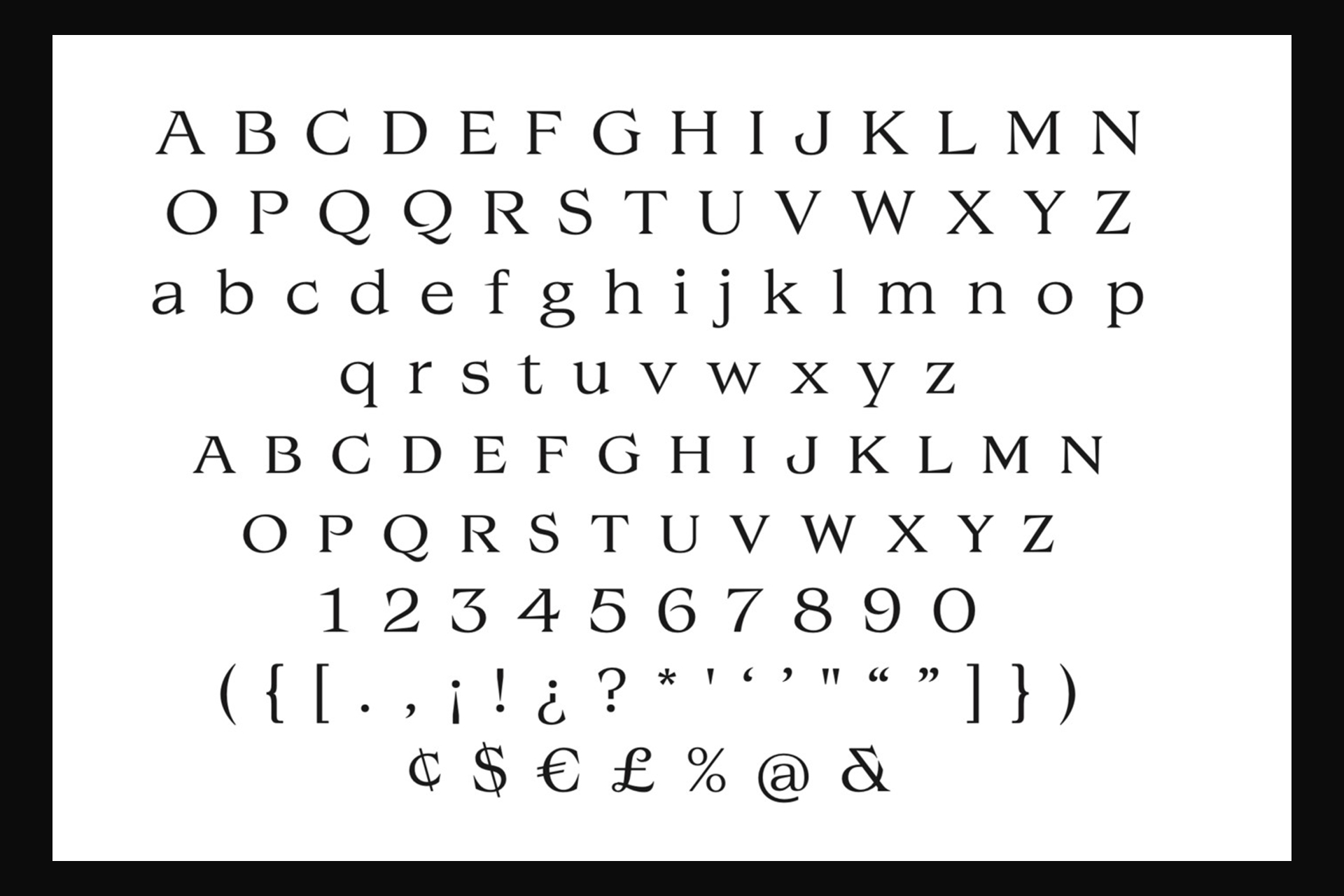
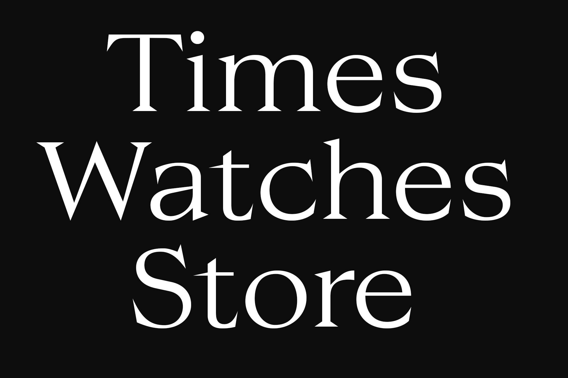
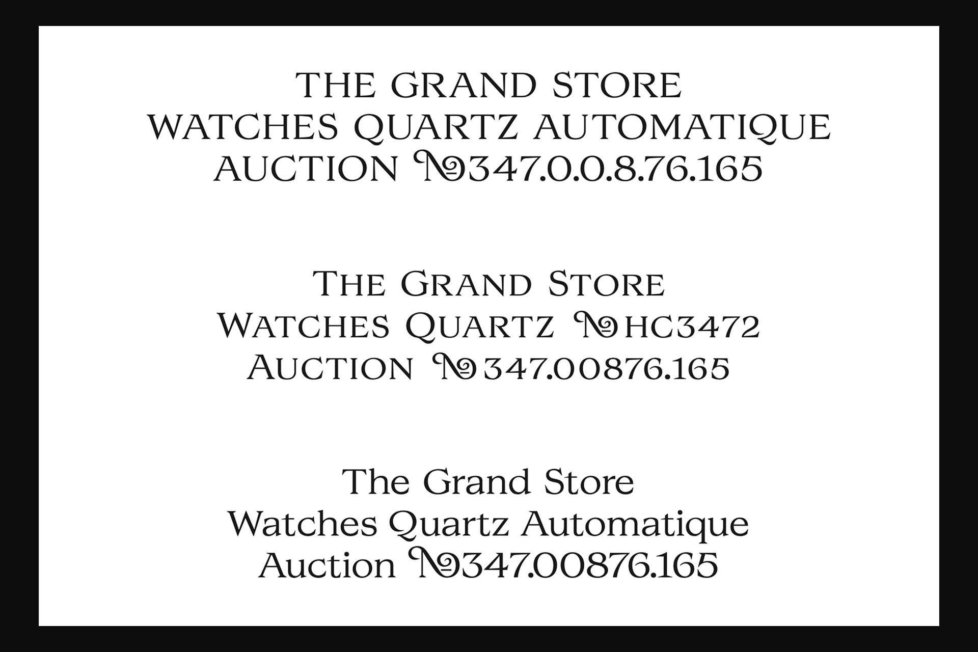
Custom font + Logotype + Monogram for Collected (Former A Collected Man).
A story of precision, movement, scale, and detail… Ultimately, the very essence of the watchmaker’s art, which the Collected custom typeface has gradually sought to translate through the study of a wide range of historical artifacts from the brand’s own collection.
Logotype
Marcel
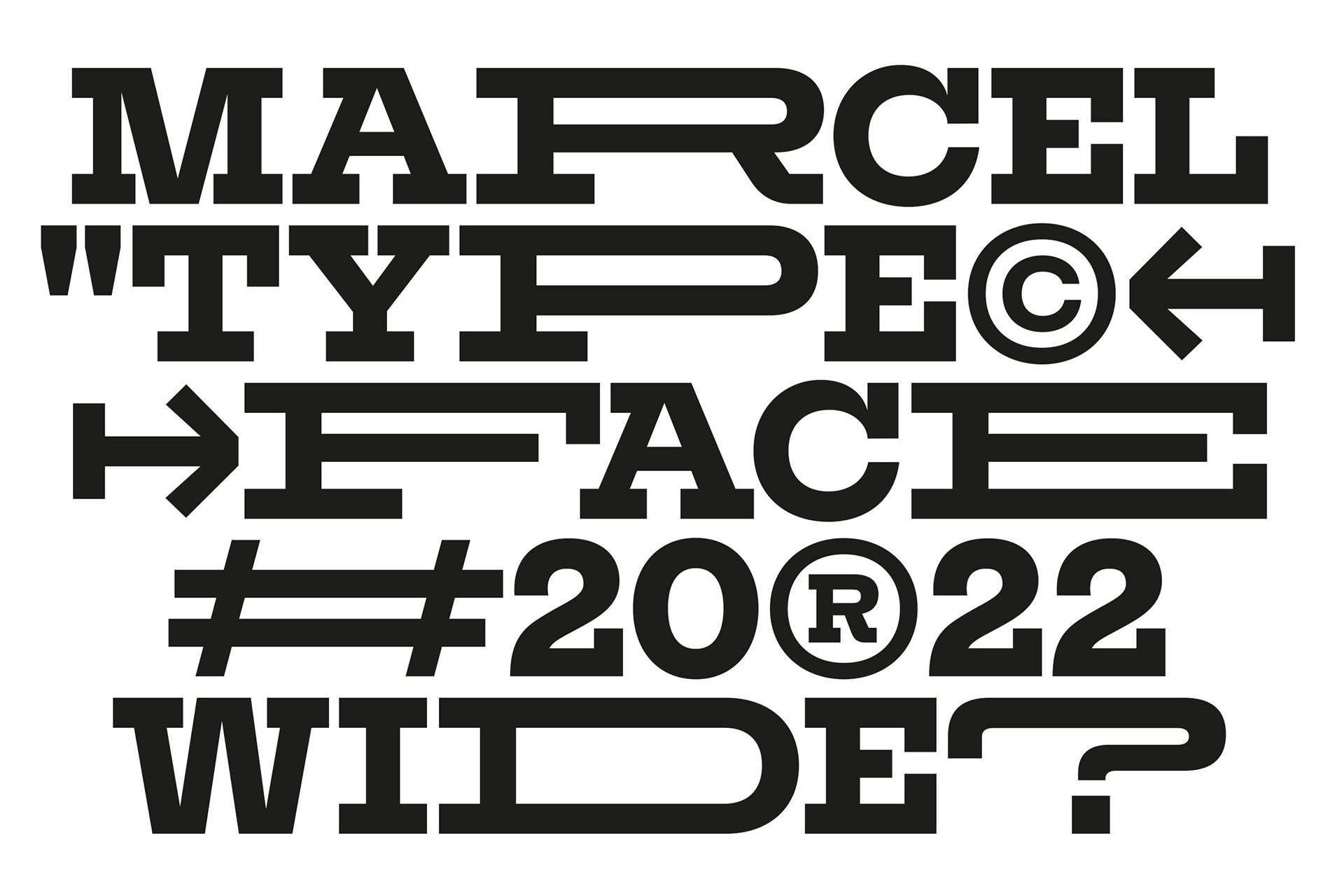
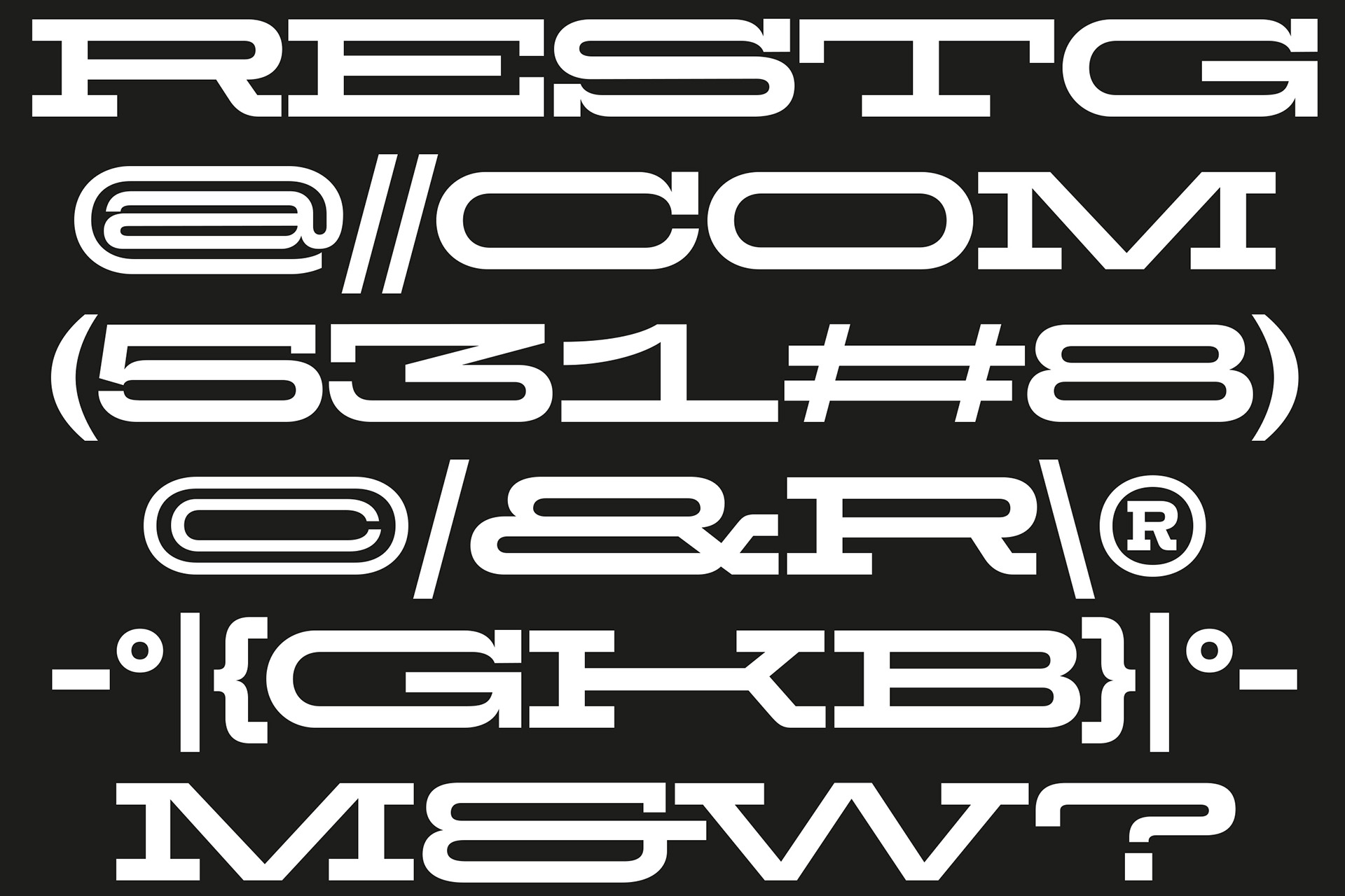
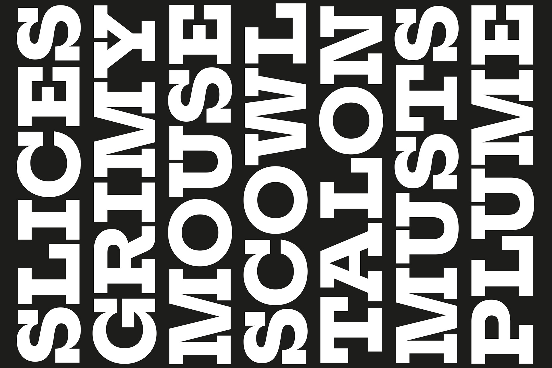
Custom variable font for Marcel Agency (Publicis Group). Based on the “Rockwell” font of their iconic logotype. A more powerful and radical typeface in two width and only uppercases.
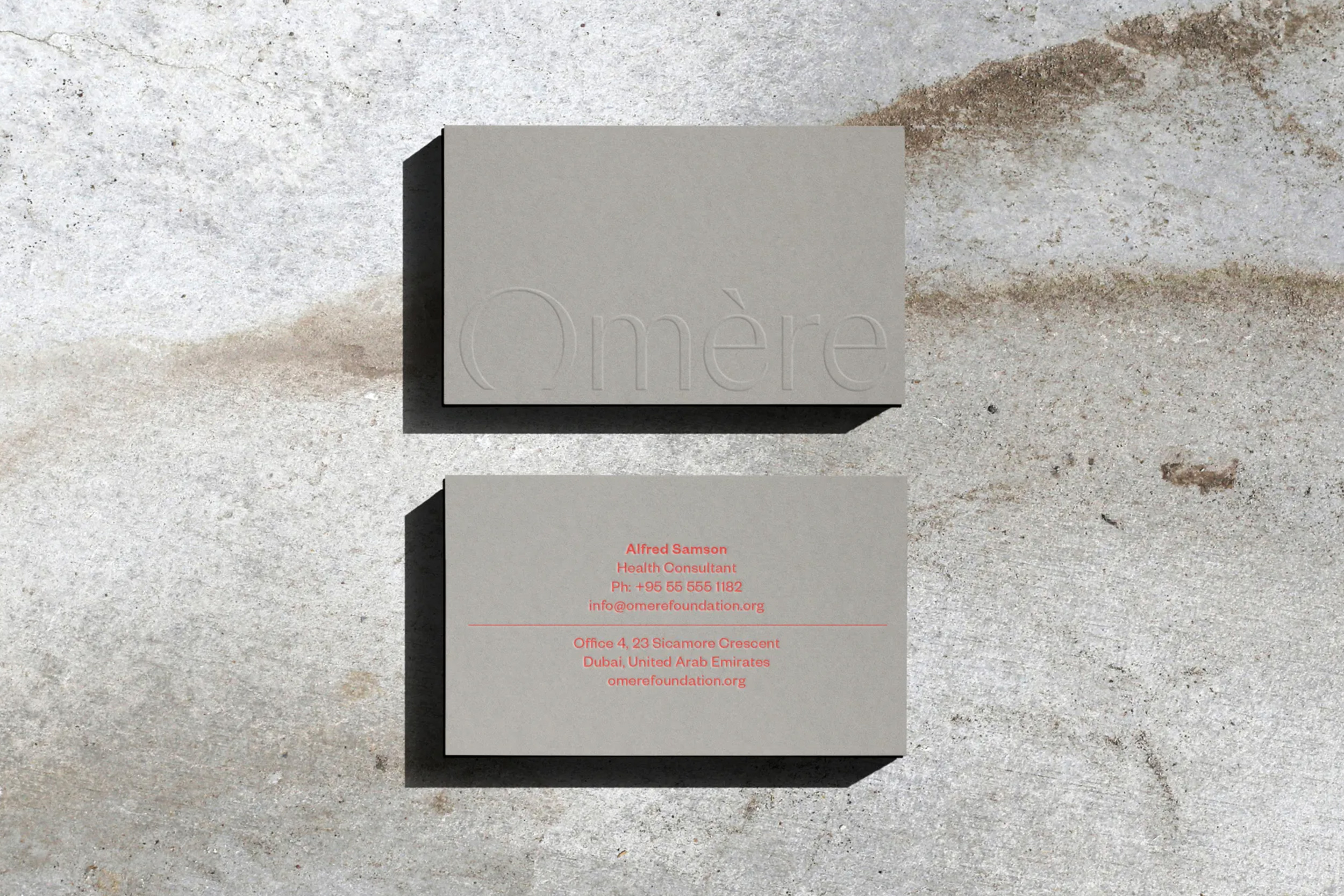
Omère
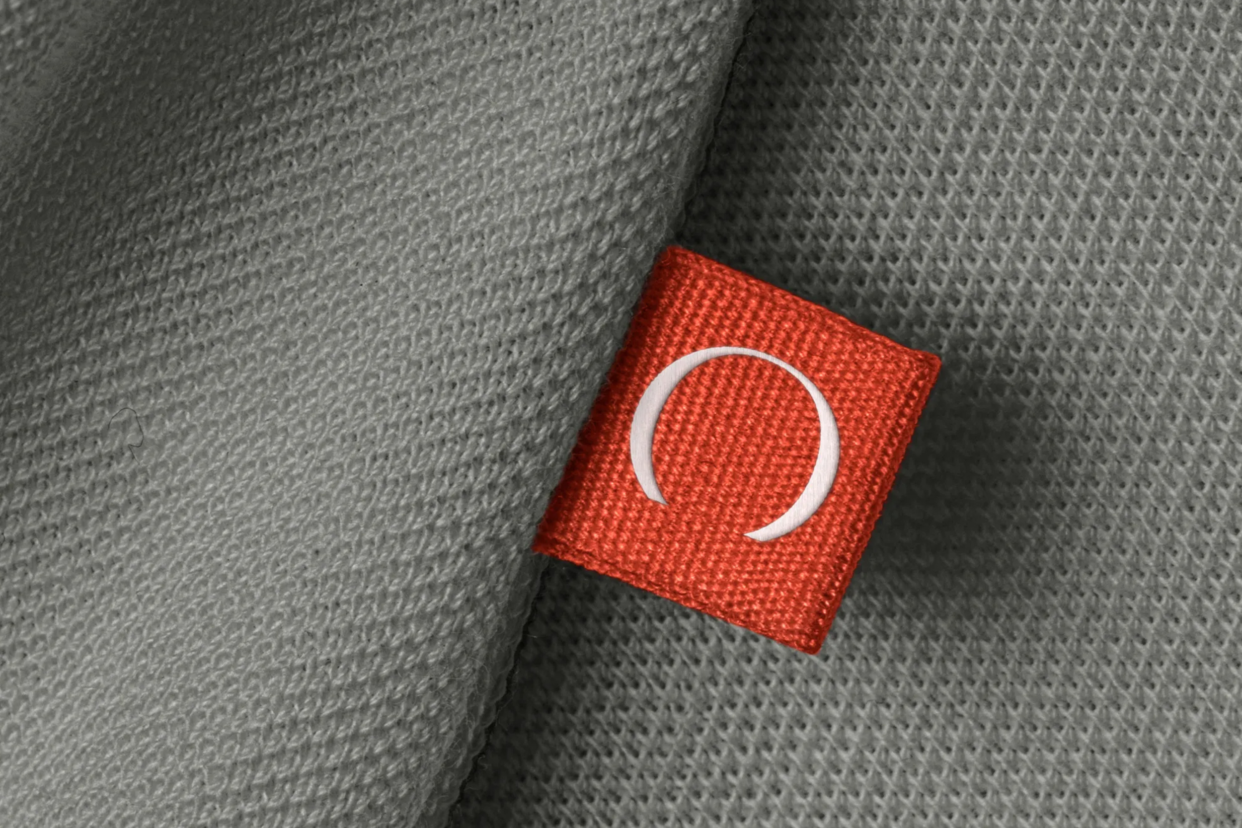
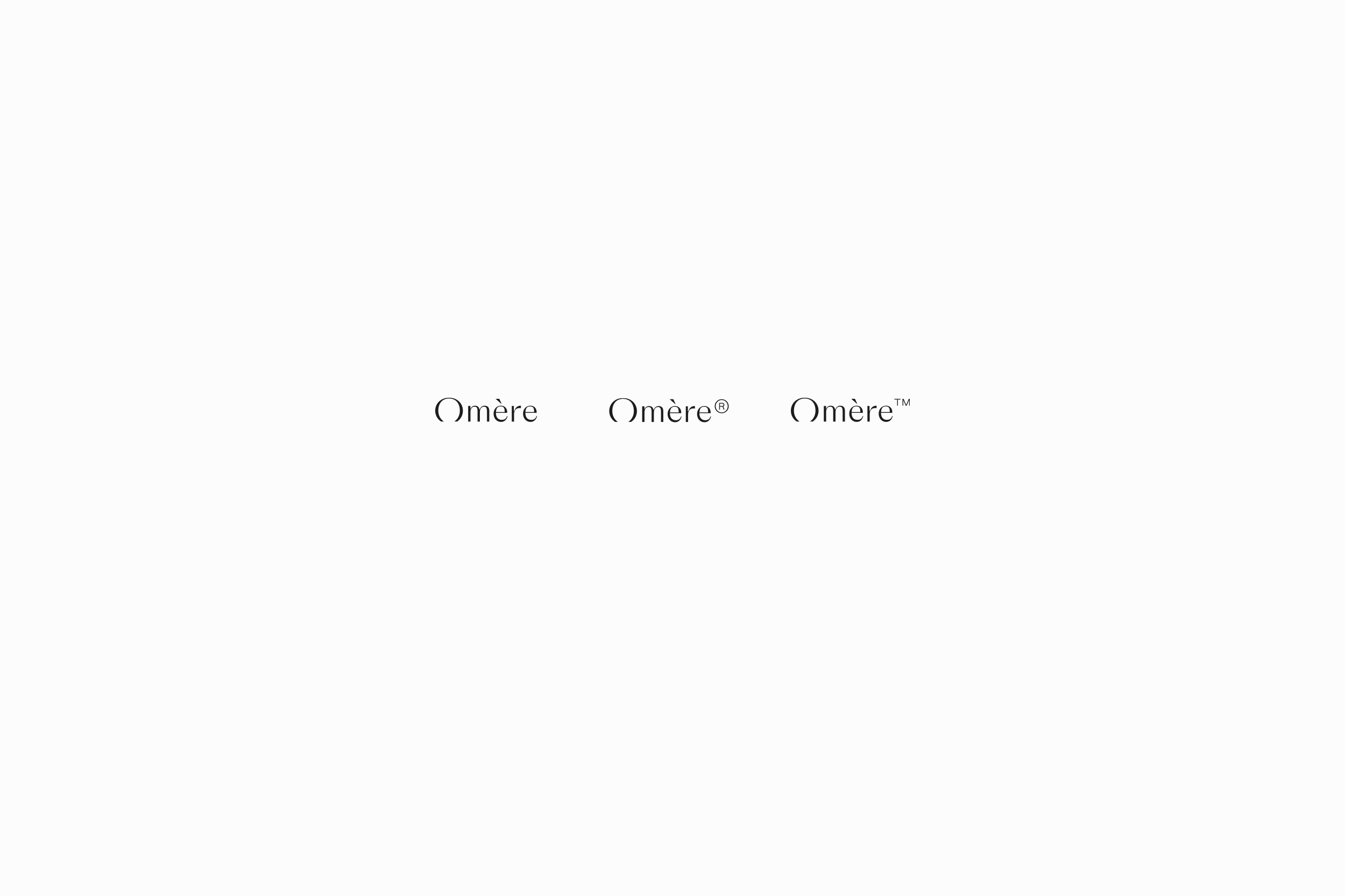
Custom logotype + Optimization. Based on the Version Typeface. For Omère, a brand actives in the health domain. Optimization of the logotype and trademark symbols to keep the same visual weight and legibility, in different sizes.
Initial on fabrics
Rotaro
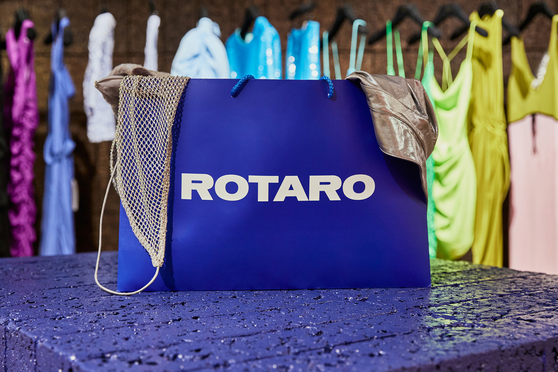
Logotype + Logomark for the substainable fashion brand Rotaro
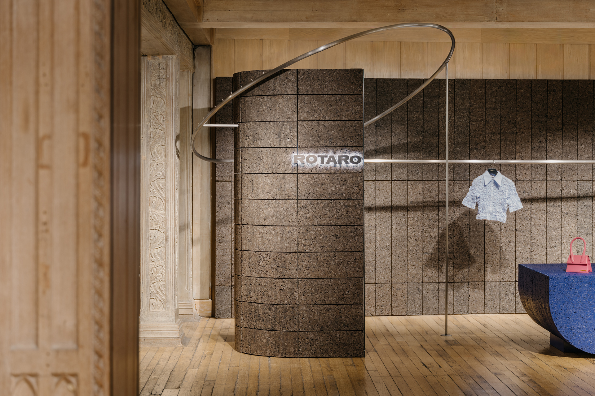
In use - Rotaro Liberty Shop
Mane Fragrances
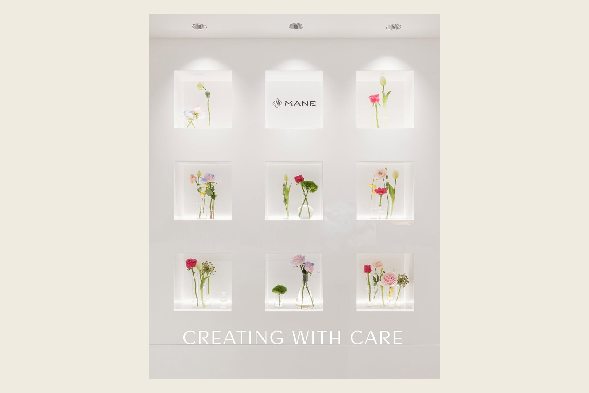
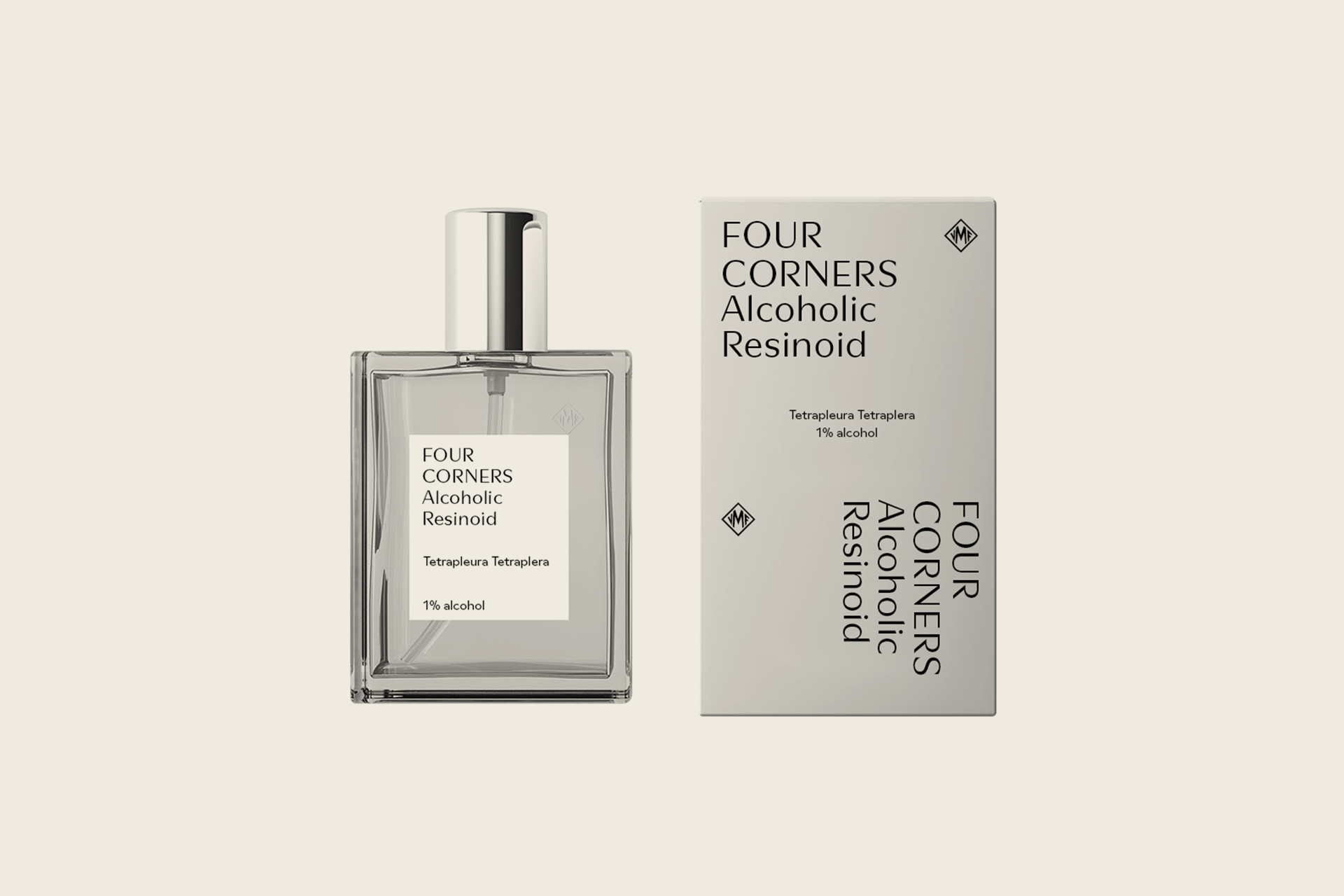
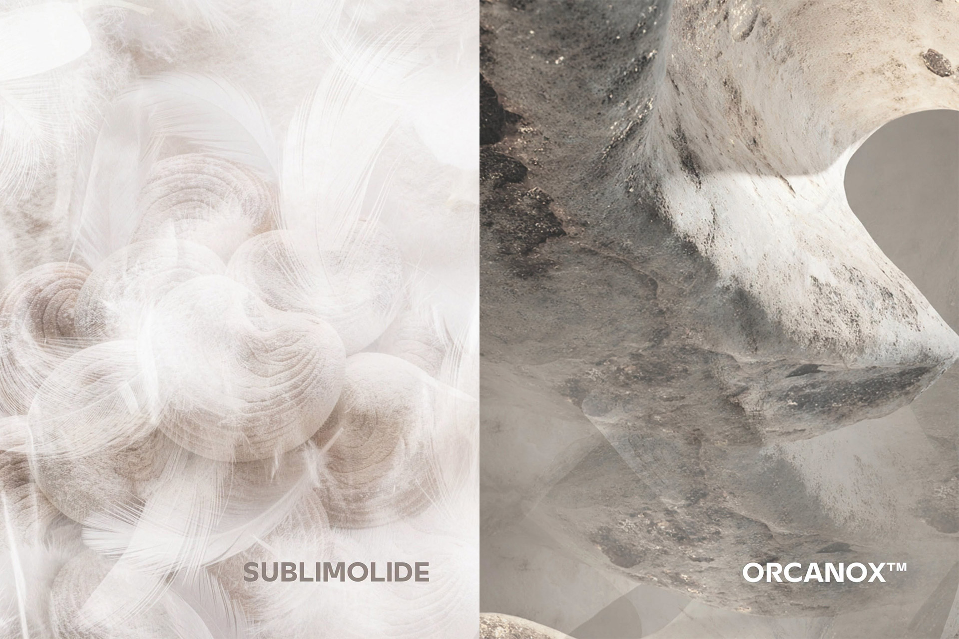
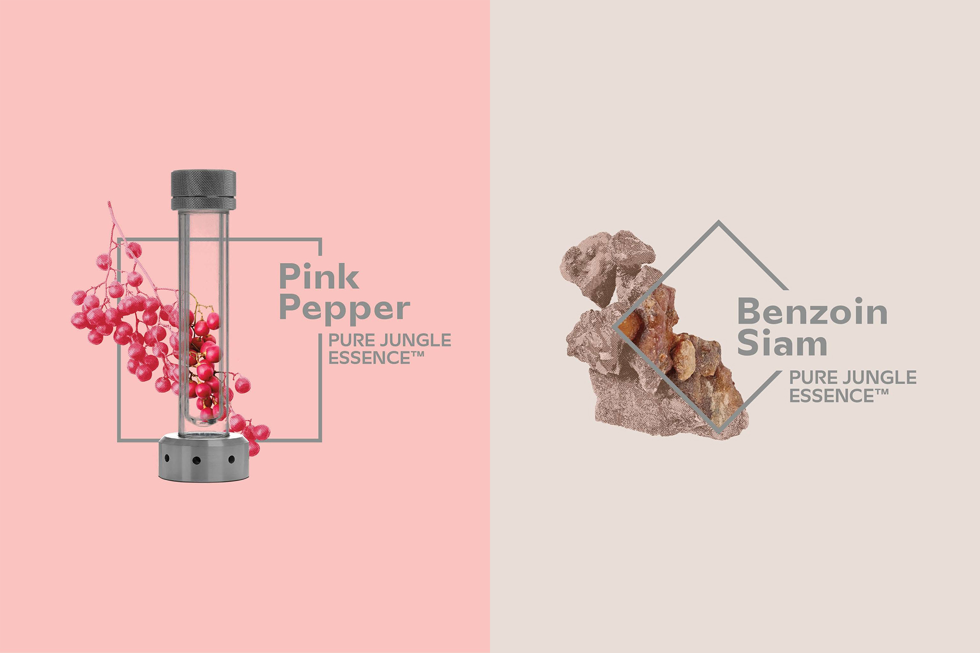
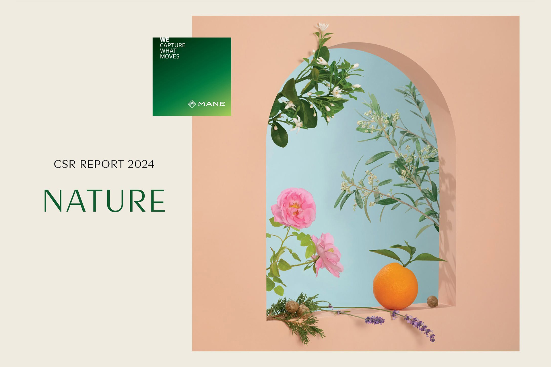
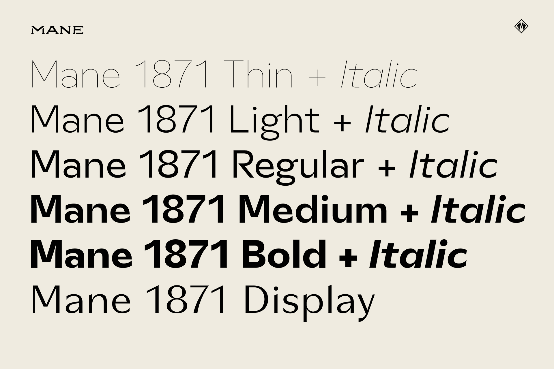
Custom font-family for the historical and awarded French fragrances creator, Mane.
Capture, Move, Essence, Flavor, and Delicate… The very language of fragrance, translated through a custom typeface developed for MANE. Drawing from the sensory, technical, and creative dimensions of perfumery, the typeface explores the relationship between precision and expression, structure and fluidity, bringing the many facets of fragrance into a single typographic system.

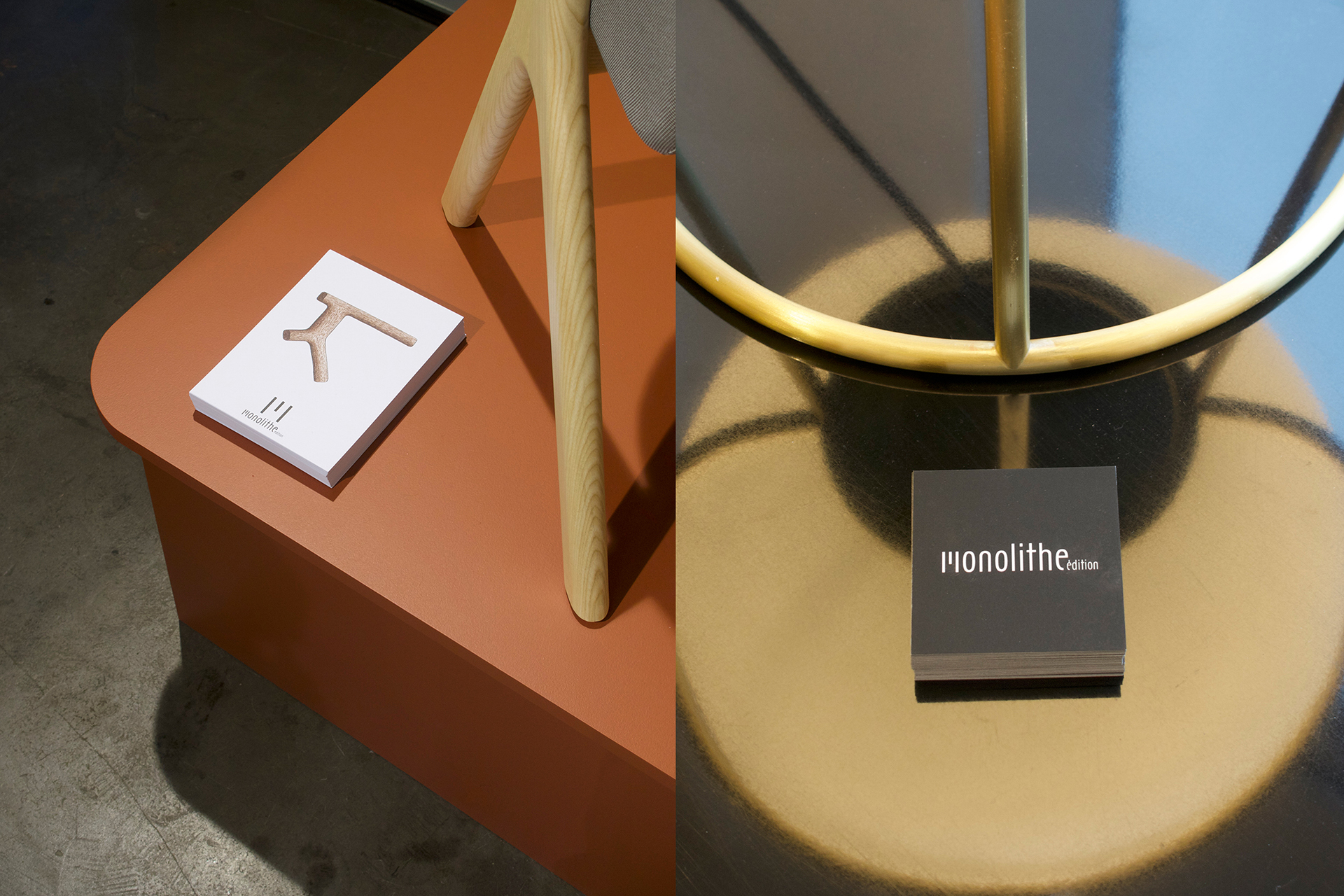
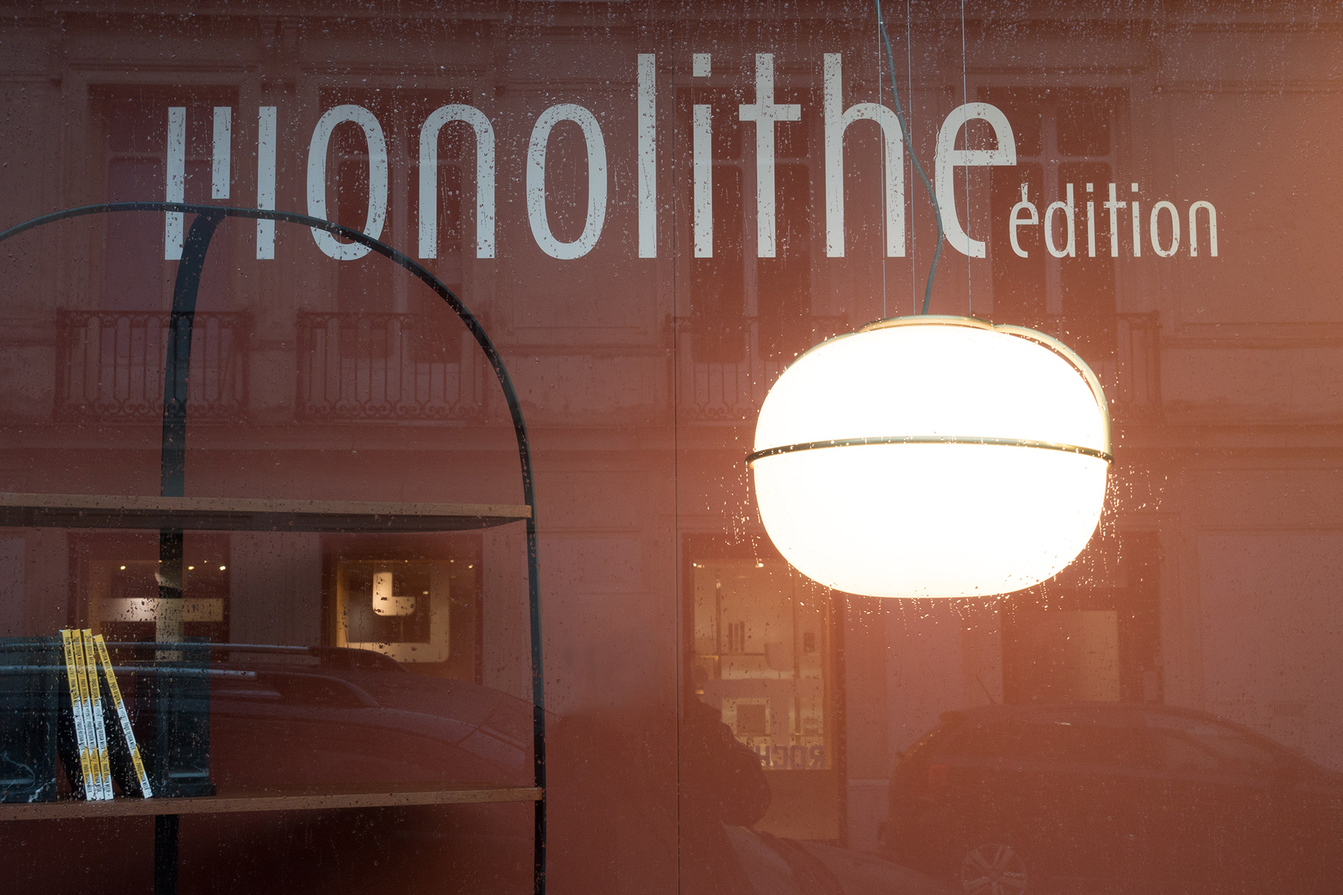
Monolithe
Logotype + Label + Signature — Custom type design for the designer furniture manufacturer Monolithe.
In use — Photo: Luc Borho
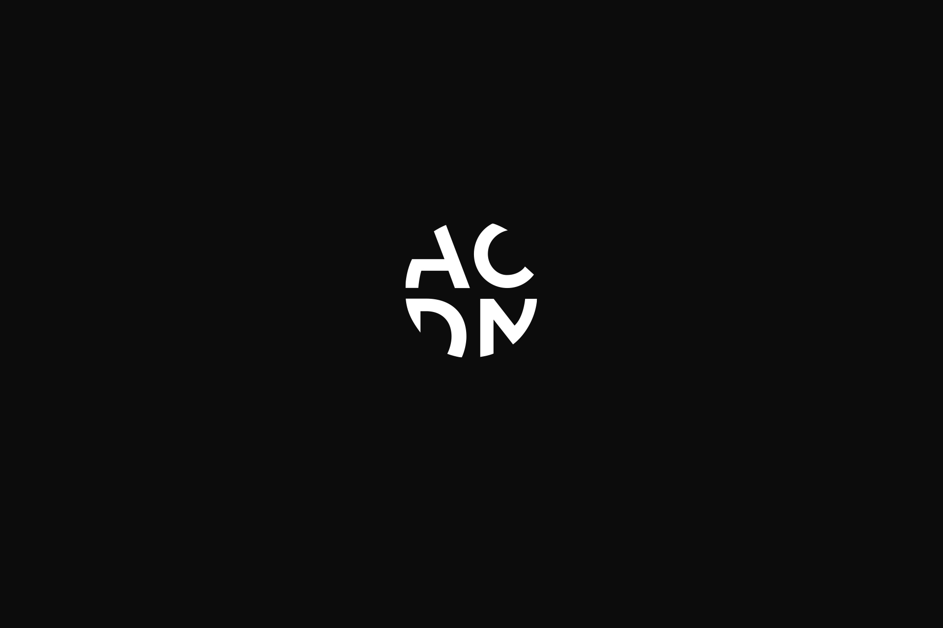
ACDM
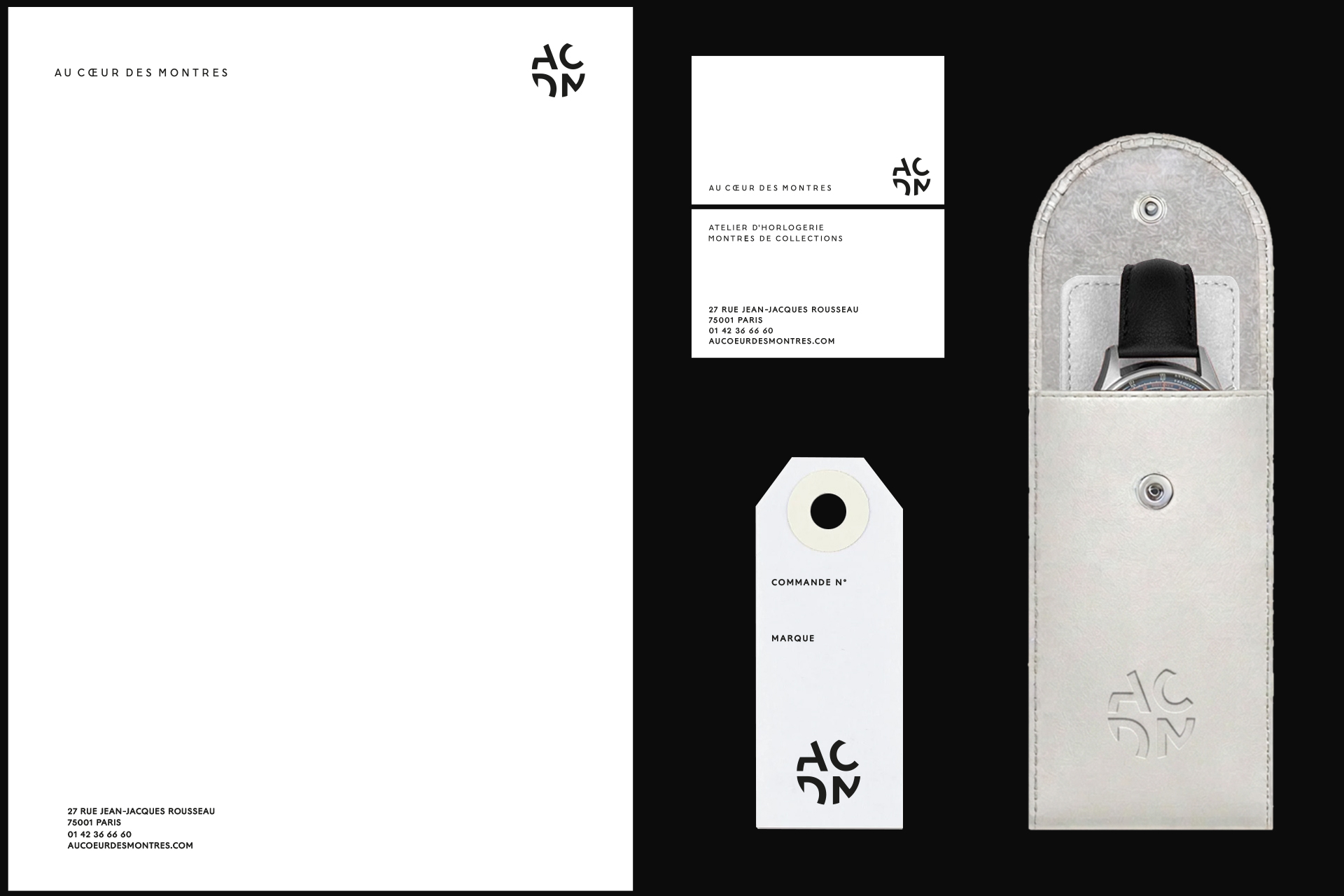
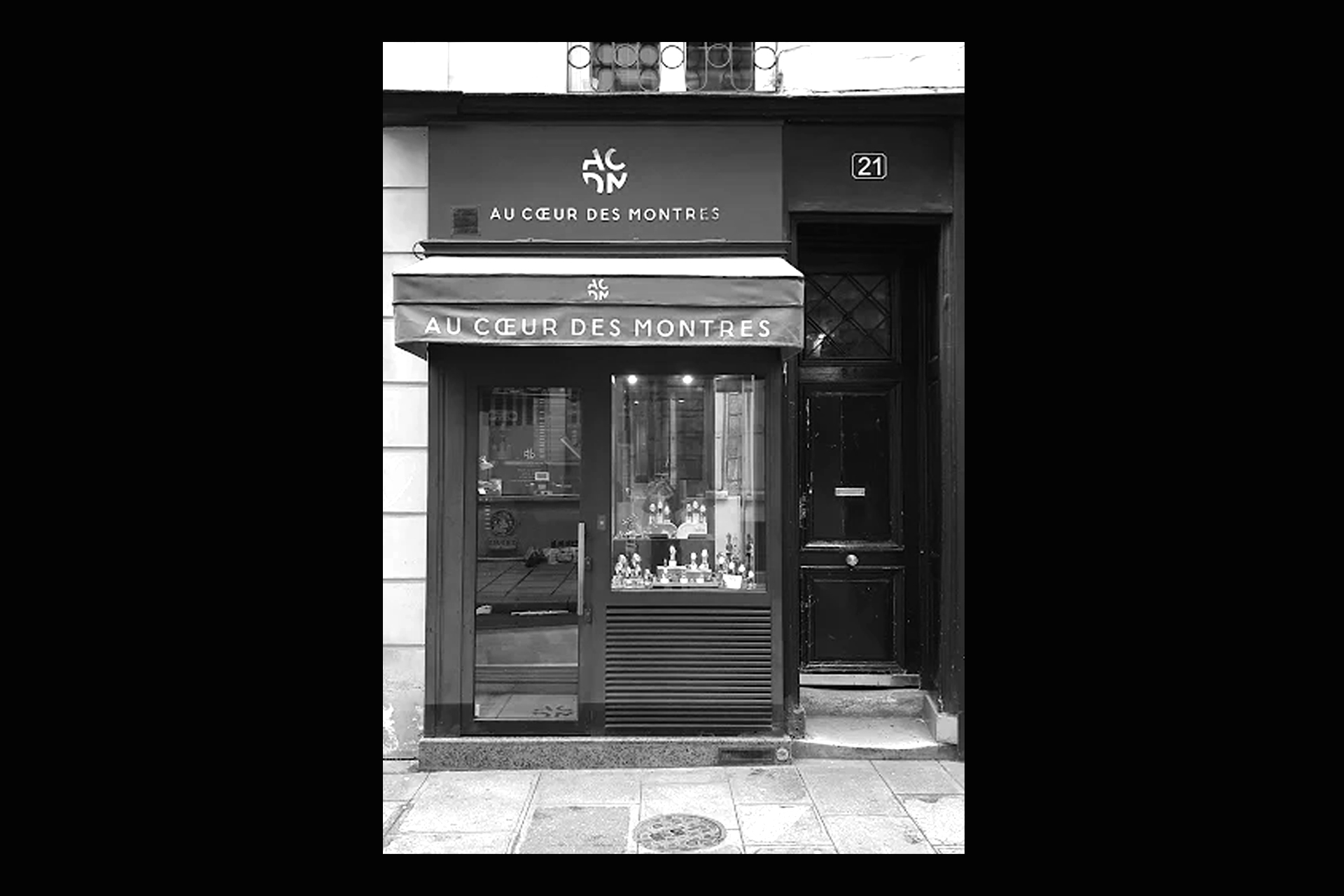
Logotype + Custom lettering and stationnery for the the watchmaker Au Cœur des Montres
Seine 13
Logotype and Logomark for the art event company Seine13. Event on the Paris river.
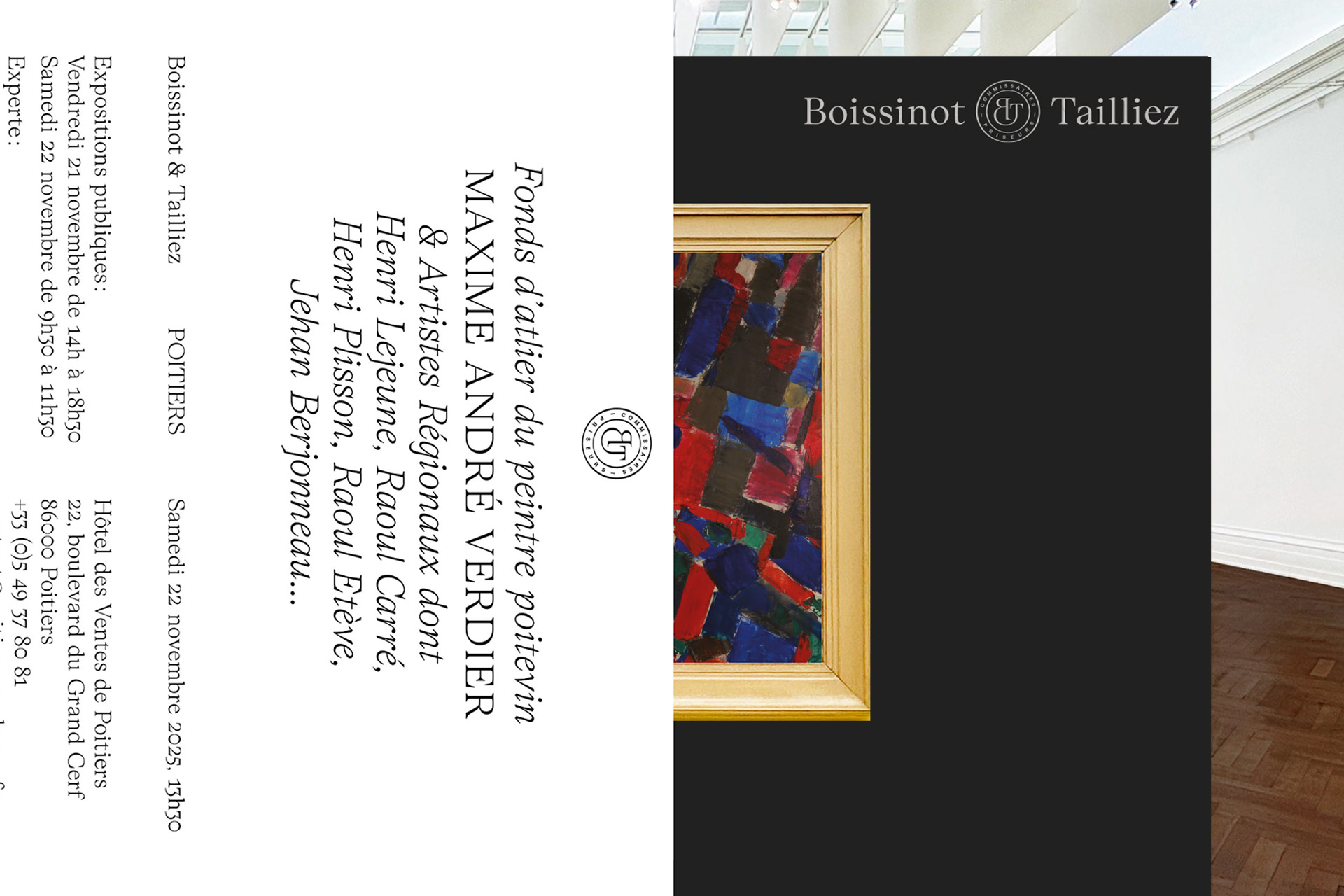
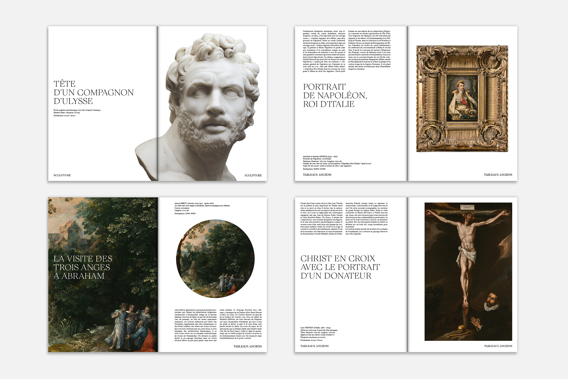
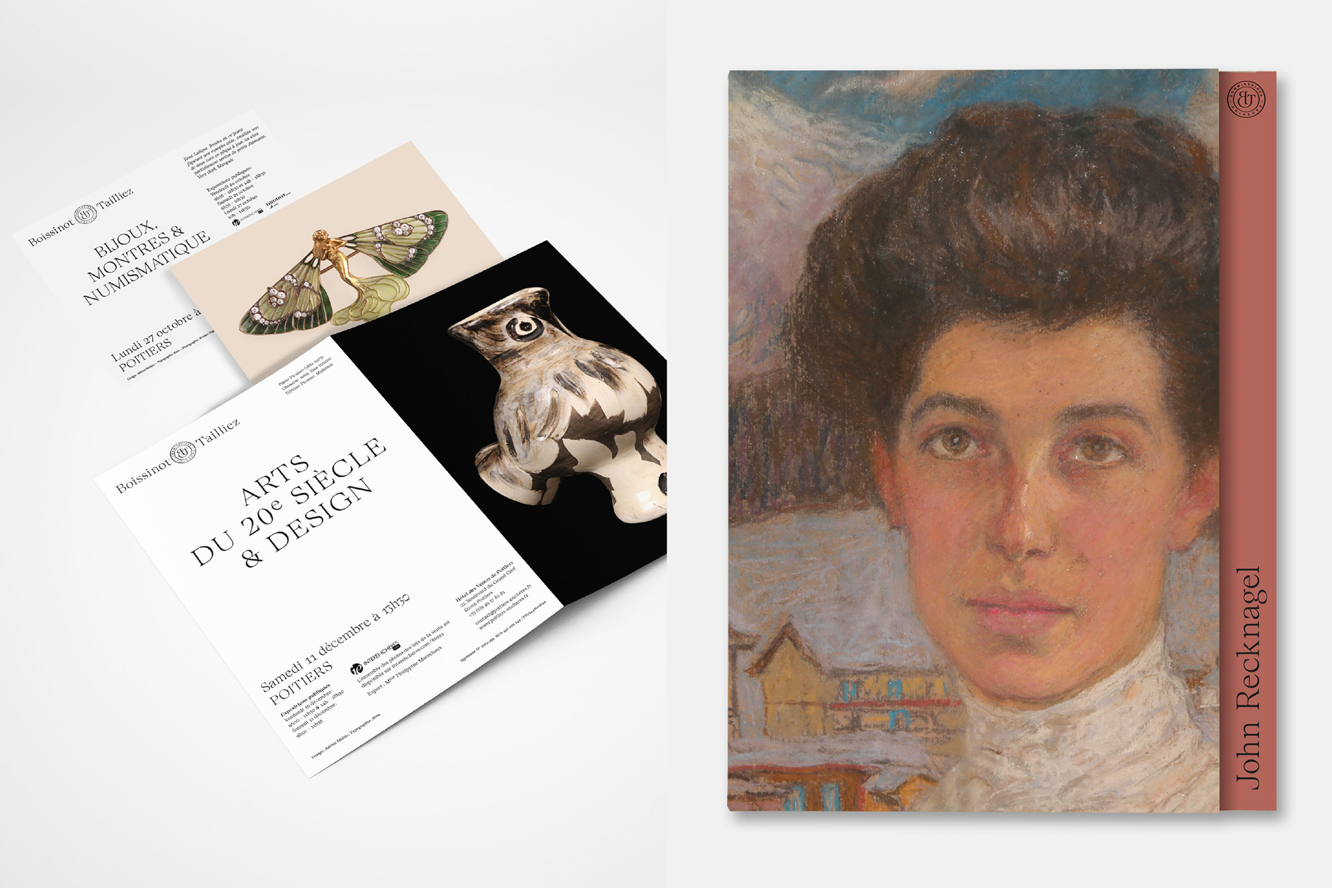
Boissinot & Tailliez
Global visual identity, art direction and graphic design for the auctioneers Boissinot & Tailliez.
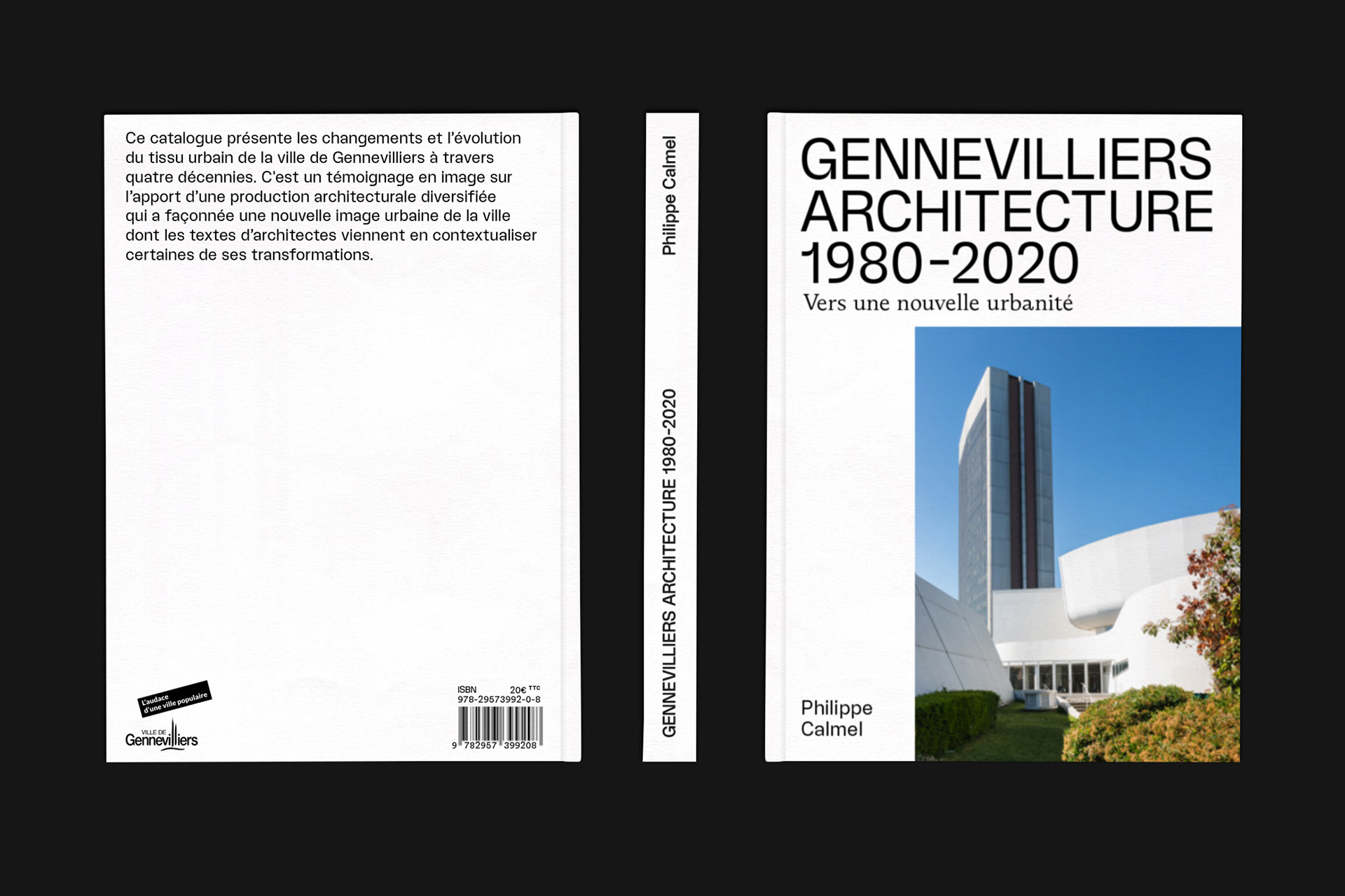
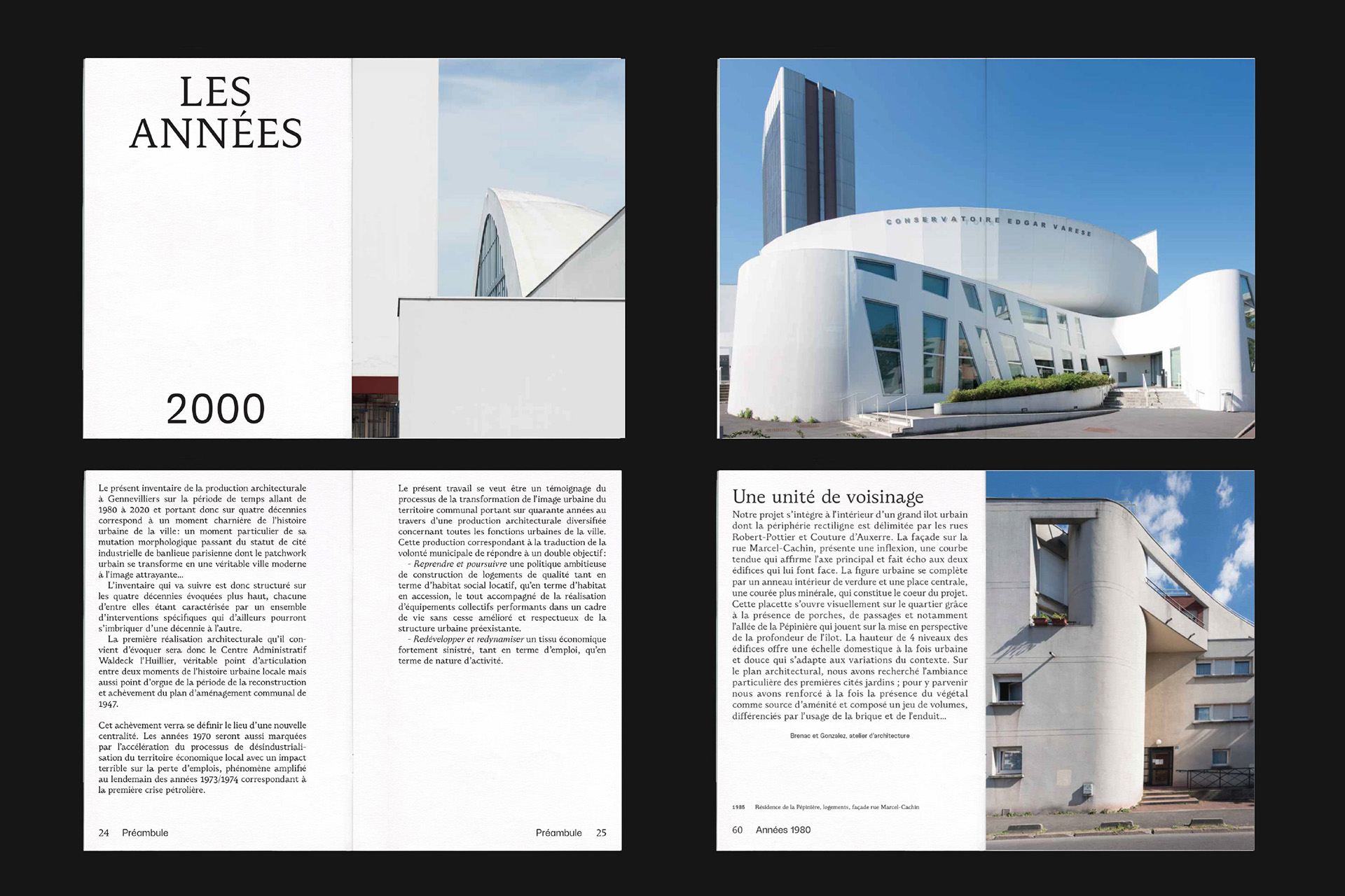
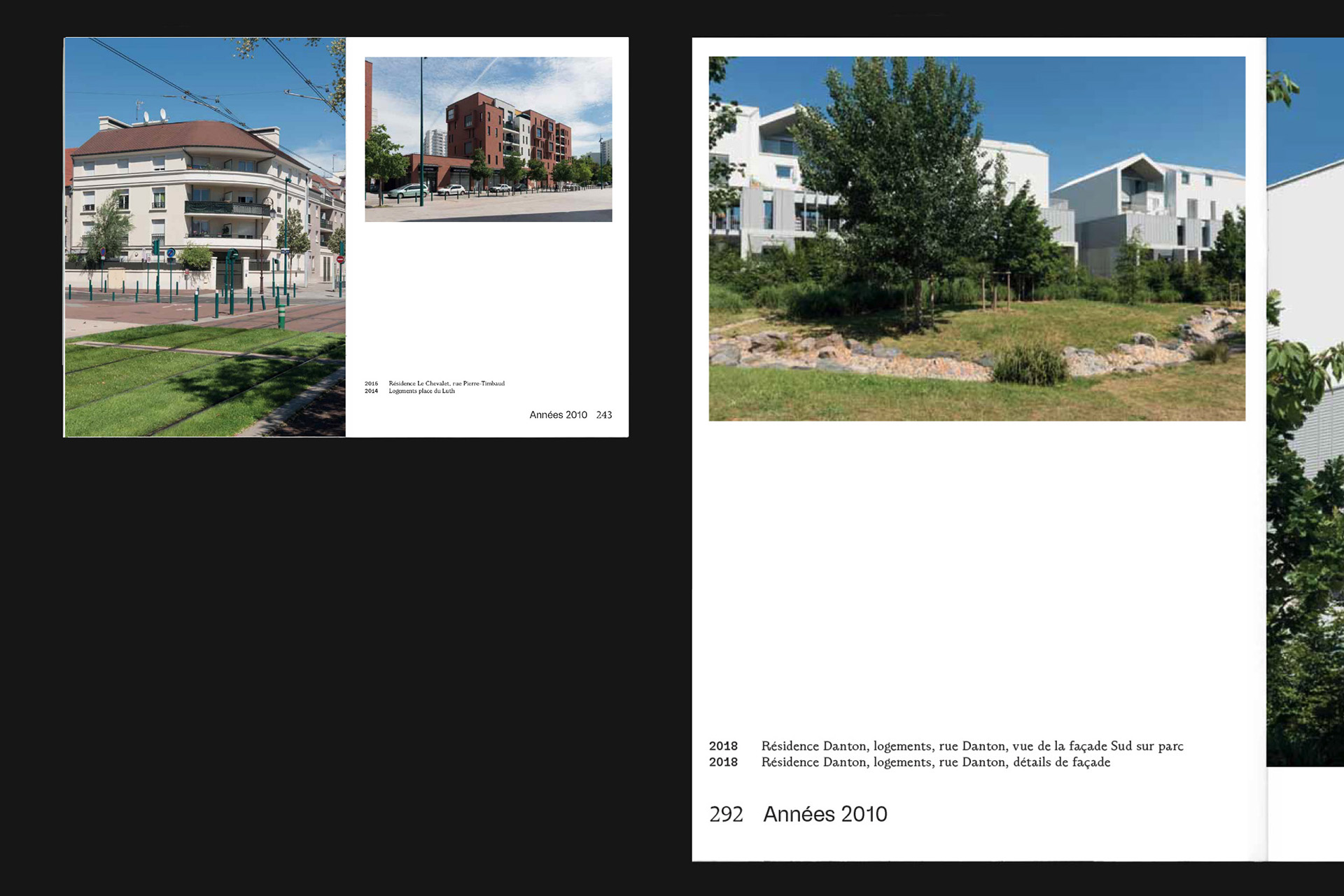
Genneviliers Architecture
Book design. Ville de Gennevilliers, Art direction + graphic design + Fabrication et BAT.
Printed on Fredigoni Arcoprint Milk 300g et 120g — Typography: Wasa et Dozza — Photos: Studio Luma — Printed by Sprint
ISBN 978-29573992-0-8
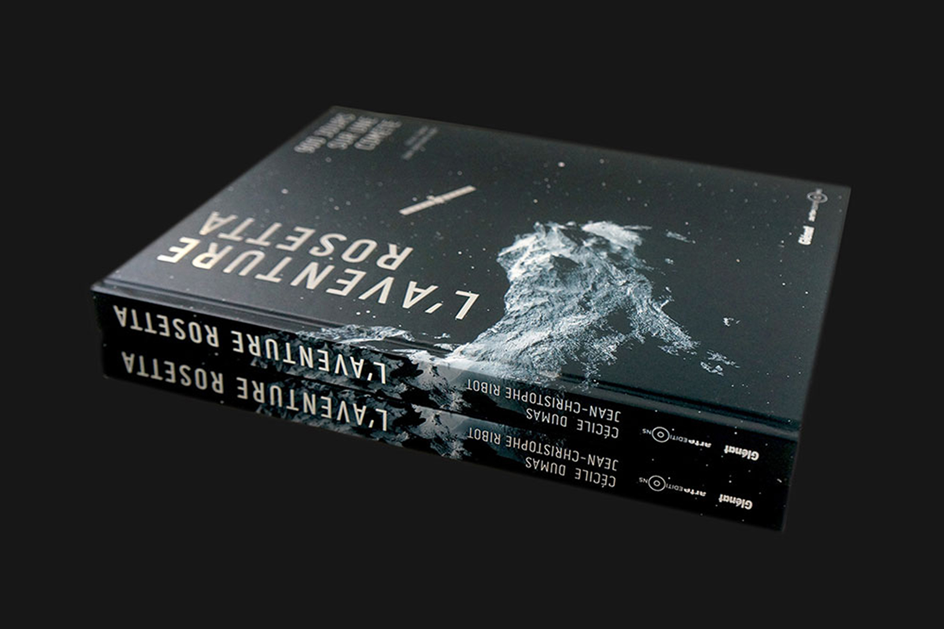
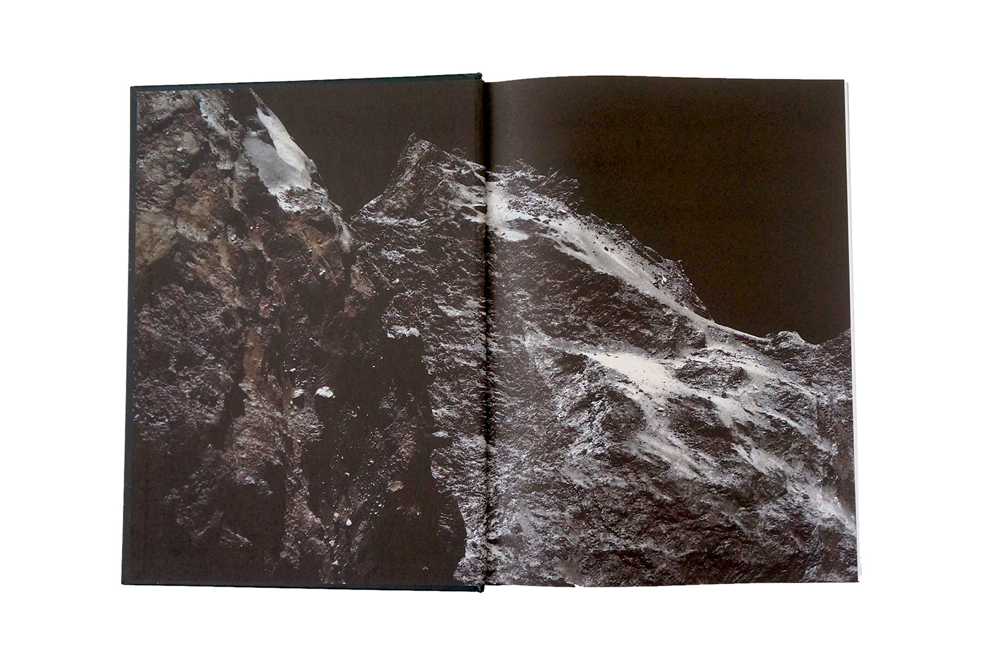
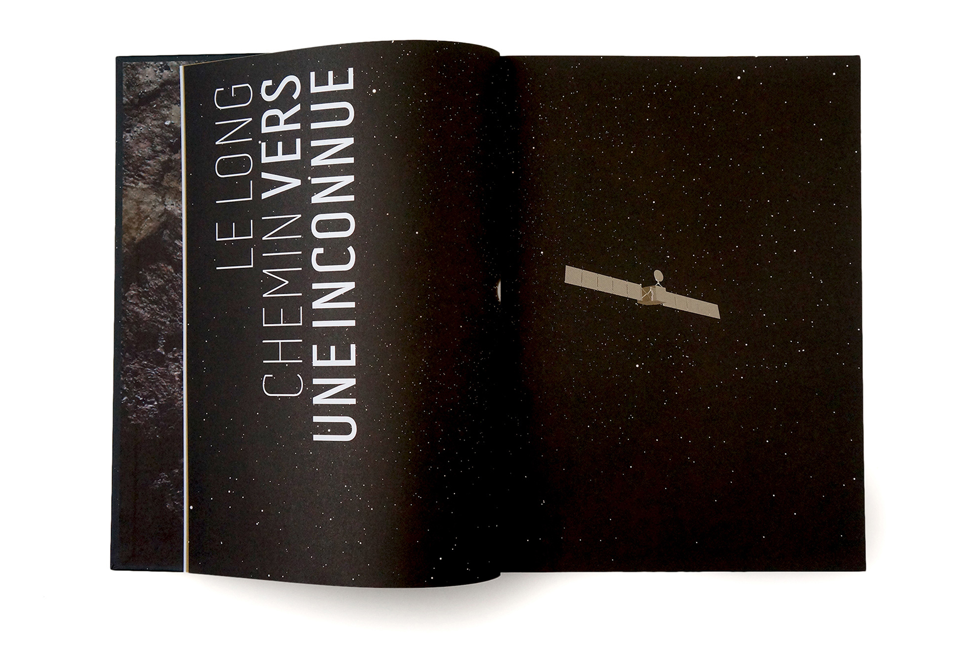
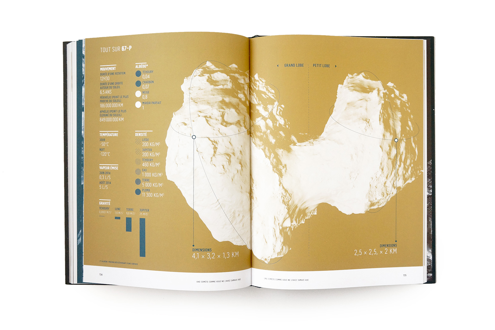
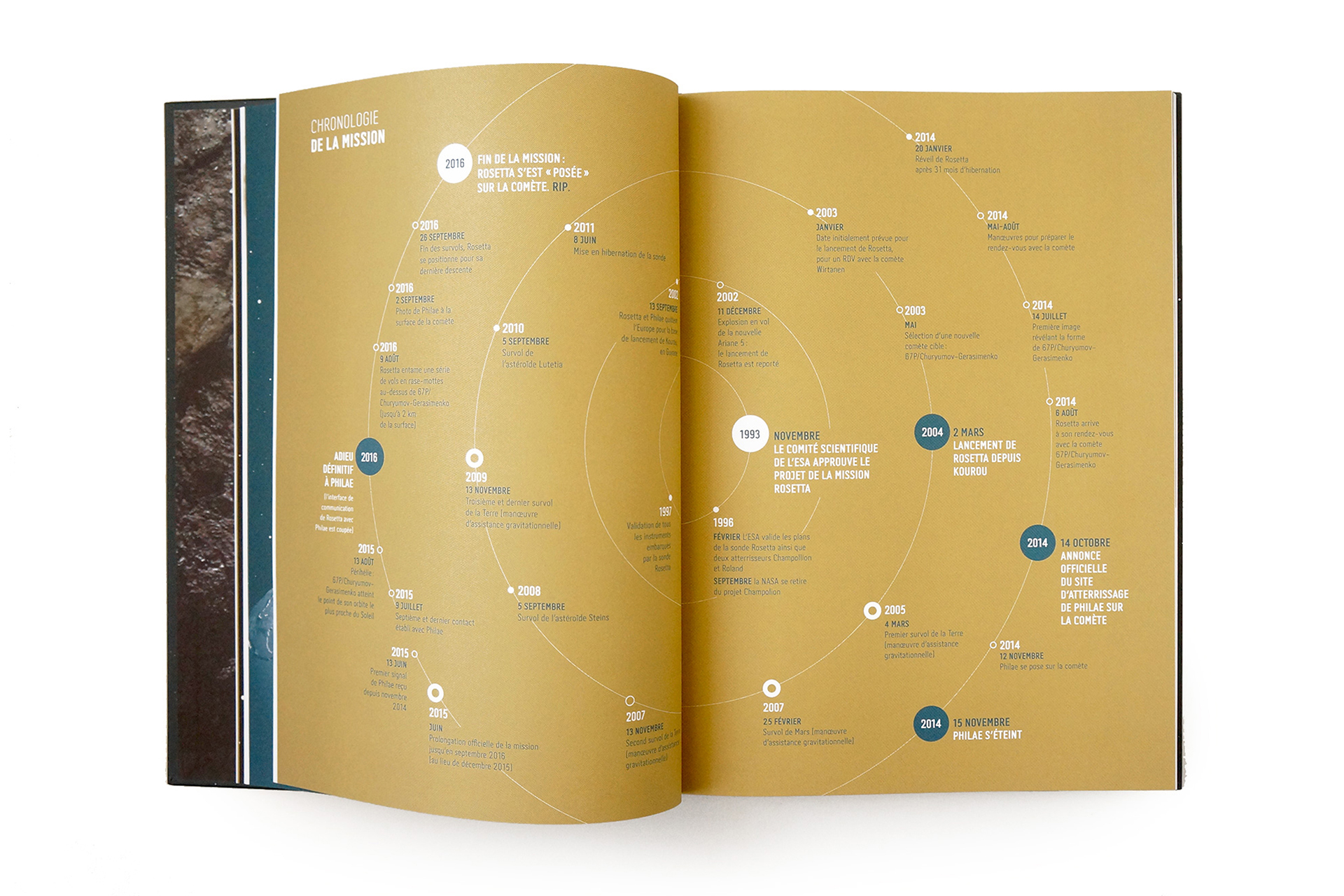
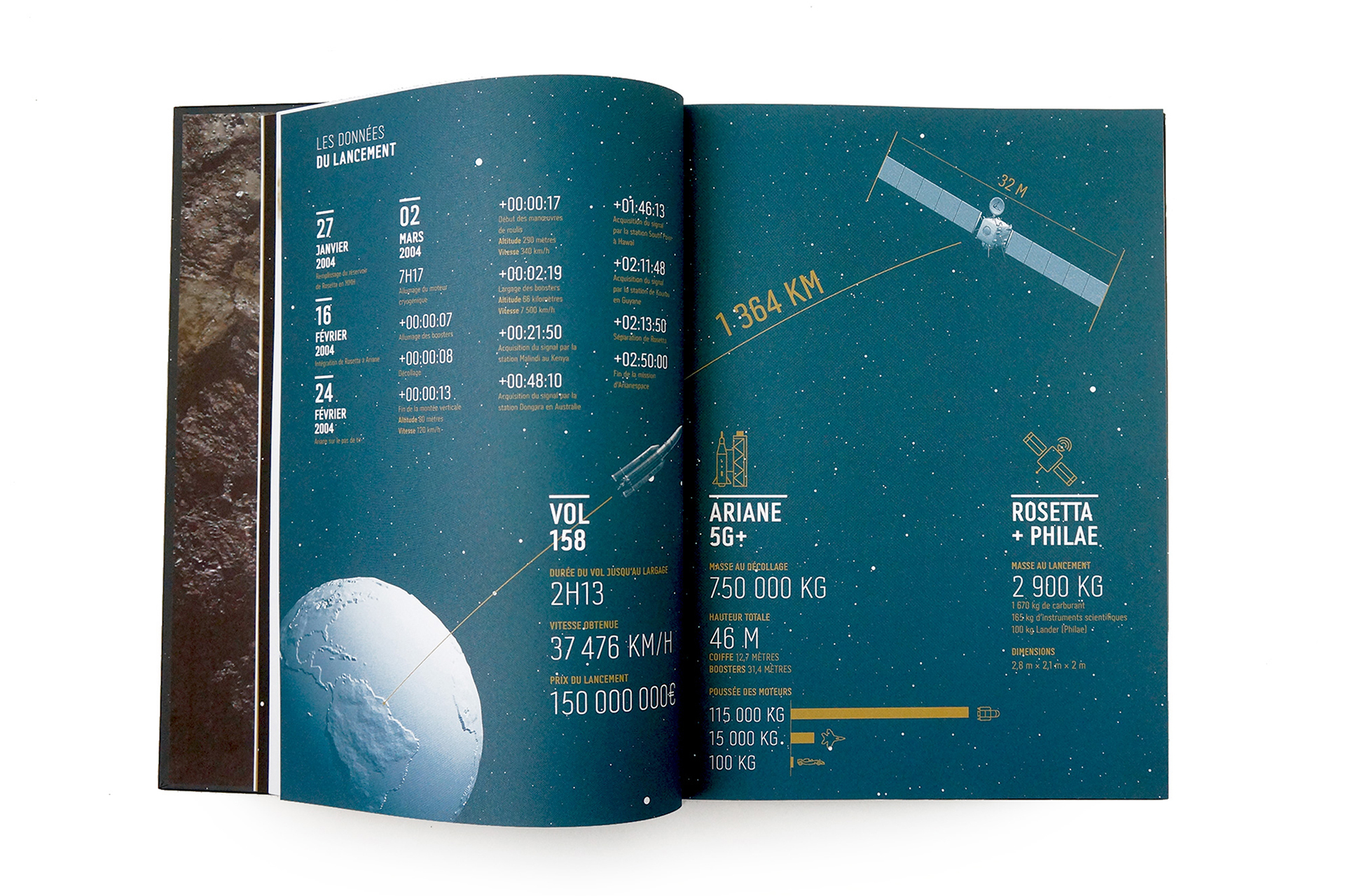
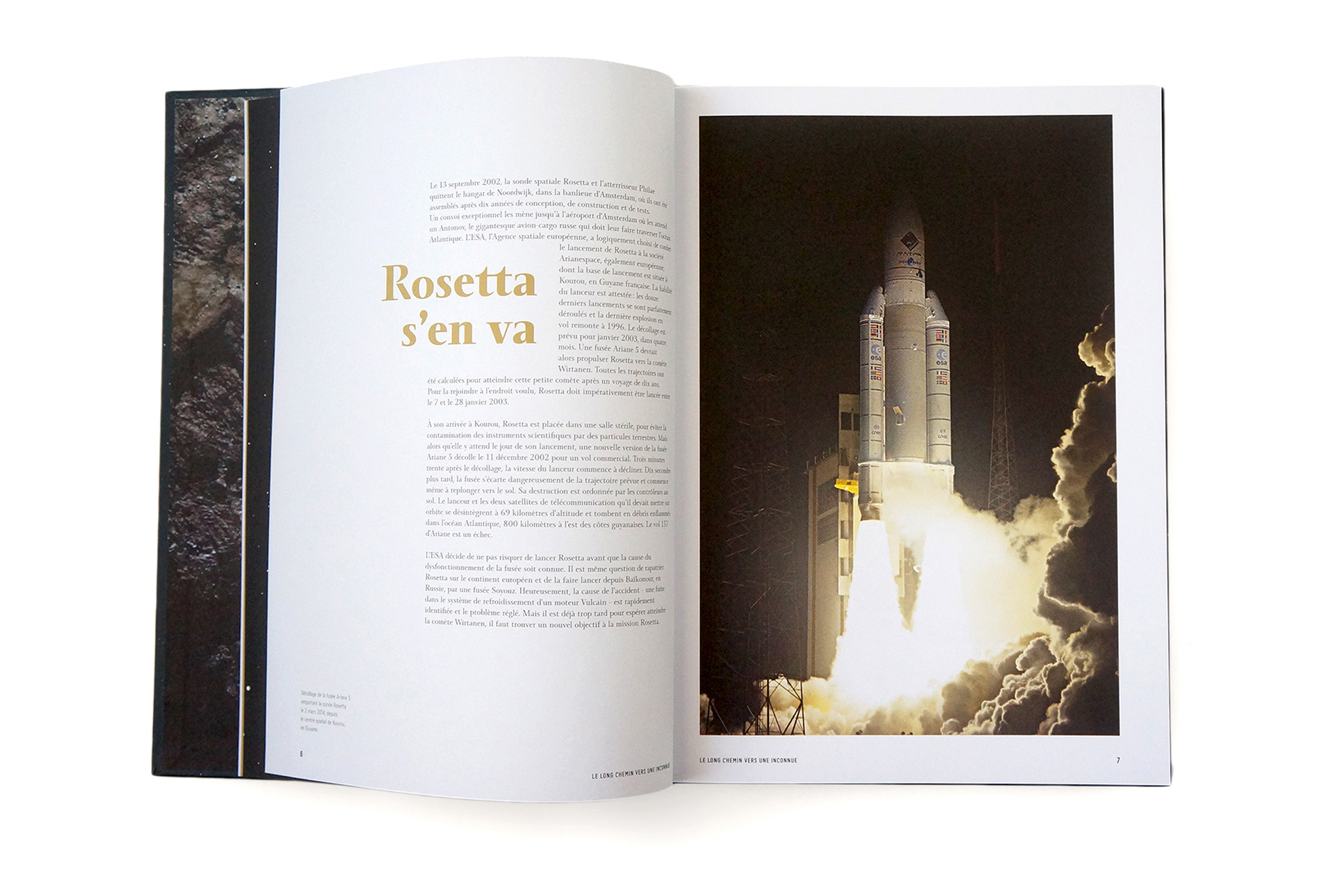
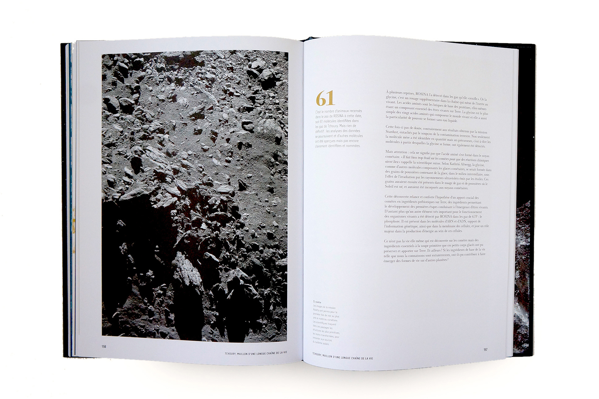
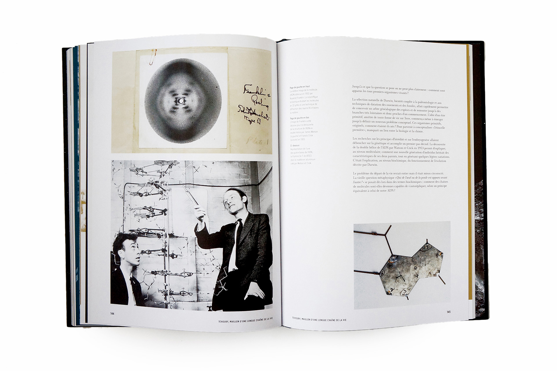
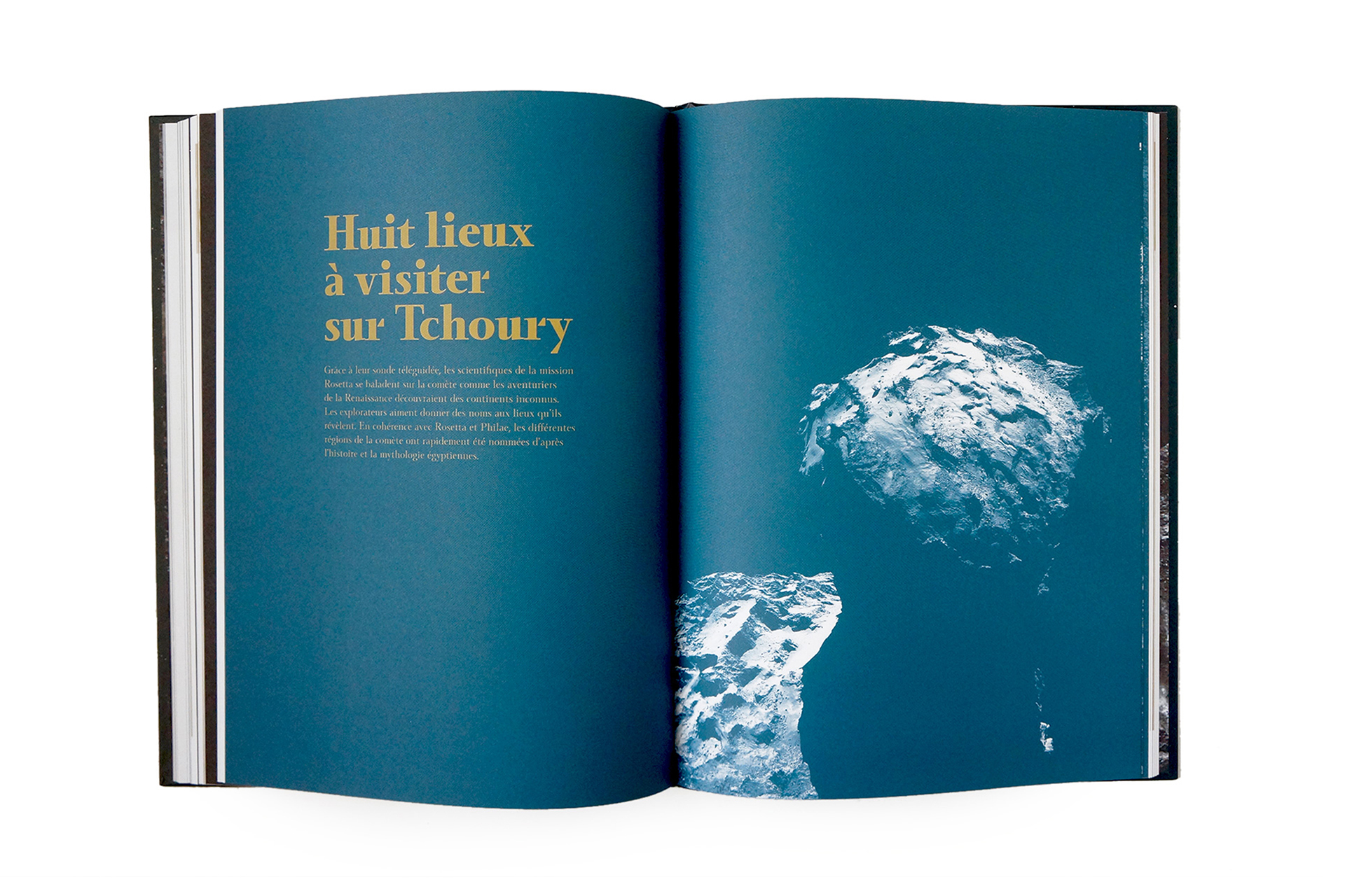
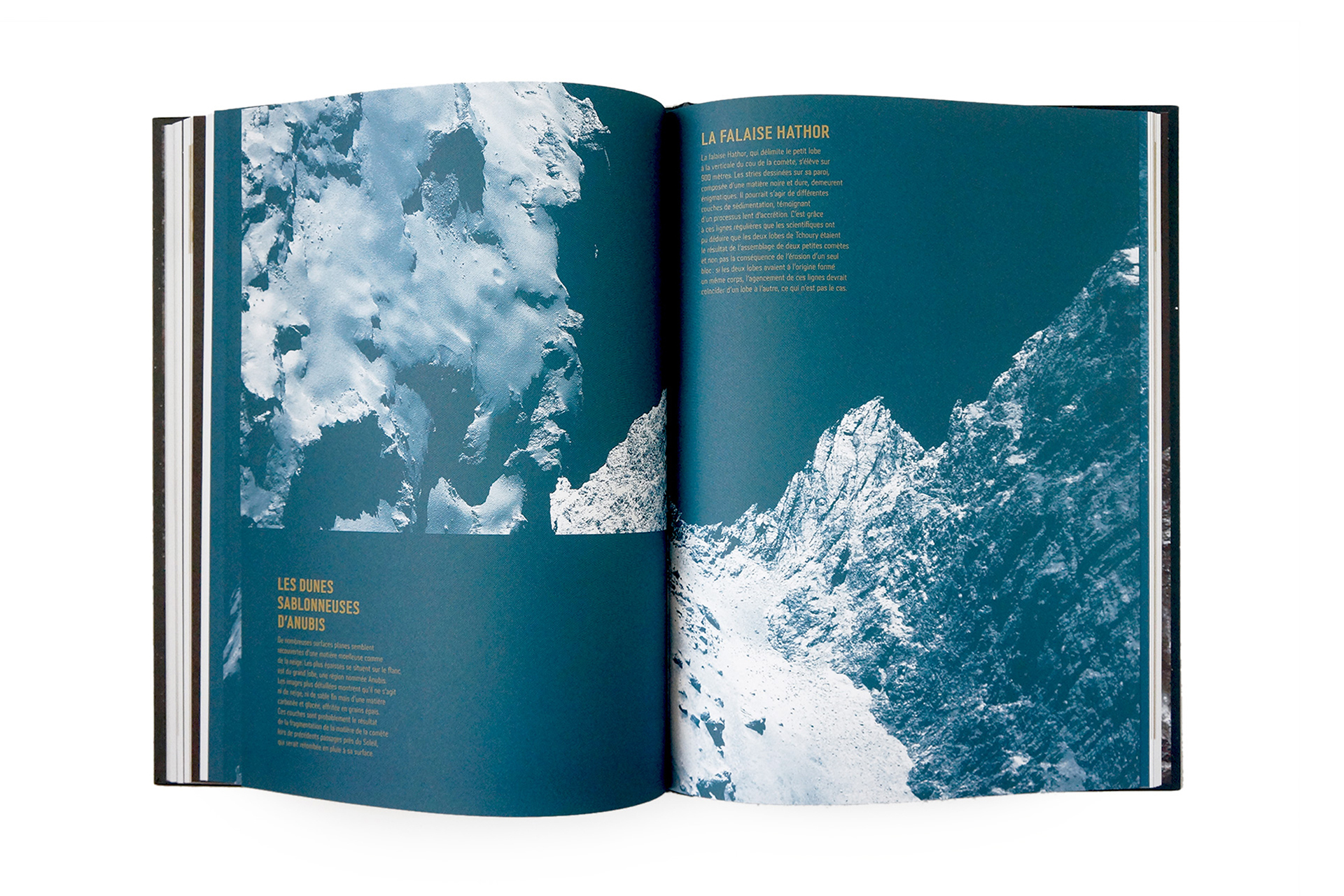
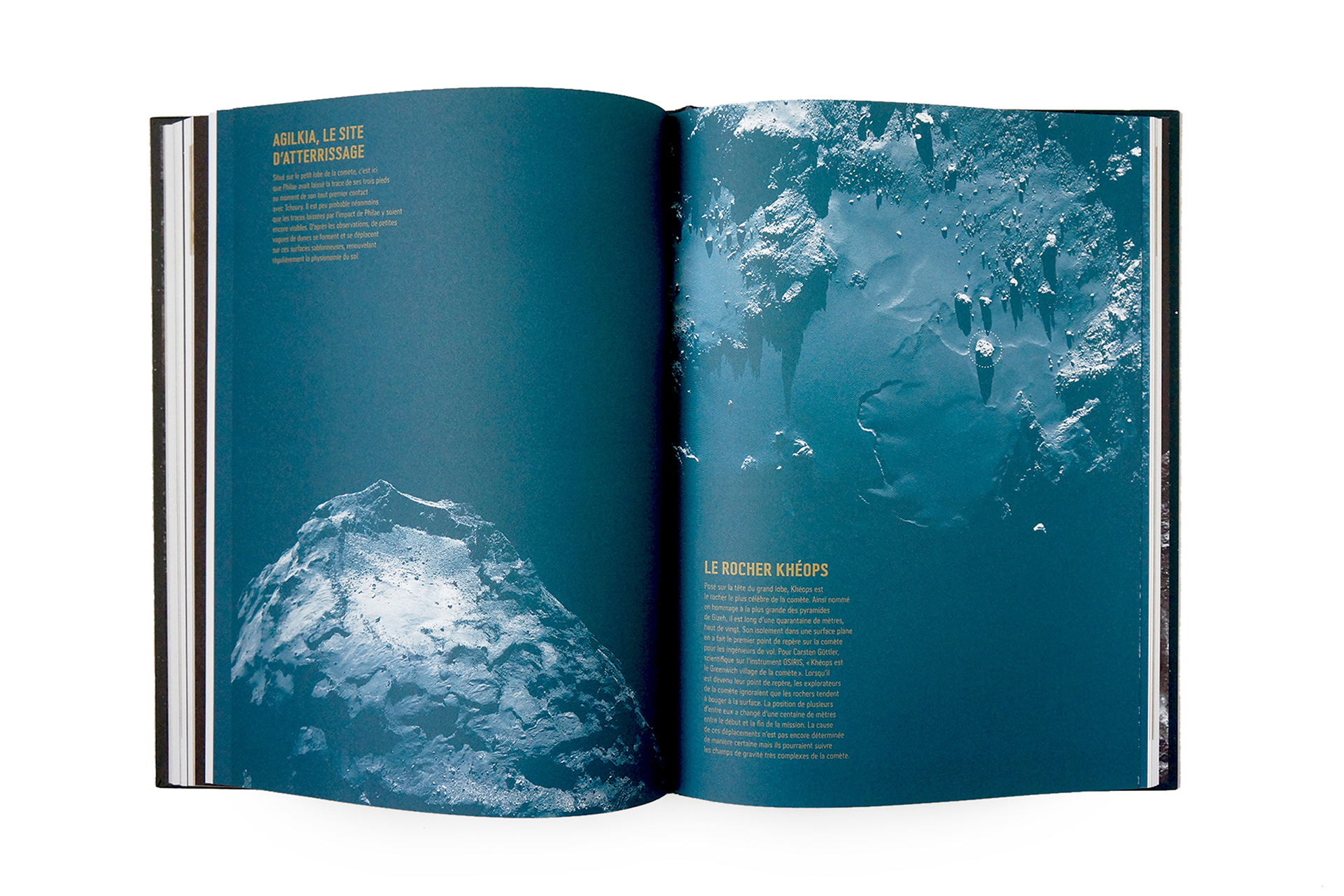
L'aventure Rosetta
Book design. Edtion Glenat and Arte Edition — Art direction + Graphic design + Data visualisations + Fabricaction.
Hard cover printed with hot foiled stamping and textured spot varnish (sand-effect) — Typography: 29LT Adir — Fabrication in collaboration with Edition Glenat — Photos: Studio Luma — Printed by Sprint
ISBN 978-29573992-0-8