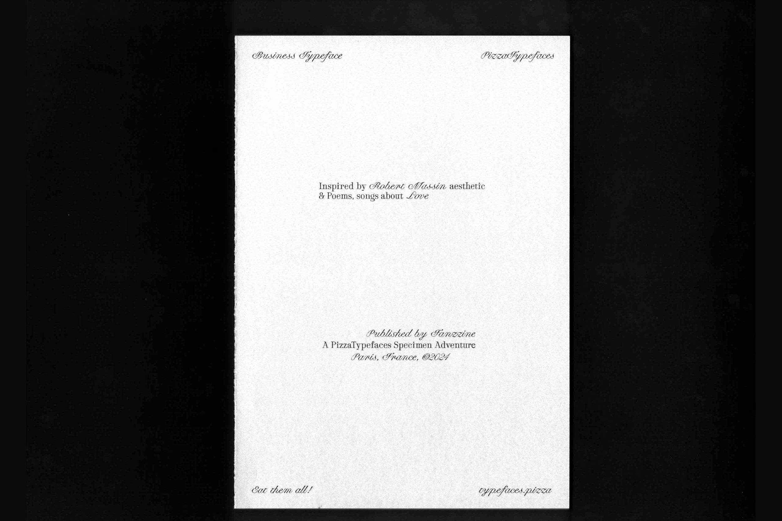
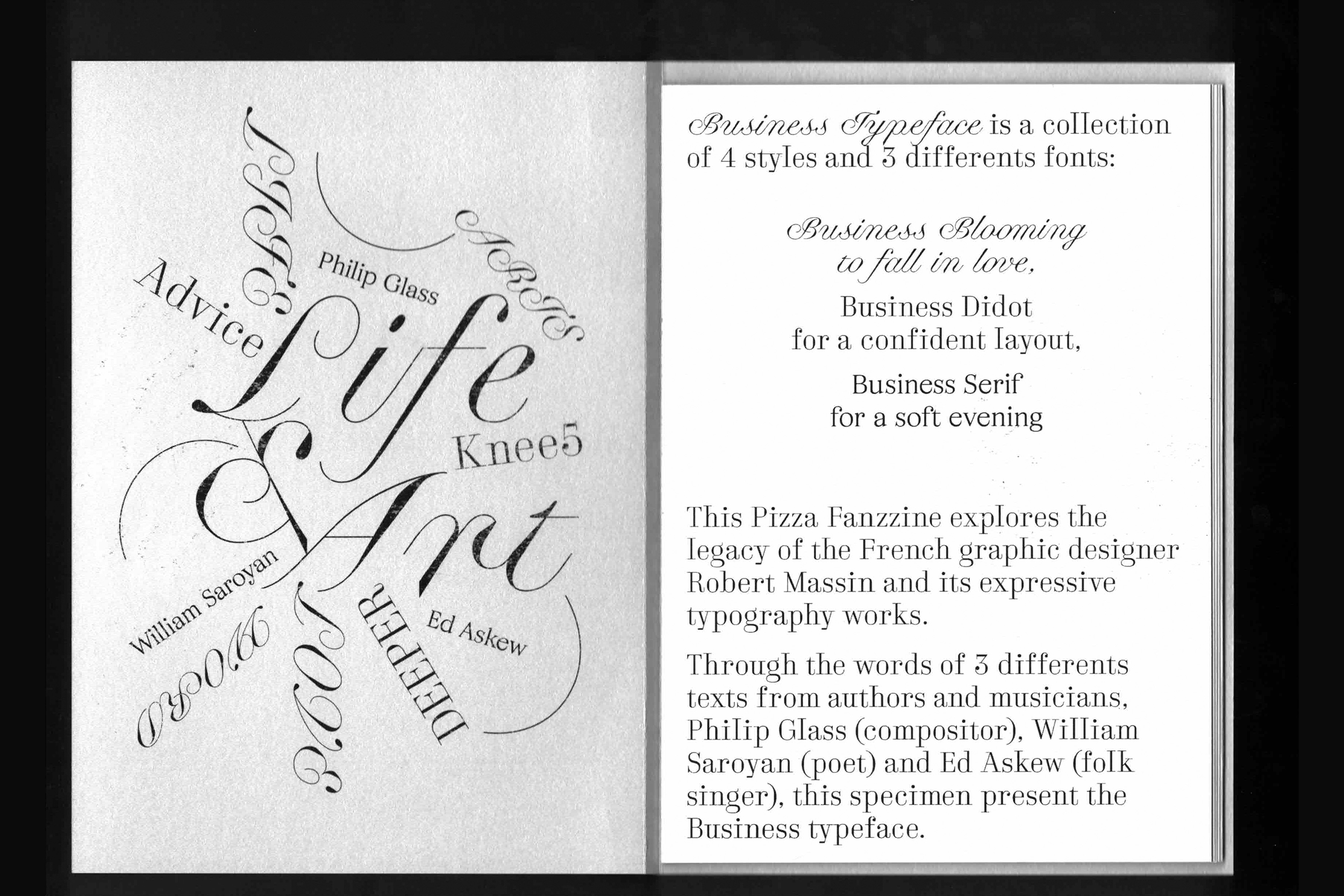
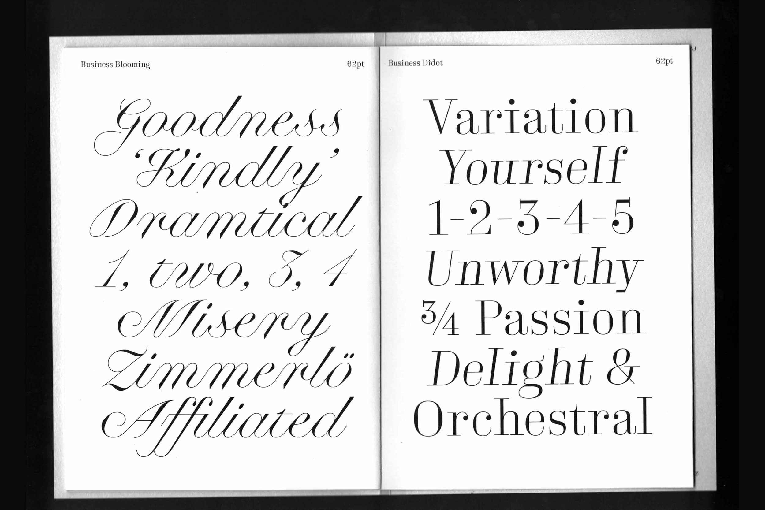
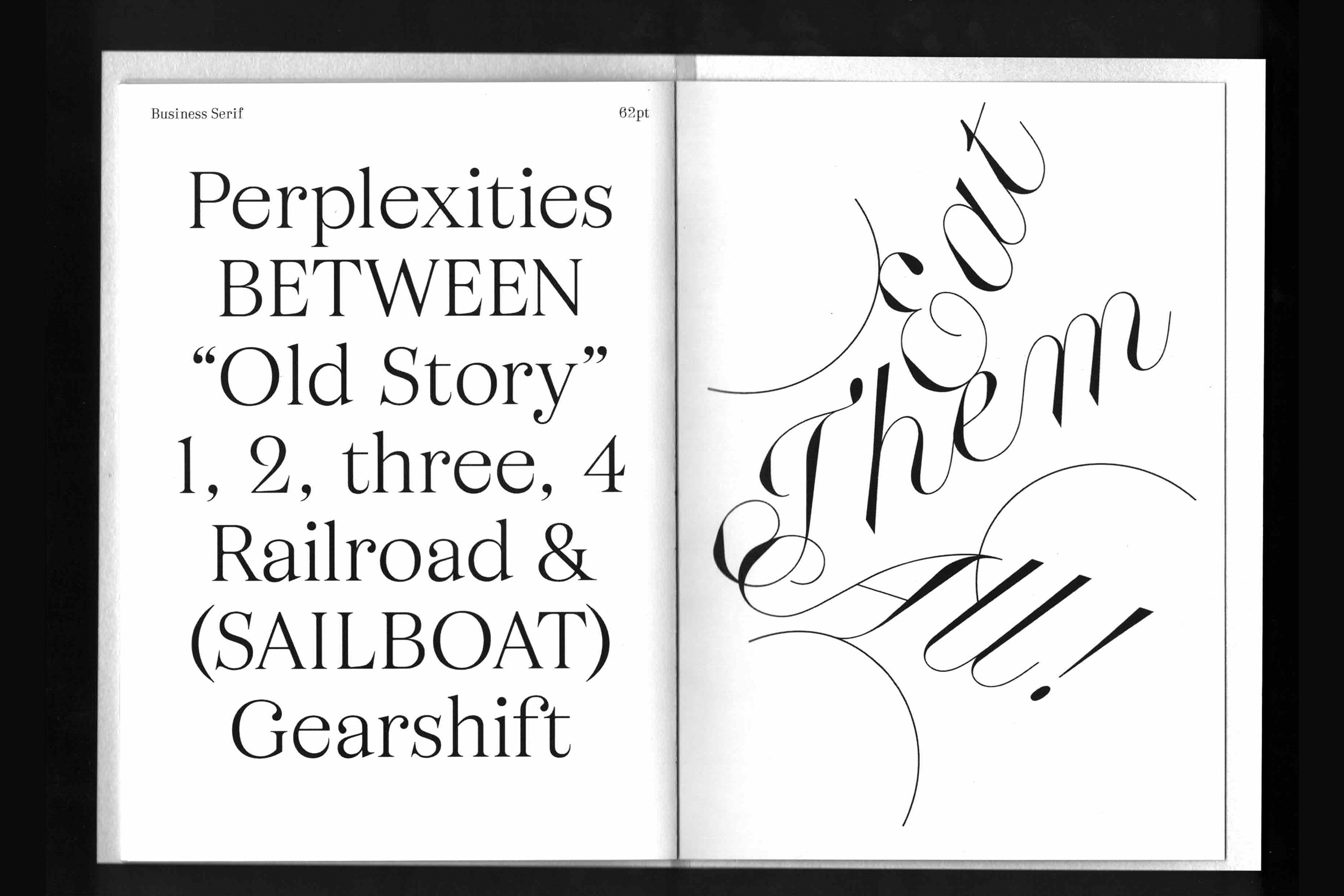
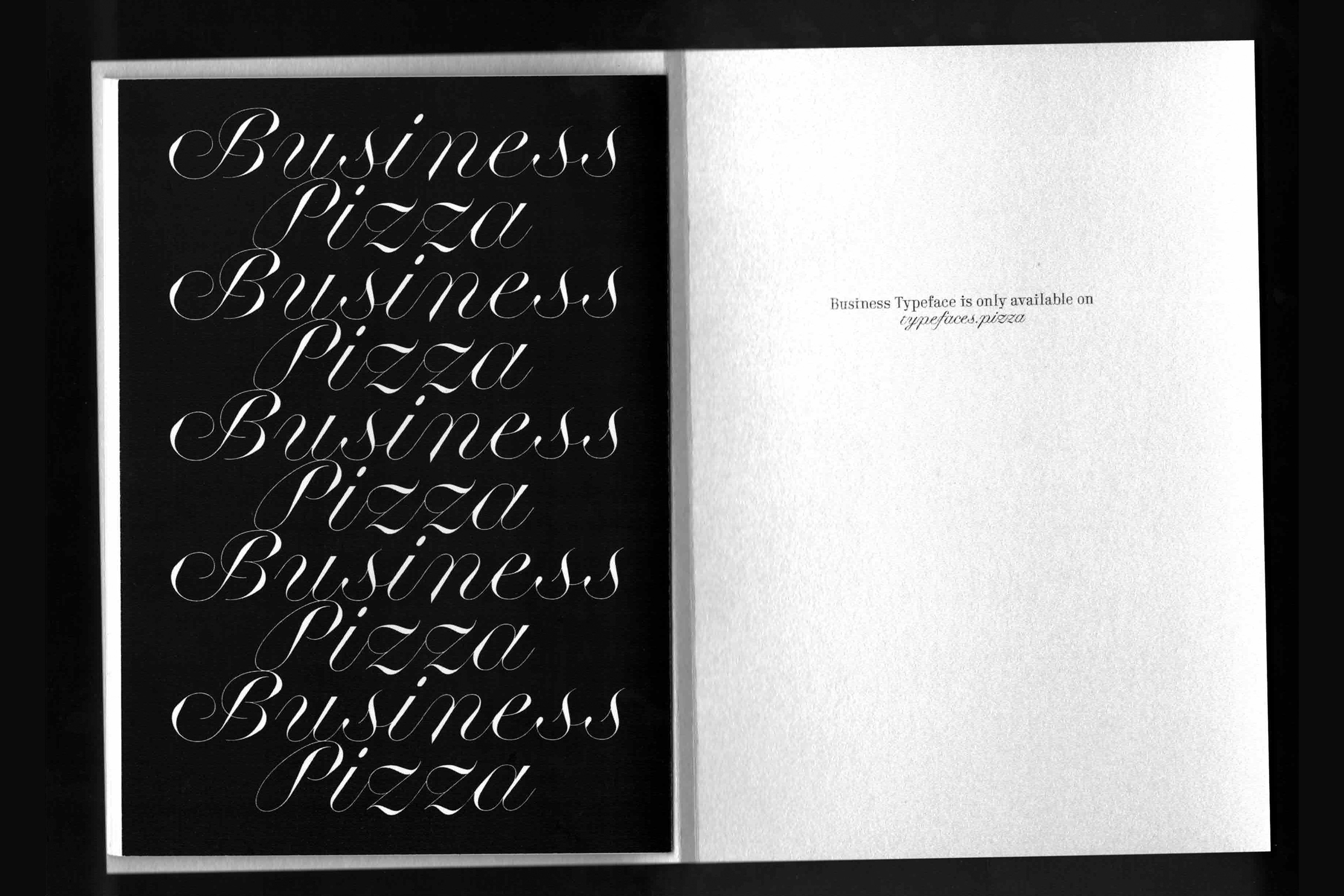
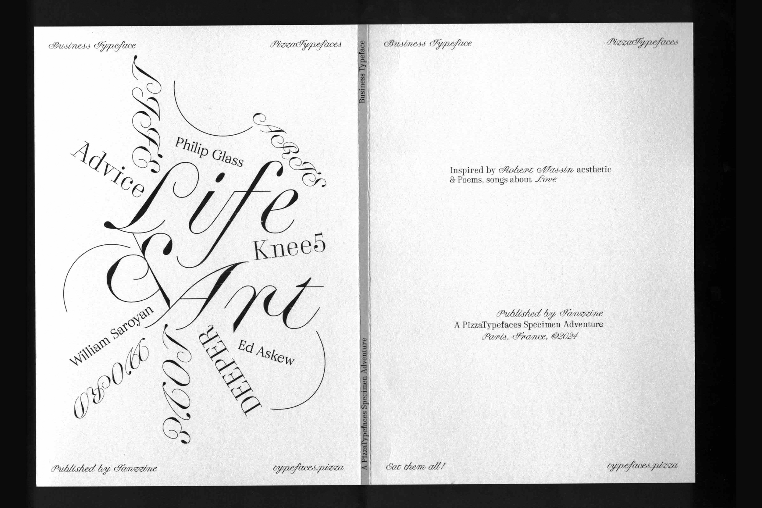
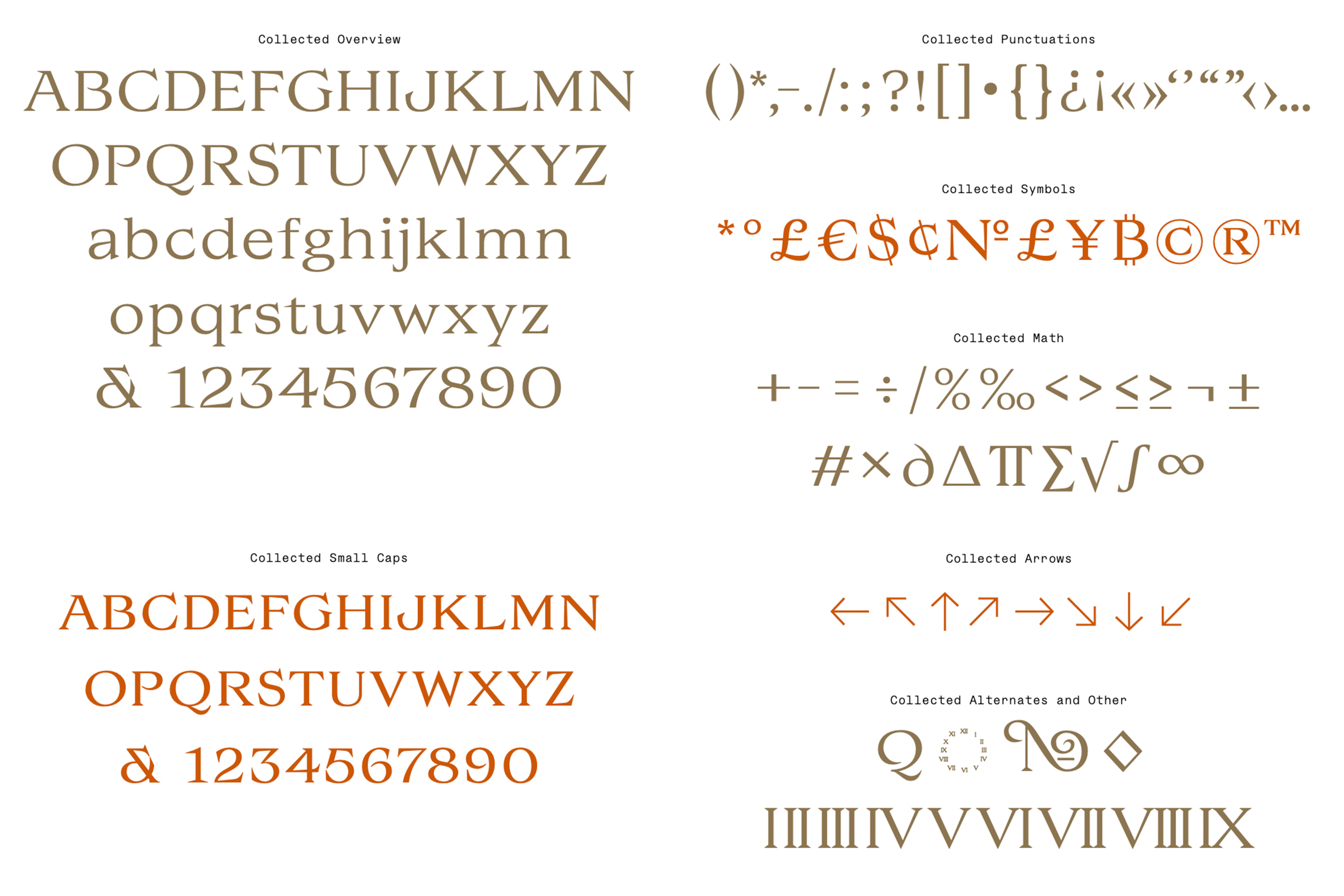
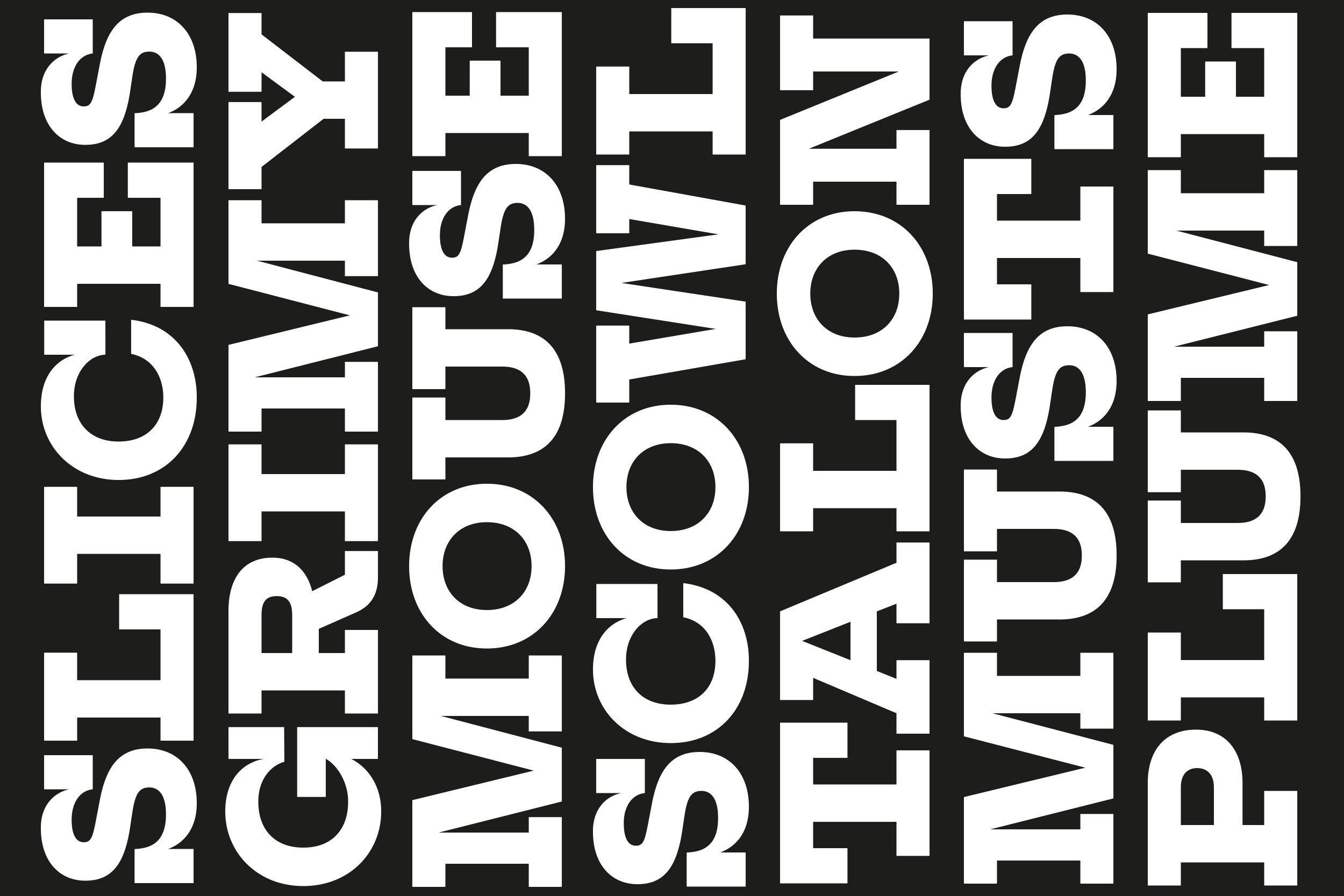
Business
Business is a collection of three font-families including a blooming script, a condifent didot and a cosy serif. The Business Blooming contain a Optical Size variable to match the right contrast depending of the size. The Business Didot and Business Serif have both Display and Text versions.
- Business Blooming
- Display
- Backpacked
- Business Blooming
- Normal
- Quaternary
- Business Blooming
- Text
- Miserliness
- Business Didot
- Display Light
- Magniloquent
- Business Didot
- Display Regular
- Unquivocally
- Business Didot
- Display Bold
- Demonologist
- Business Serif
- Text Light
- Professionally
- Business Serif
- Text Regular
- Schizophrenia
- Business Serif
- Text Bold
- Vegetarianism
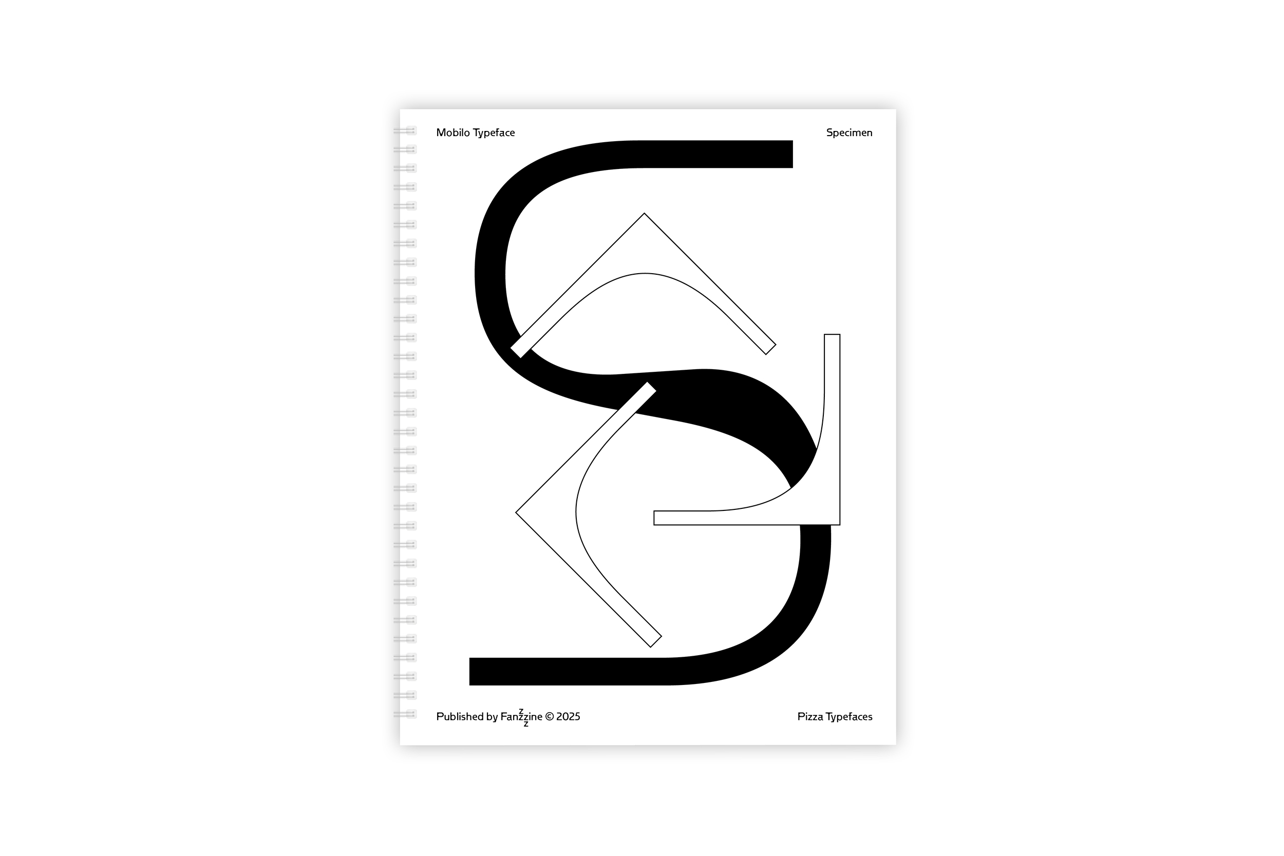
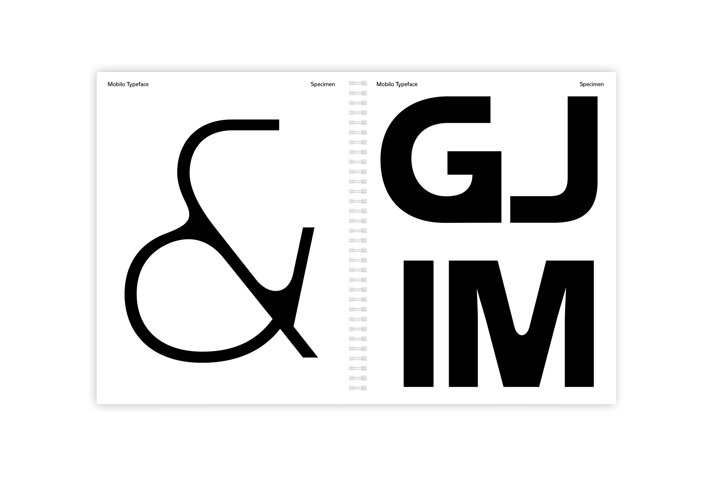
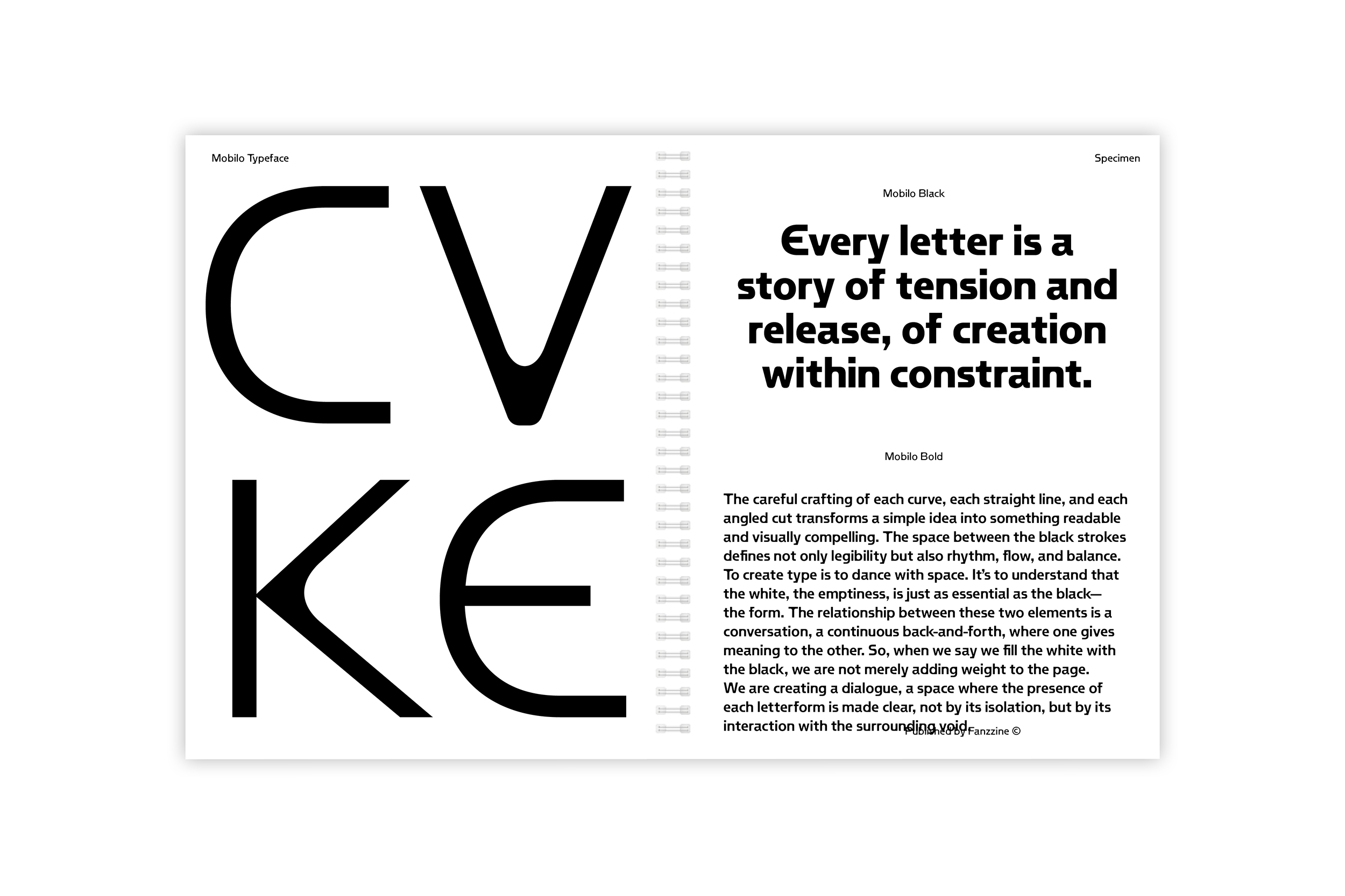
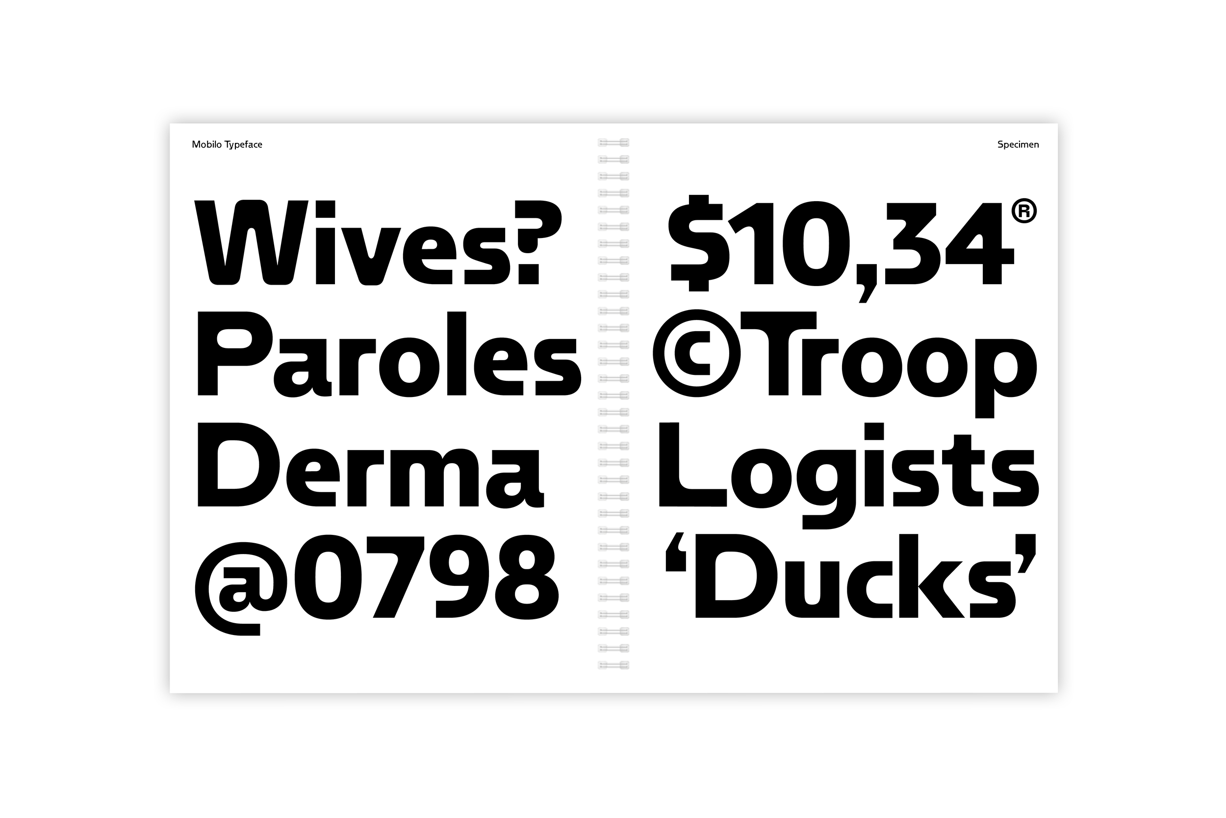
Mobilo
Mobilo is a font who play with the the interaction between black and white not just about contrast but as balance, presence, and absence. To “fill the white with black” is to mold the empty spaces with intention, creating forms that do not simply occupy space but define it. With some stylistic sets for bigger details.
- Mobilo
- Thin
- Depersonalizing
- Mobilo
- Light
- Set 4
- Monumentality
- Mobilo
- Regular
- Hydrodynamics
- Mobilo
- Medium
- Set 2
- Expressionistic
- Mobilo
- Bold
- Authorizations
- Mobilo
- Black
- Slaughterhouse
Nuqtra
Nuqtra Typeface نقطرة عربي is a biscript typeface designed to support both Arabic and Latin languages. It is both the ripe fruit and the spicy starter of a collaboration with my native Lebanese type designer friend, Studio Nem. Nuqtra seeks to create harmony resonating across two distinct cultures. The Arabic script features a contemporary, narrow design, with an italic slanted to match the angle of the Latin. The Latin draws inspiration from the strict geometry of DIN, but takes its distance.
- Nuqtra
- Thin
- التطفل غير Creativity
- Nuqtra
- Thin Italic
- 5.86 بخصوص السماء
- Nuqtra
- Regular
- سيمفونيات Regards
- Nuqtra
- Italic
- المتوسط الأكثر .Elec
- Nuqtra
- Medium
- فراخ الموانئ 36’90
- Nuqtra
- Medium Italic
- والتقدير Ergonomie
- Nuqtra
- Bold
- 1869 مستكشفي J.H
- Nuqtra
- Bold Italic
- Library سعف إلزامي
- Nuqtra
- Ultra
- الكلى مفترس Grand
- Nuqtra
- Ultra Italic
- Plan صراخ المنفذين
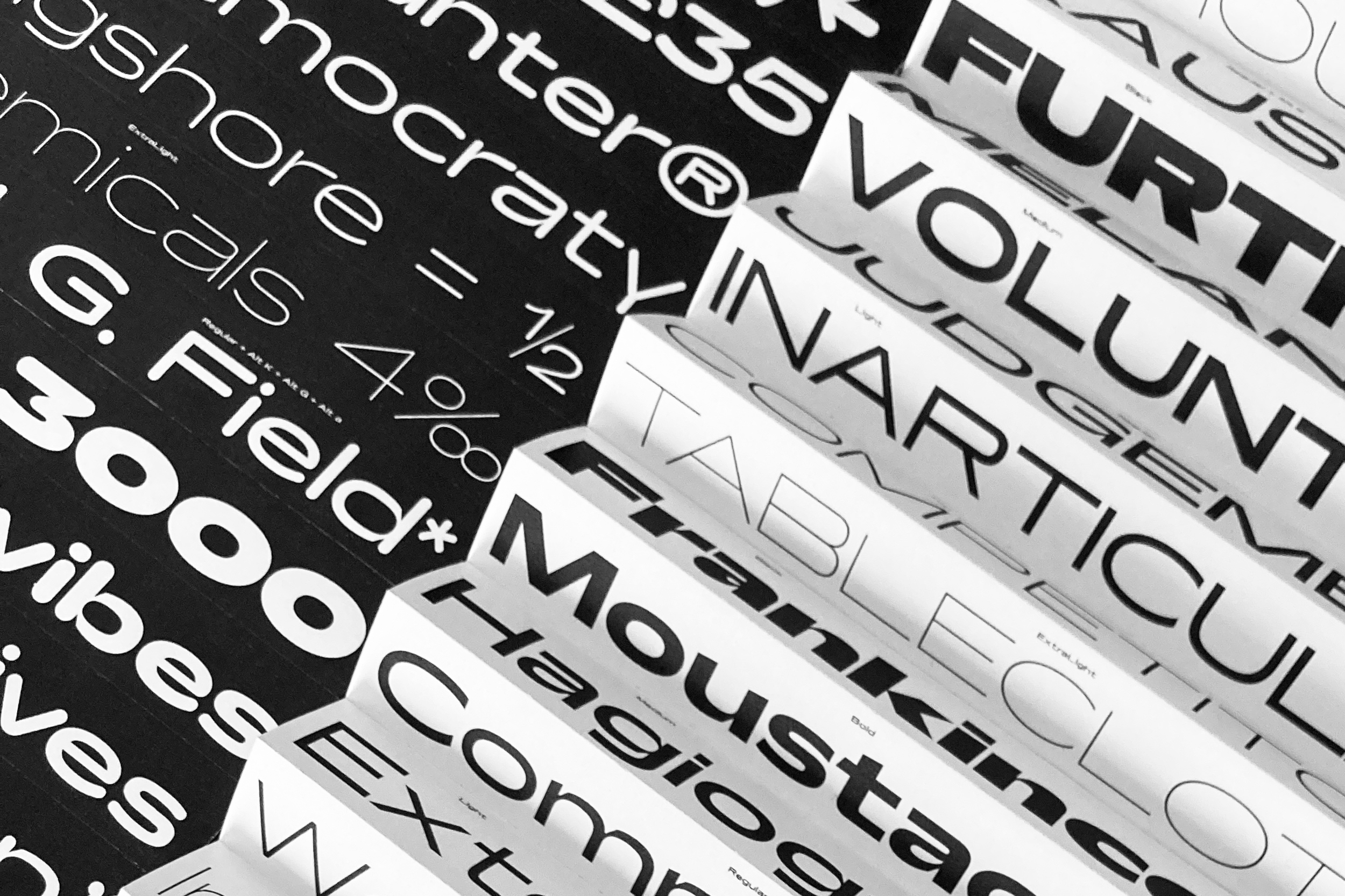
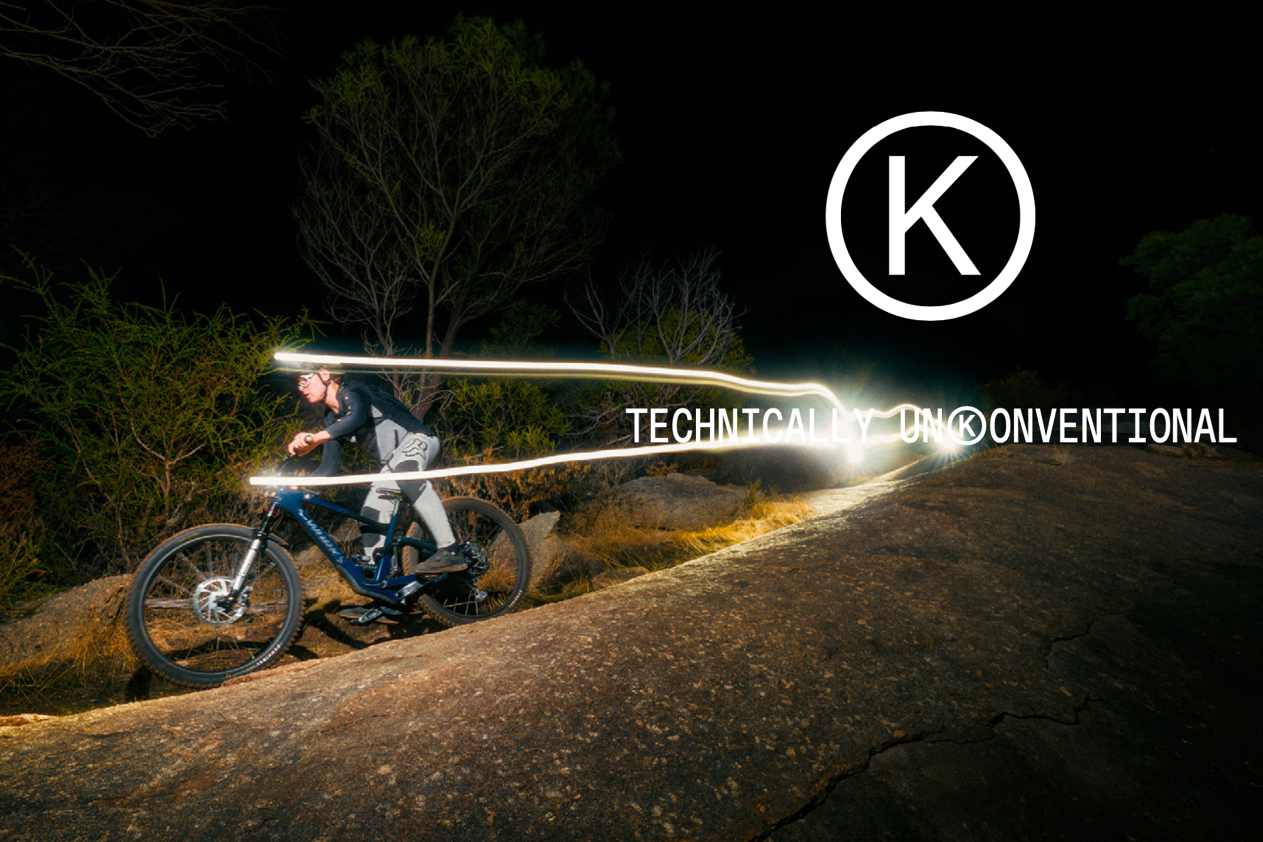
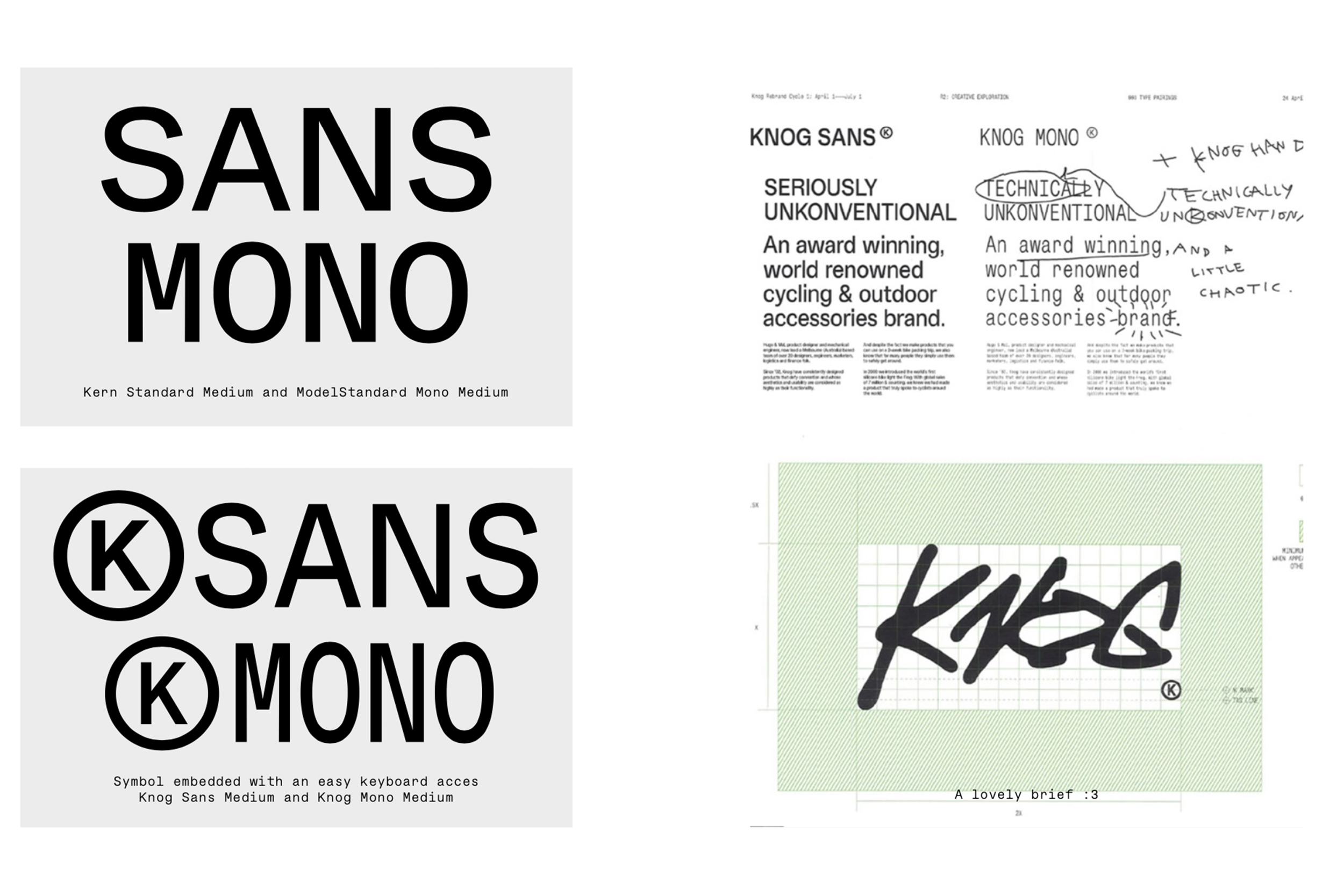
Kern
Kern Typeface is a big family, a sans-serif font. 5 Families with 12 styles each. From Thin to Black weights and Italics. It's my first Helvetica's genre font. But not so neutral. Extended through 4 years into this big family.
- Kern Compressed
- Bold
- Thermodynamically
- Kern Condensed
- Bold
- Misidentification
- Kern Standard
- Bold
- Set 2
- Risplacements
- Kern Extended
- Bold
- Undispersed
- Kern Expanded
- Bold
- Occasional
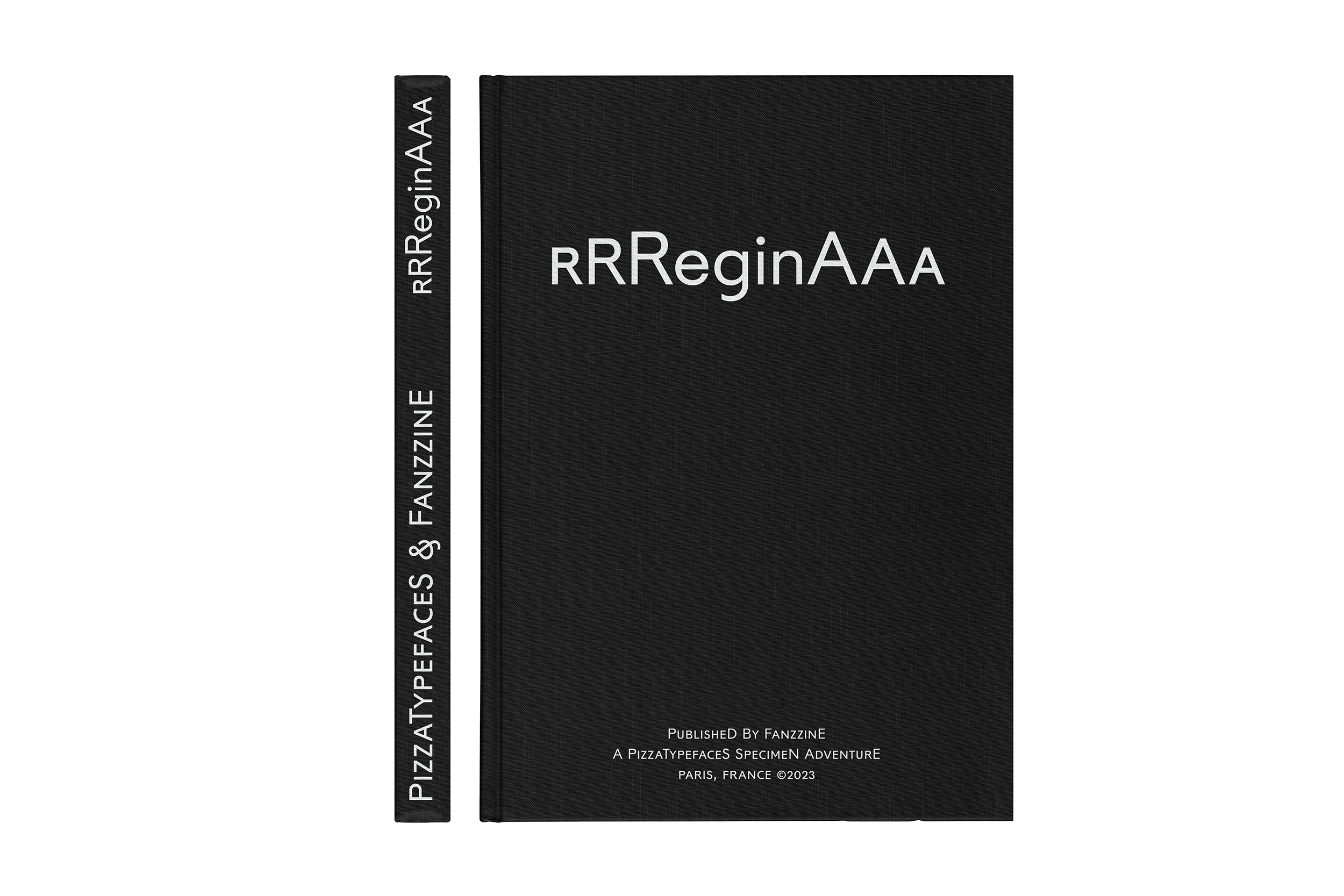
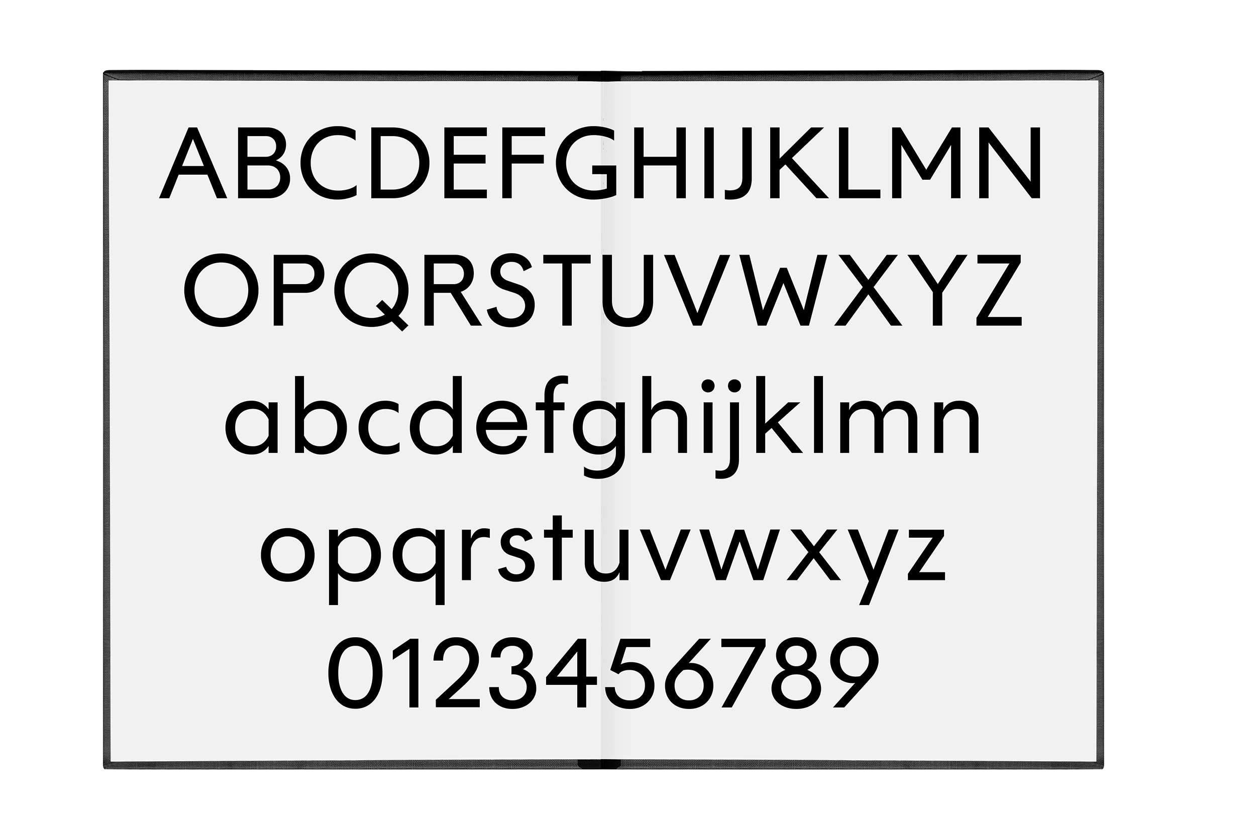
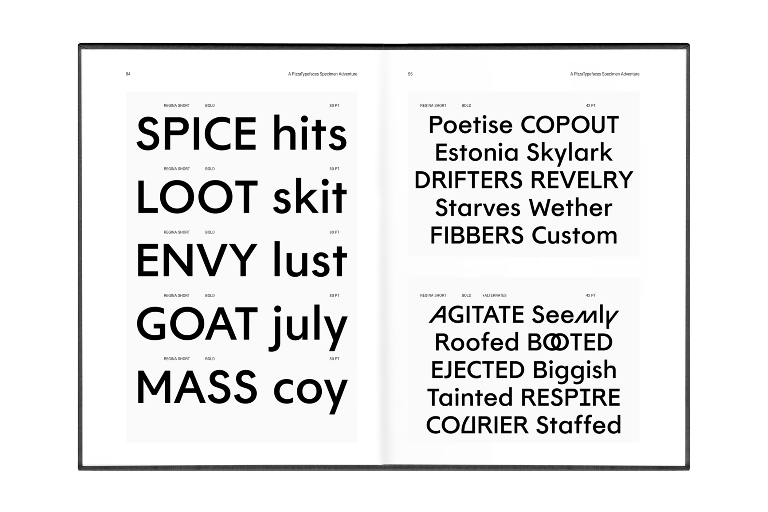
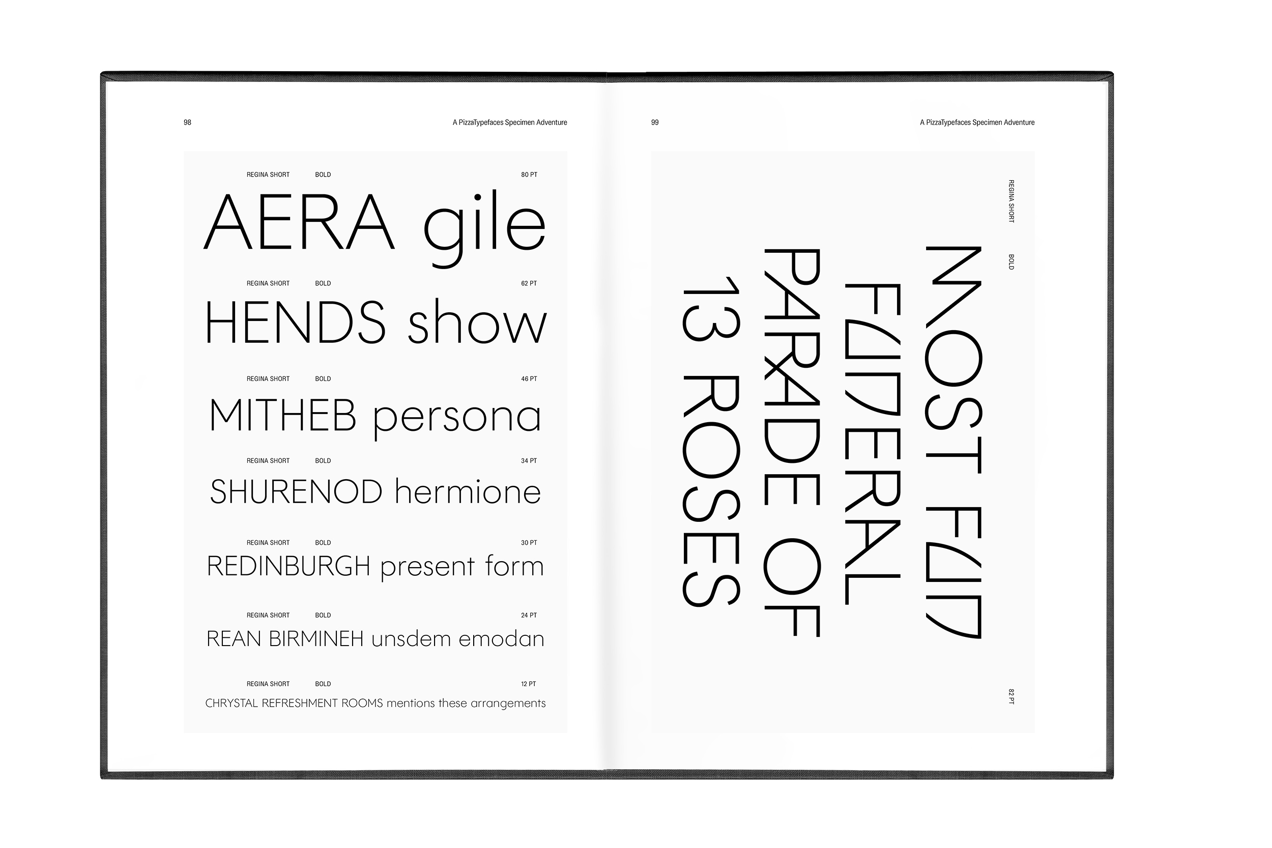
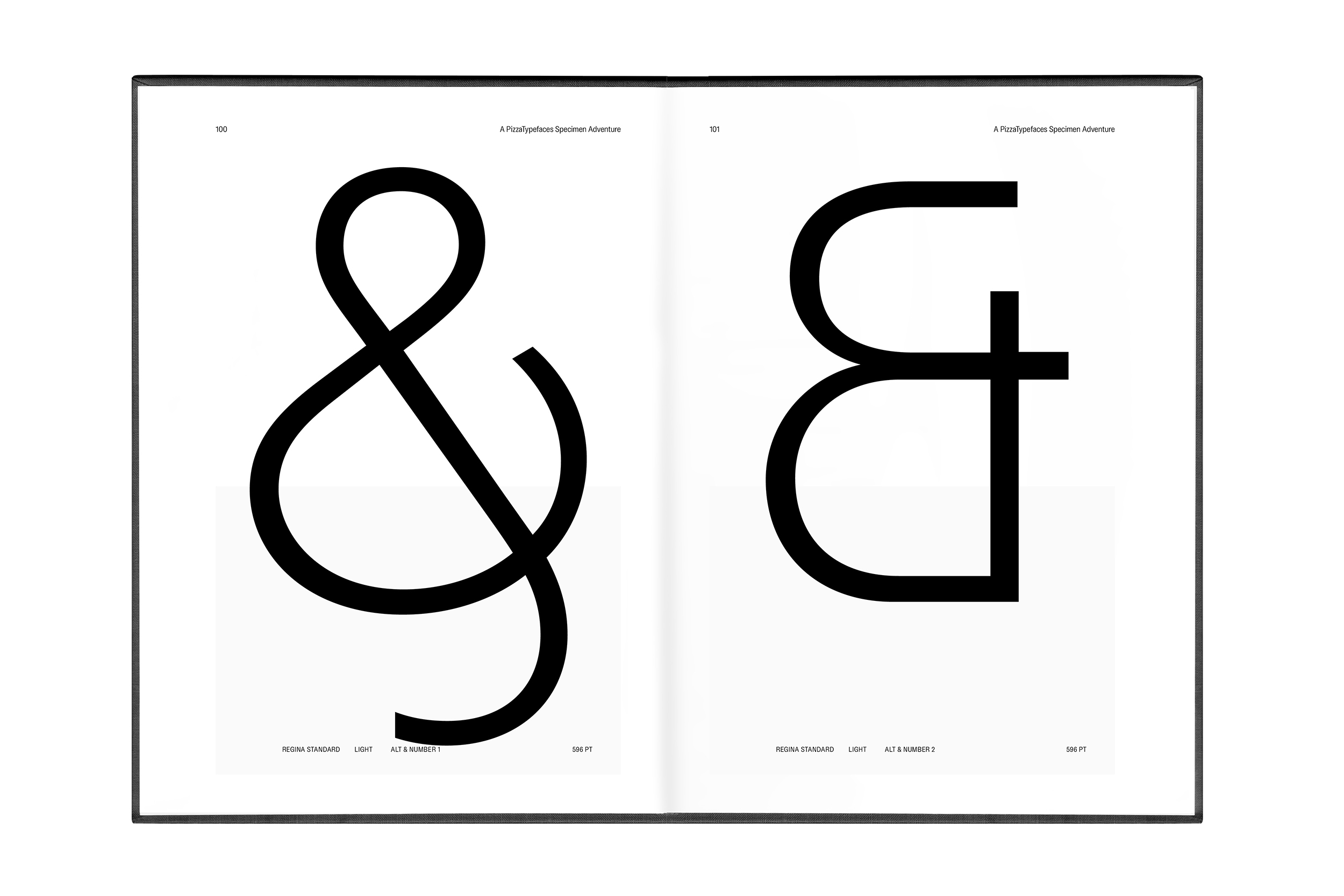
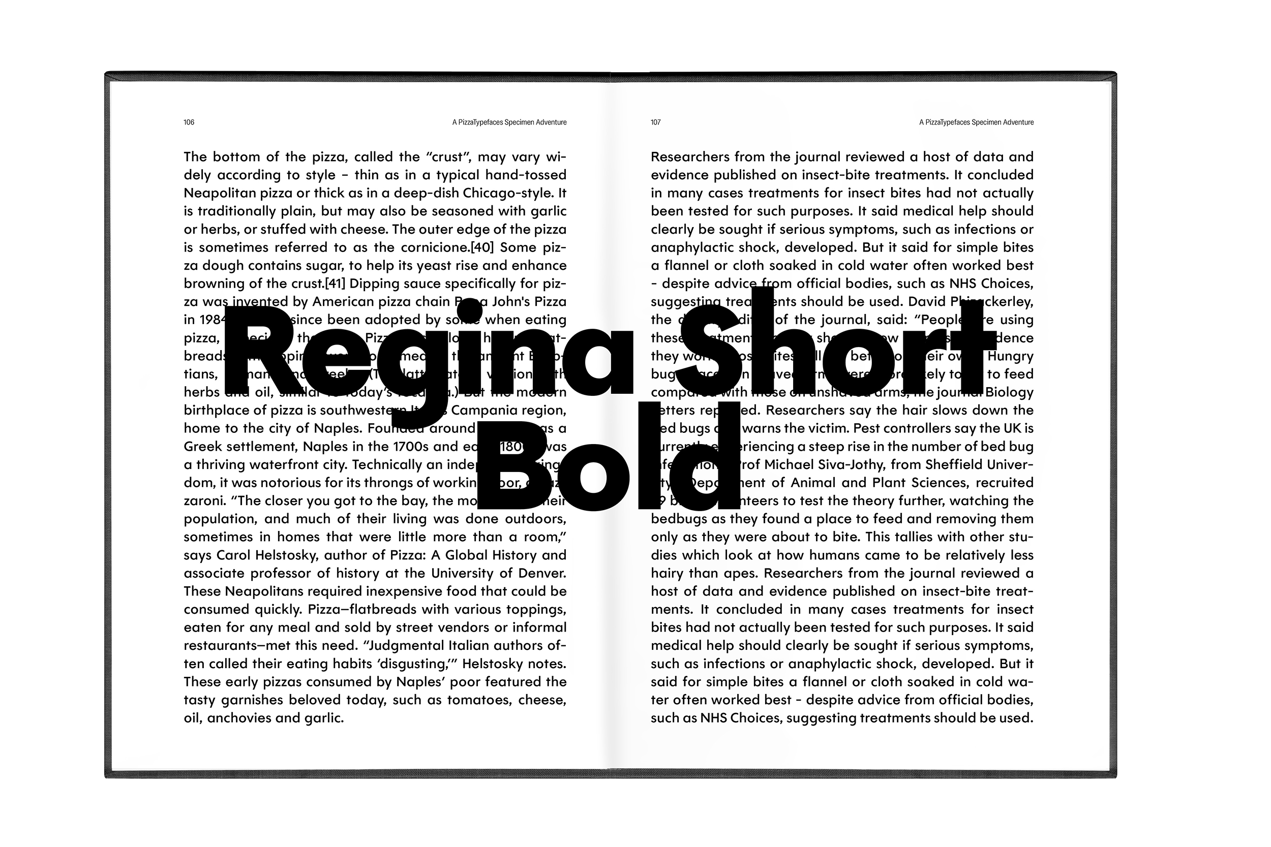
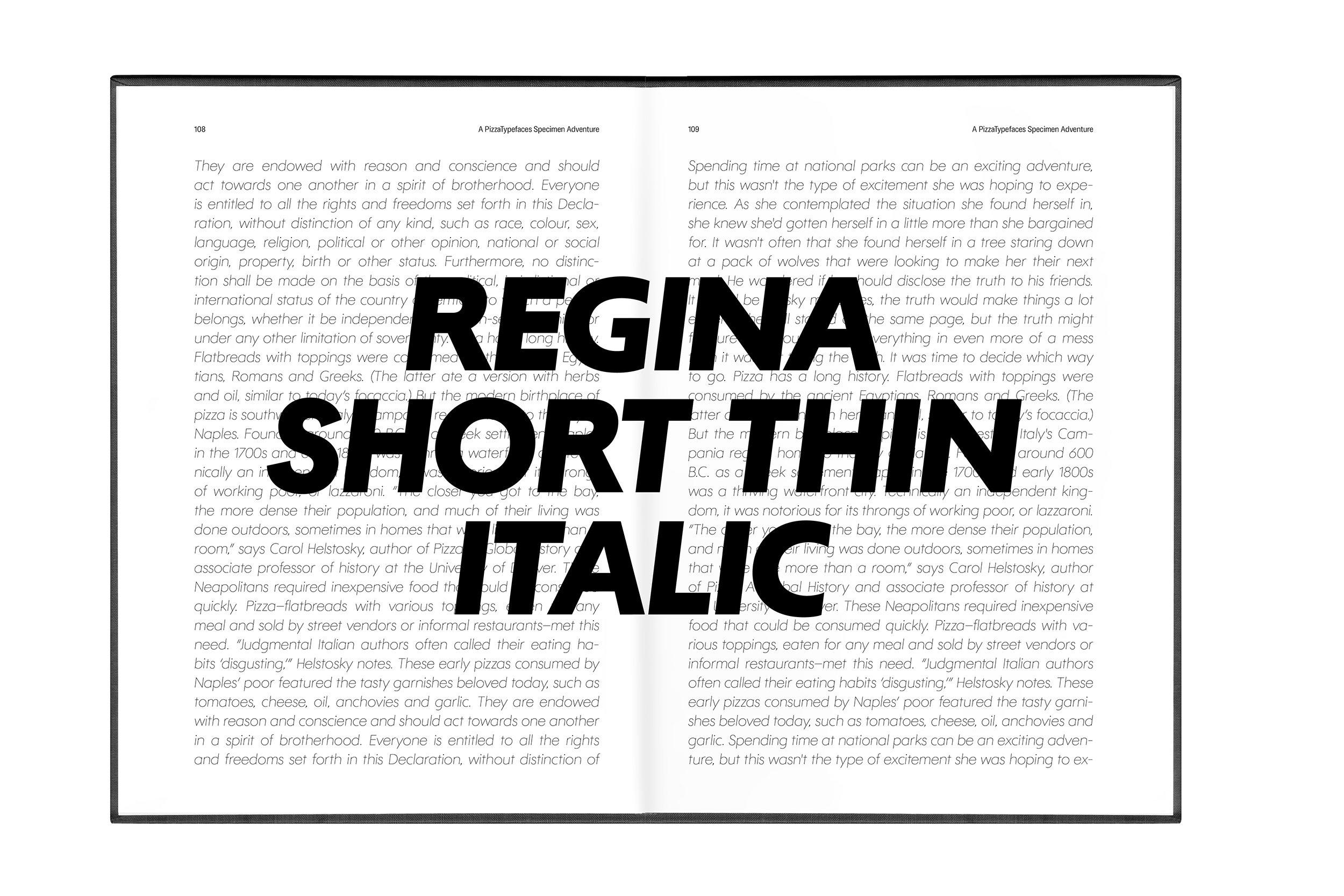
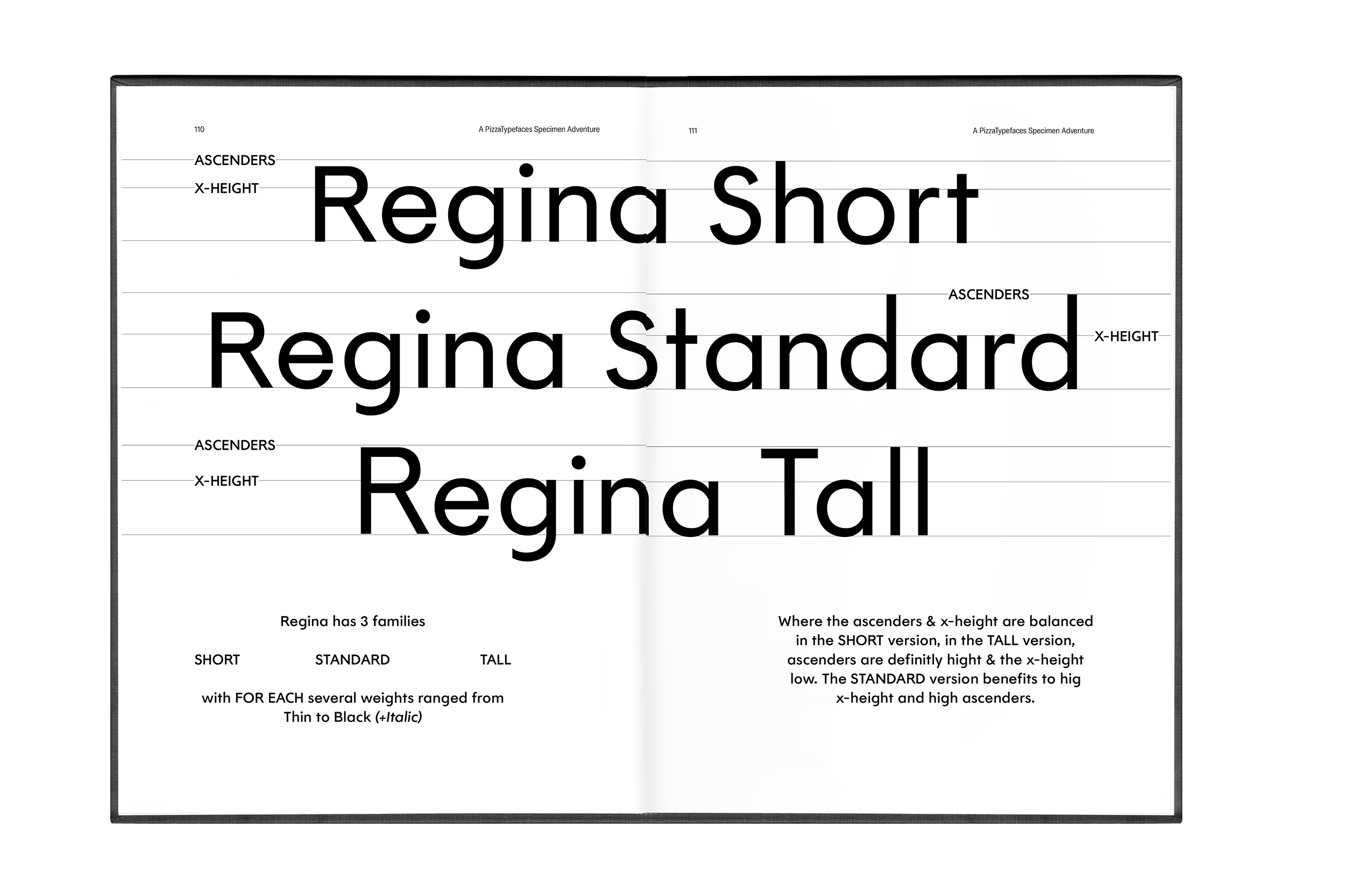
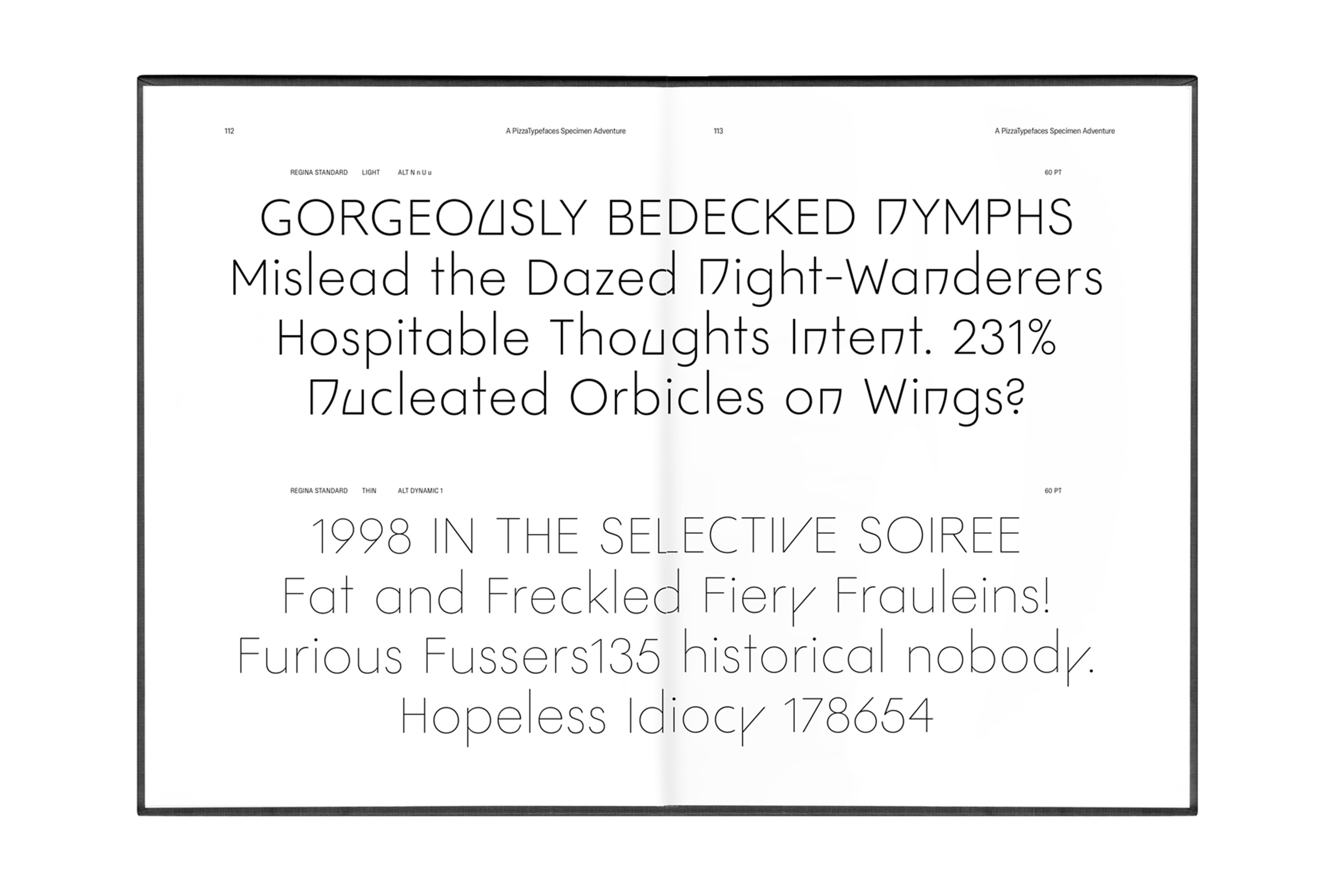
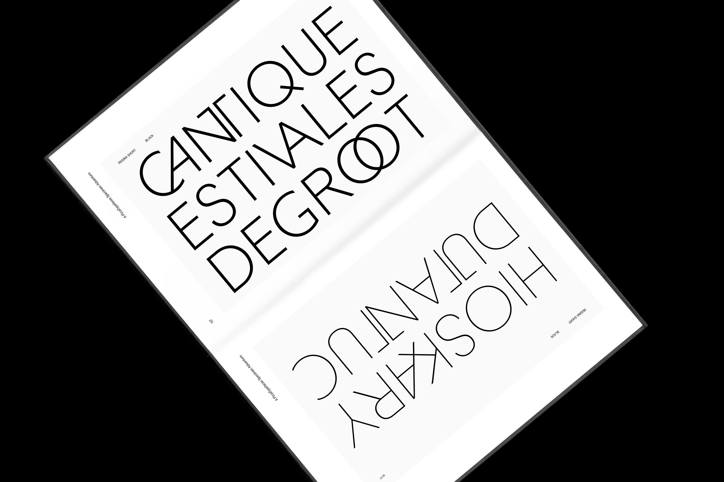
Regina
Regina Typeface is a kind of Futura but, as if the Gothic Avant-Garde had interfered. It offers more than a geometric style font with the Uppercase ligatures and specifics letters form design give it a high elegance.
Regina offers three families: the Short one with balanced x-height and Ascenders height. The Standard with an high x-height and high Ascenders. And the Tall for Futura lovers with a low x-height and high ascenders & uppercases.
- Regina Standard
- Thin
- Unincorporated
- Regina Standard
- Light
- Set 1, Set 3
- HOMEOPATHIC
- Regina Tall
- Regular
- Enthusiastically
- Regina Tall
- Black
- Middleweights
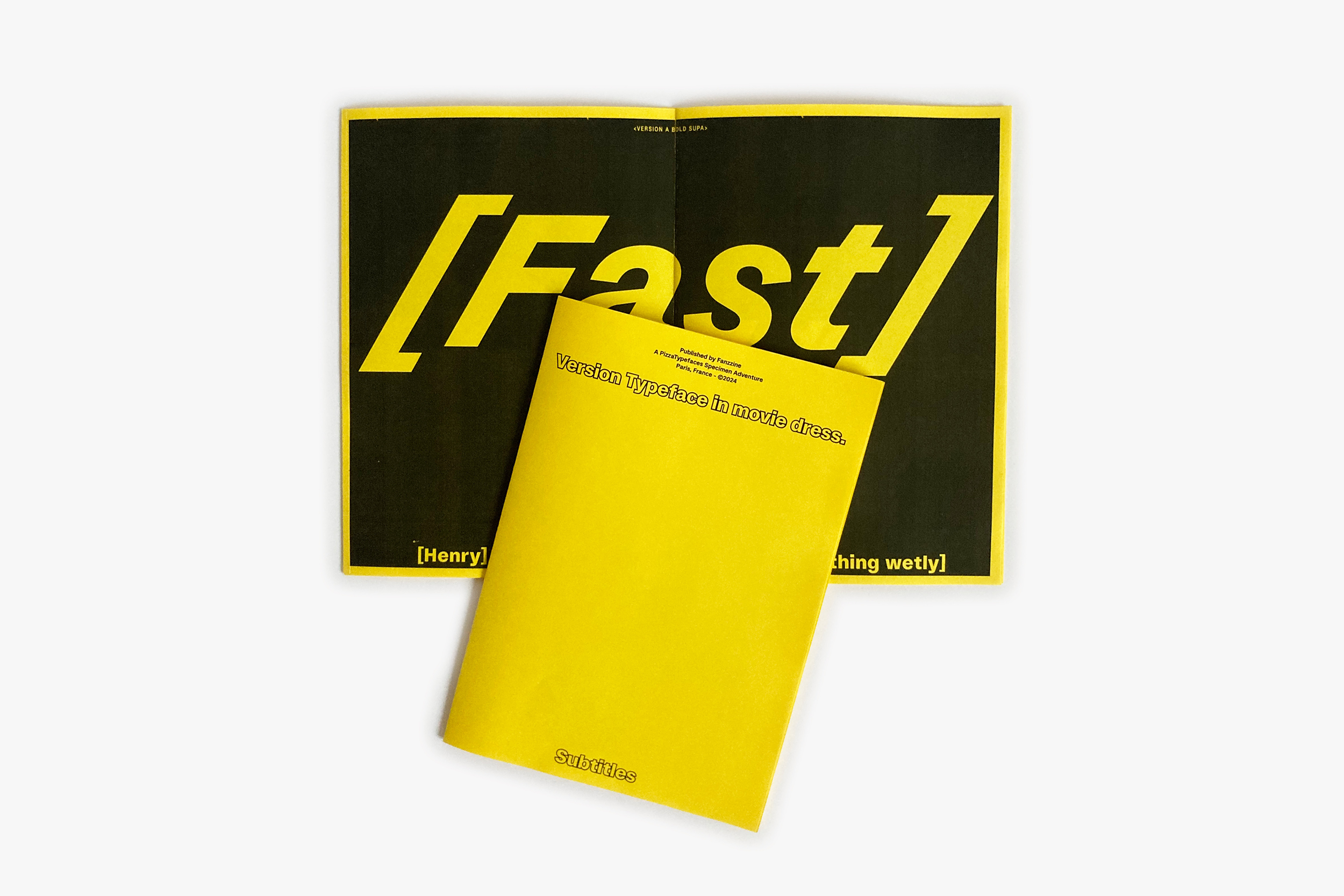
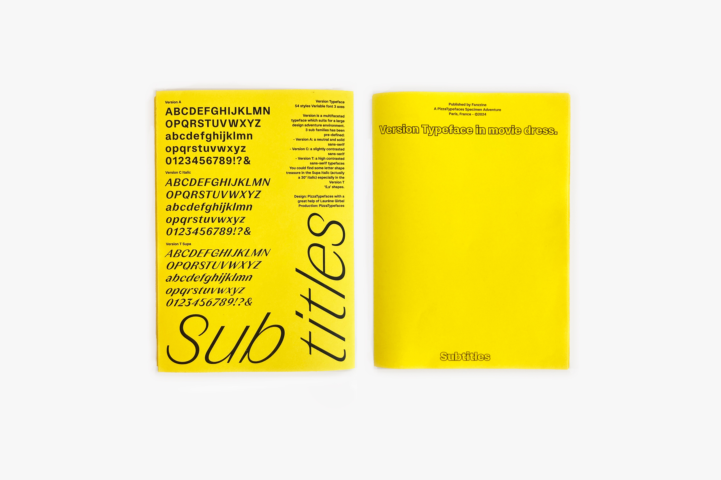
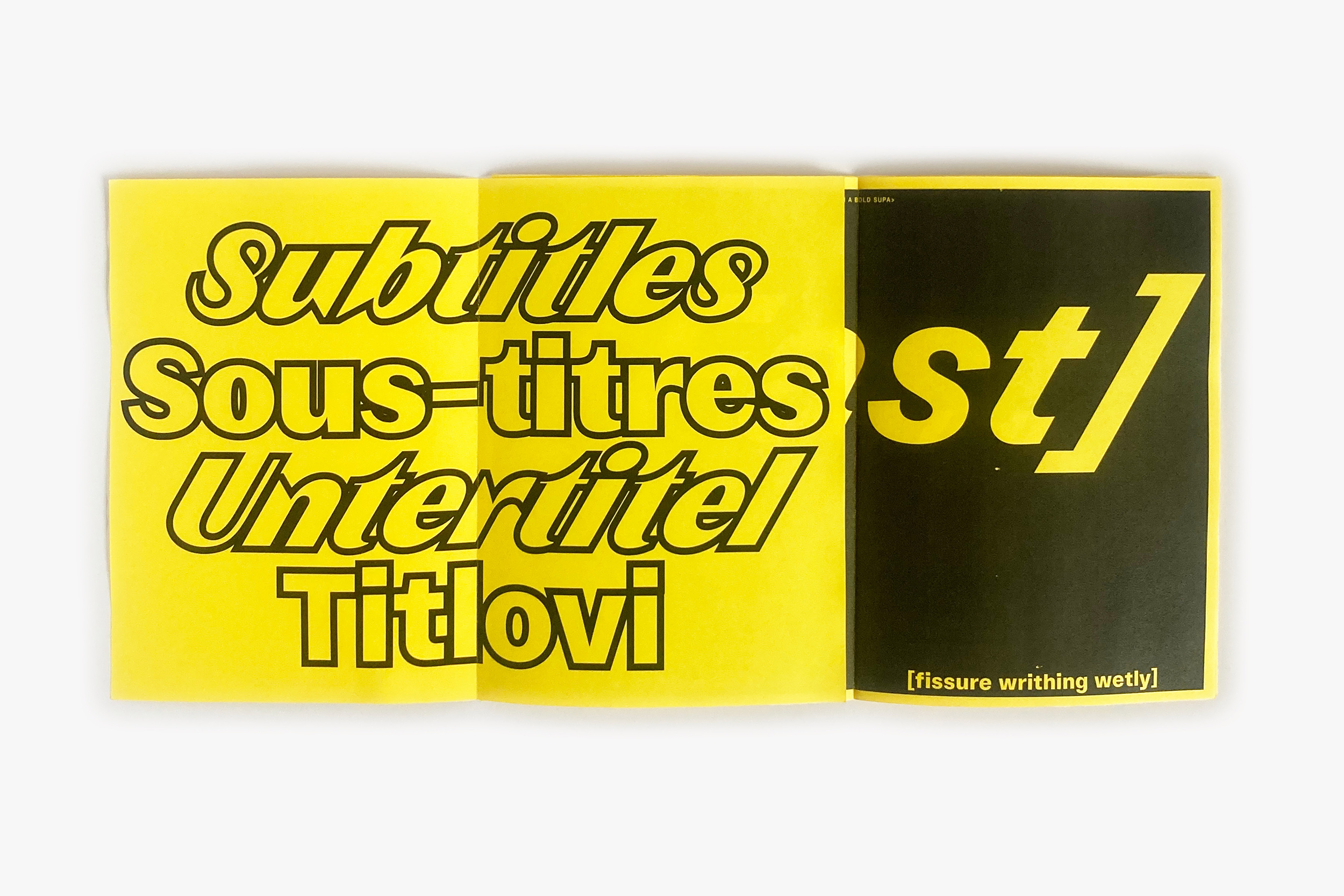
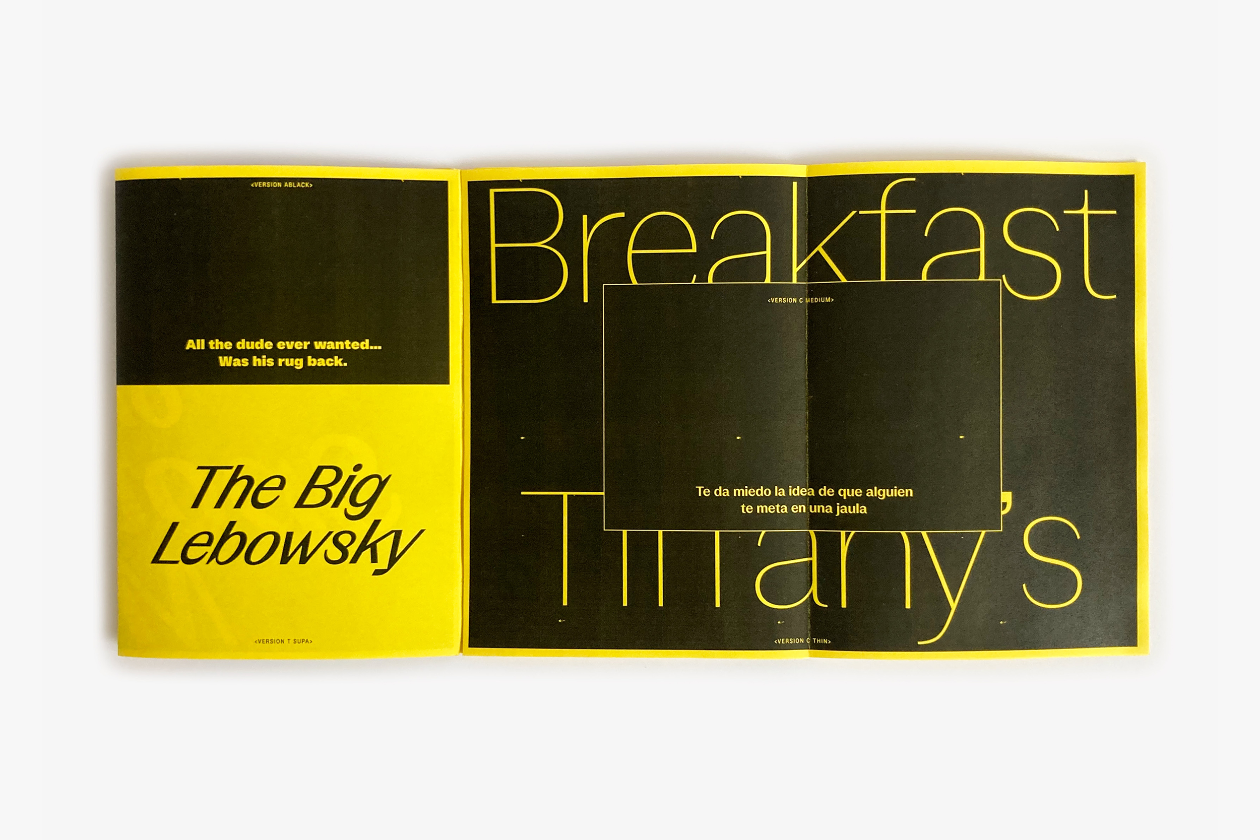
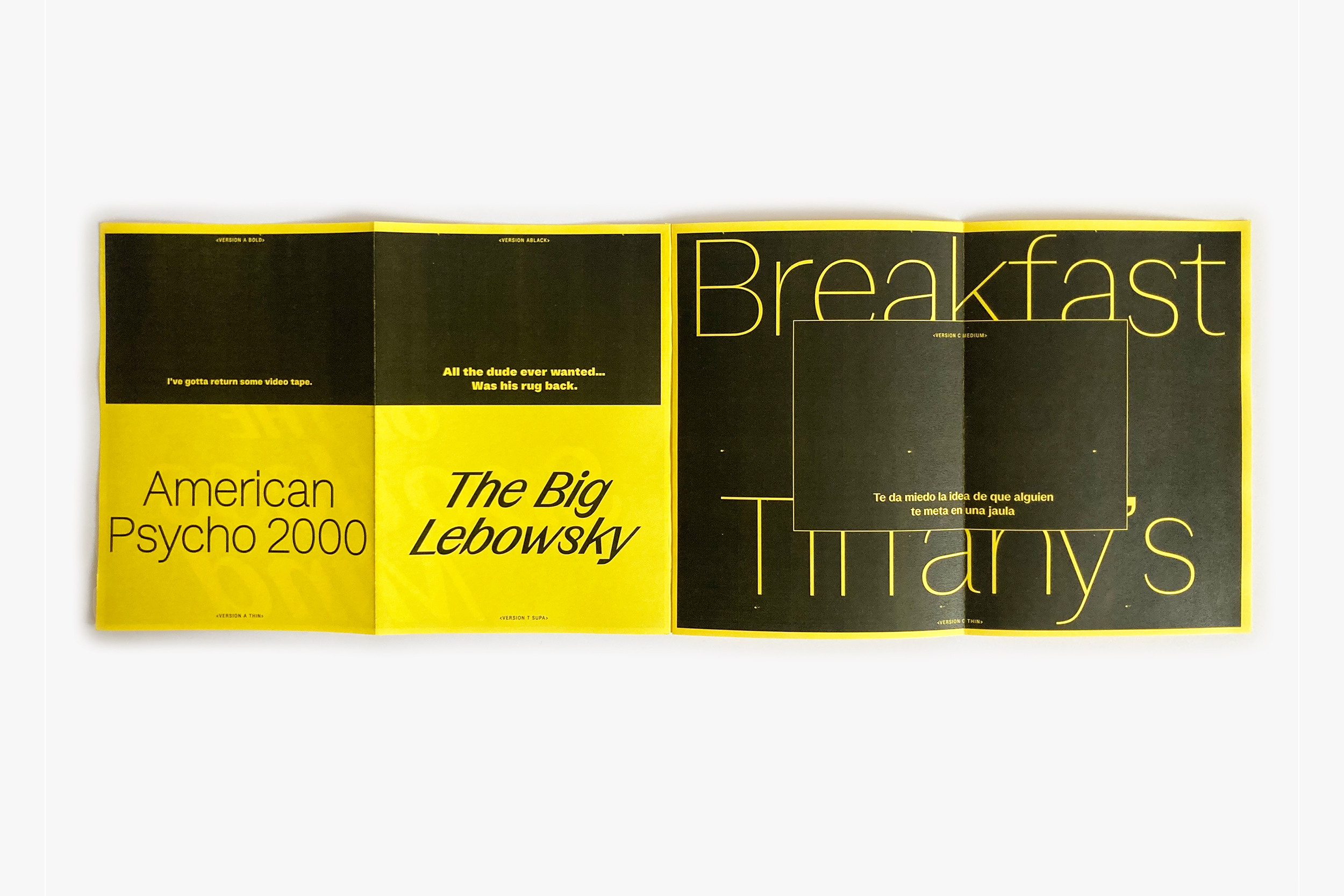
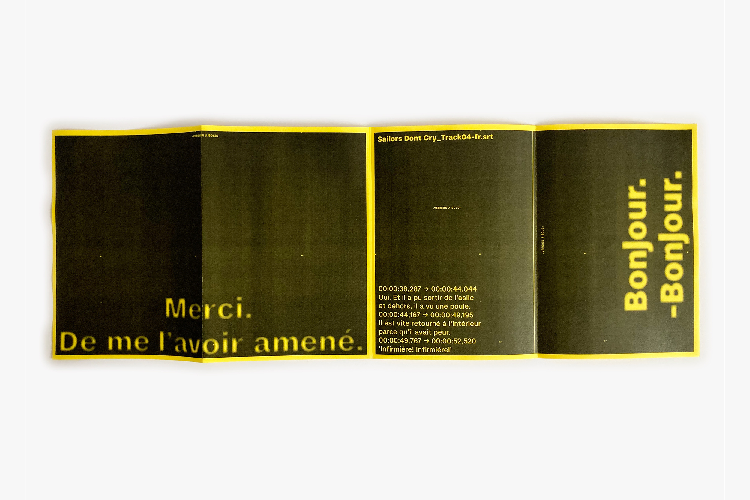
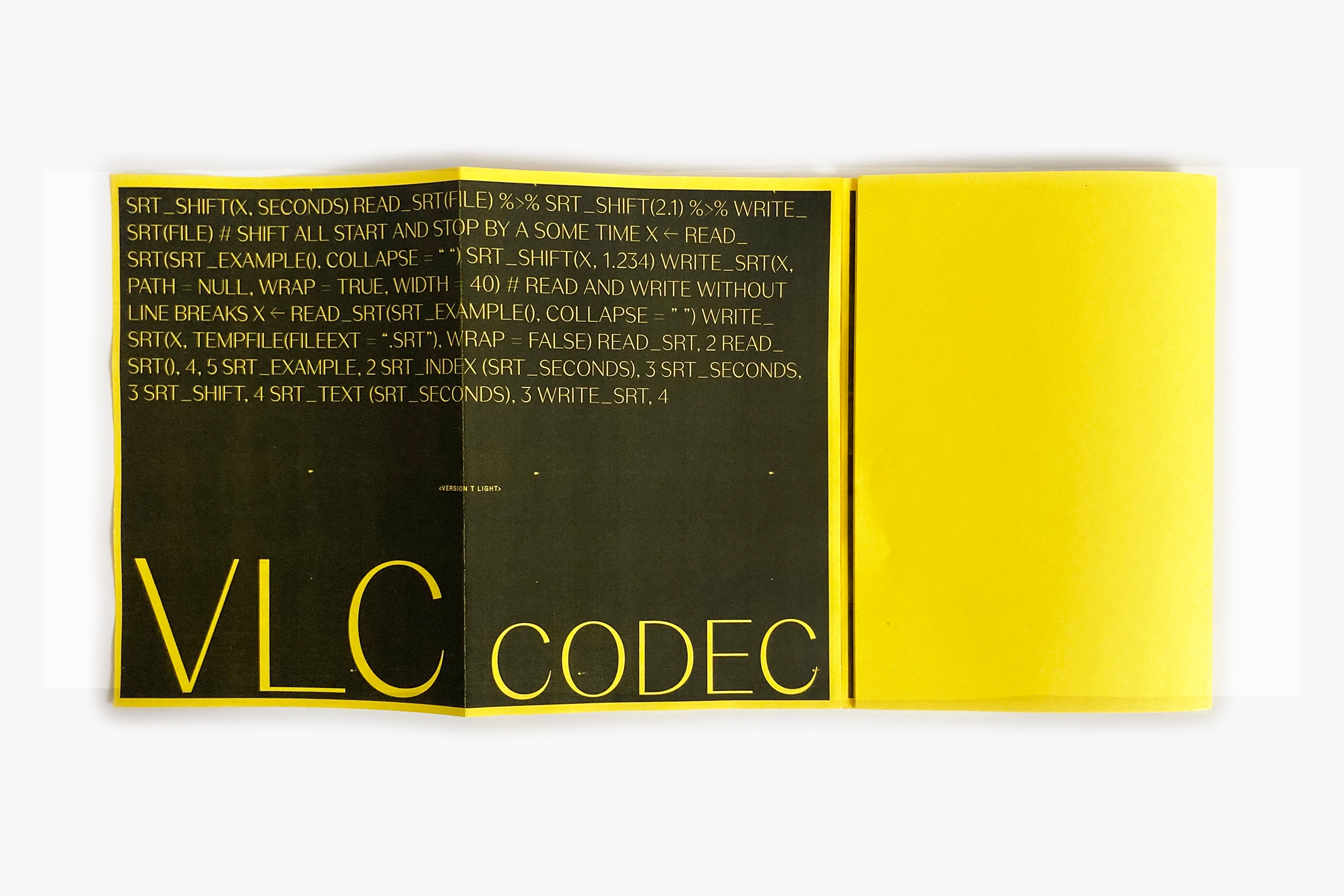
Version
Version is a multifaceted 🪩 typeface which suits for a large design adventure environment.
Threee families works in contrast differences from a neutral and solid sans-serif (A) to a high contrasted sans-serif typefaces (C) with a middle one, a slightly contrasted sans-serif (C). You could find some letter shape treasure in the Supa italic (actually a 30° italic) especially in the Version T 'S, s' shapes.
- Version A
- Thin
- Unreconstructed
- Version A
- Regular
- Relinquishments
- Version A
- Bold
- Teleprocessing
- Version C
- Thin
- Augusta Stuffing
- Version C
- Regular
- Authoritarianism
- Version C
- Medium Supa
- Pamphleteering
- Version T
- Black
- Sentimentality
- Version T
- Black Italic
- Optimistically
- Version T
- Black Supa
- Reminiscently
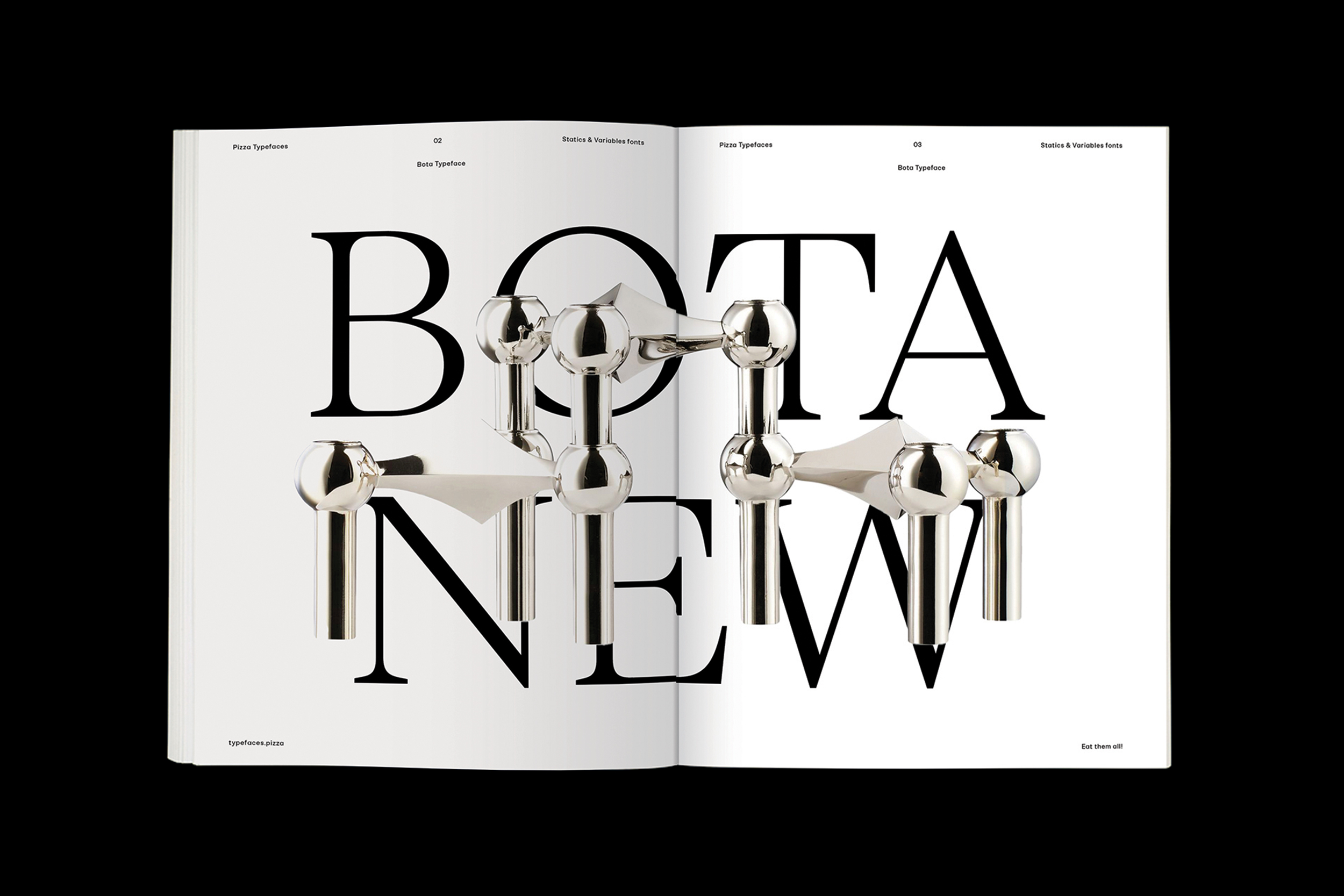
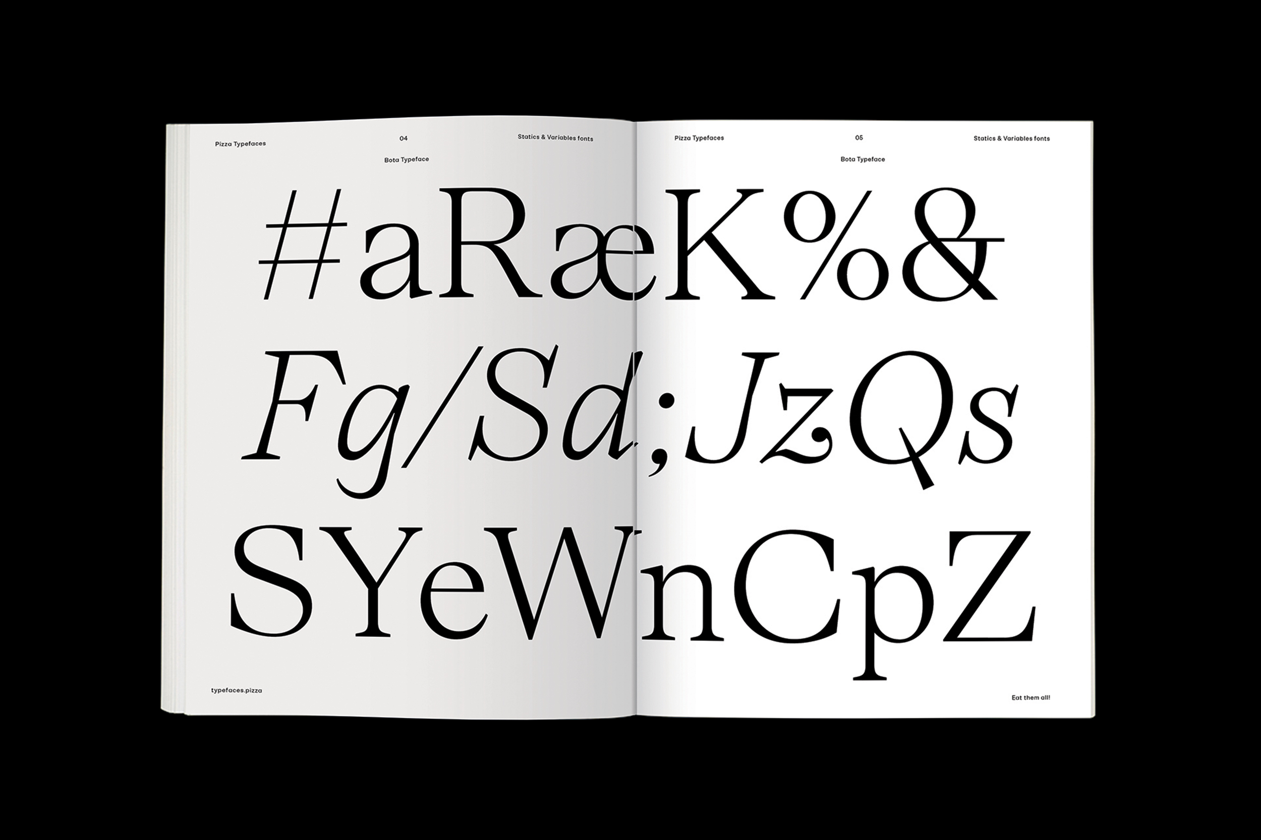
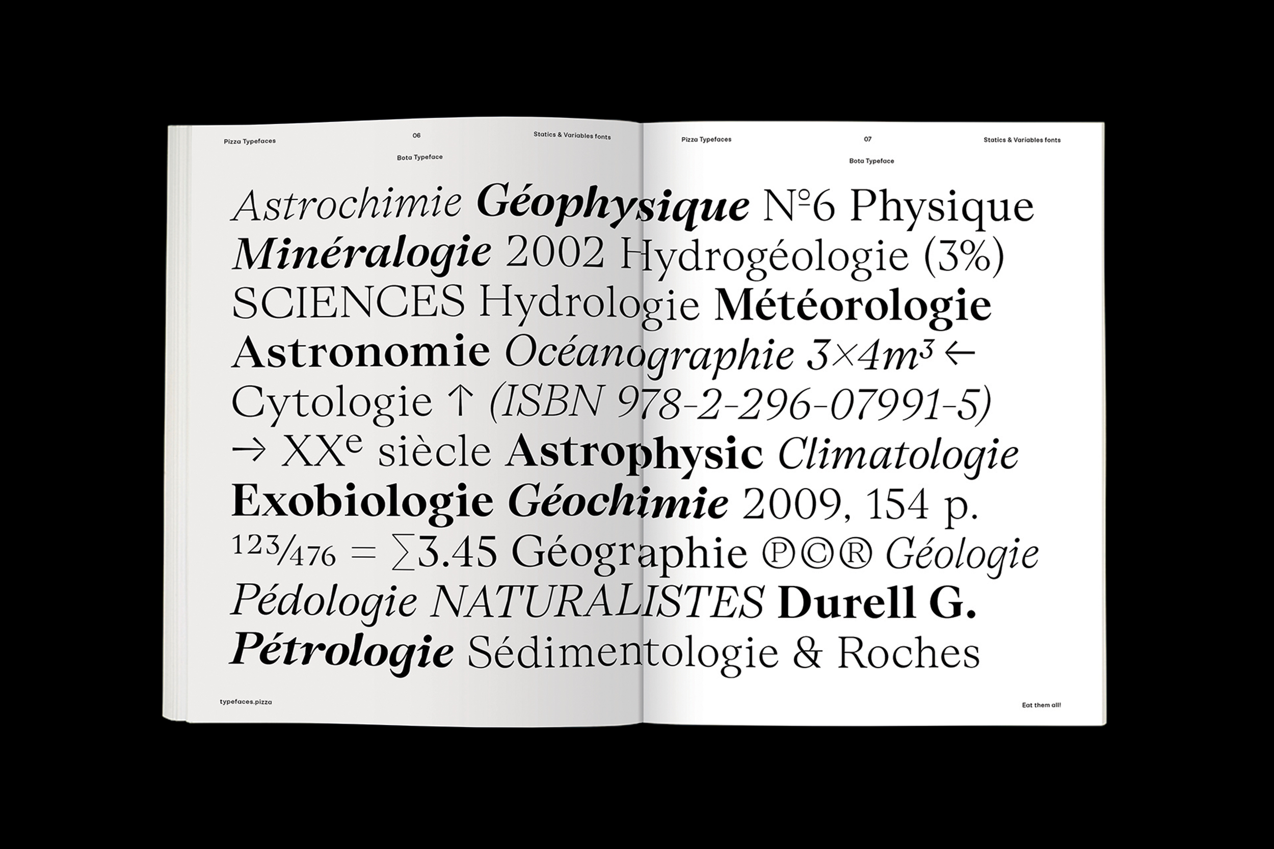
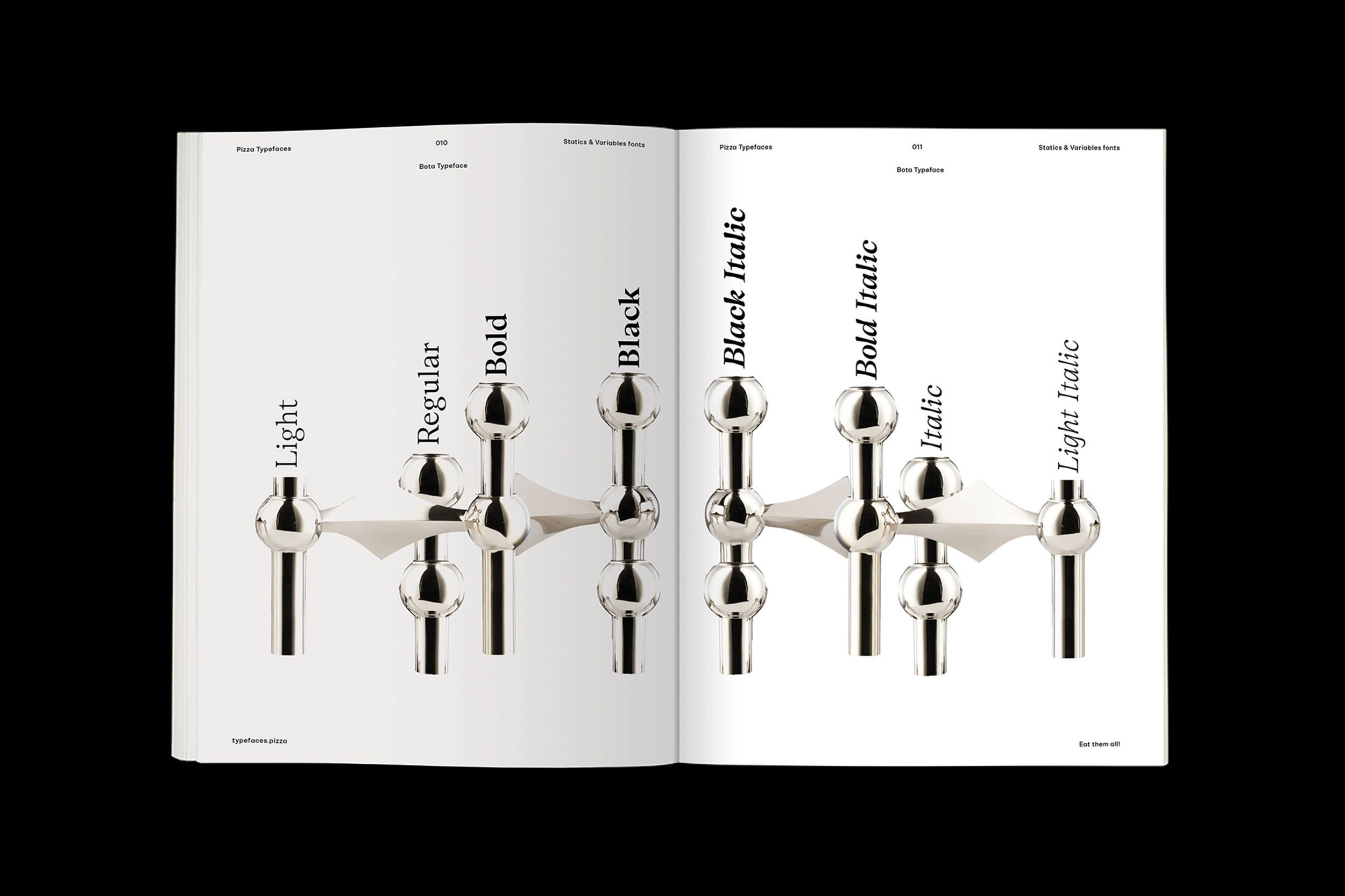
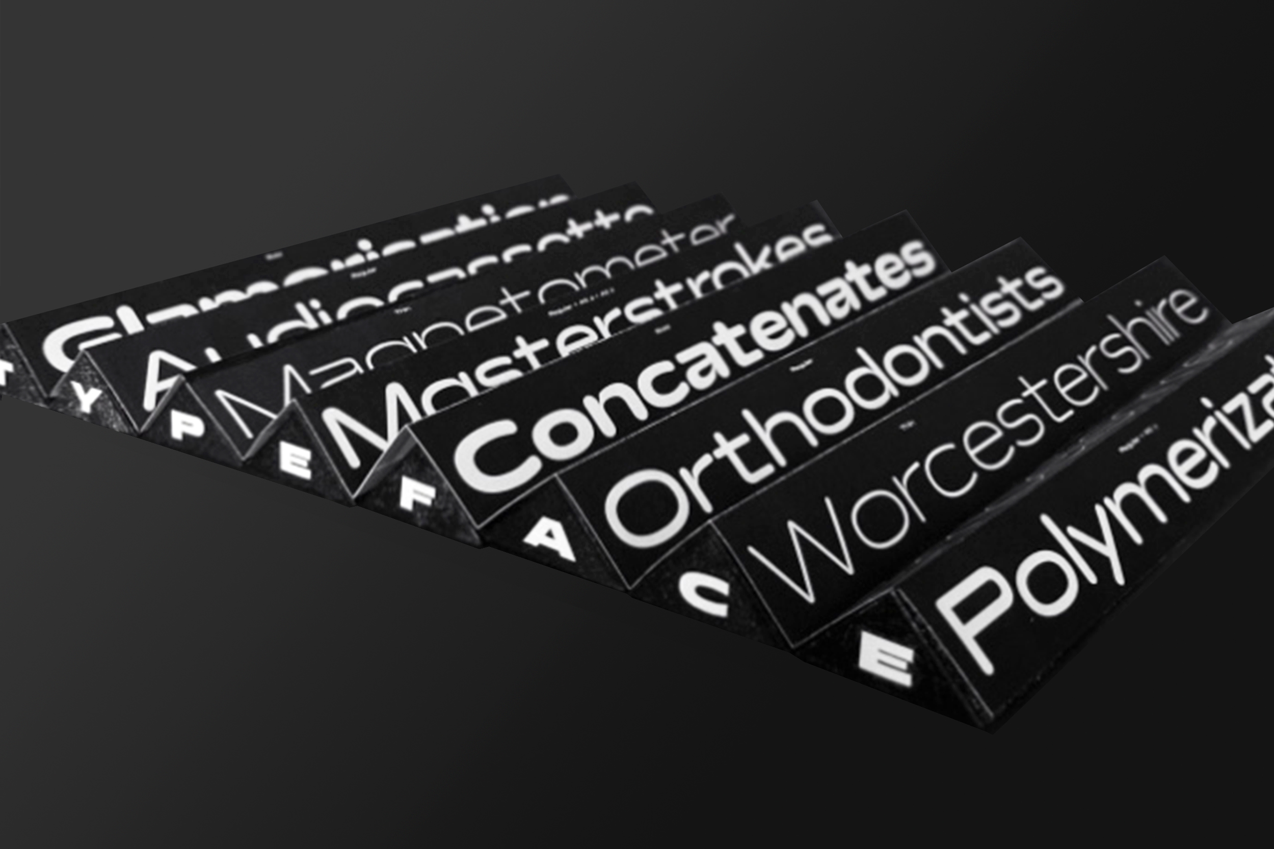
Bota
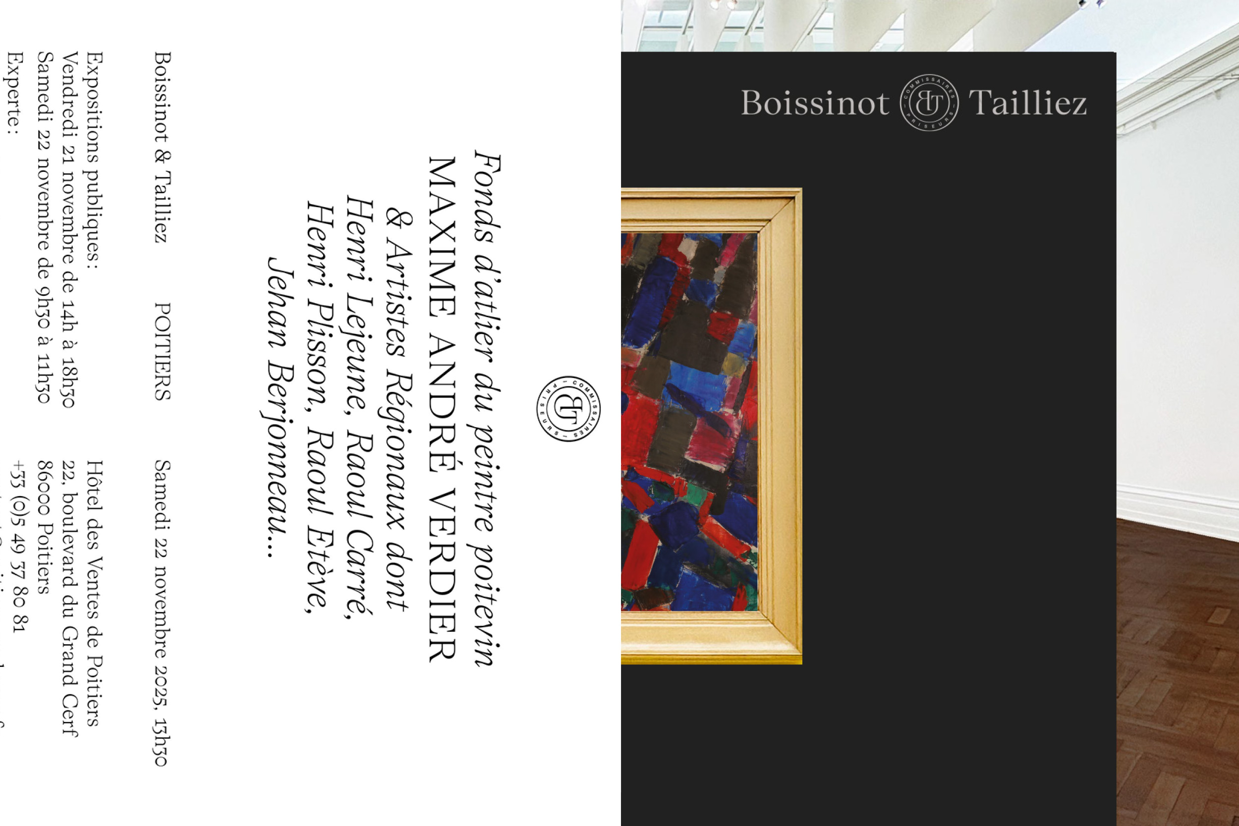
Bota typeface is a sharp serif genre. With its balanced uppercase widths from Roman capitals and calligraphic features, you can use it to stand out in upright style for an elegant look while italics are already dancing across the floor of the layout. It was originally designed for the Boissinot & Tailliez brand identity and has now expanded into a full font family. Becareful, the switch between upright and italic is brutal.
- Bota
- Thin
- Counterparties
- Bota
- Thin Italic
- Rationalisations
- Bota
- Light
- Galvanometers
- Bota
- Light Italic
- Imperceptibility
- Bota
- Regular
- Temporization
- Bota
- Italic
- Documentation
- Bota
- Bold
- Chronographs
- Bota
- Bold Italic
- Marginalising
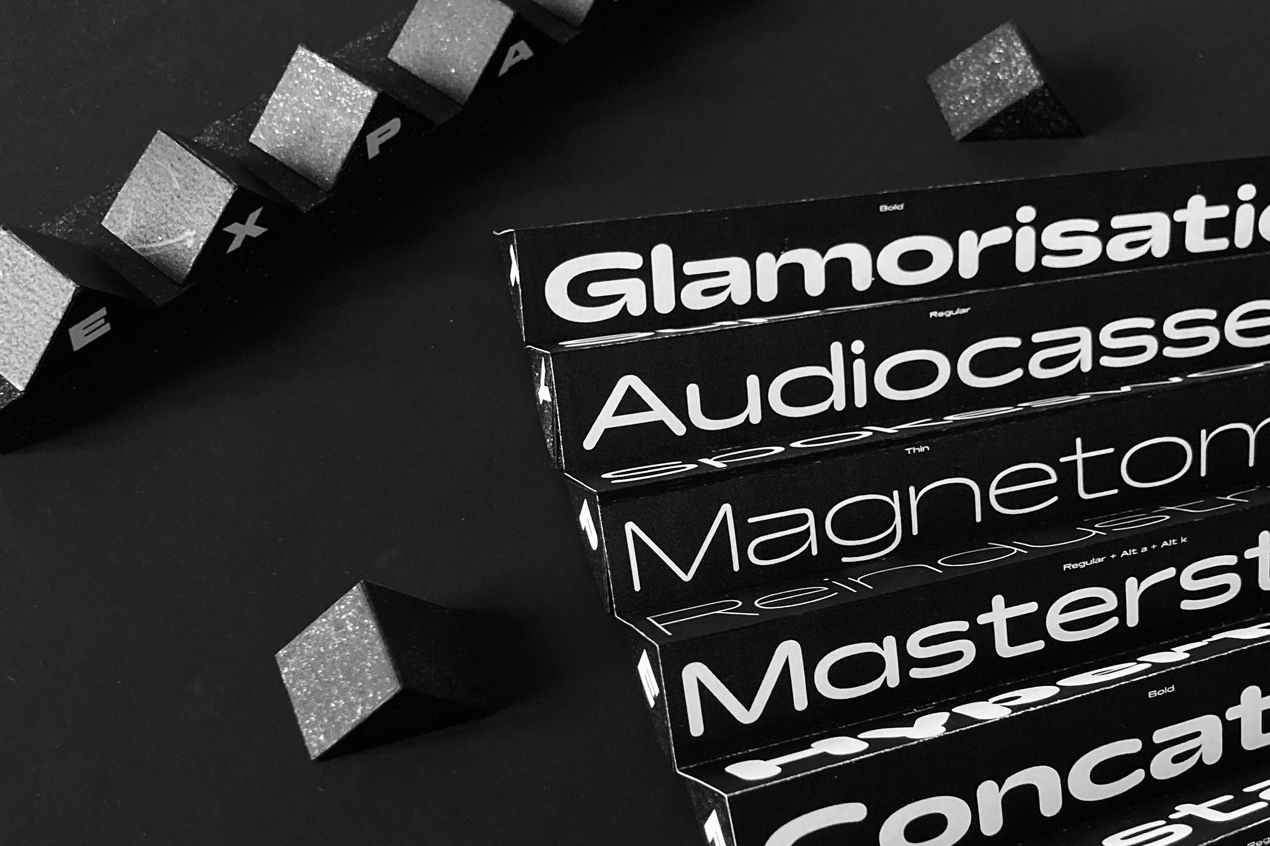
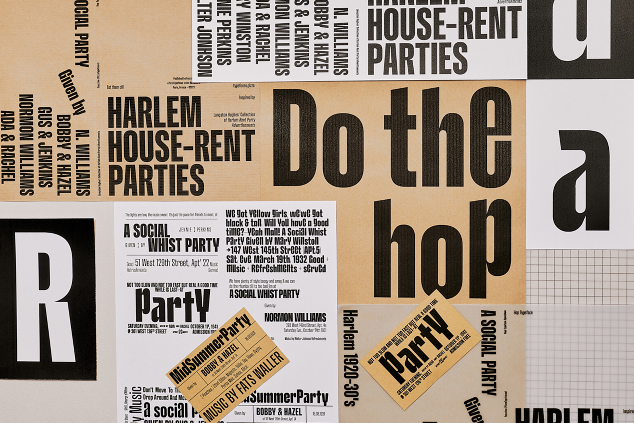
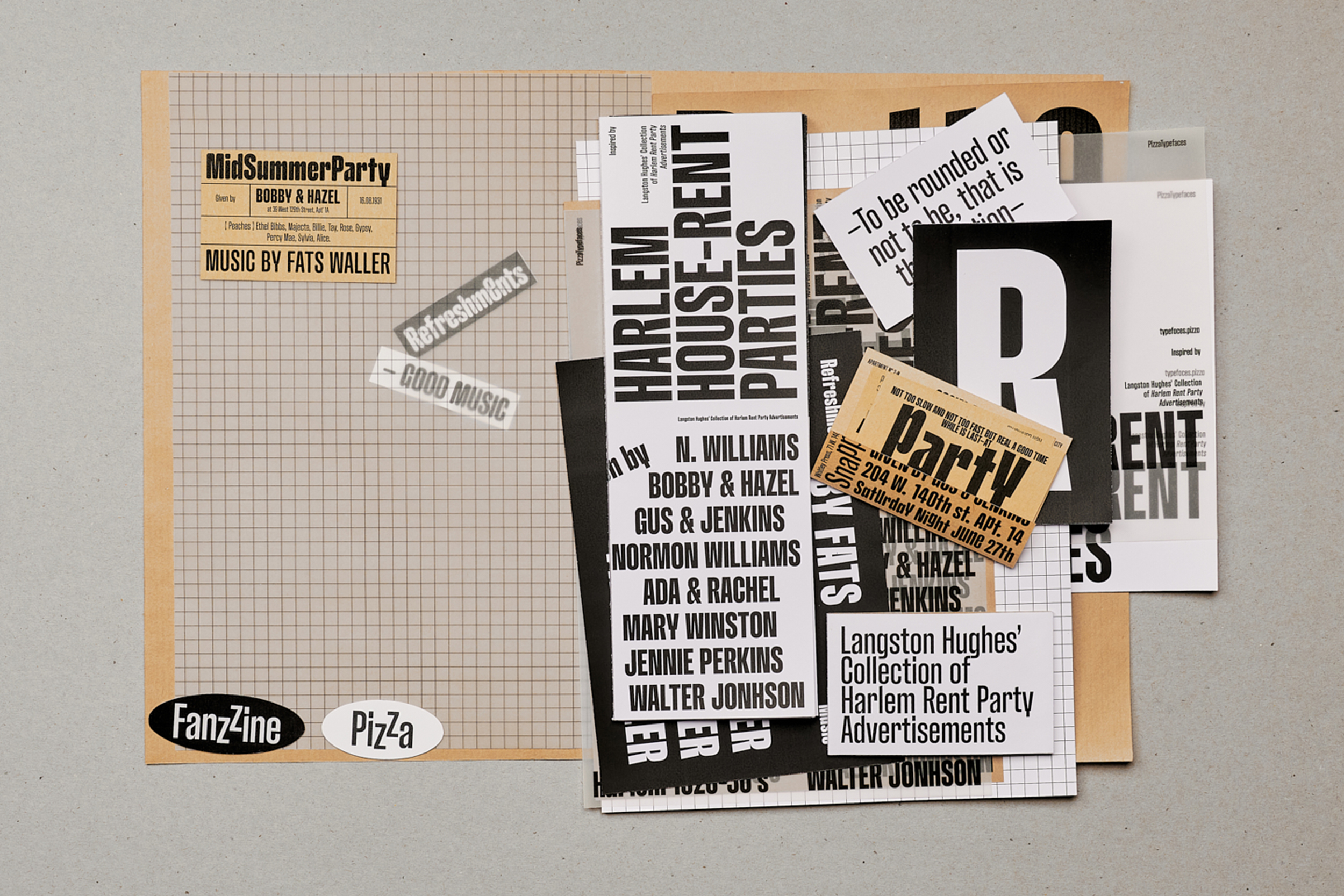
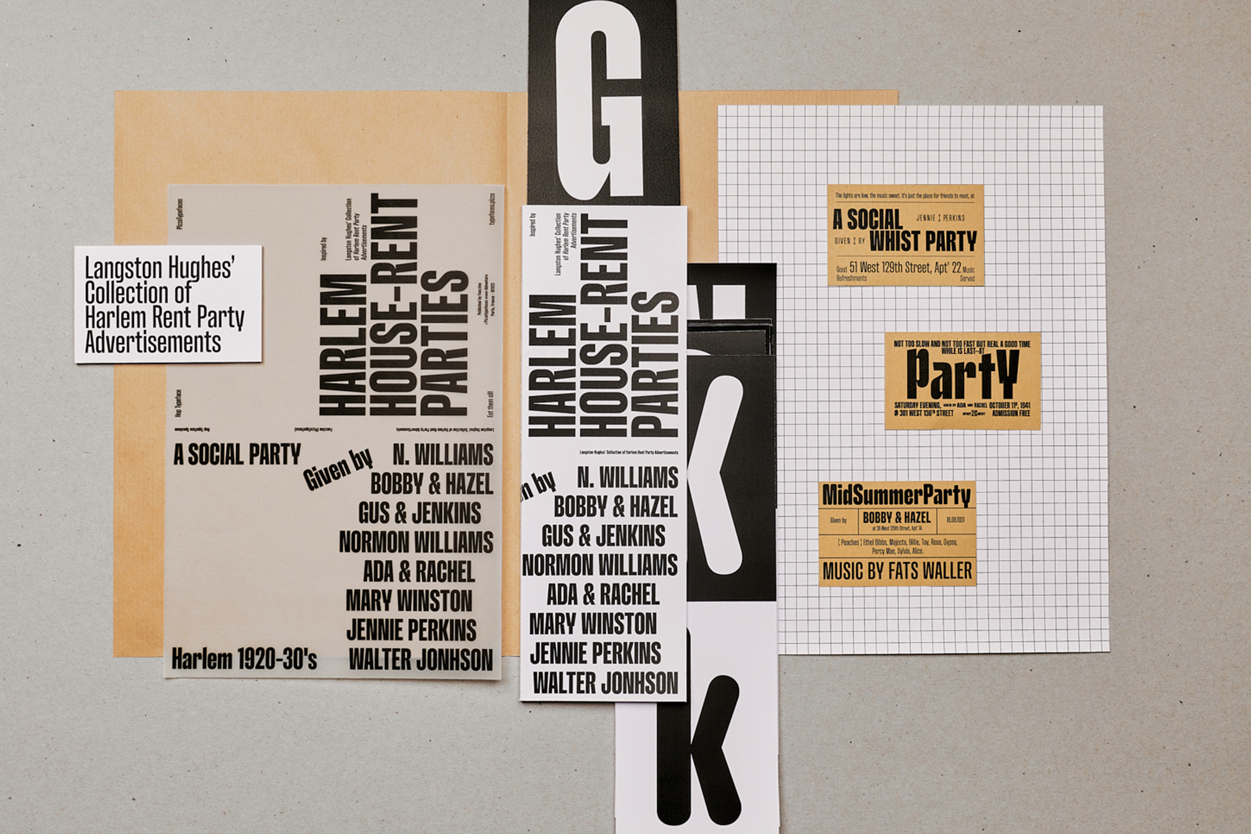
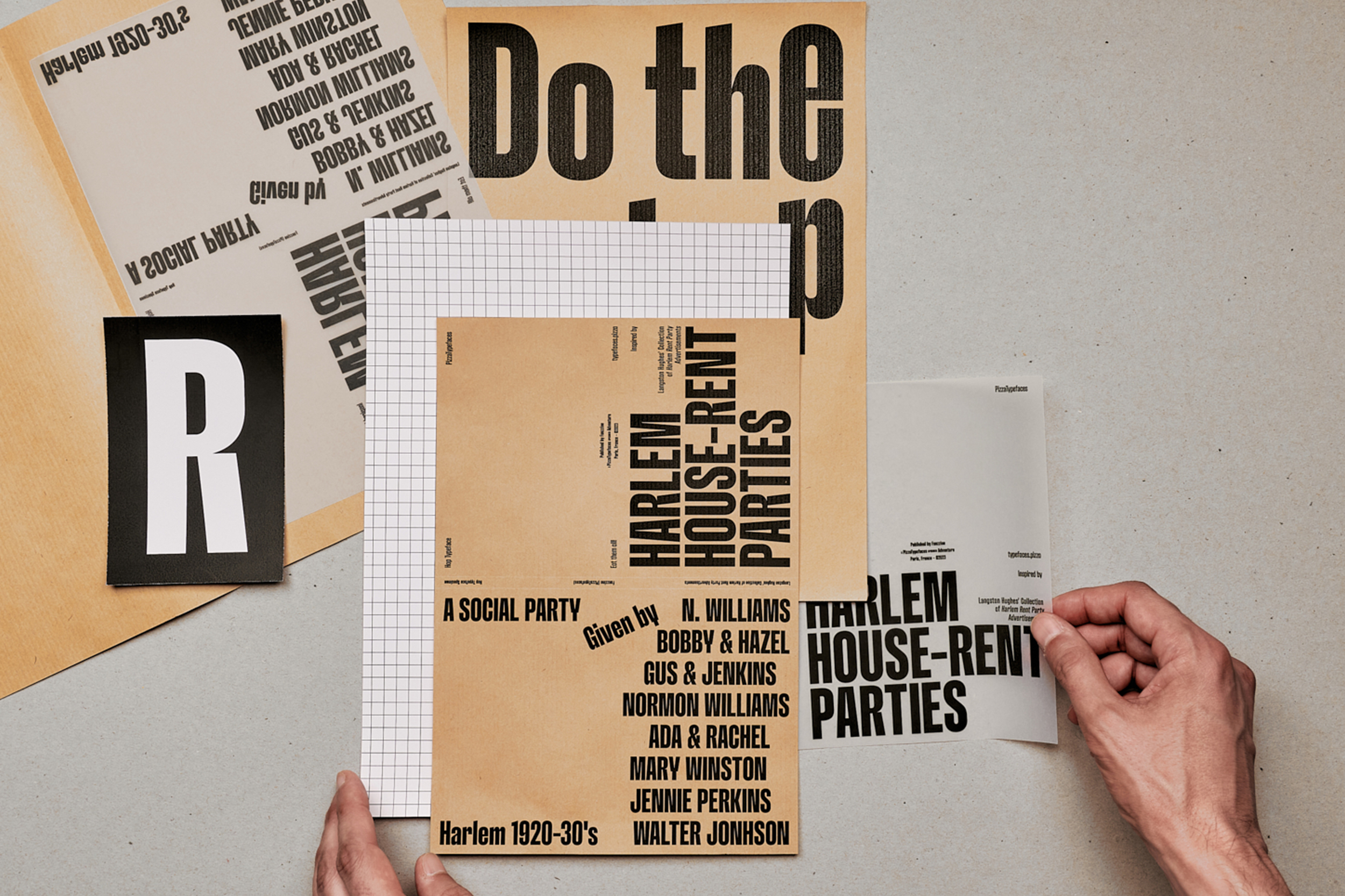
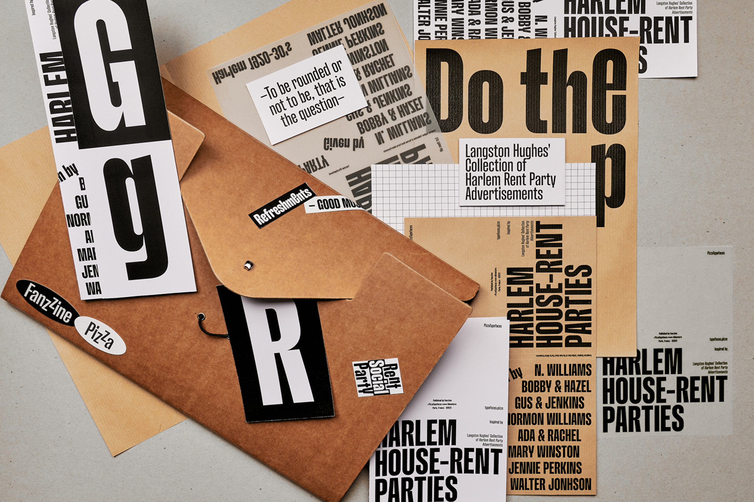
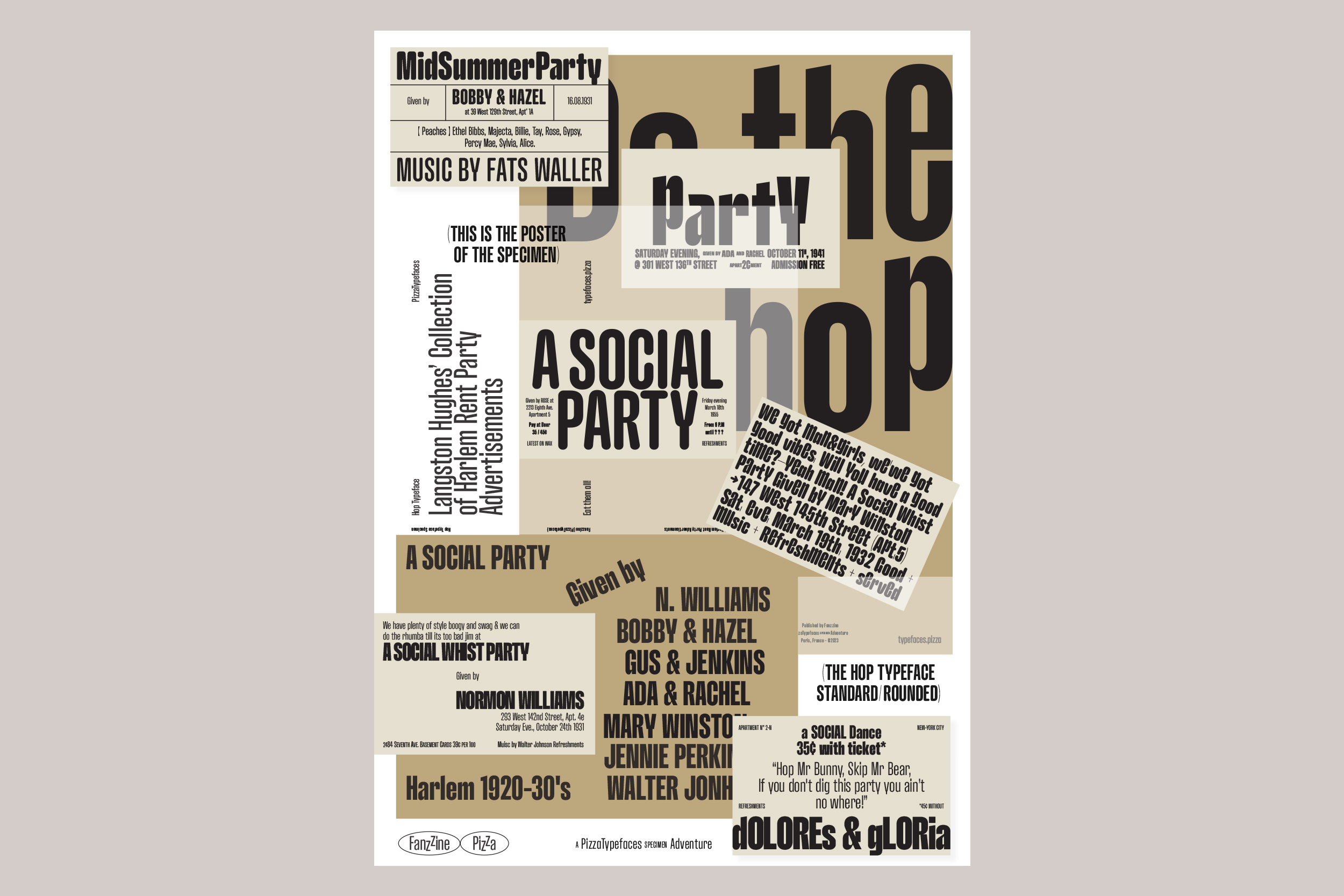
Hop
The Hop typeface is splitted into two extrems widths. Compressed and Expanded. The main features here also resides in a calligraphic approach in the connection between the stems and the bowls, offering a wide range of weights, switch to a rounded companion in all styles + alternates Up lowercase. Hop includes four families: Hop Compressed Normal, Hop Compressed Rounded, Hop Expanded Normal, Hop Expanded Rounded. The Rounded version for smooth and soft sensations.
- Hop Compressed Normal
- Light
- Savaged Chosen Unbeatable
- Hop Compressed Normal
- Medium
- Spite Skylarks Criminating
- Hop Expanded Rounded
- Bold
- FRANCS
- Hop Compressed Rounded
- Medium
- Set 4
- Role Yipping Appropriators
- Hop Compressed Normal
- Ultra
- Humanity Inapplicability
- Hop Compressed Rounded
- Ultra
- LIQUIDISERS OBJECTIFIES
- Hop Expanded Normal
- Regular
- Loca 123
- Hop Expanded Normal
- Bold
- Kennedy
- Hop Expanded Rounded
- Black
- Refocus
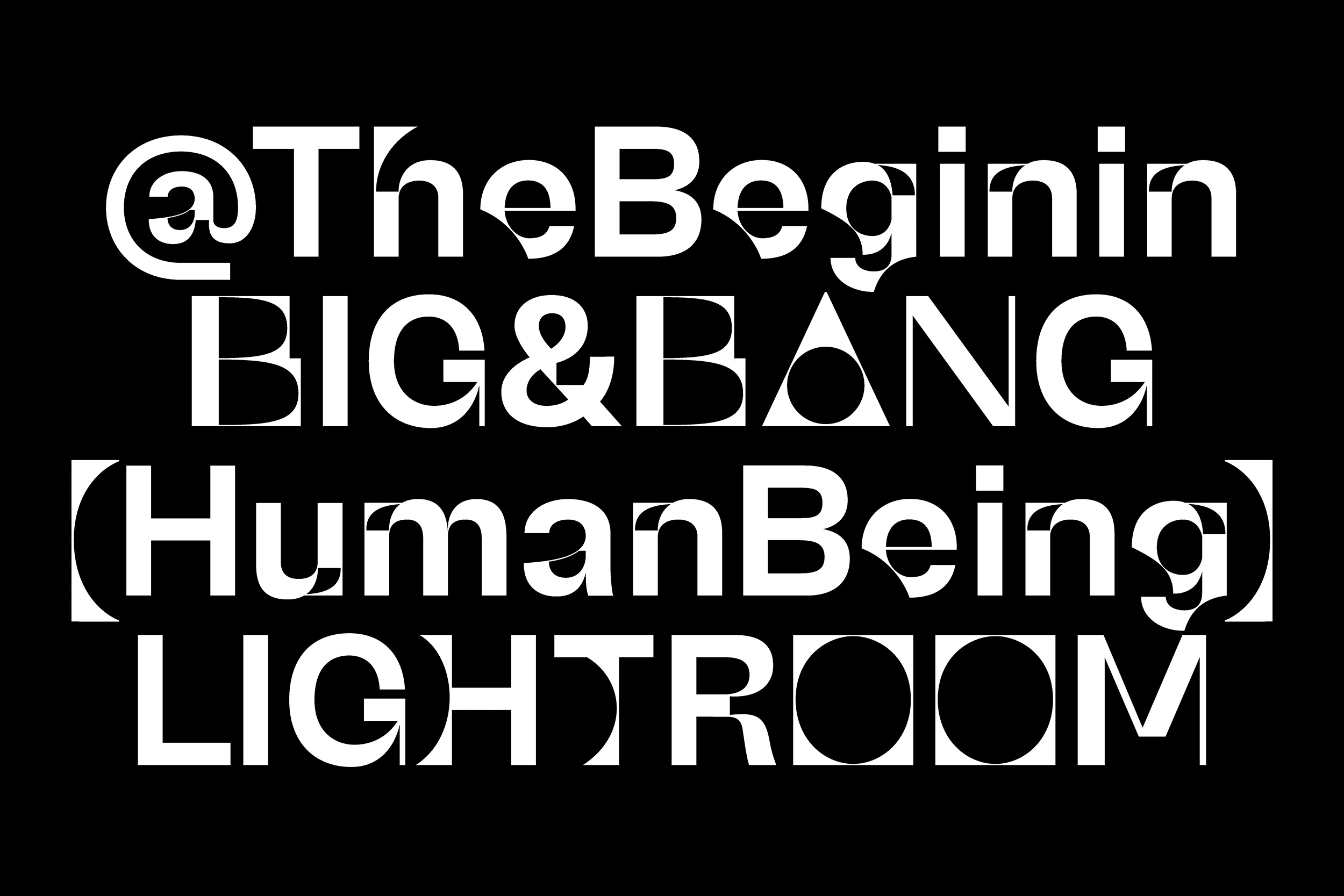
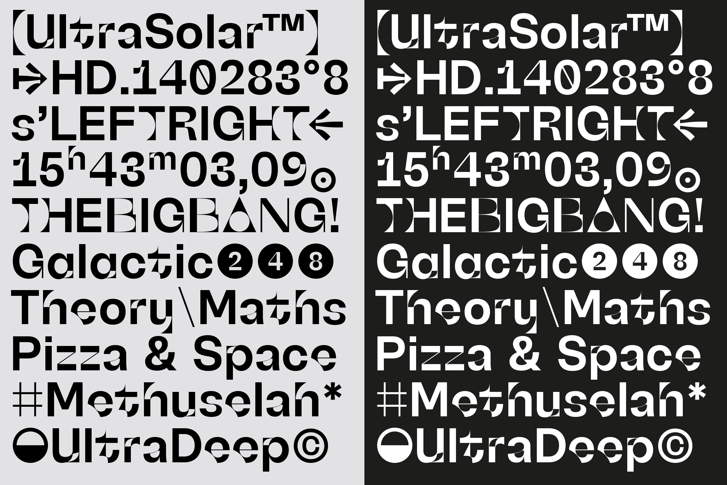
UltraSolar
UltraSolar is in orbit, a new exploration based on the Wasa typeface and inspired by the oldest star, Methuselah. UltraSolar features new-era letterforms, a new take on inktraps, weird details, multiple stylistic sets, and a set of DingBats. Even so far from the end of our galaxy, UltraSolar, and by miracle, is still readable in small size. Better try observing it through a telescope with Focal stylistics set.
- UltraSolar
- Normal
- Characteristic
- UltraSolar
- Normal
- Set 1
- CONVULSIONS
- UltraSolar
- Normal
- ss05, ss08
- Rj&Sawerkings
- UltraSolar
- Normal
- Set 2
- GEOMETRICAL
- UltraSolar
- Normal
- Set 2
- Verkeer, 39-12
Shreck
Like I don't like see my typefaces wildly stretched, I did it, yes, but with some improvements :)
Shreck is a ‘Monster cut’ of ModelStandard typeface in Mono, SemiMono and Sans variations.
You can play also with the width from Compressed to Condensed in a variable font way.
Design and development of a mini website.

- Shreck Compressed
- Bold
- Memorised Australopithecine Directorate Electrifying Exhumed
- Shreck Compressed
- Medium
- Hyperbolize Acquitting Outmanoeuvred Somnambulating Pimples
- Shreck Compressed
- Regular
- Them Anaesthetists Recommendatory Distinguishably Apostatise
- Shreck Condensed
- Bold
- Unattained Schoolmistresses Returnees
- Shreck Condensed
- Medium
- Set 1, Set 2, Set 3
- Reliance Penalising Jog Thoughtfulness
- Shreck Condensed
- Regular
- Sawfish Retiree Chalkboard Readmitting
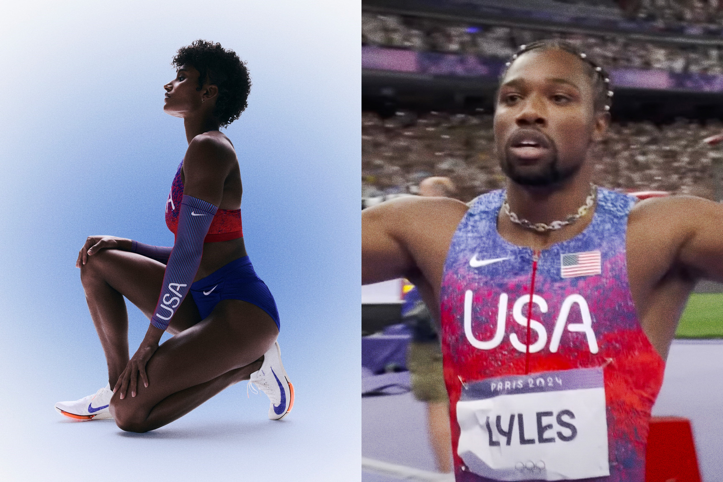
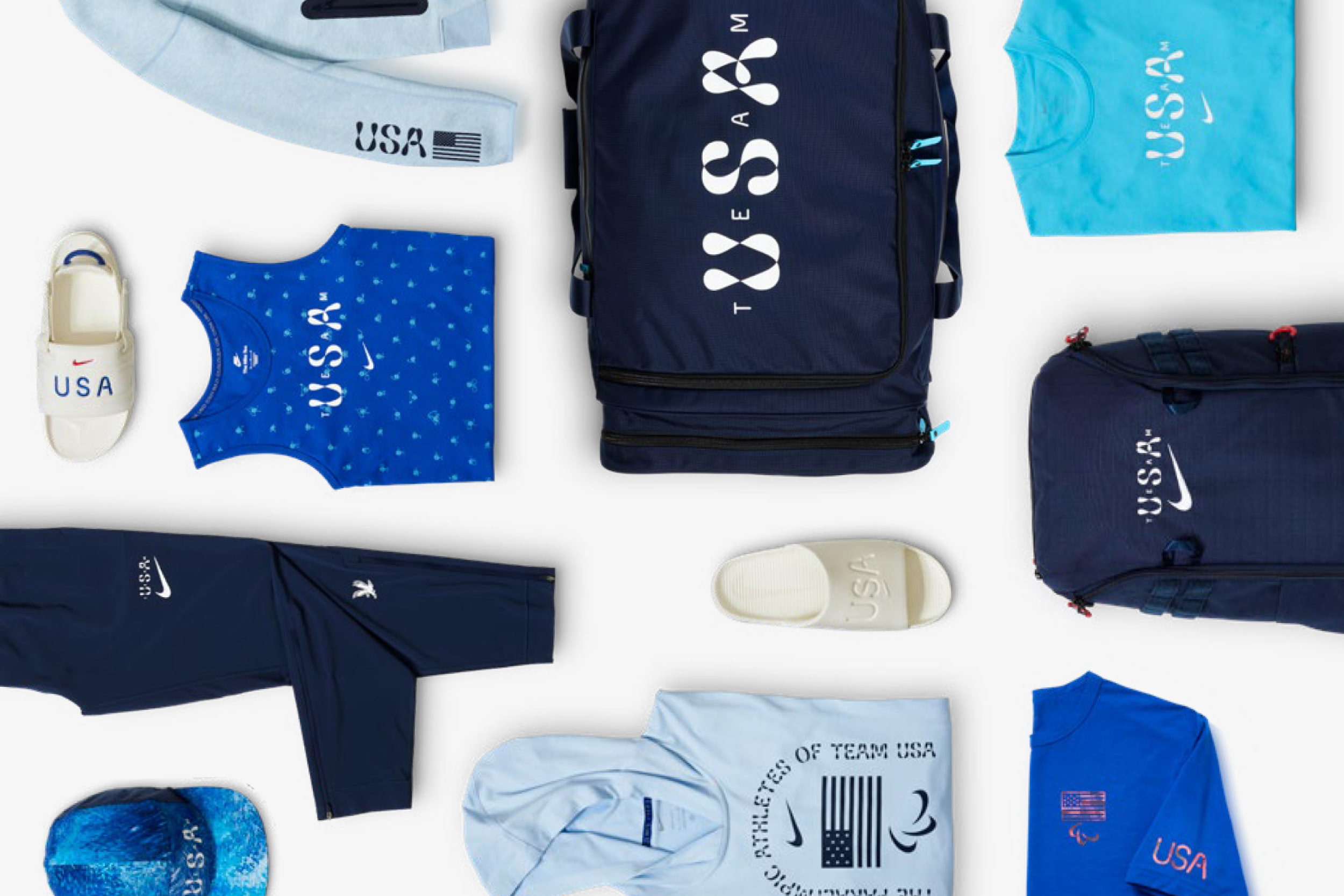
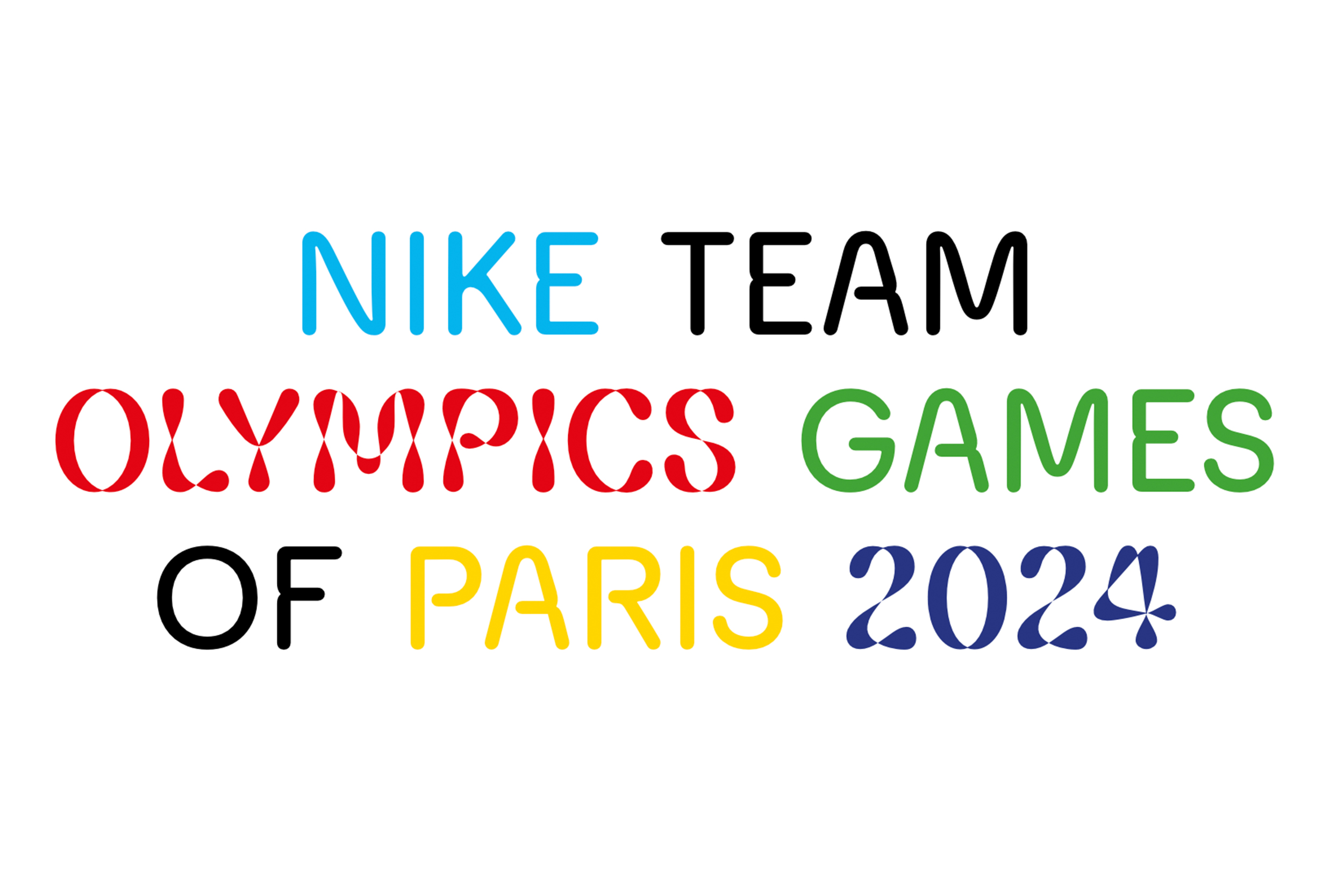
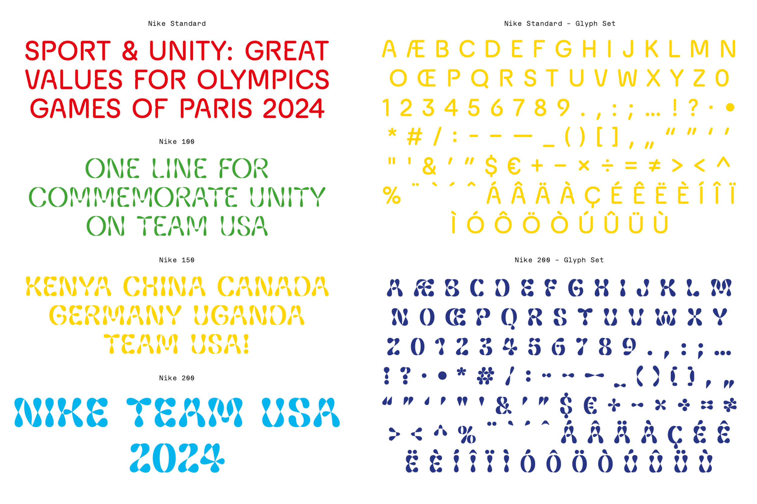
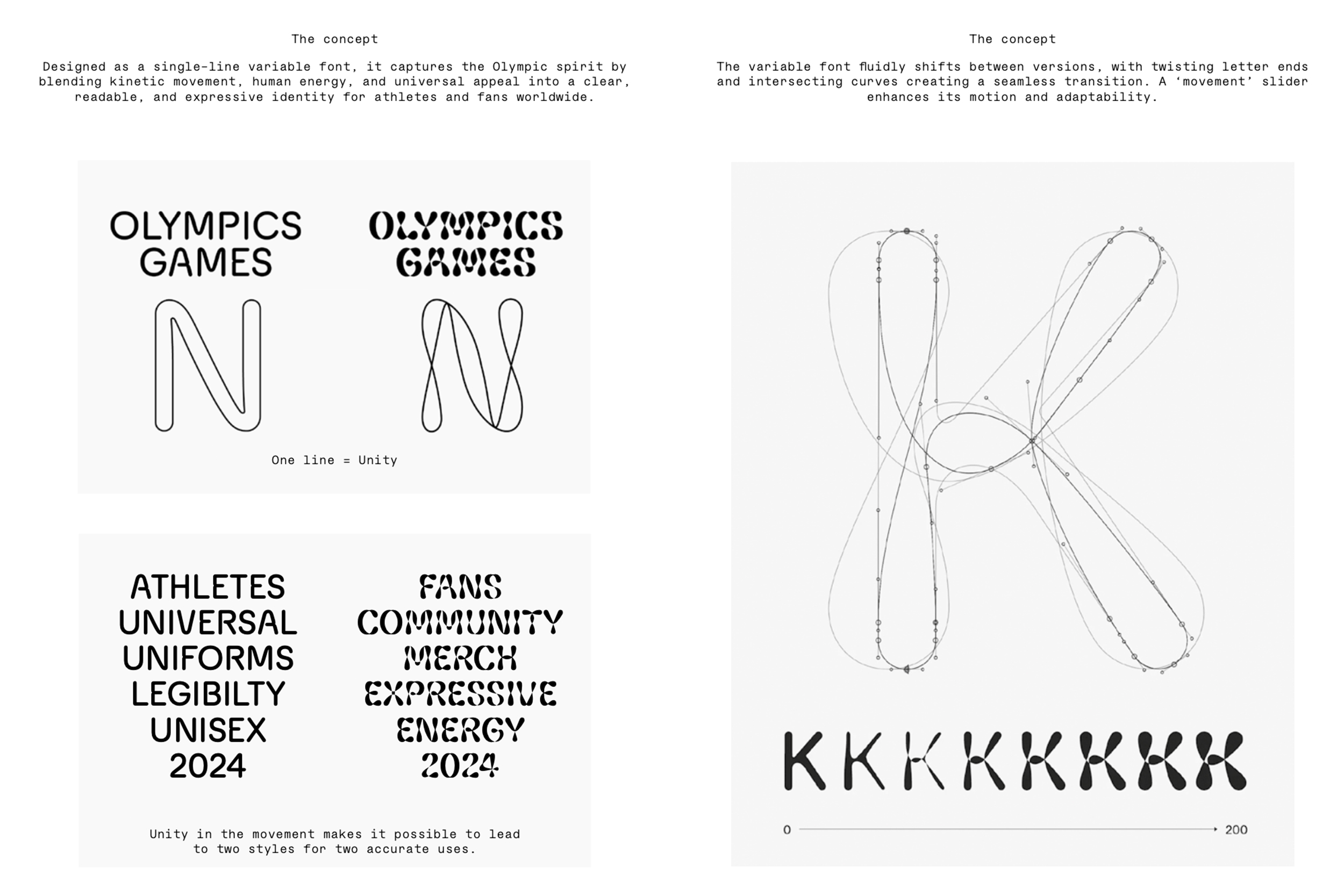
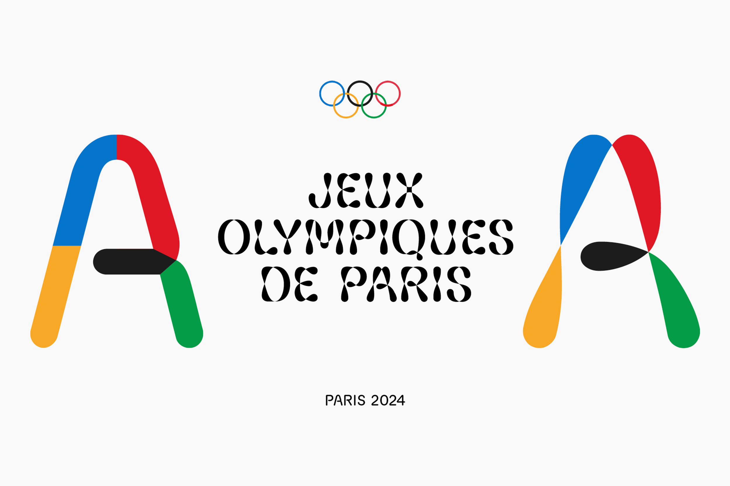
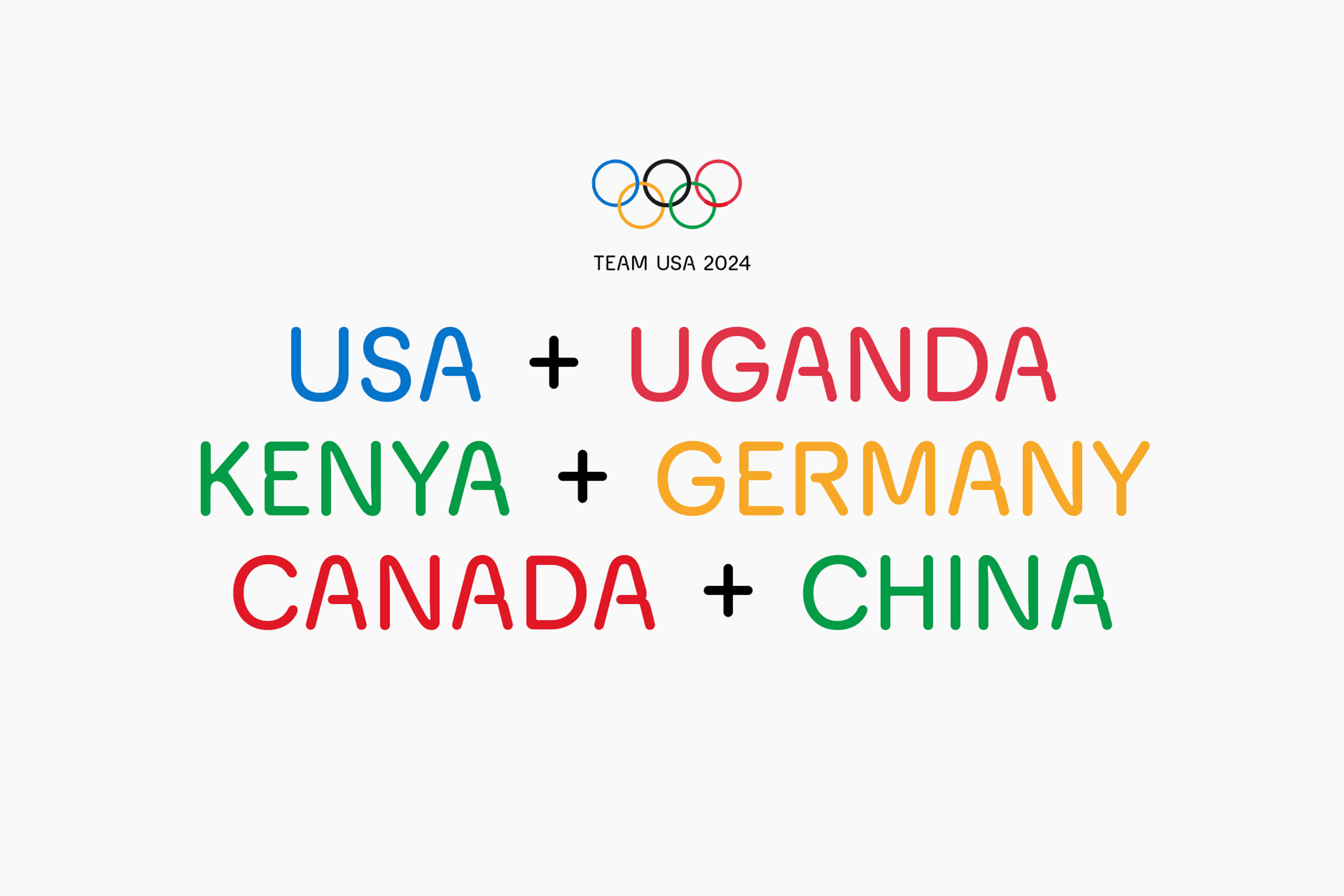
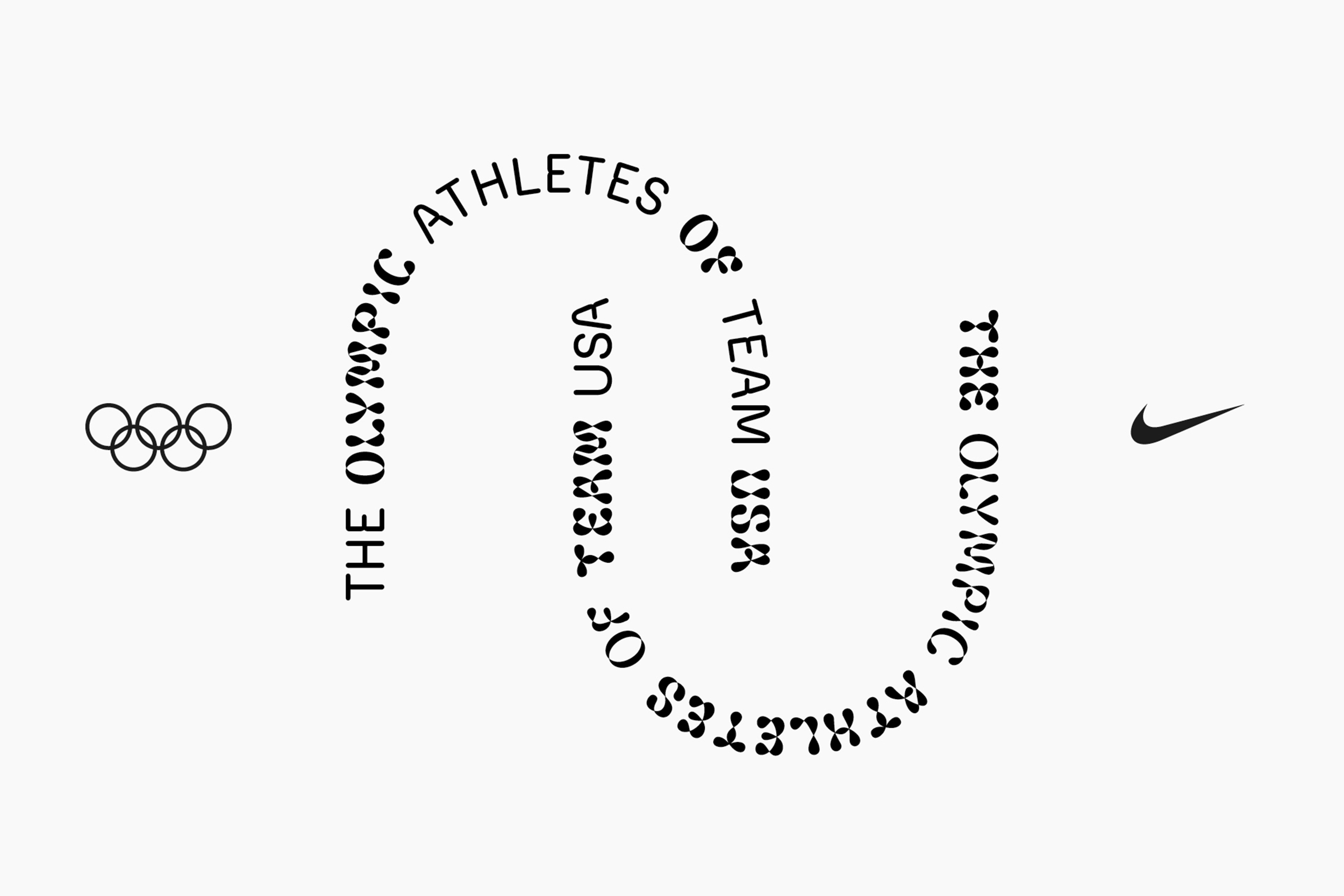
Nike
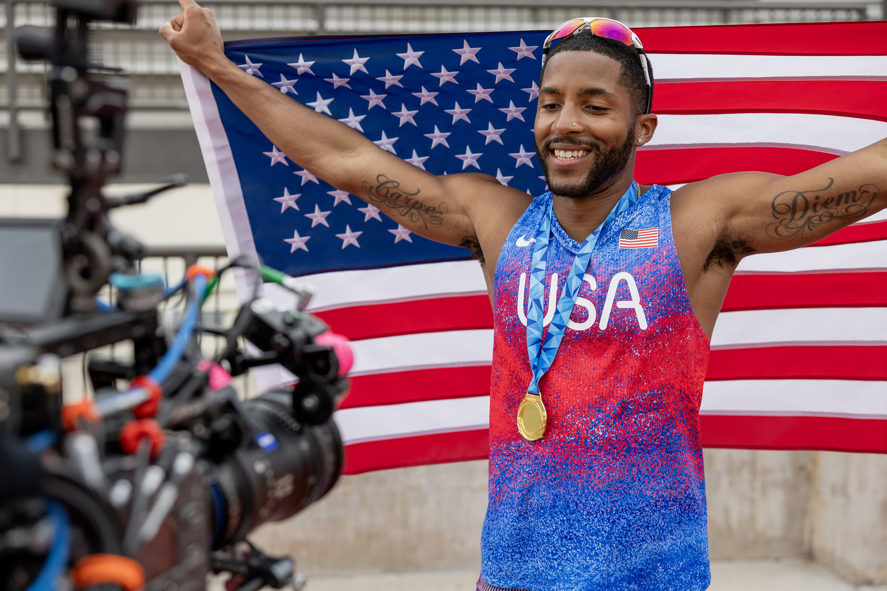
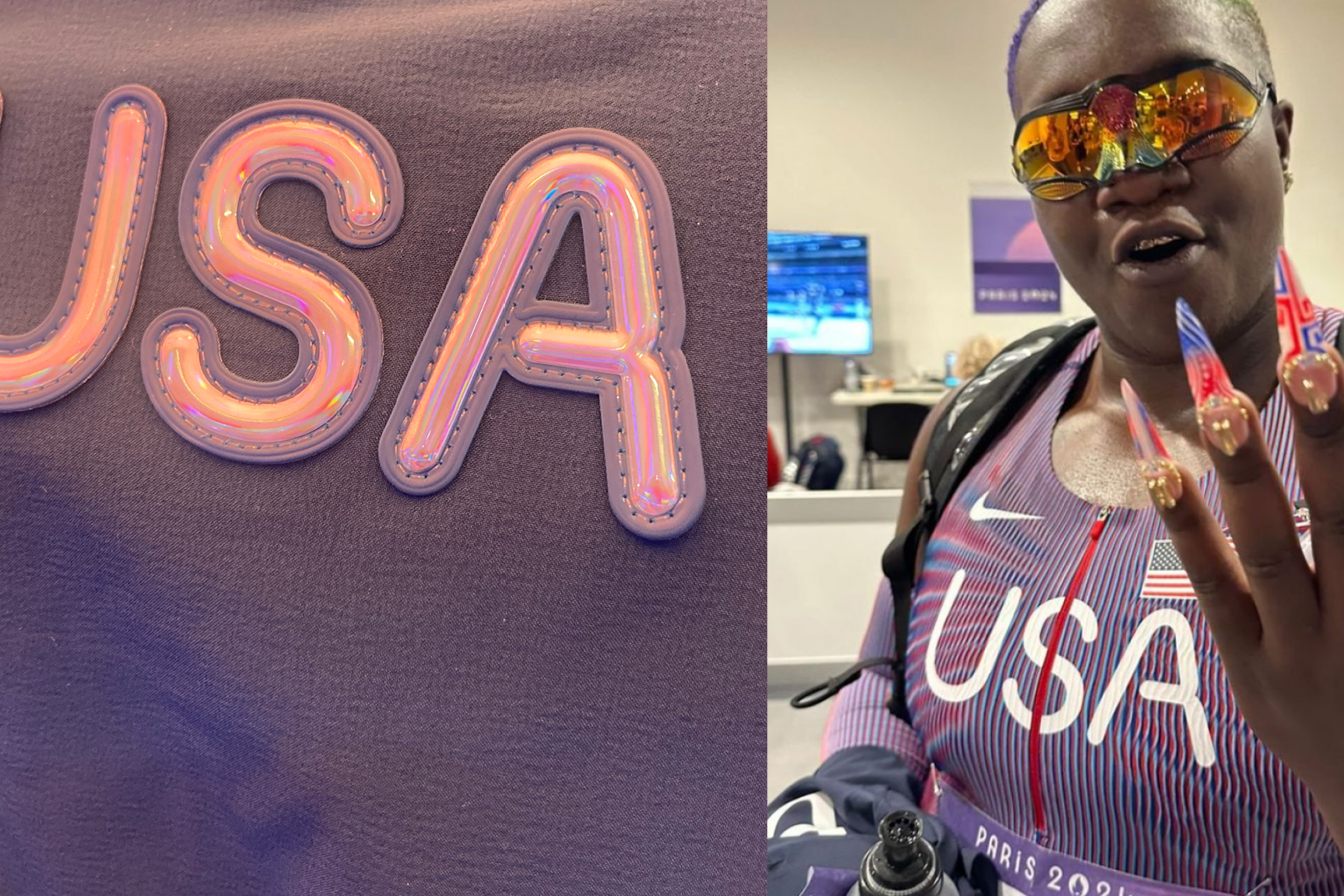
Custom typeface for Nike. A variable font for the Olympics Games of Paris 2024. The typeface has a dual personality: highly legible for athlete jerseys yet full of character for merchandising. Futura, iconic for the brand, inspired its round letters, subtly echoing the Olympic rings. Designing a font that suggests movement while remaining versatile was a challenge. The lines trace an athlete’s trajectory, like a long-exposure photograph. This visual language conveys motion and connection, reminiscent of the Olympic rings. The variable font, enabling smooth transitions between styles. Letter ends twist and curves intersect, allowing modifications via a “movement” slider. The font defies categorisation: neither masculine nor feminine, neither bold nor delicate. It’s hard to pin down as performance-oriented or pleasure-focused, local or global. This versatility sets it apart from the bold, angled typefaces typical in sports branding.
Yaelokre
Custom type and Logotype for the new Yaelokre EP album signed on Atlantic Records.
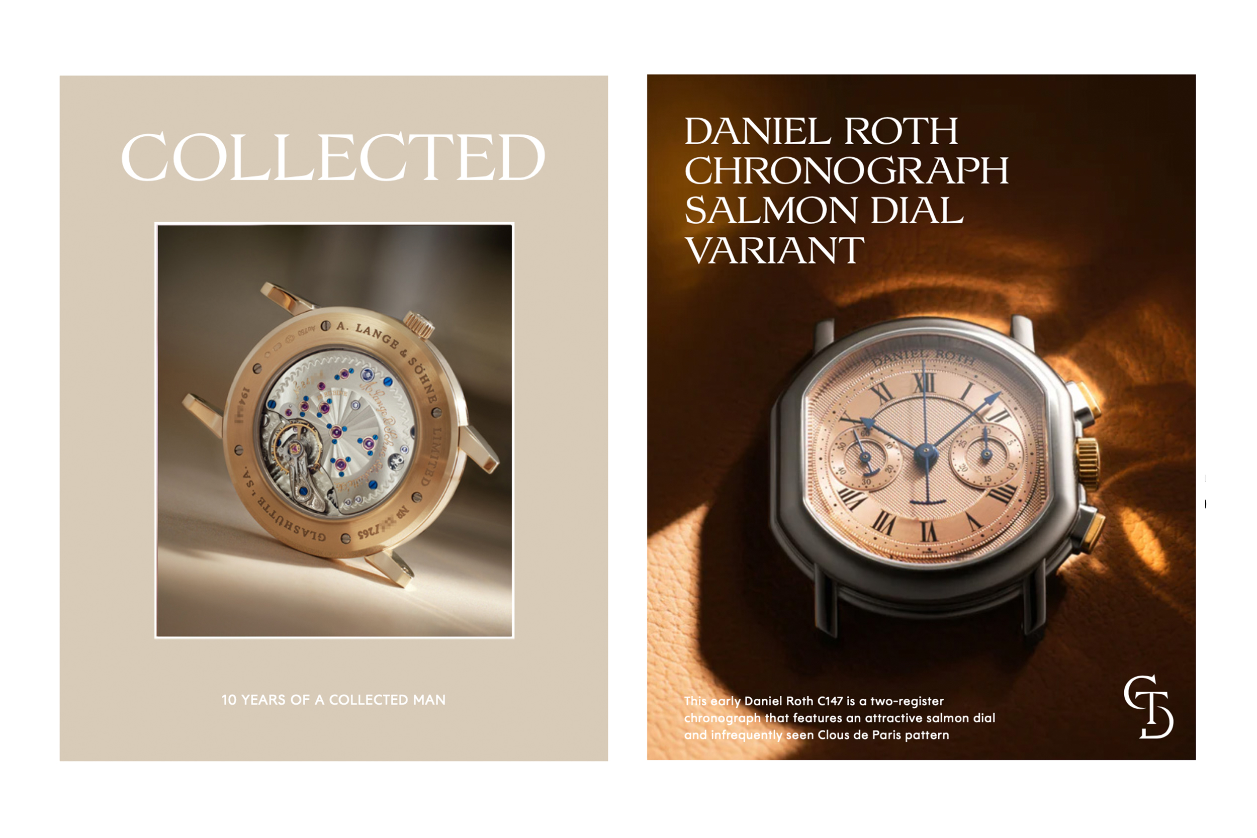
A Collected Man
Custom font and monogram design for A Colleted Man. Through a huge ressource about watch making, history, knowledge, the creative process of this font focusing on watches features. Engraving, small elements, elegance and solidity.
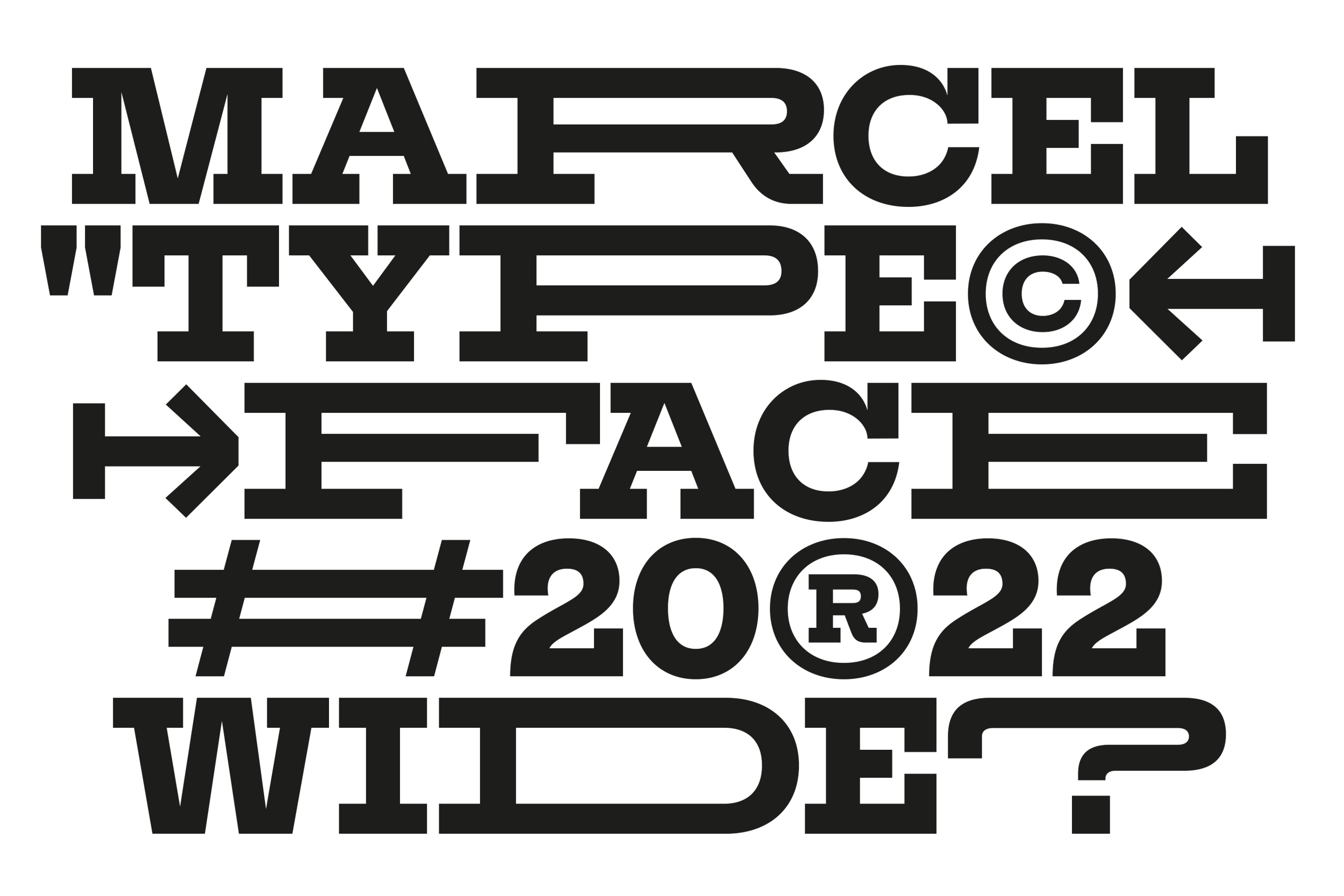
Marcel
Design and production of a Custom variable font for Marcel Agency (Publicis Group). Based on the “Rockwell” font their iconic logotype, I design a new version and more powerful and contemporary typeface in two width and only uppercase. They can animate the letters they want through the width axe and in all their visual identity.
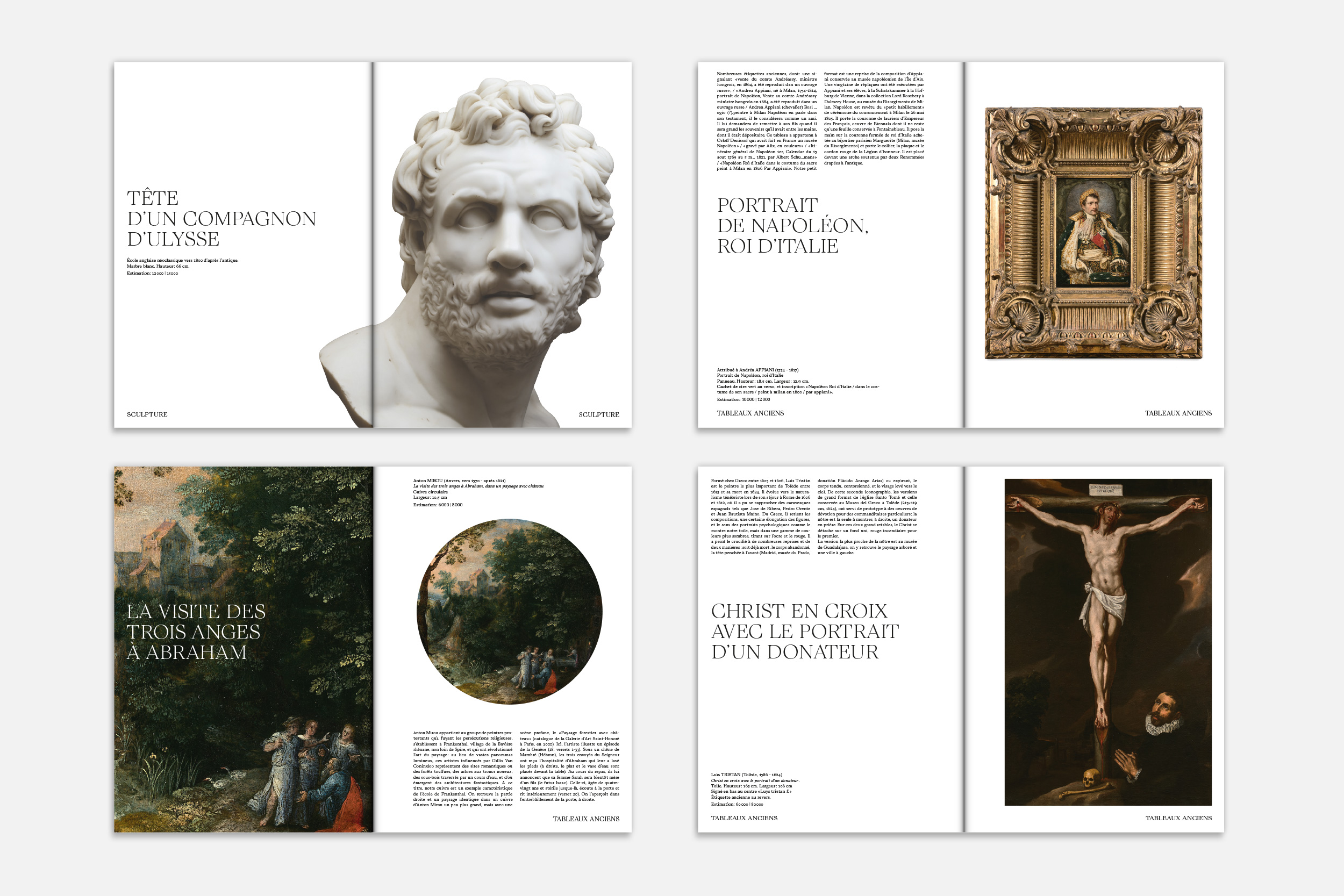
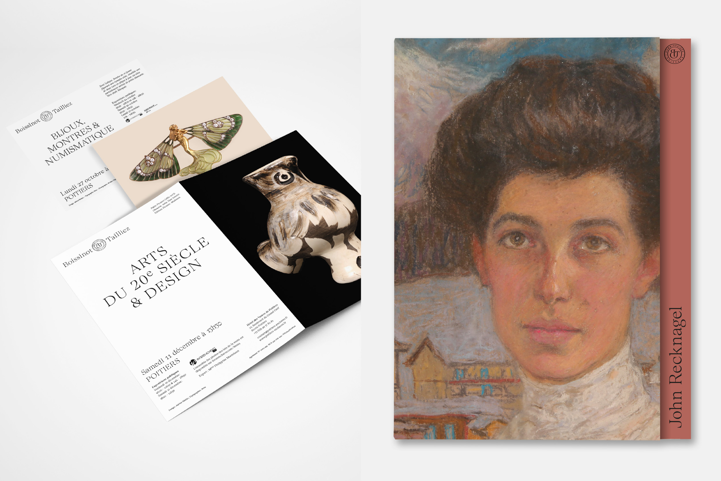
Boissinot & Tailliez
Global visual identity, art direction and graphic design for the auctioneers Boissinot & Tailliez.
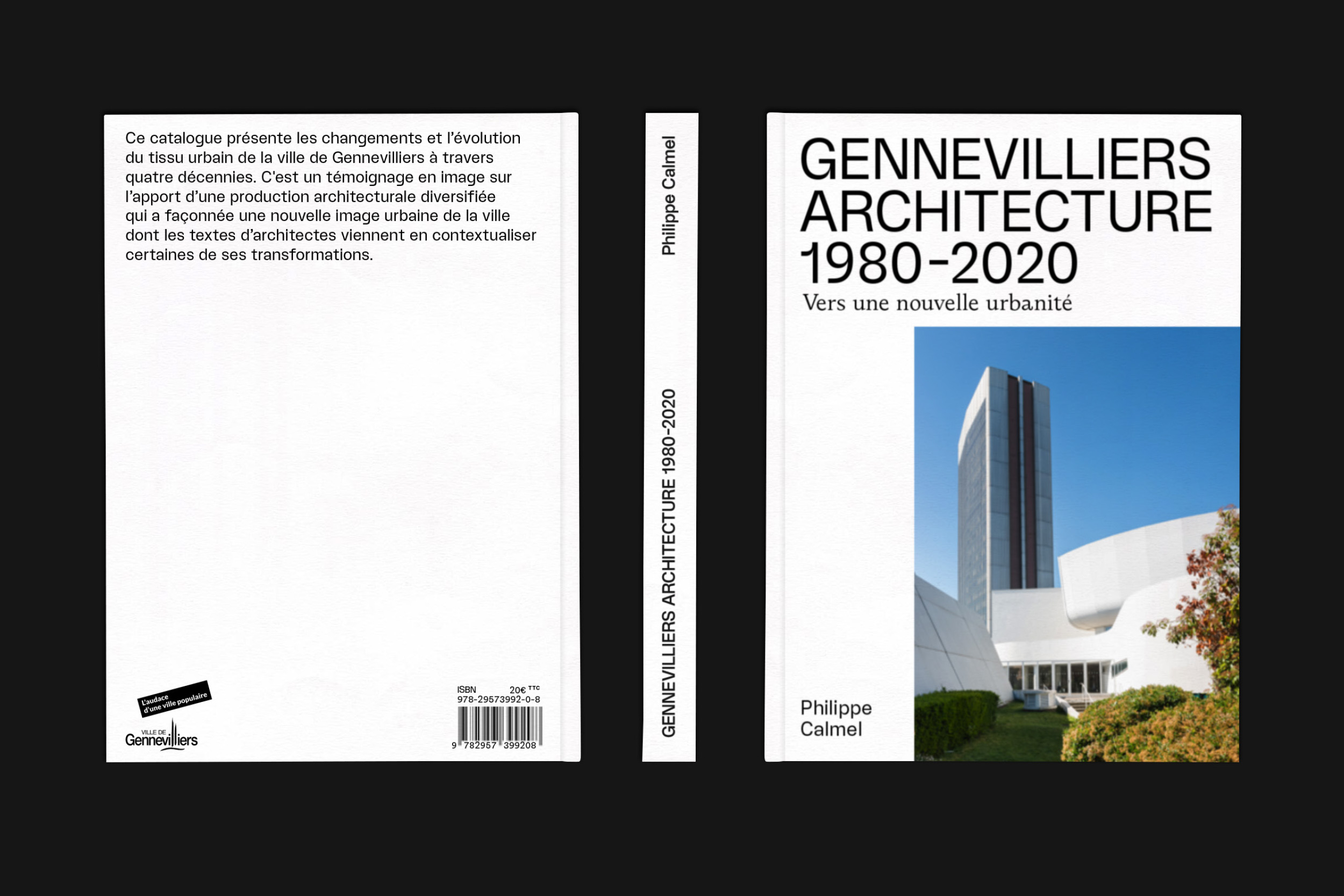
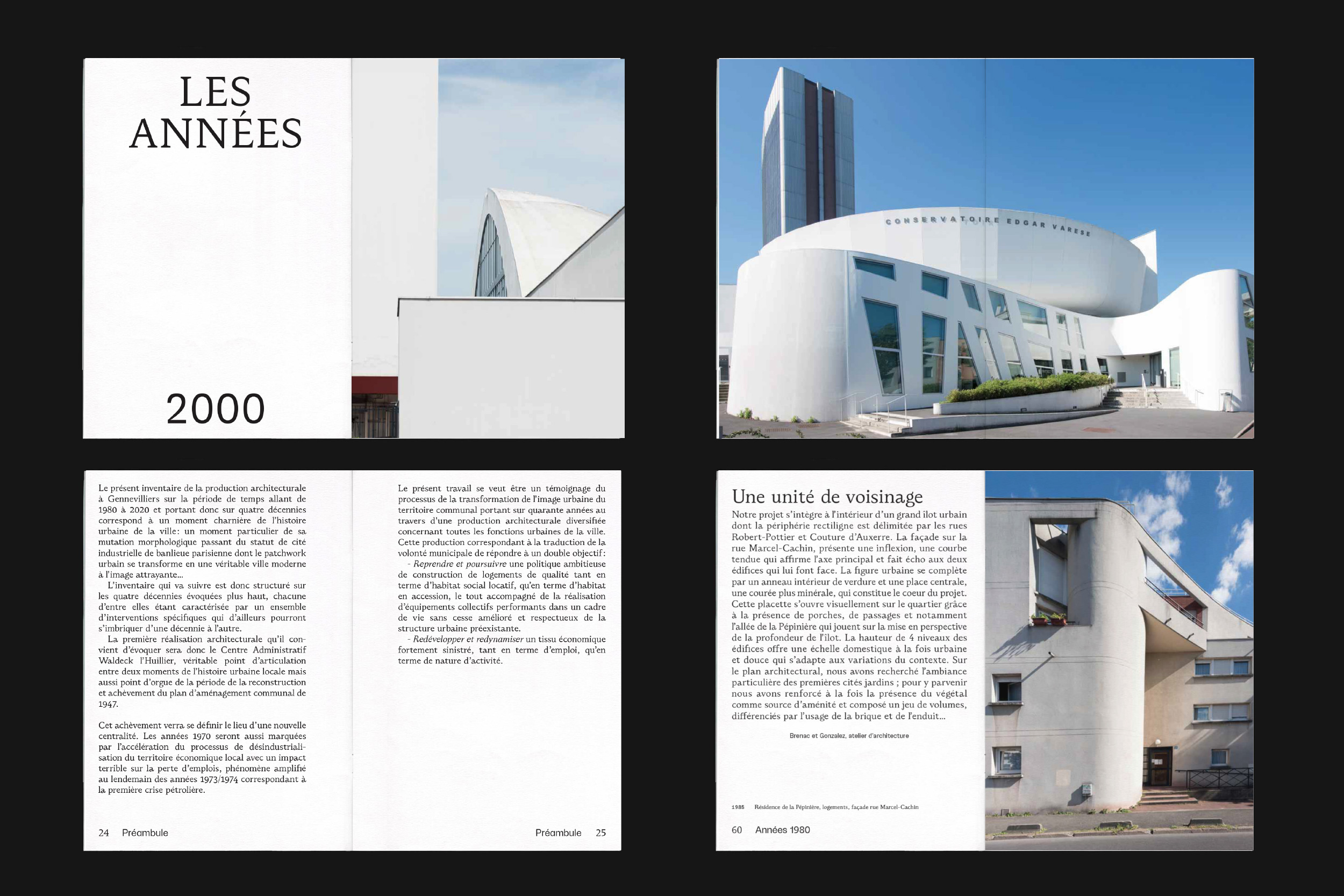
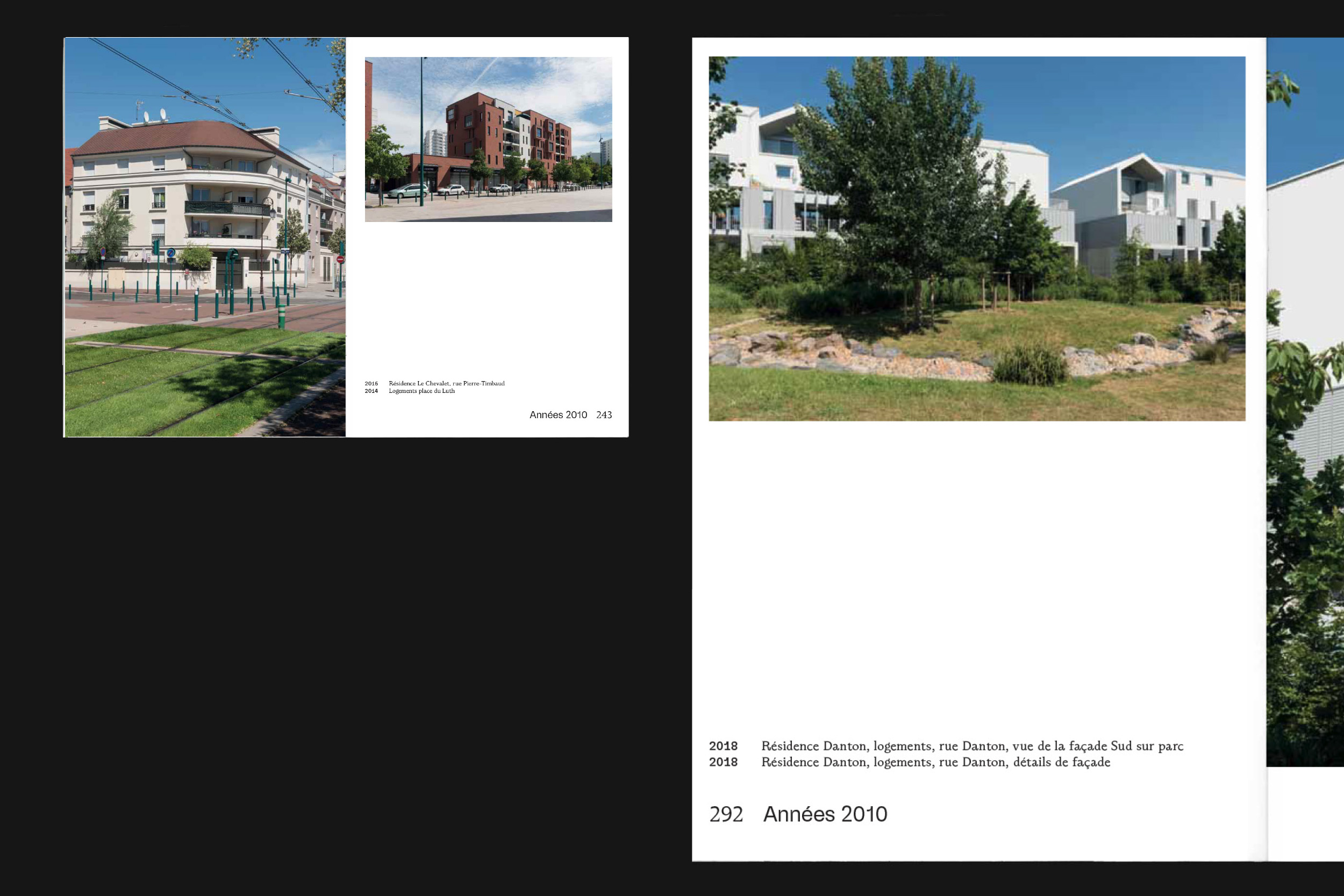
Genneviliers Architecture
Book design. Ville de Gennevilliers, Art direction + graphic design.
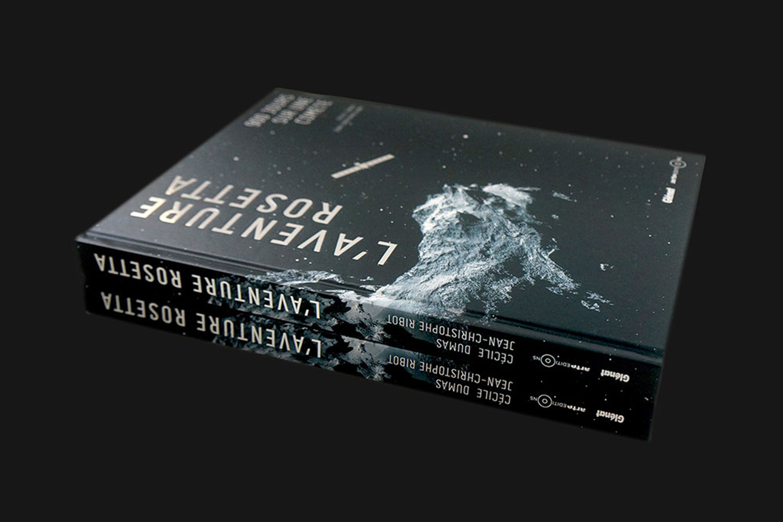
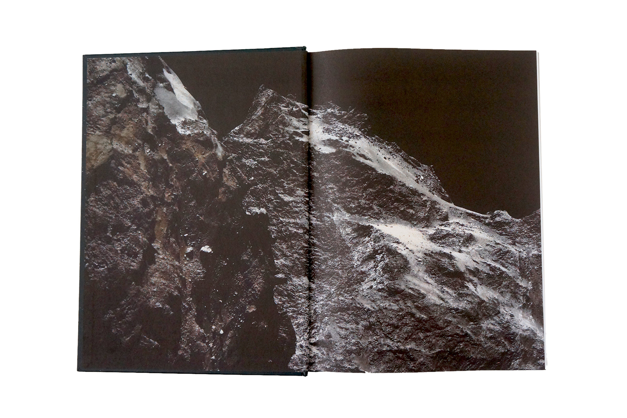
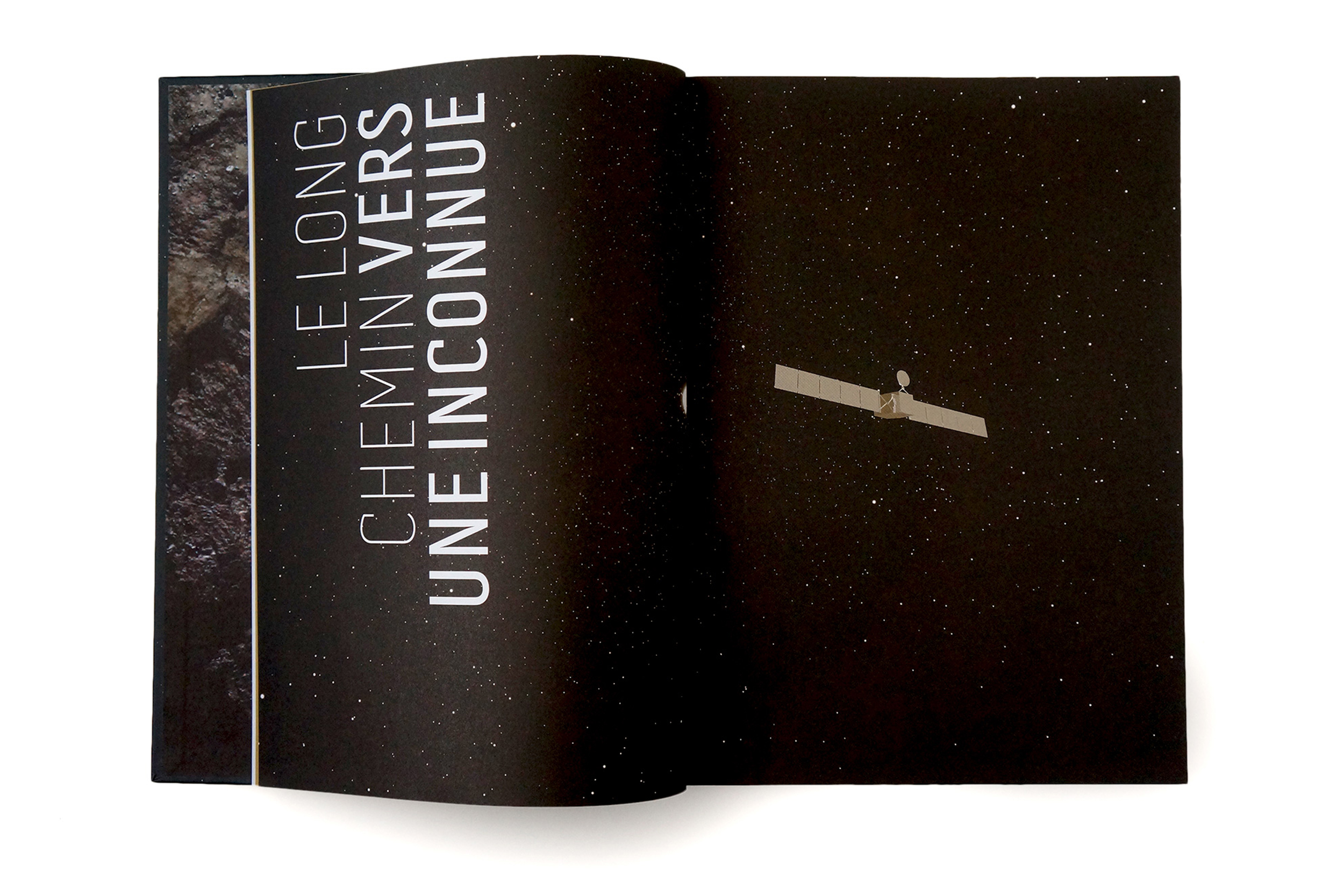
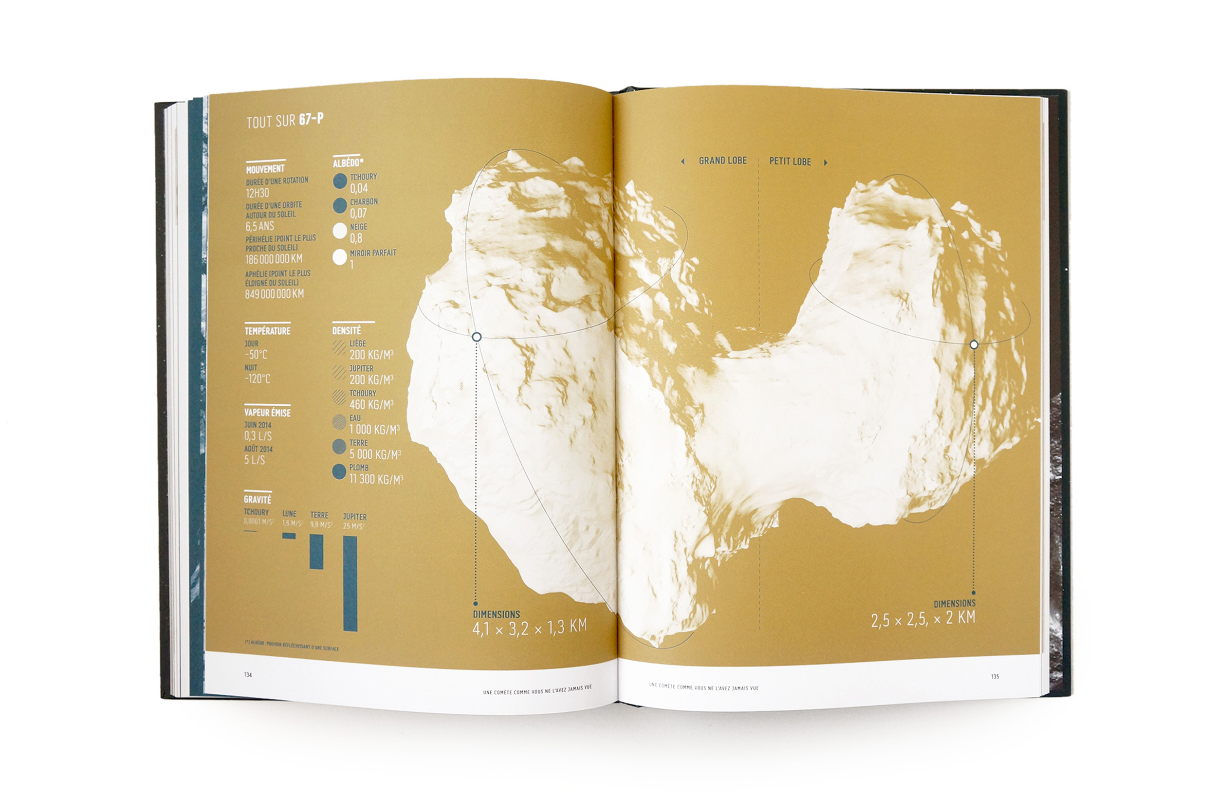
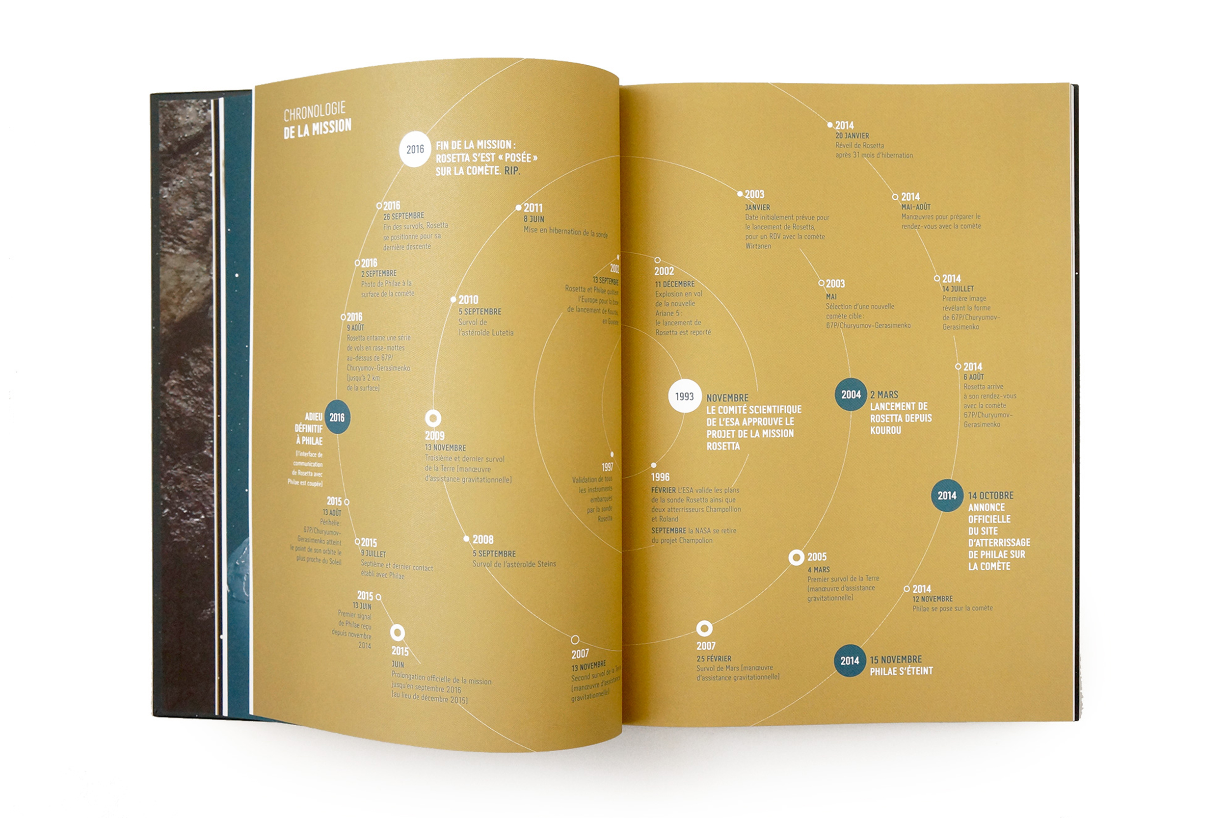
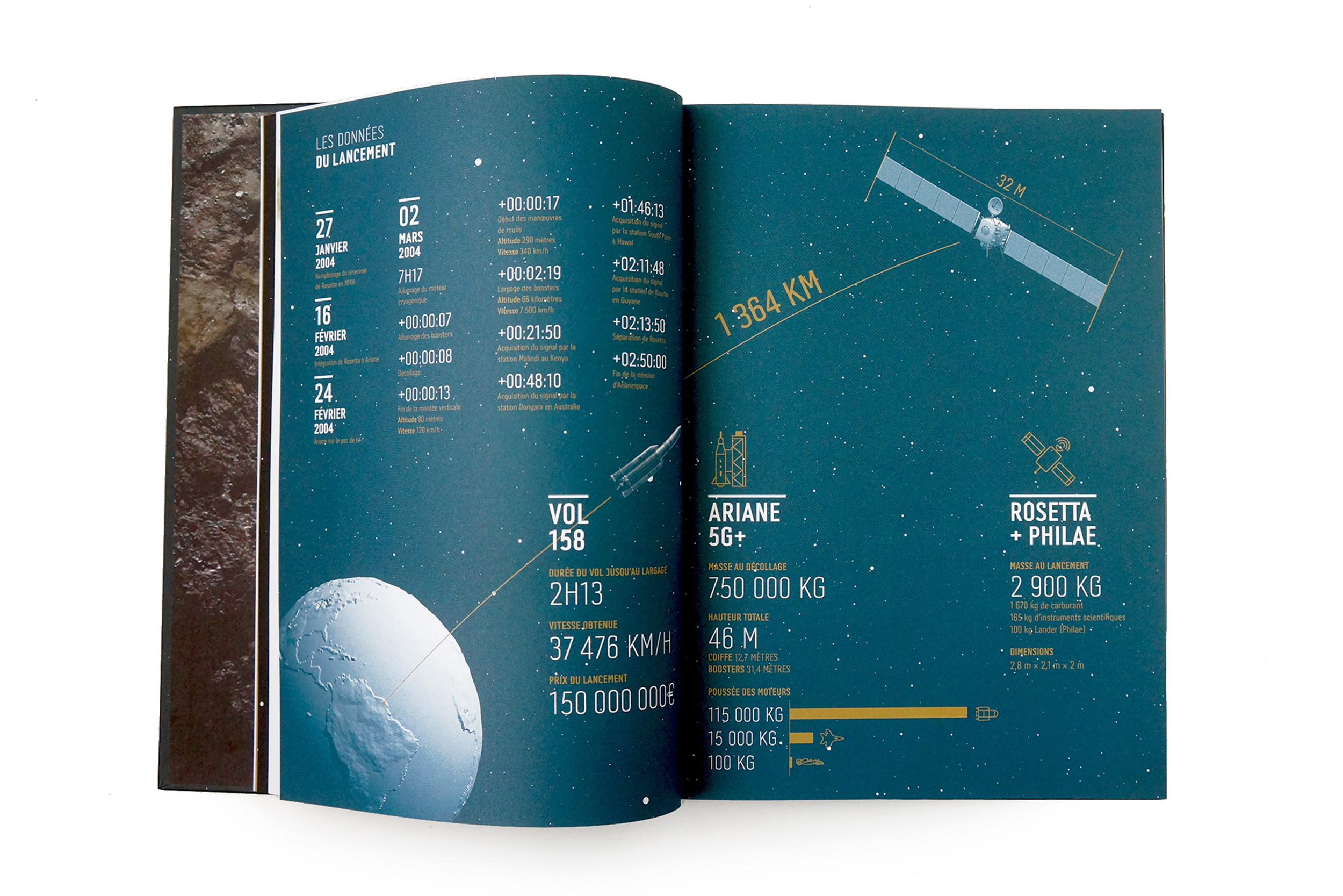
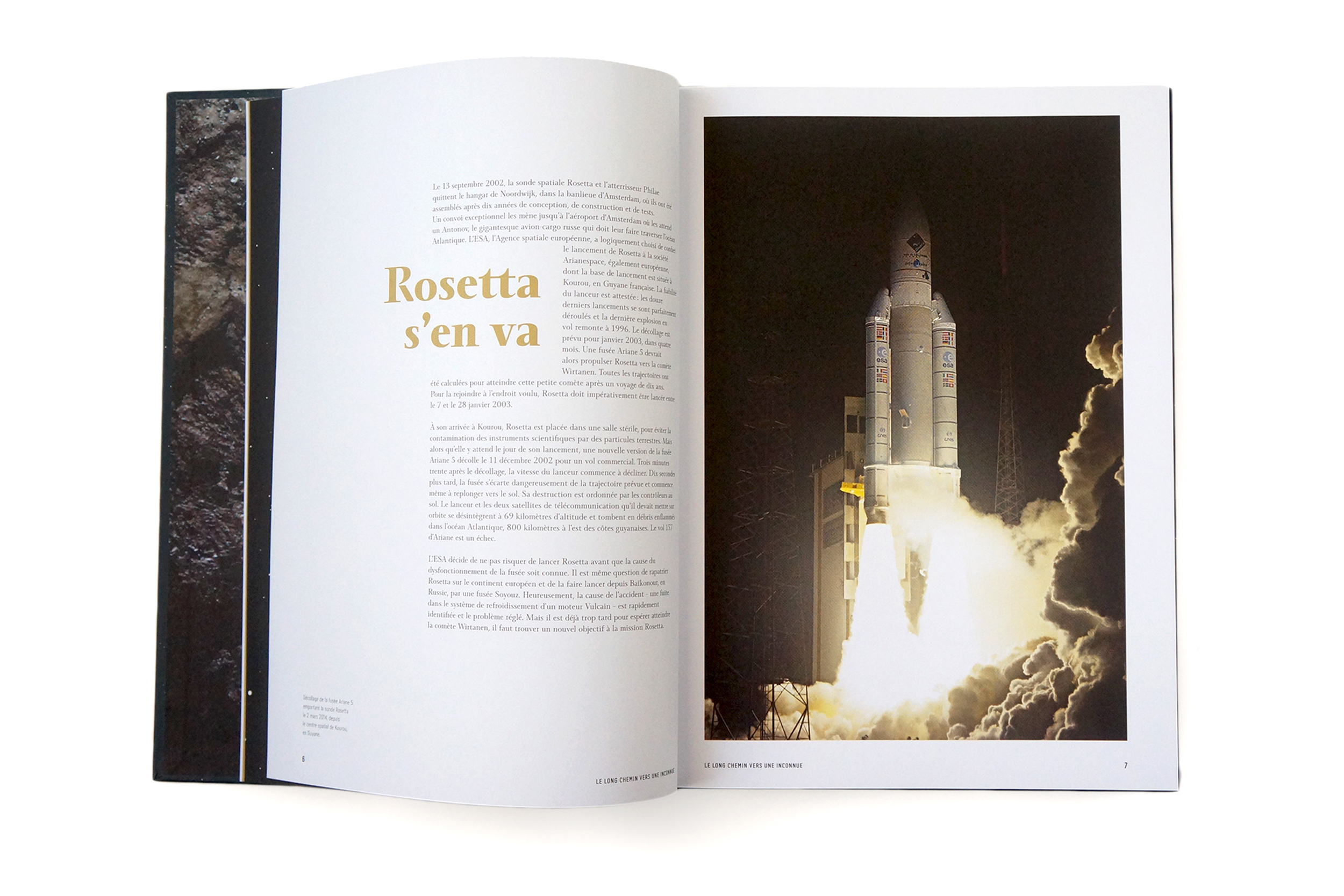
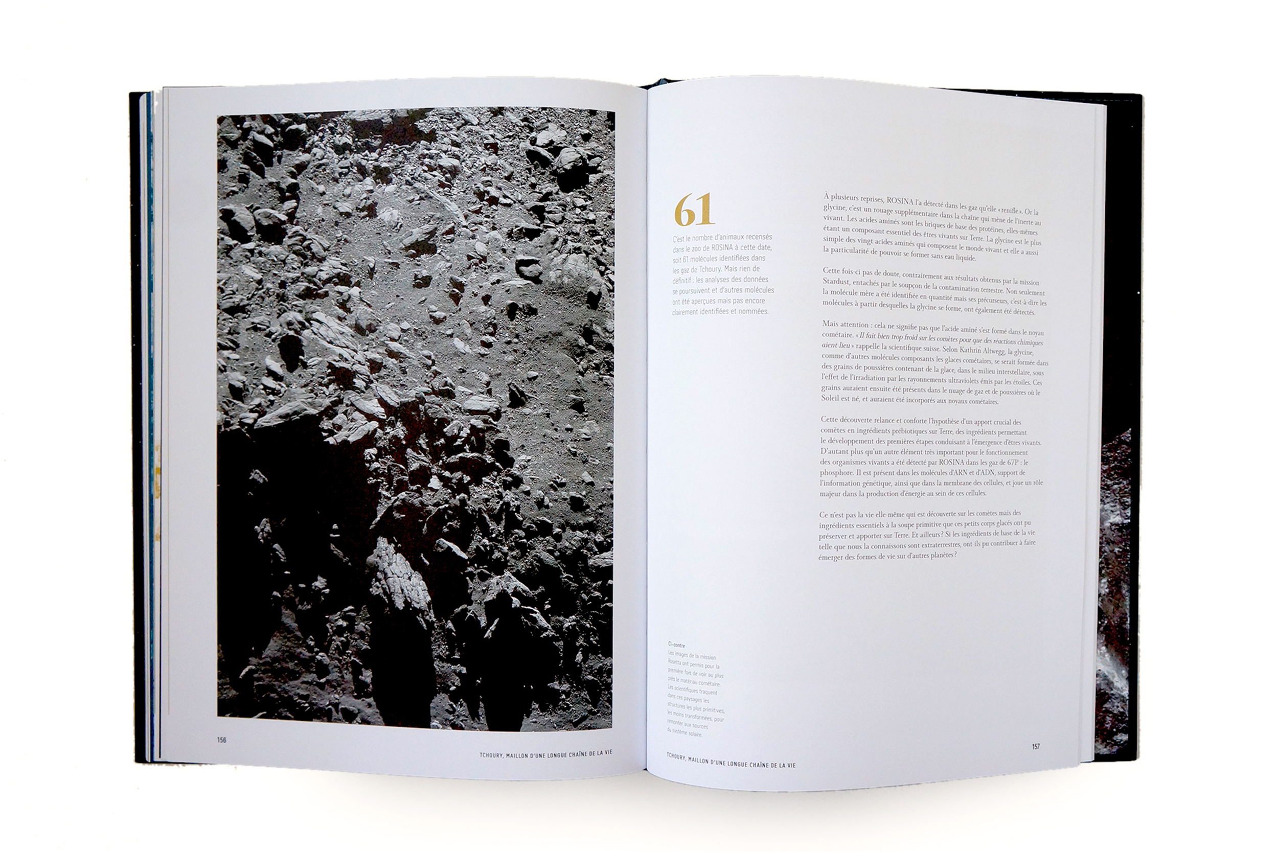
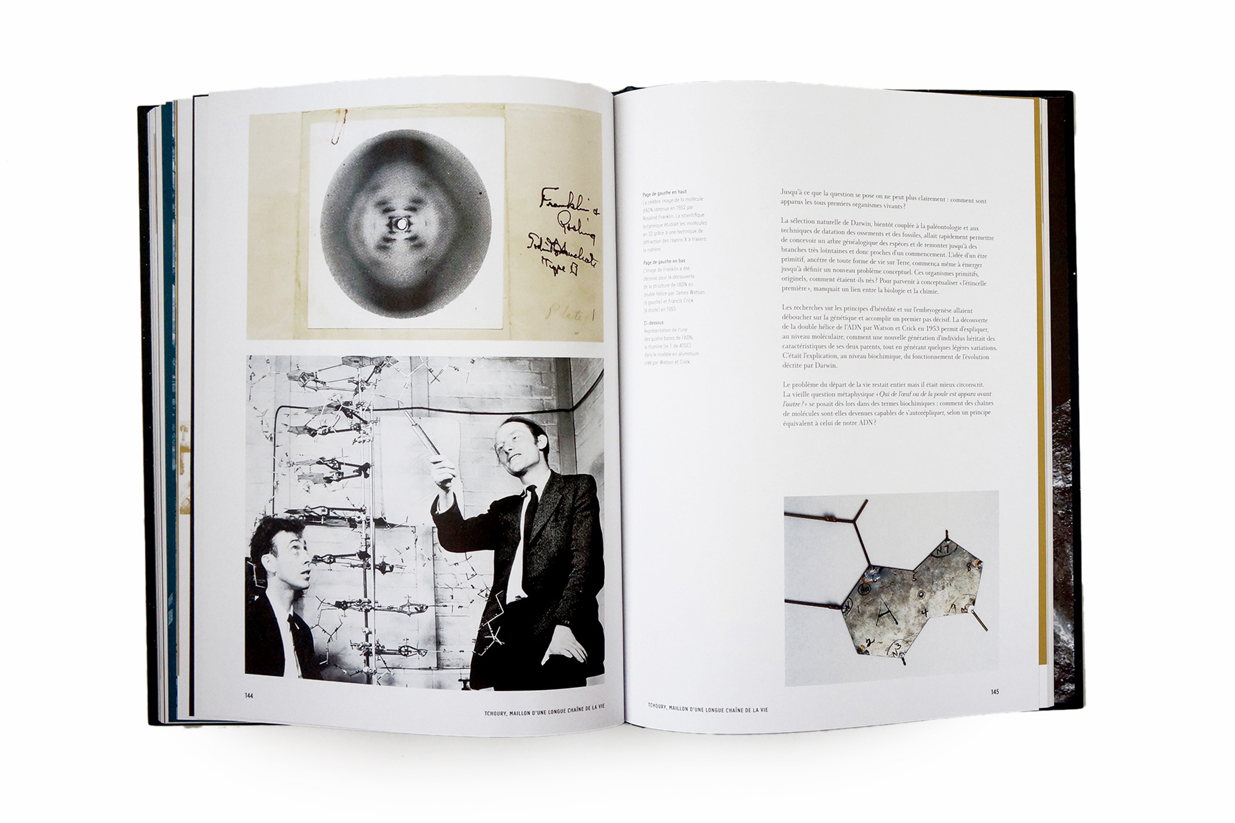
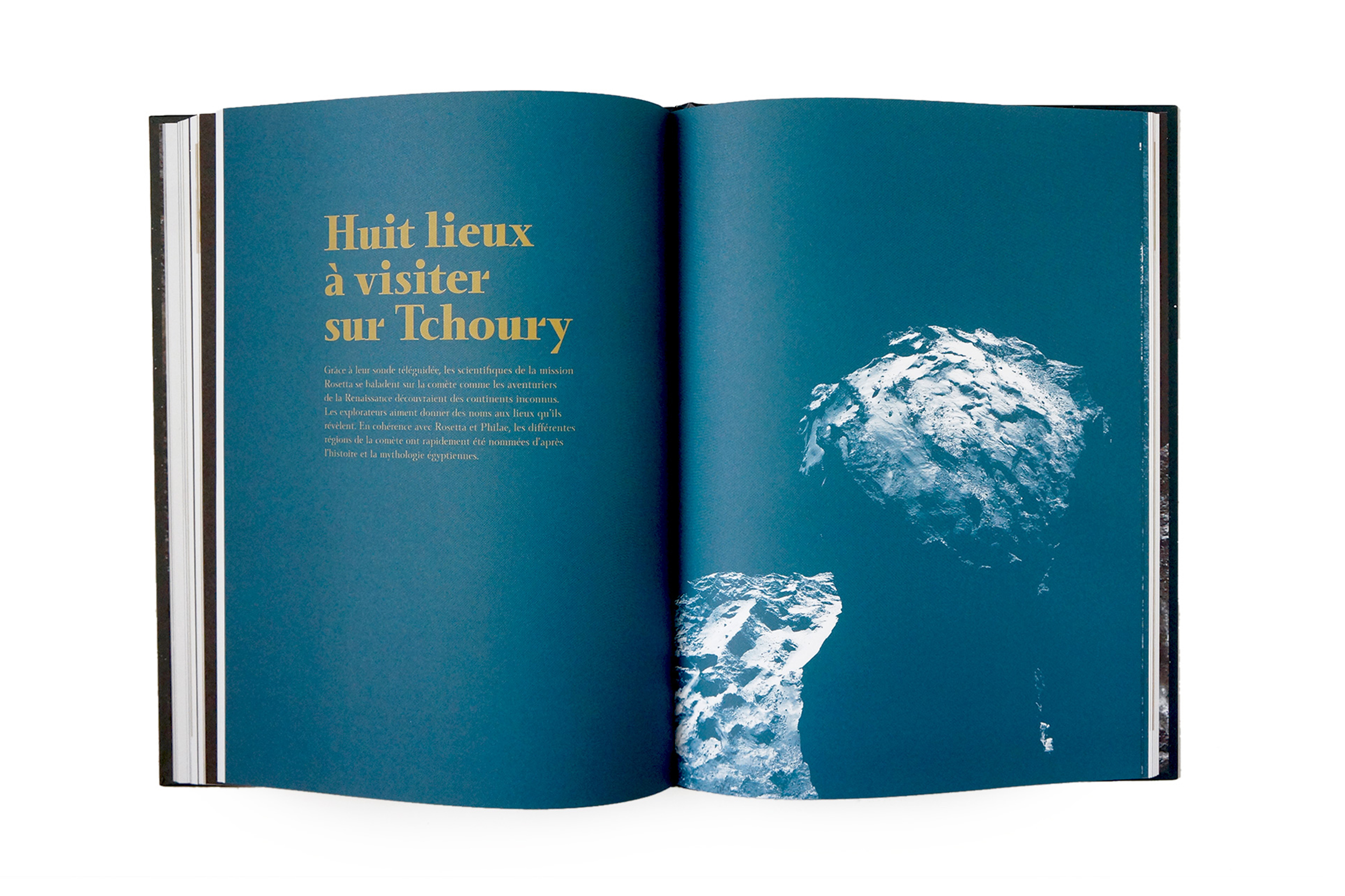
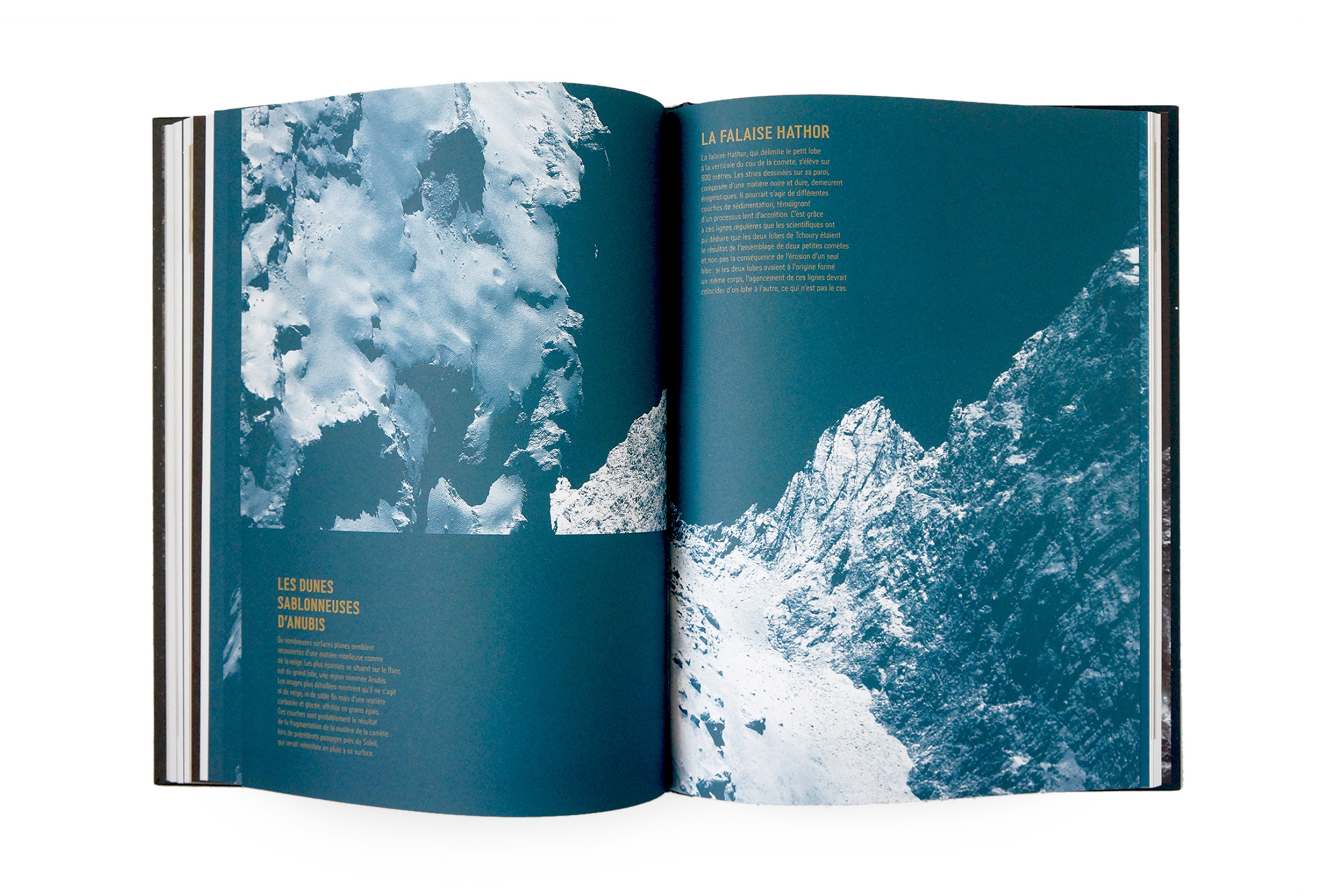
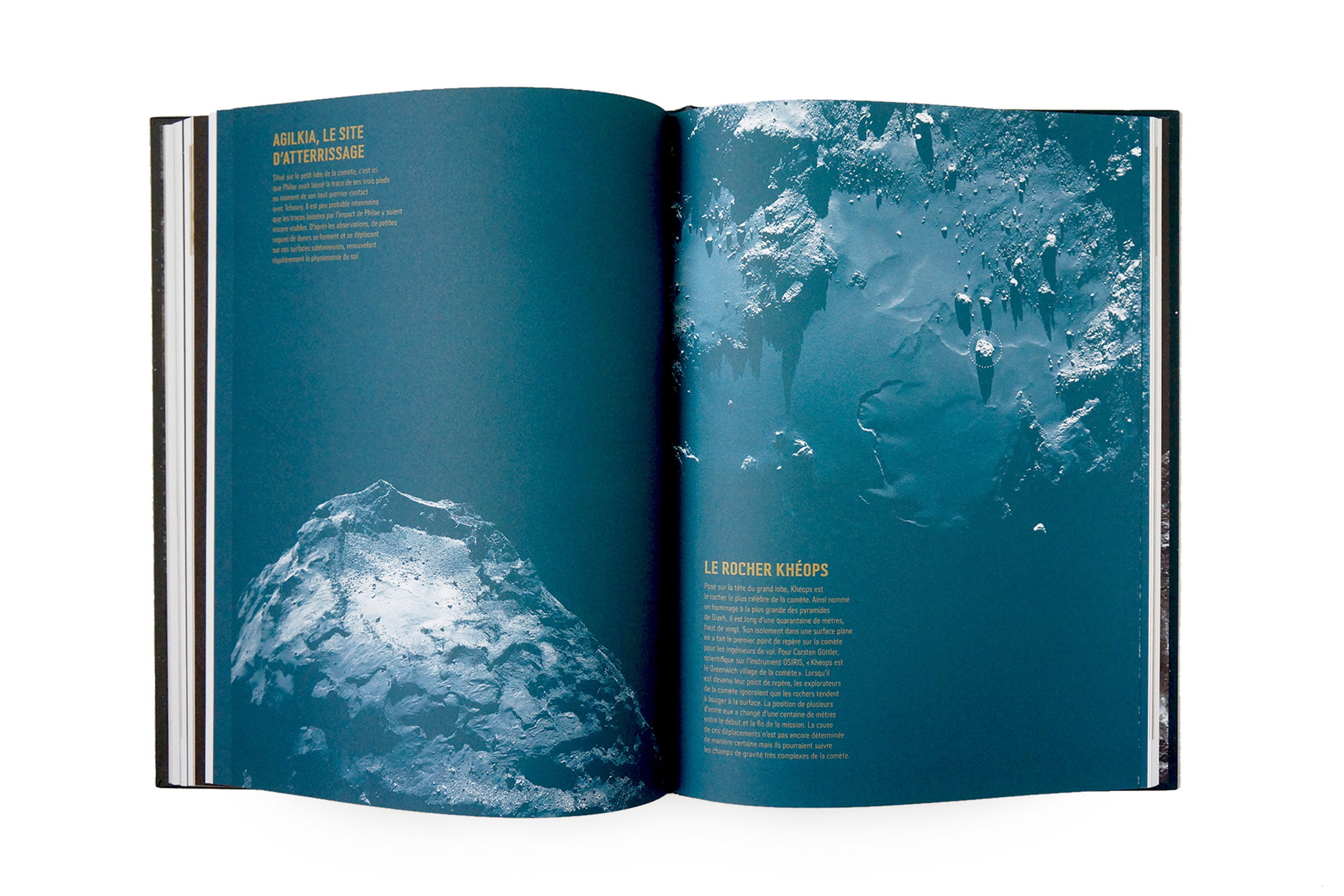
L'aventure Rosetta
L'aventure Rosetta. Book design. Édtion Glénat. Art direction + graphic design.
Movie about this crazy spatial adventure!
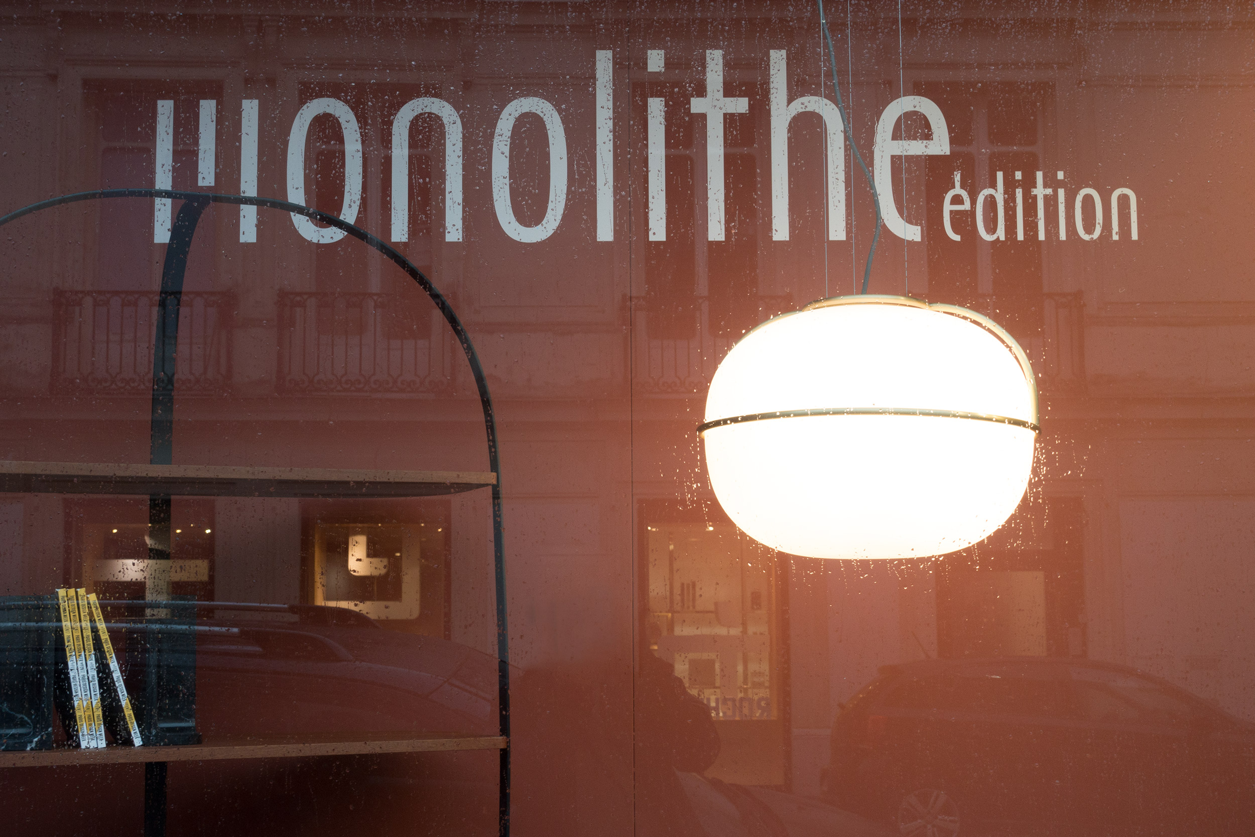
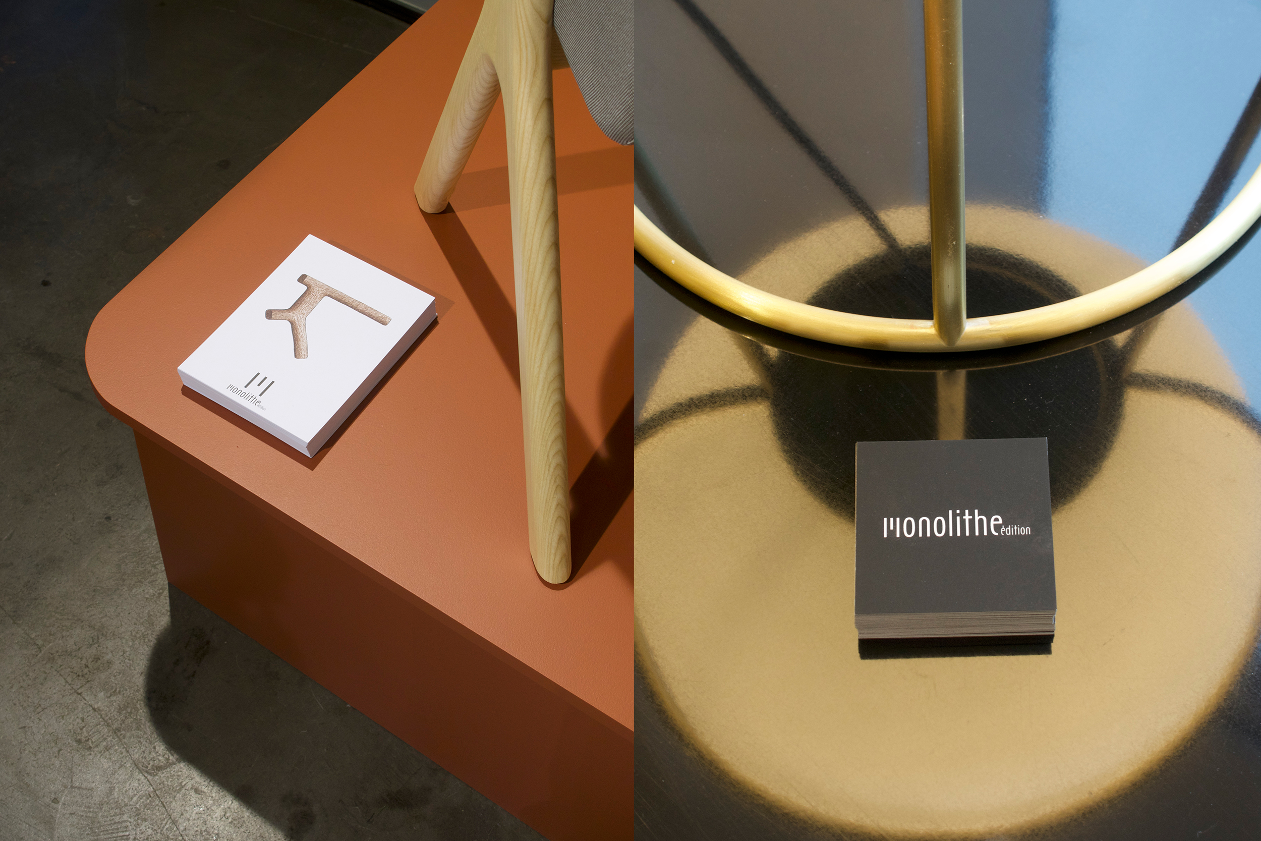
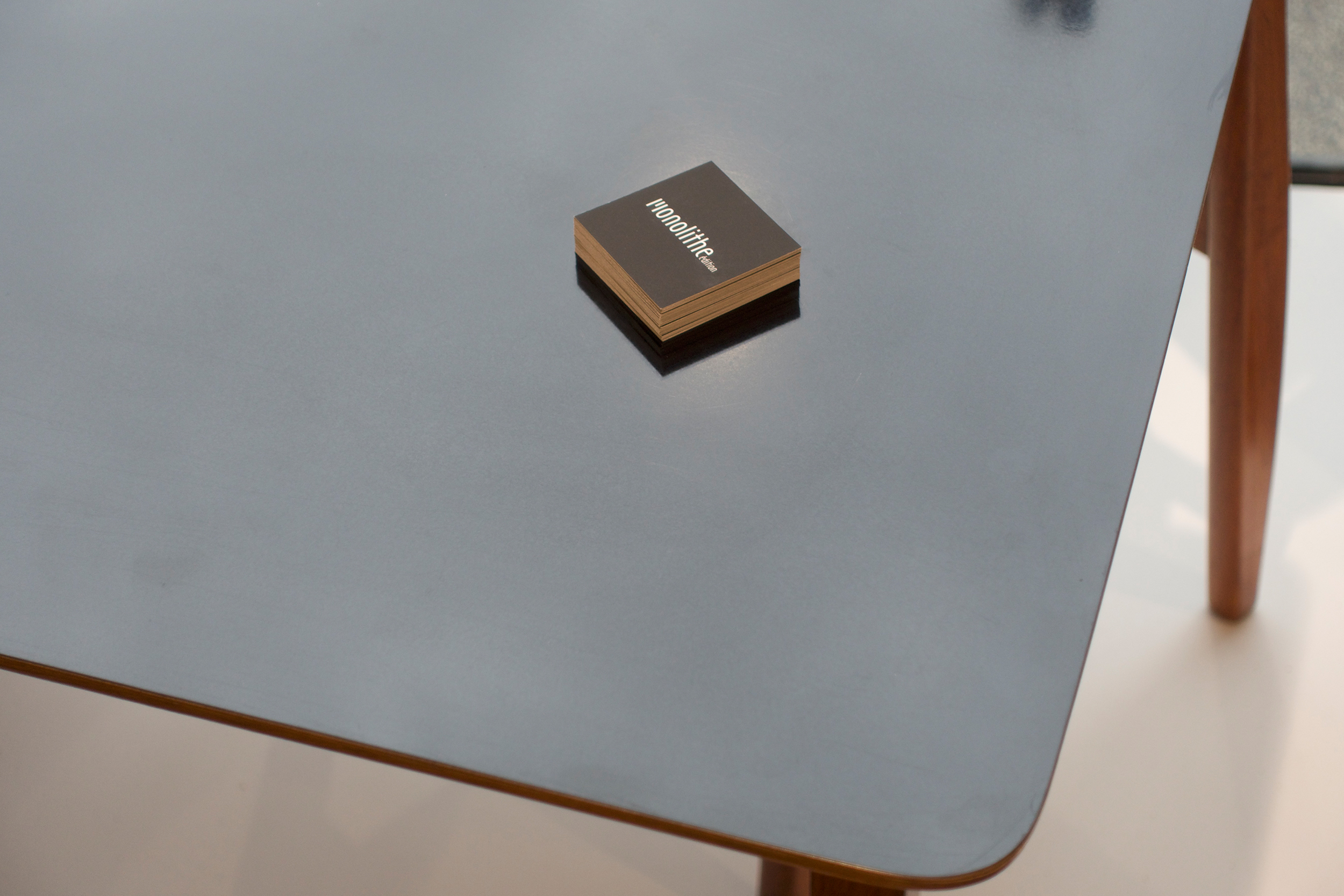
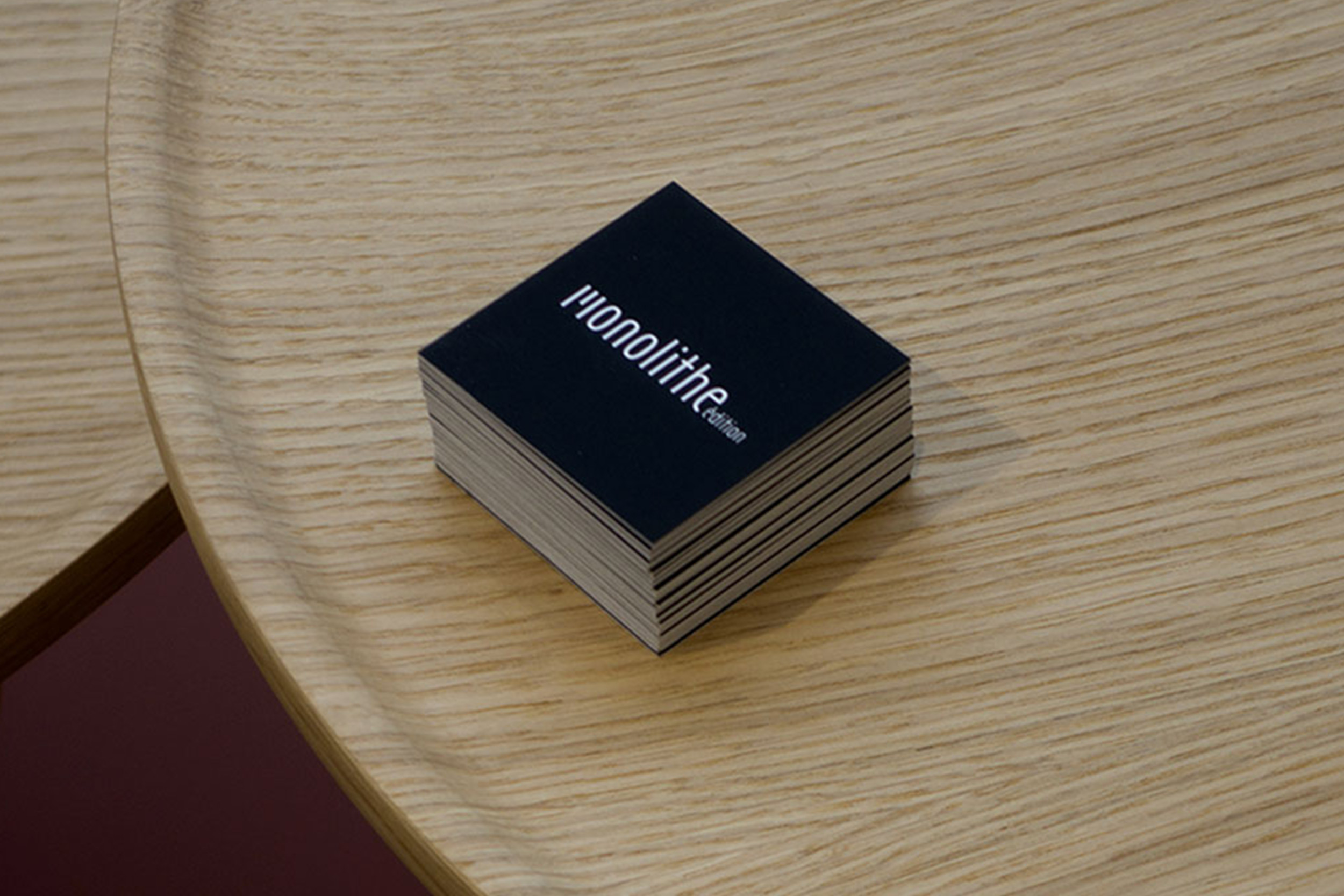
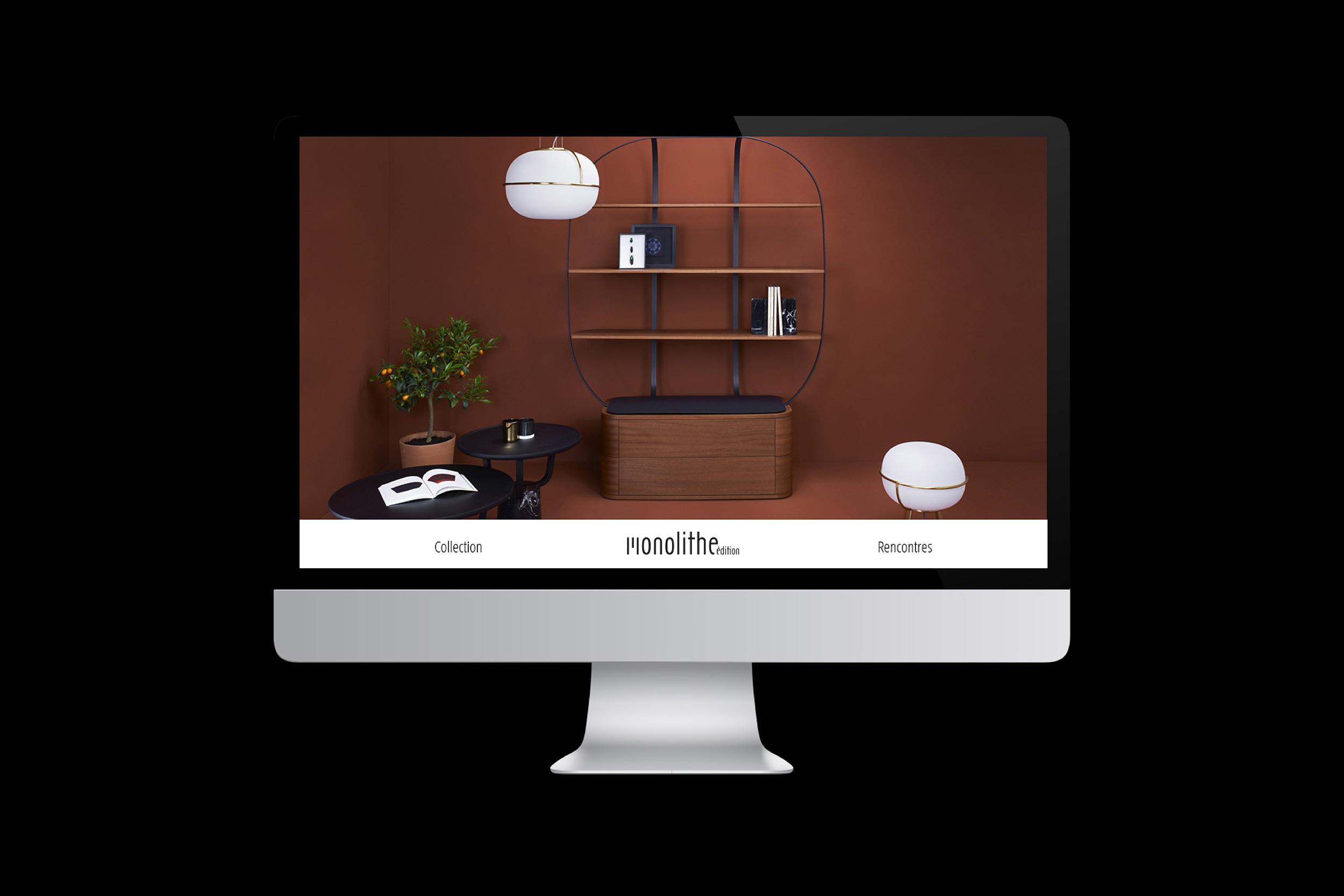
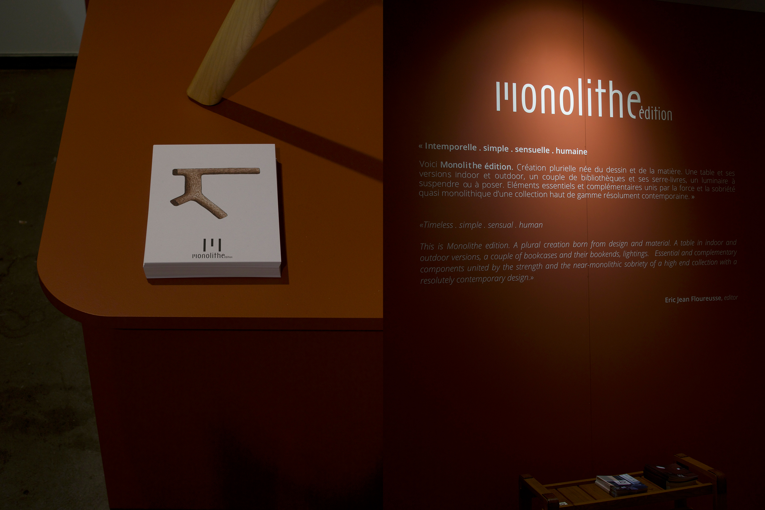
Monolithe
Brand design. Logotype, font design, stationery and webdesign. Photo ©BorhoStudio
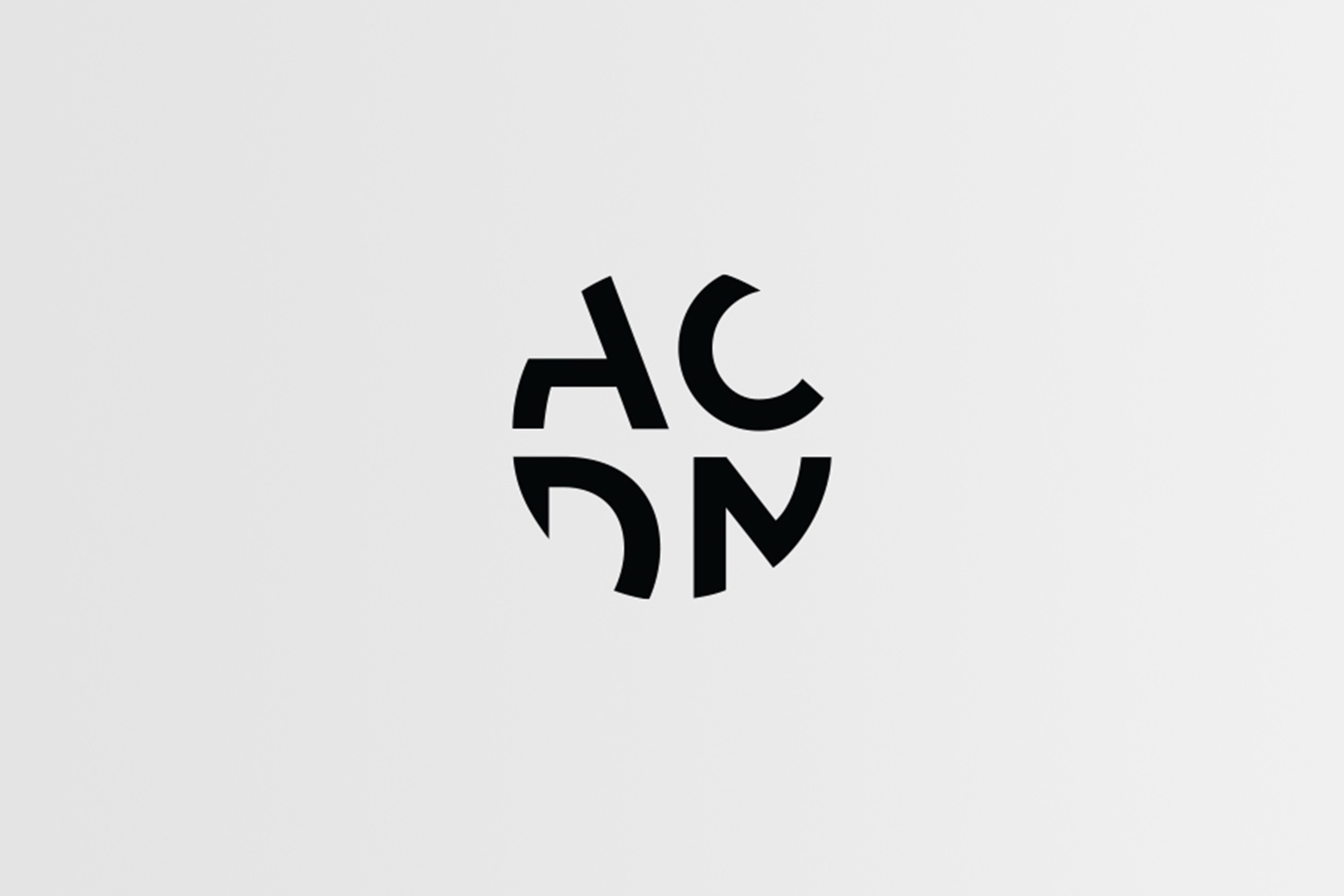
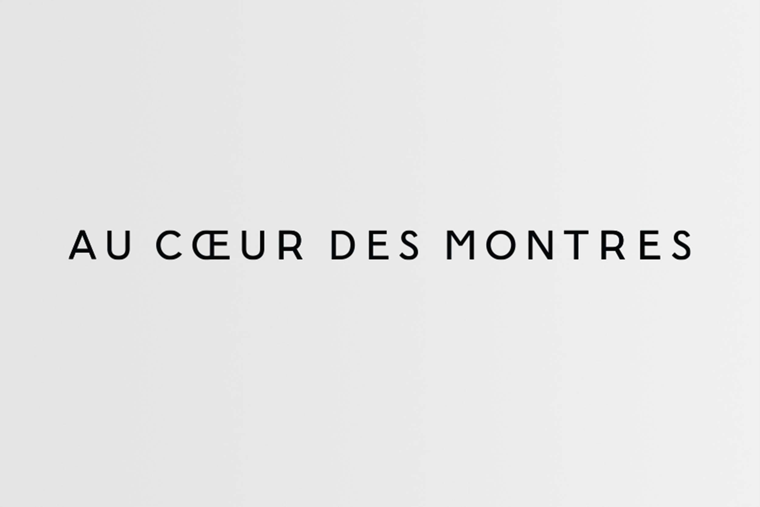
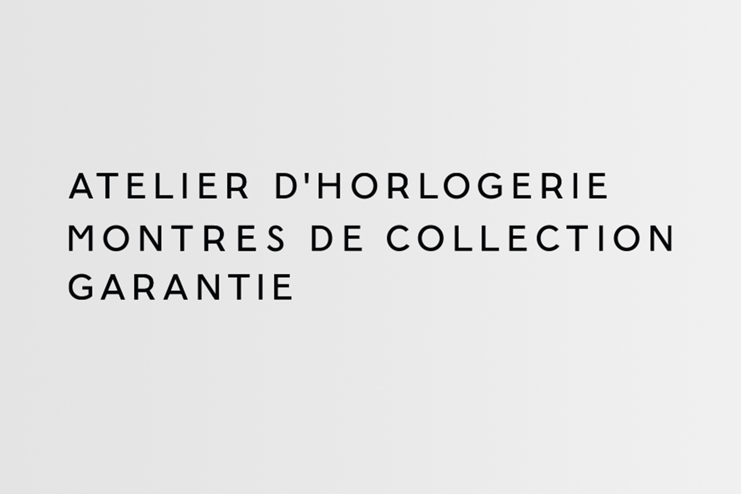
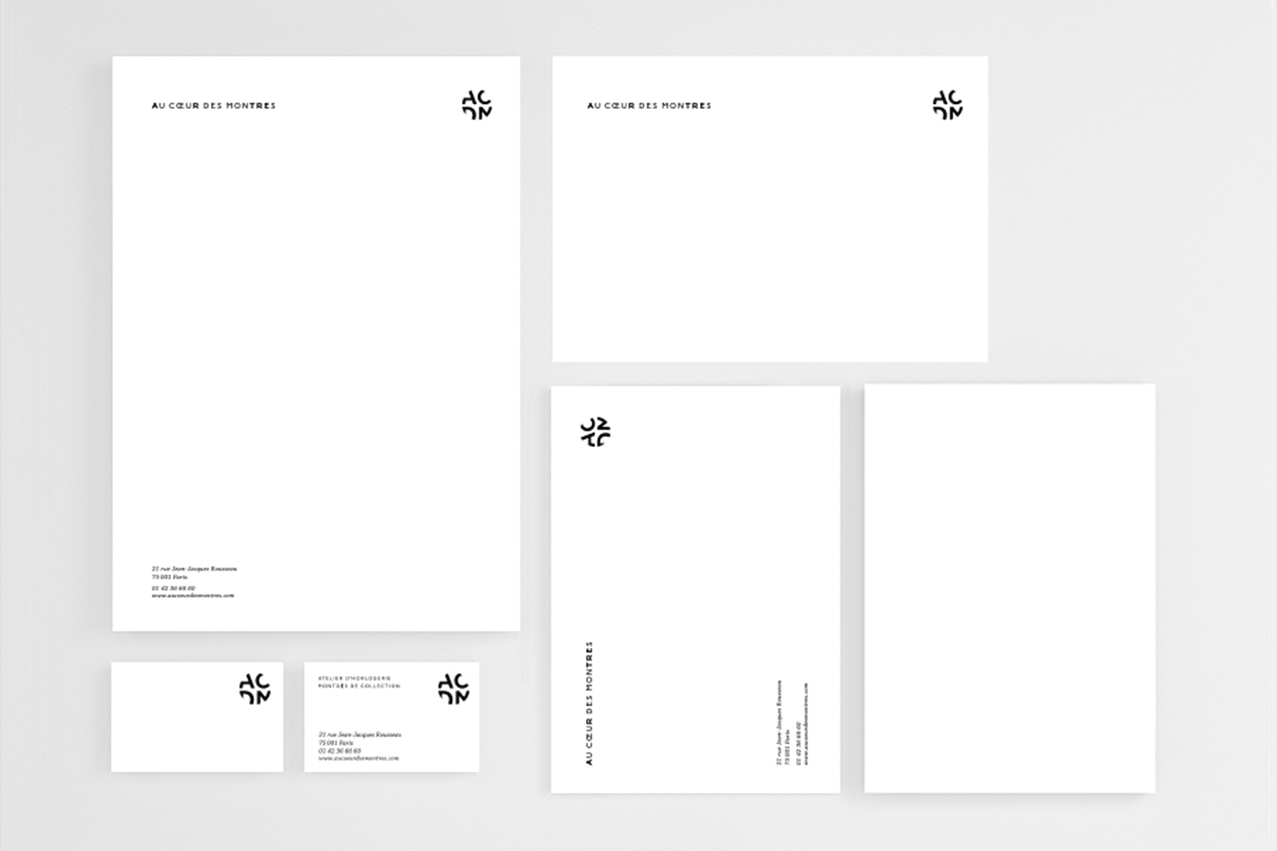
Au Cœur des Montres
Branding for ACDM (Au Cœur des Montres). Logotype — Type Design — Stationery.
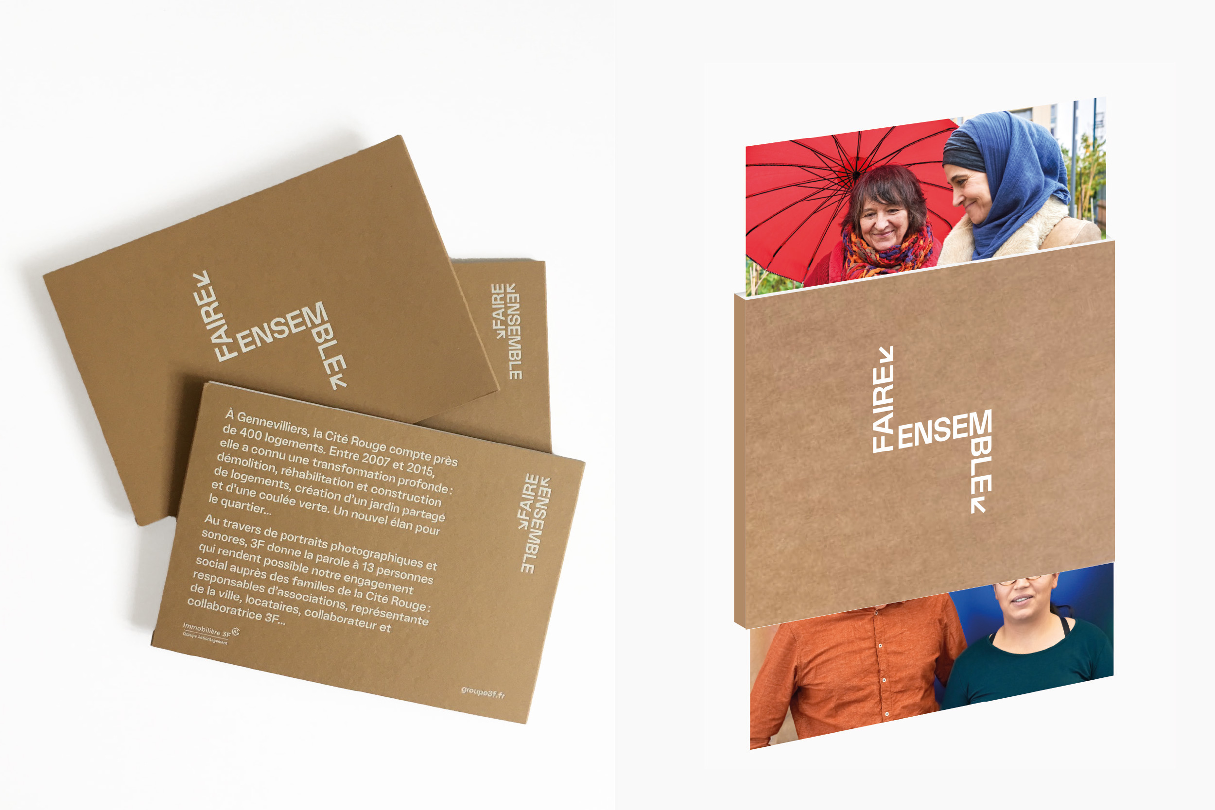
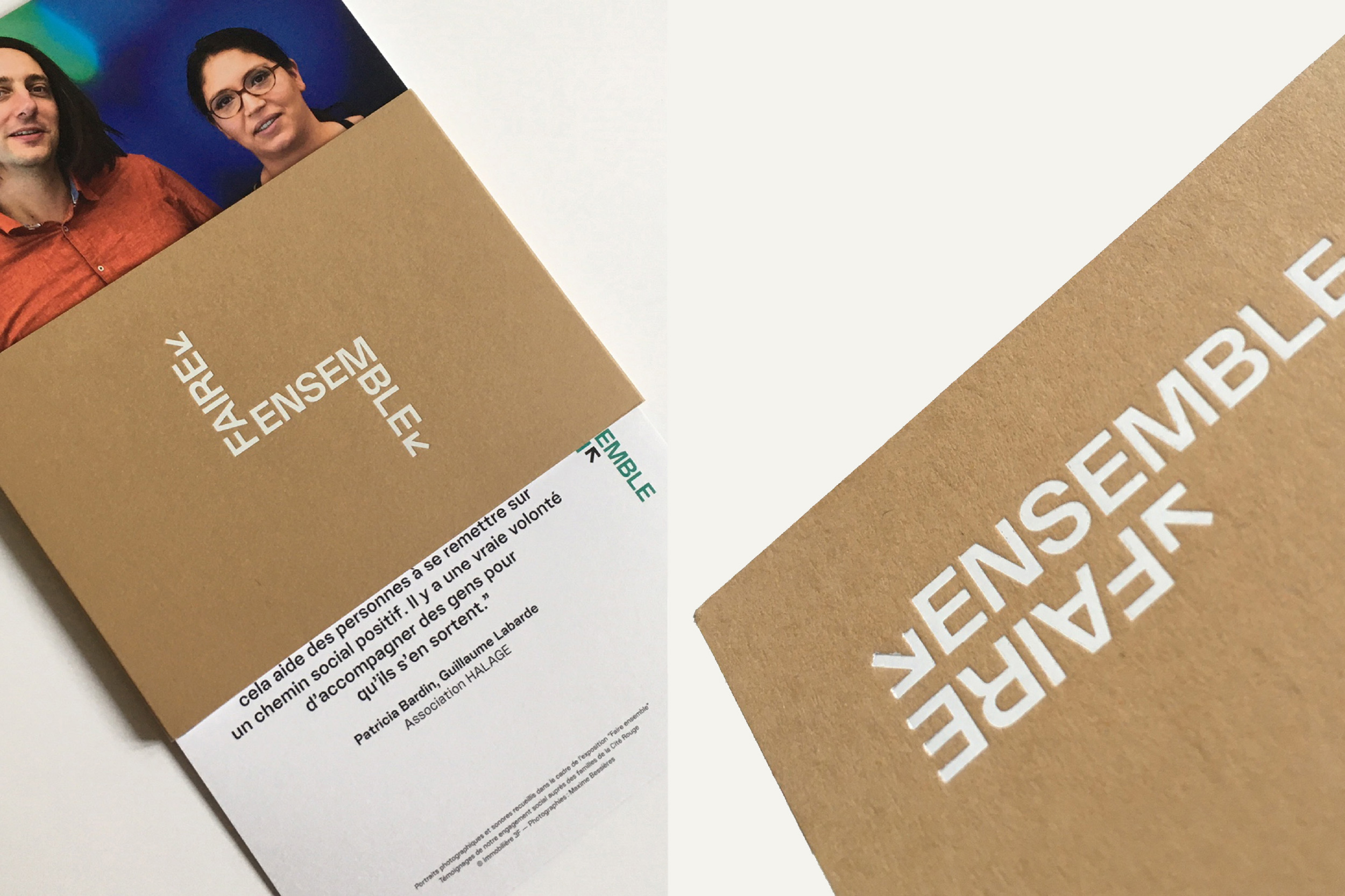
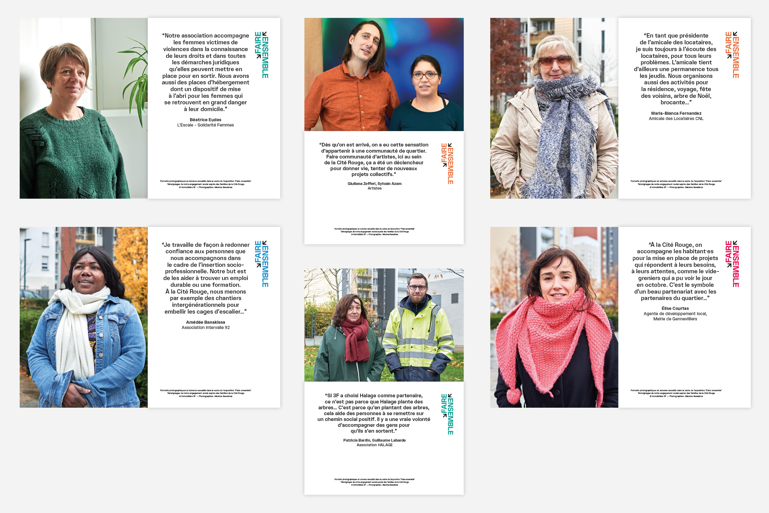
Immobilière 3F
Packaging, Fabrication, Graphic design
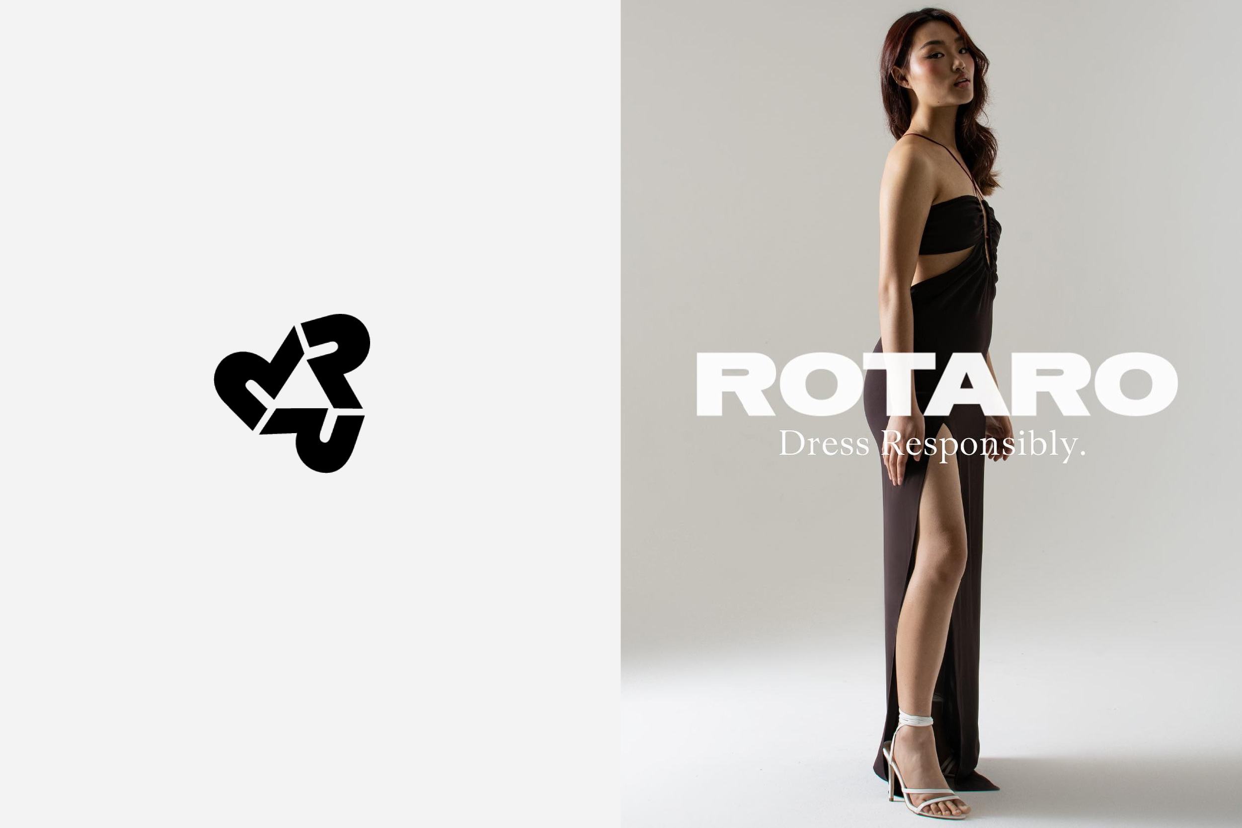
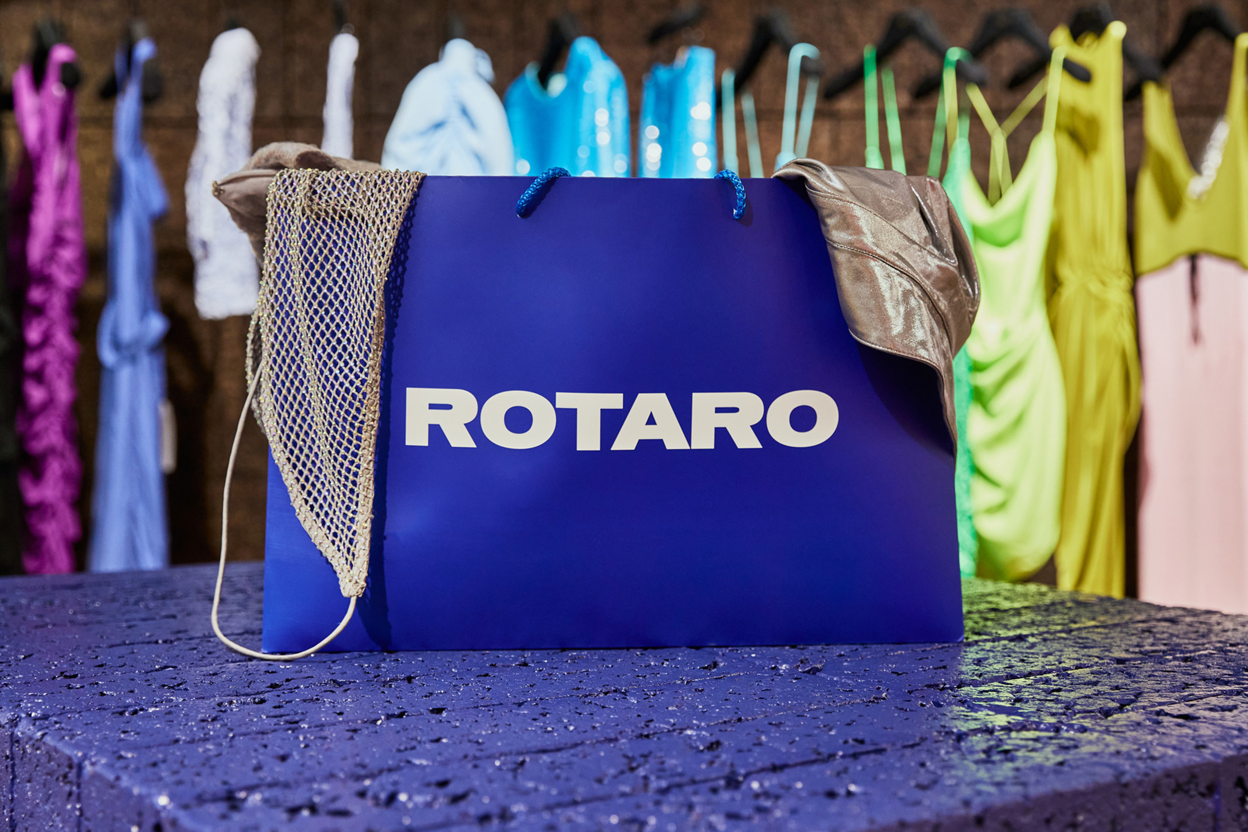
Rotaro
Logotype, Logomark
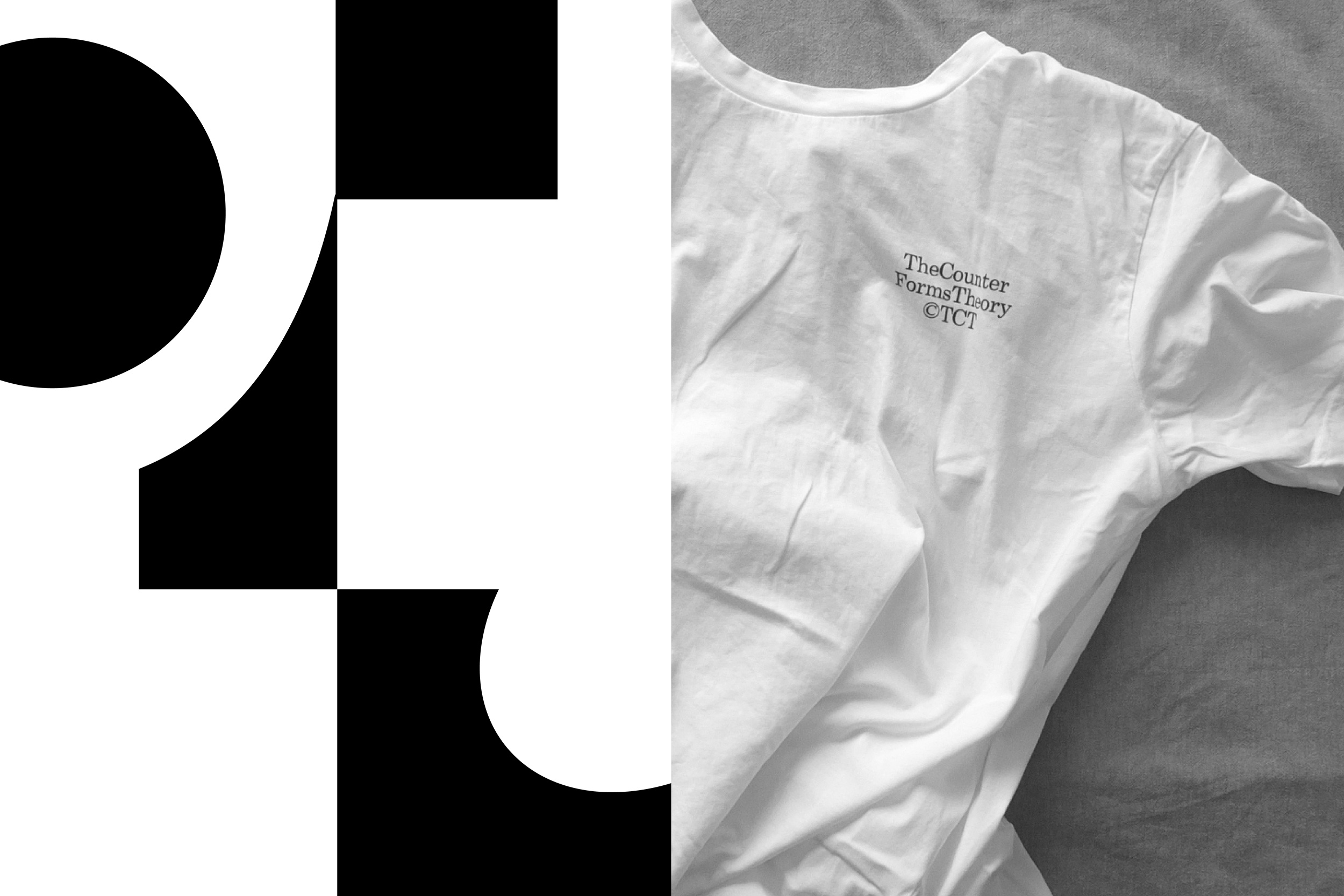
Everpress
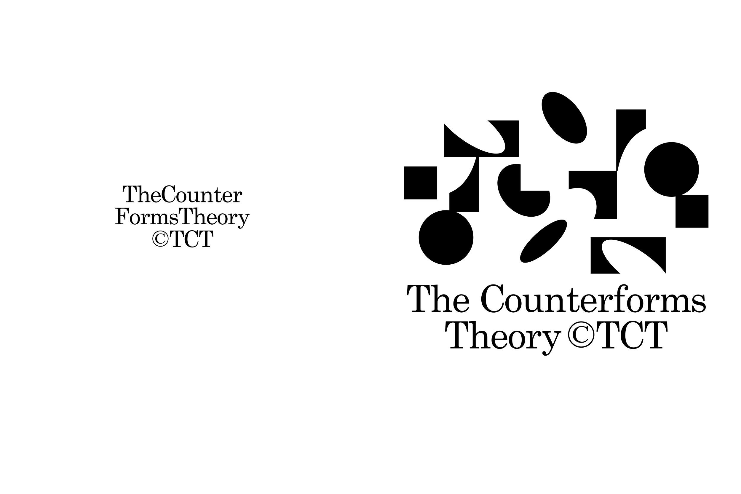
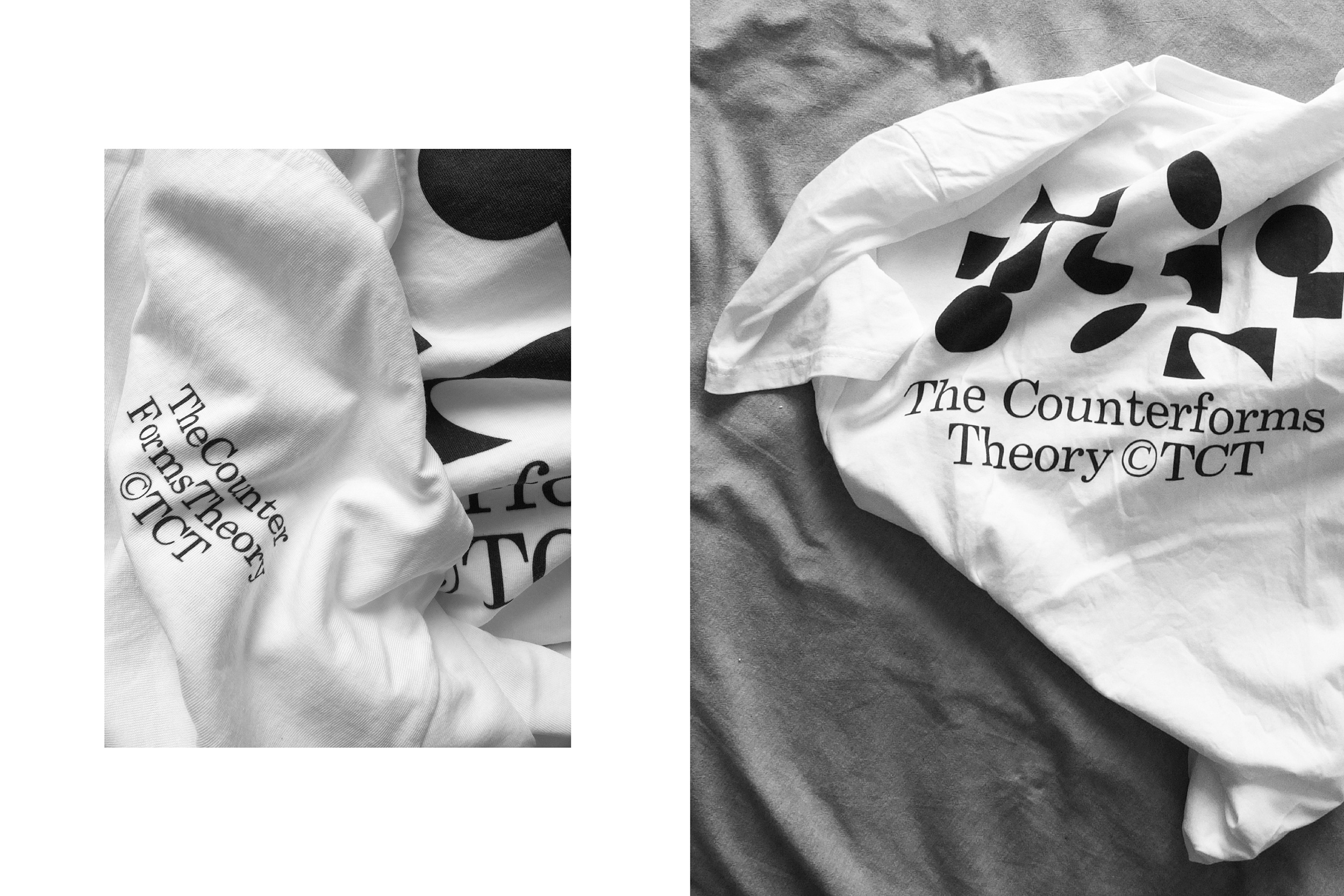
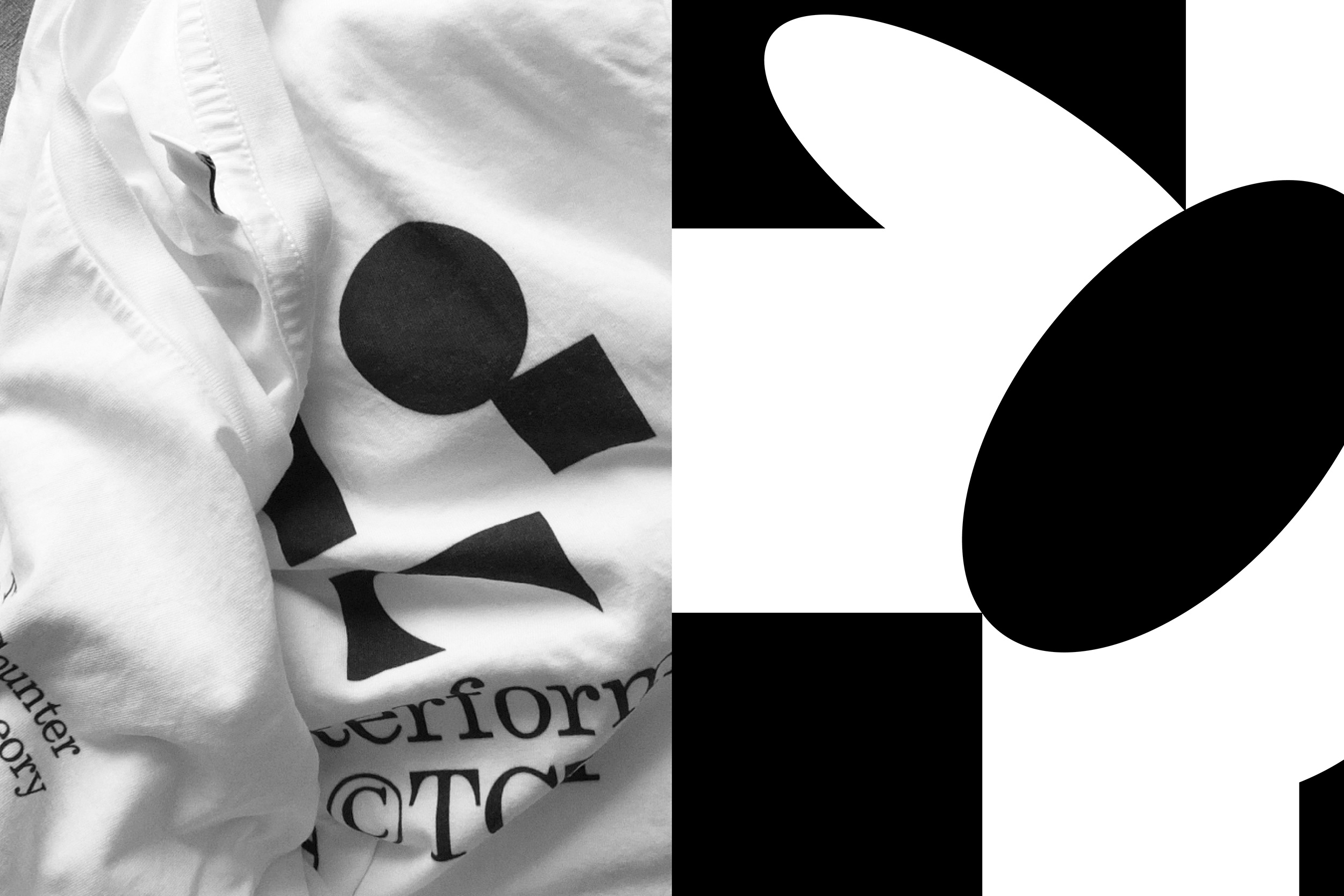
For the “Outside the Line” Everpress' campaign, I was invited to create a T-shirt. I took the opportunity to create a visual connection between lines and type design, throught a theory I named 'The Counterforms Theory TCT®'. Design and creation of a t-shirt and of a promotional mini website embedding an imagined game play.
VIsit Everspress T-shirt
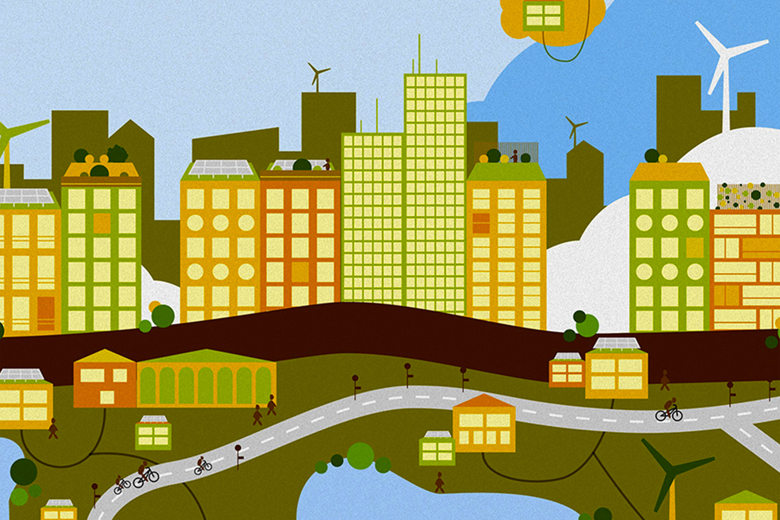
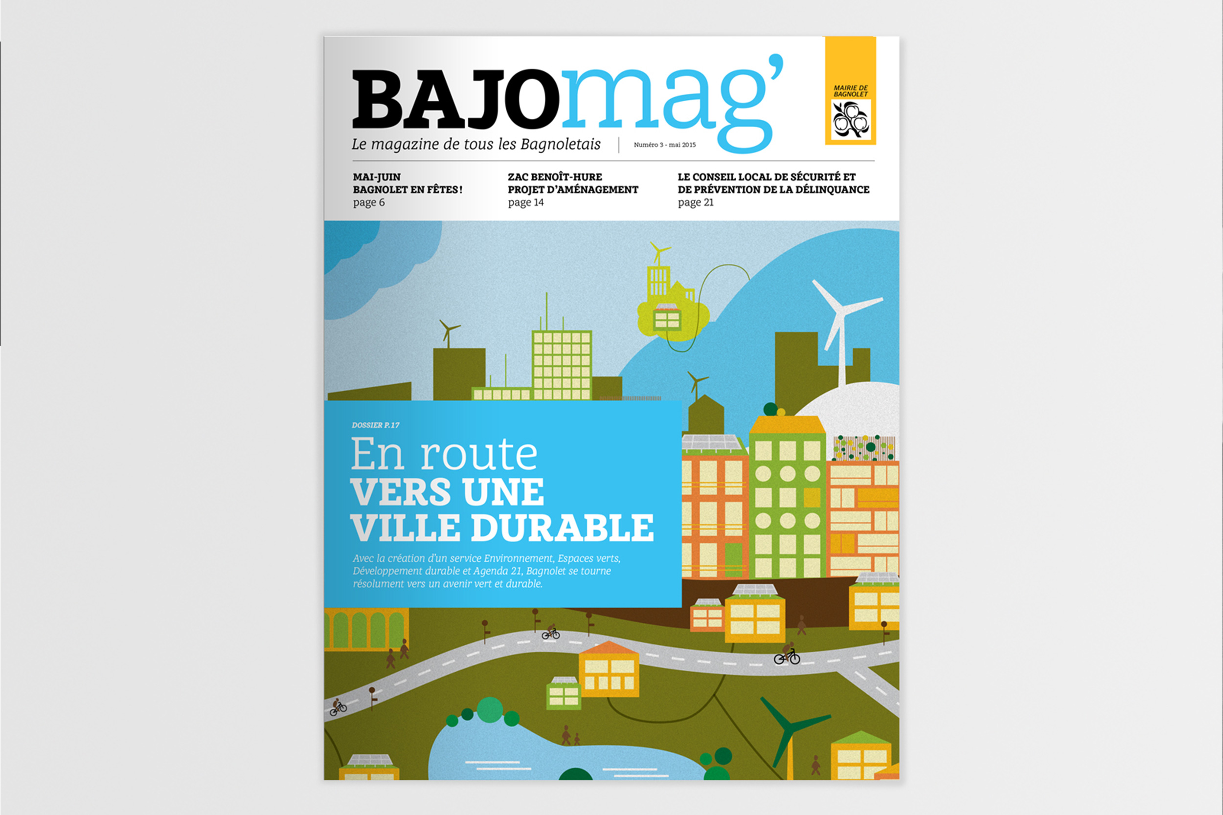
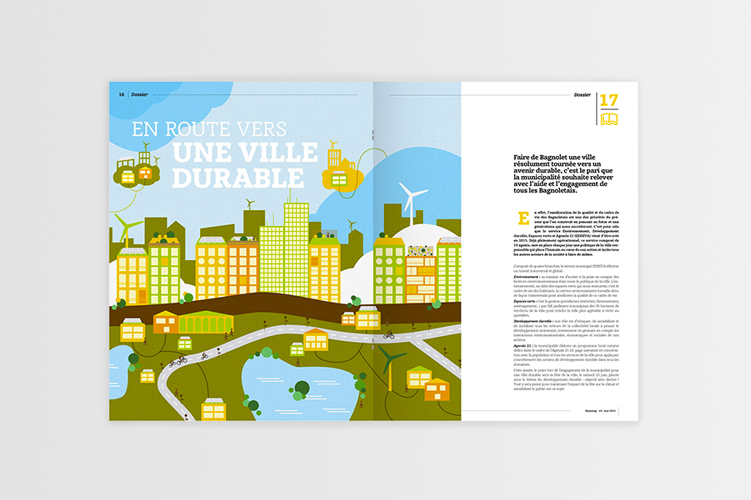
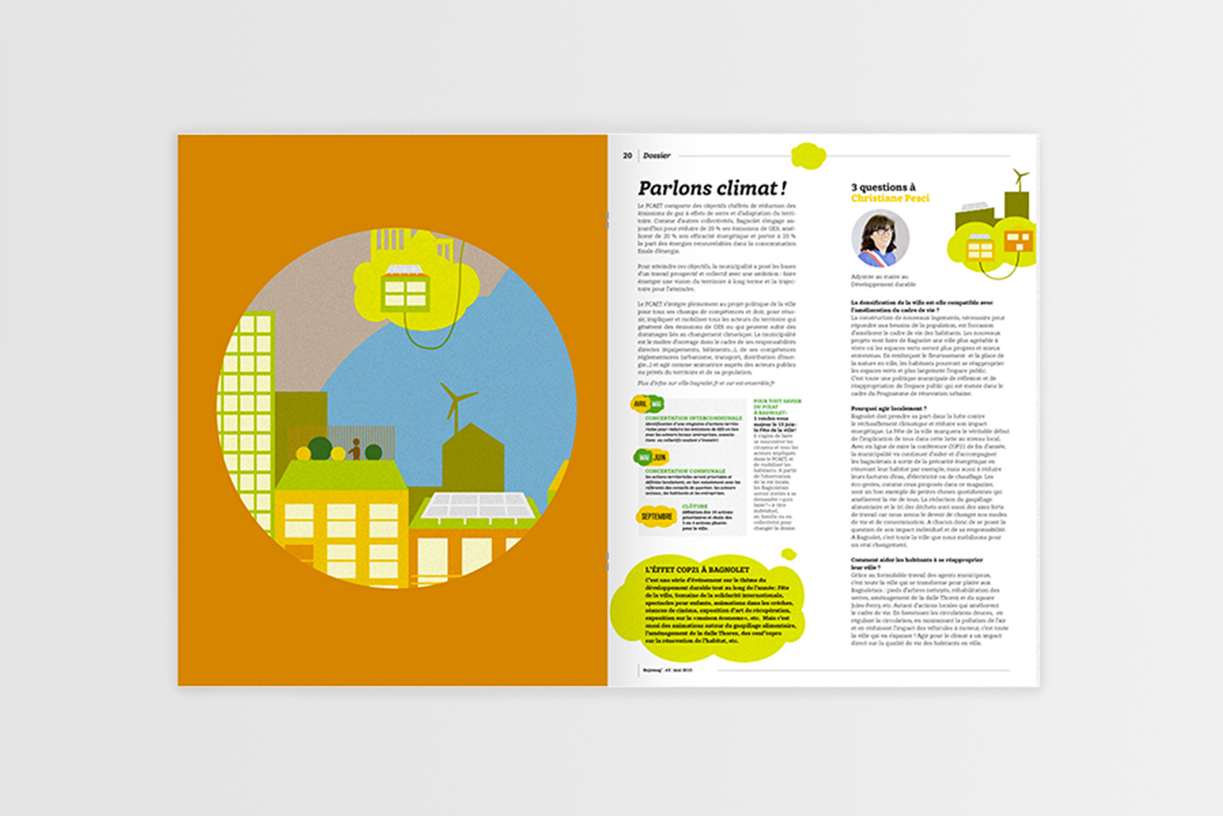
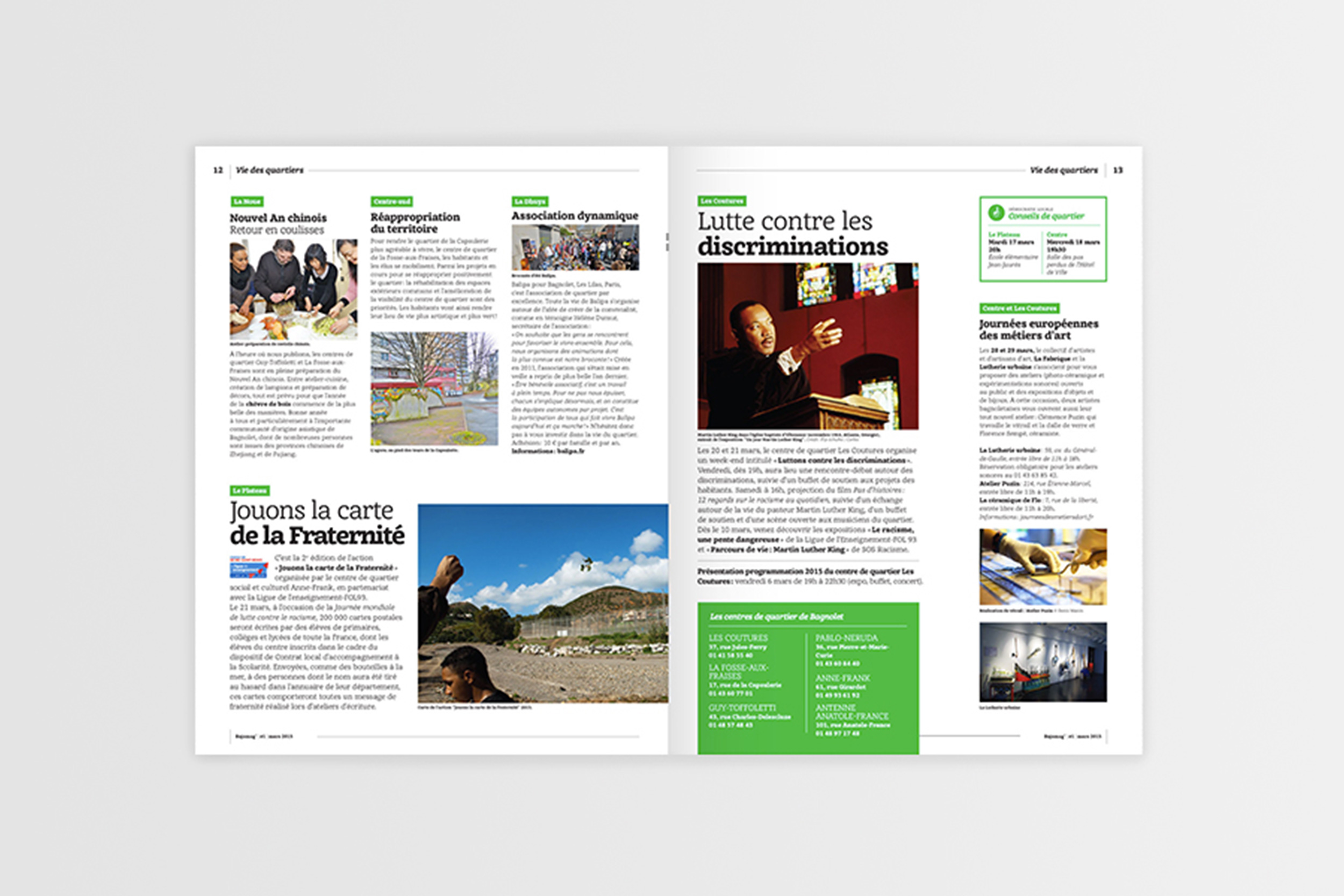
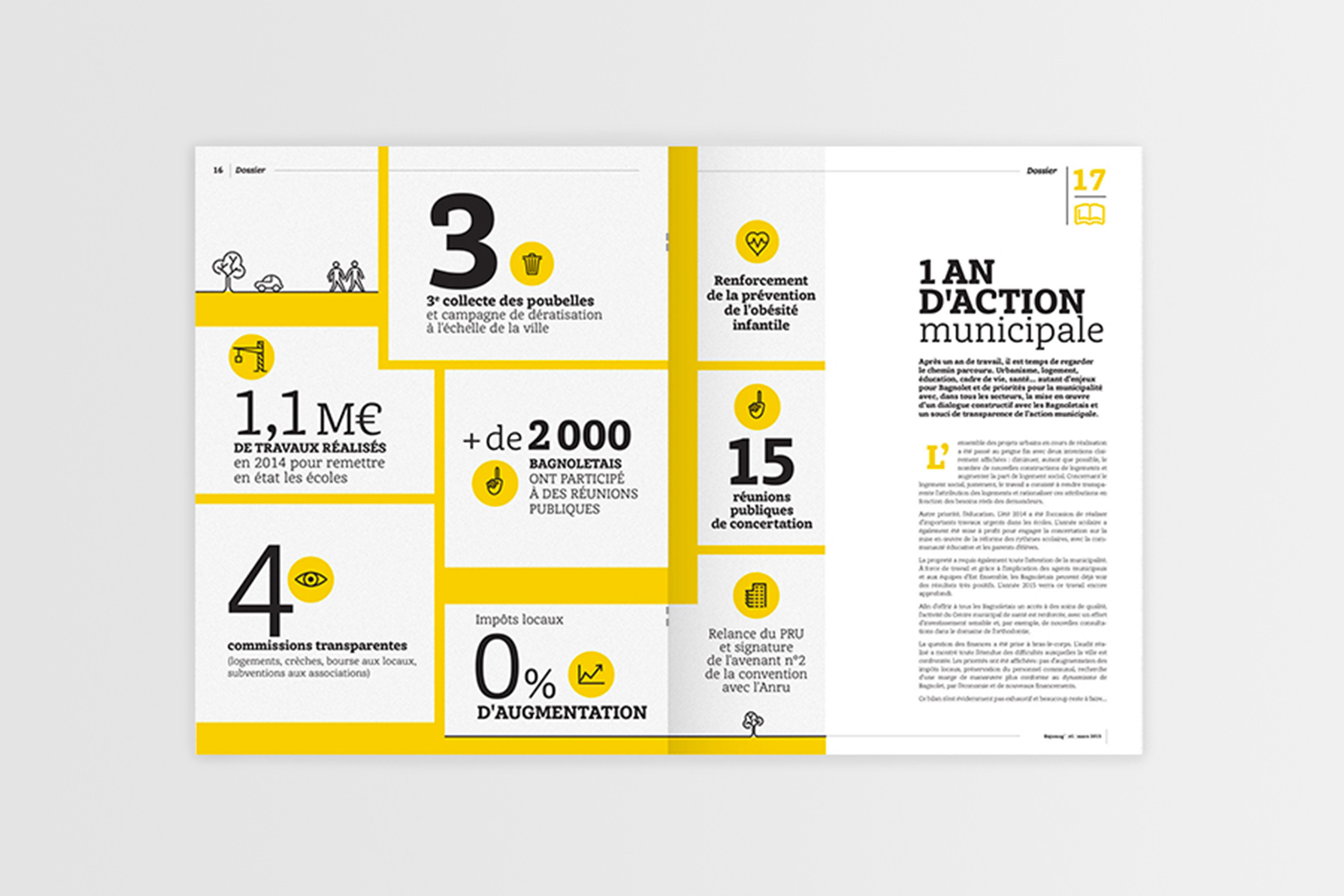
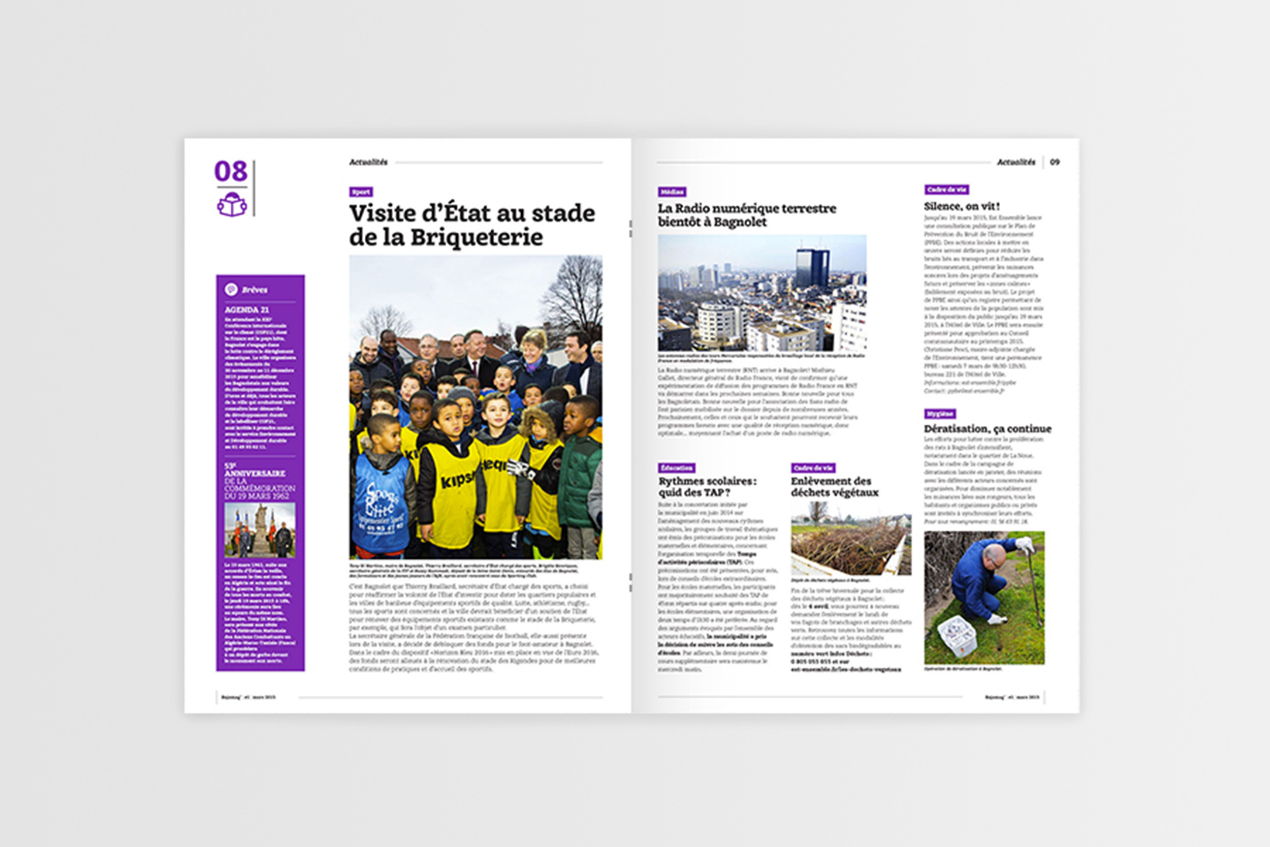
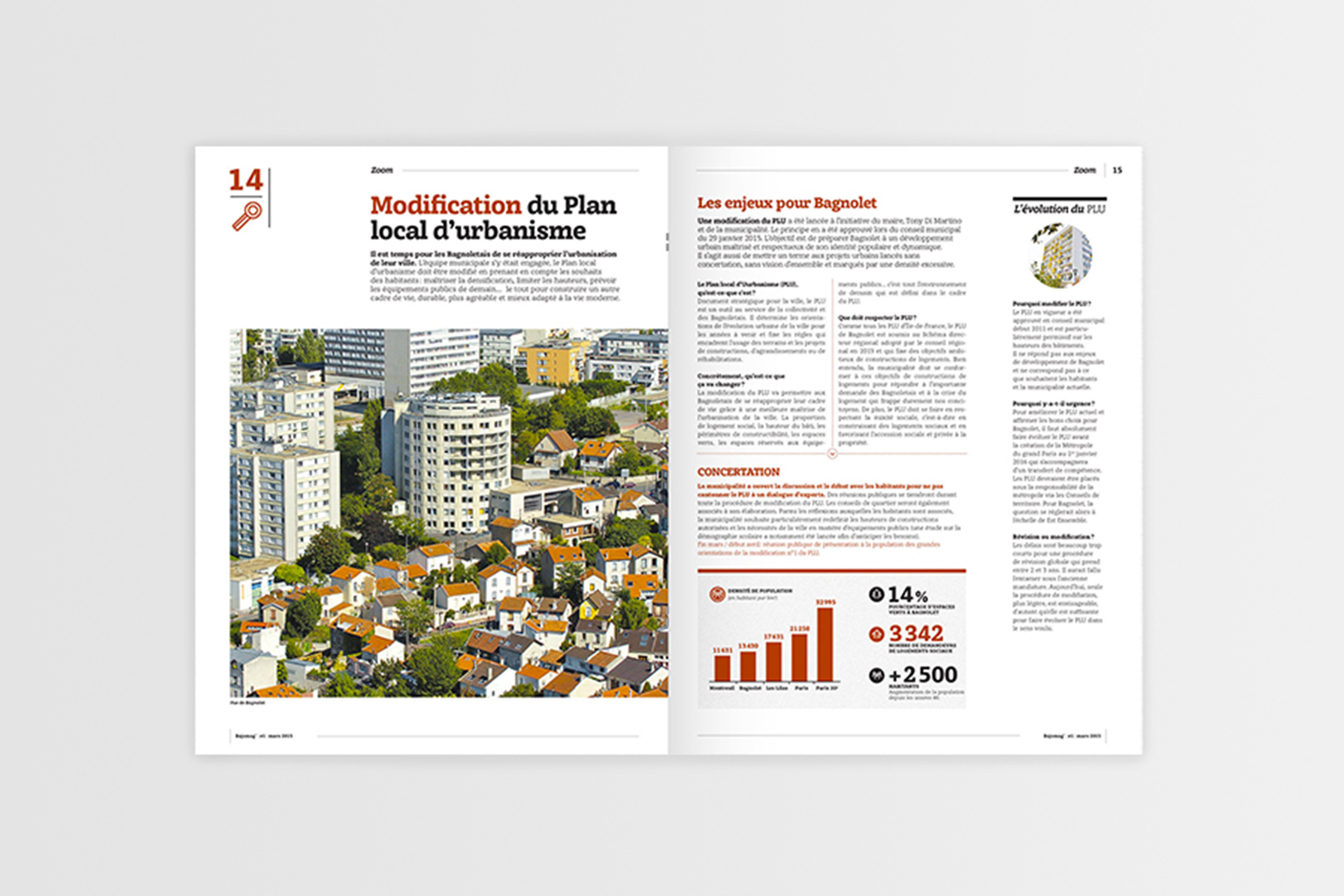
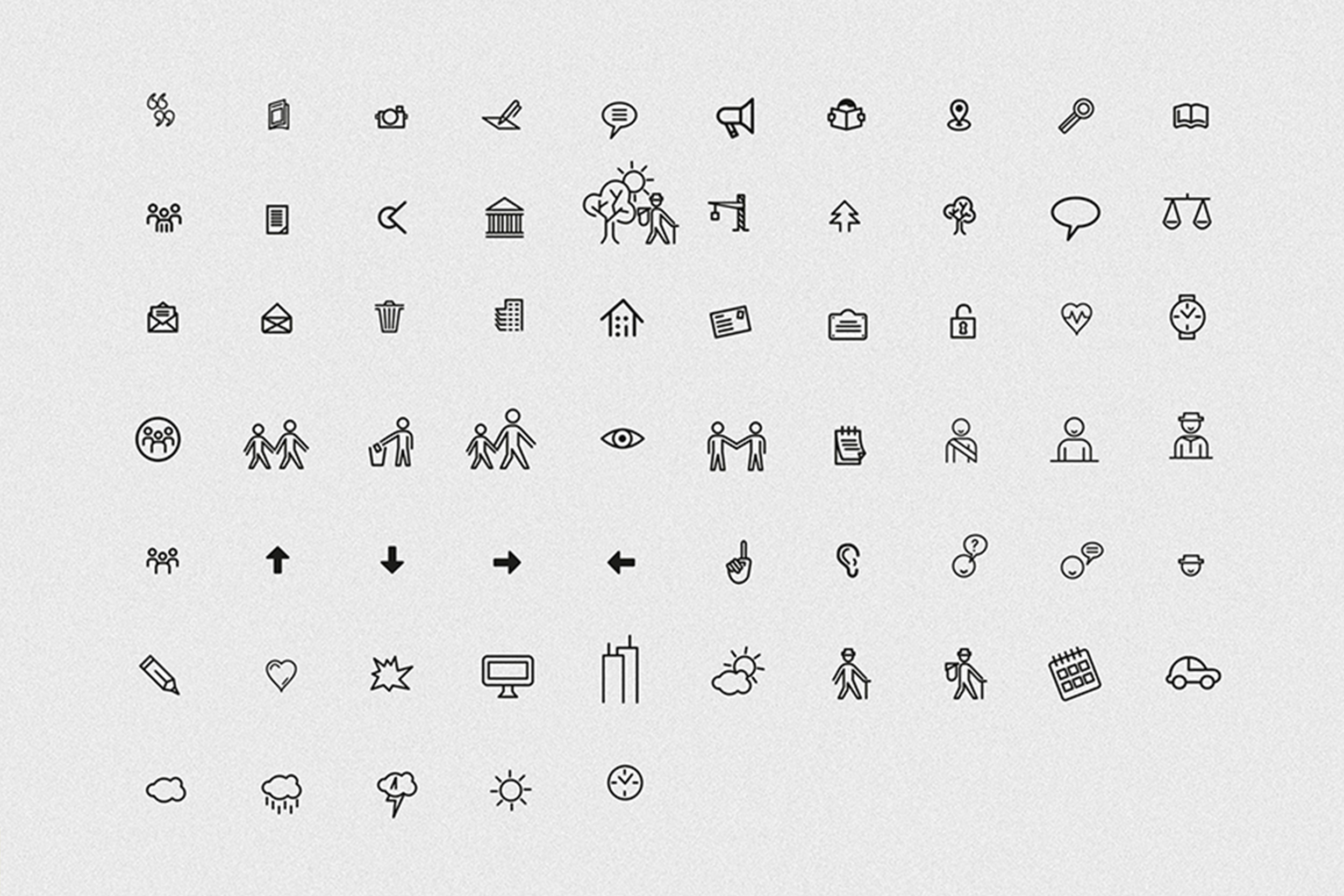
Bajomag
Art direction and creation of the new formula of the magazine of the Ville of Bagnolet. INcluding, logotype, layout, pictogram library, visual identity and illustrations. Design of the 3 first issues.
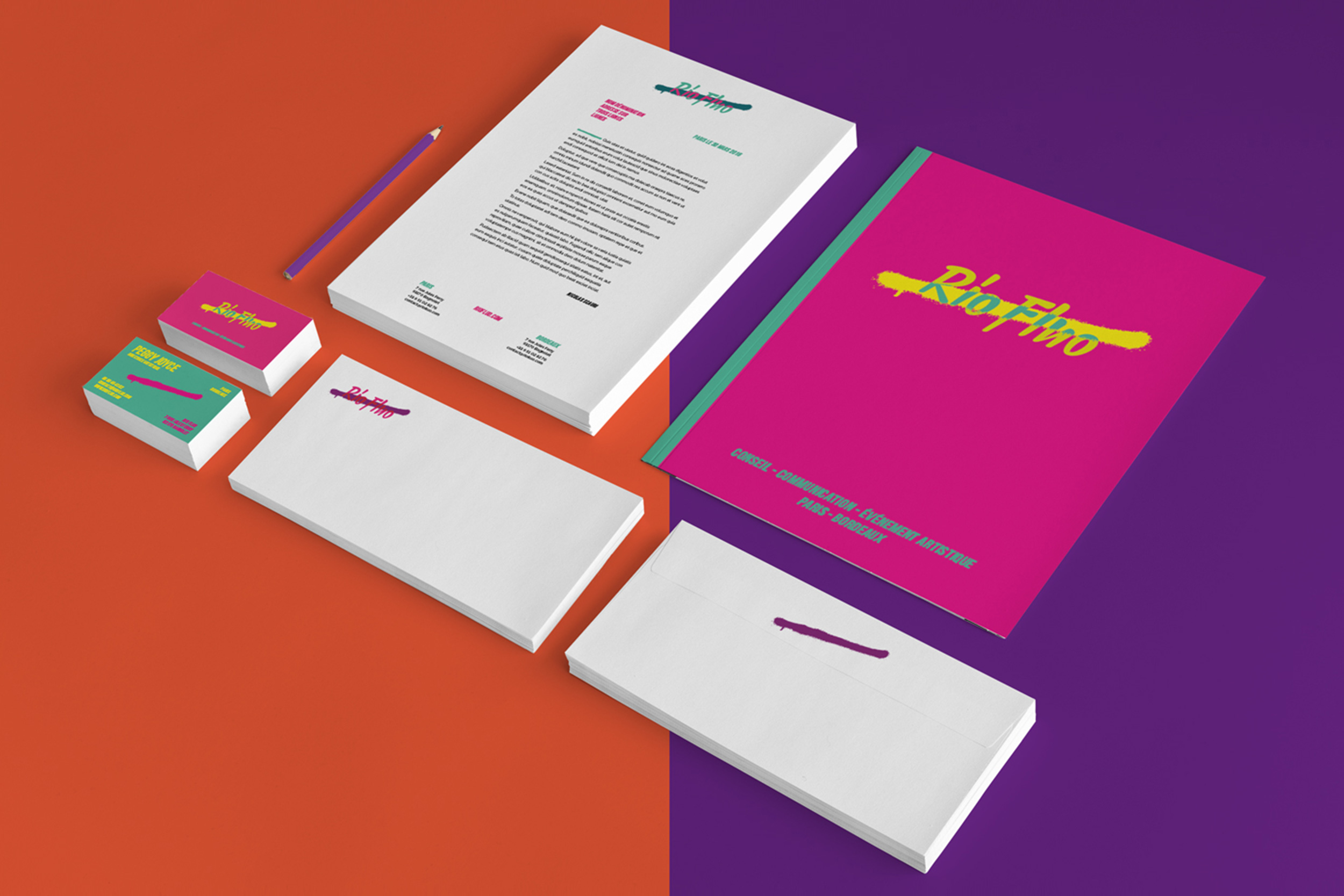
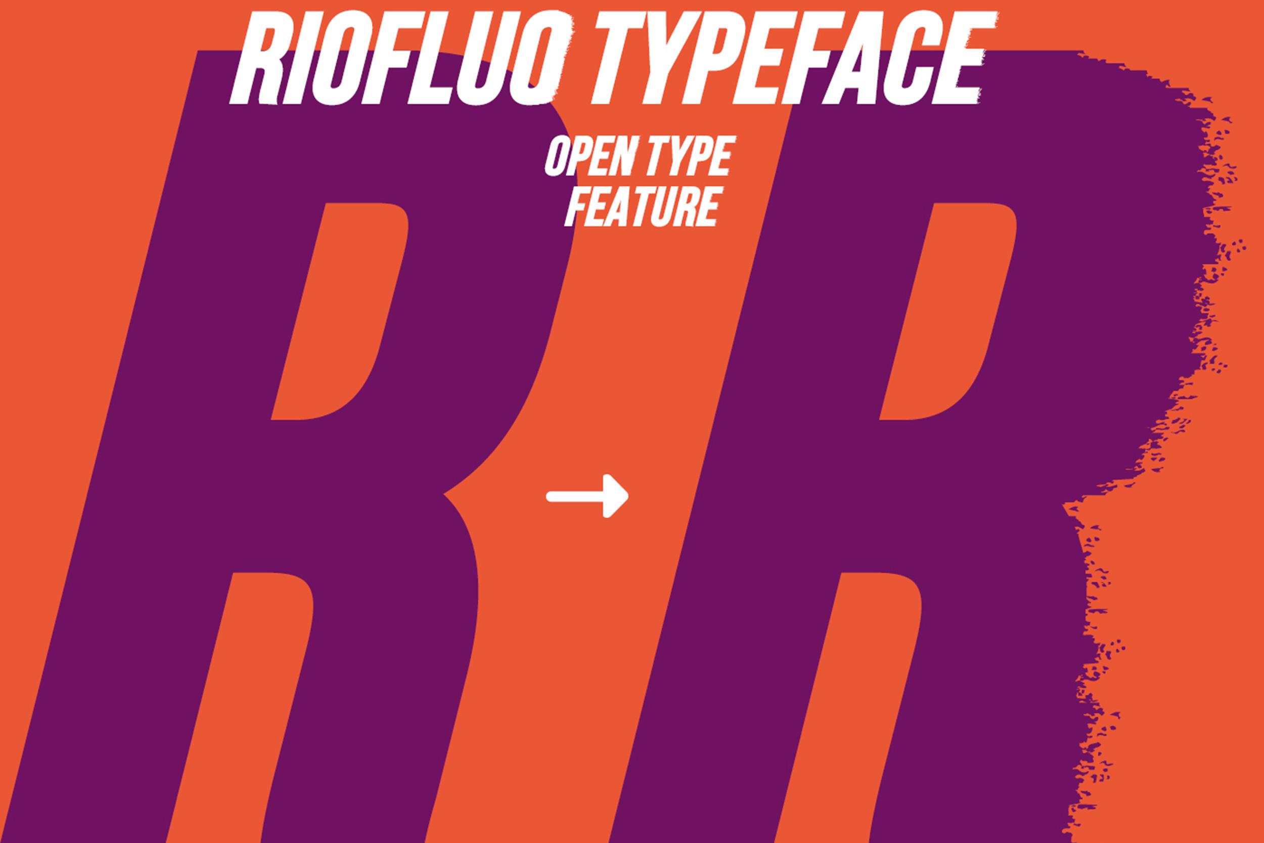
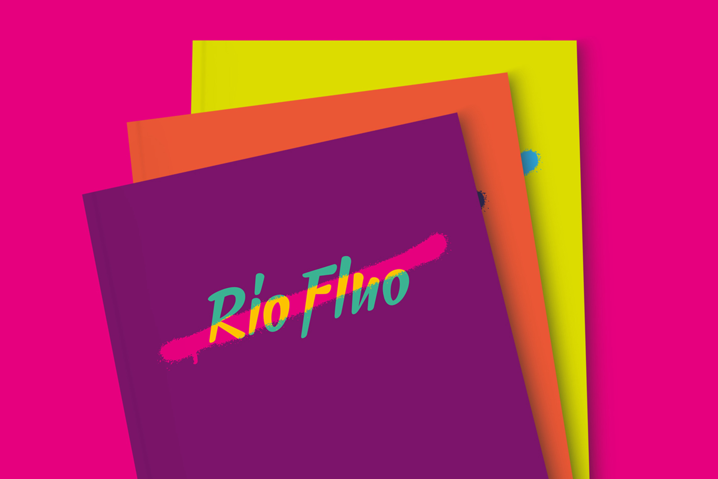
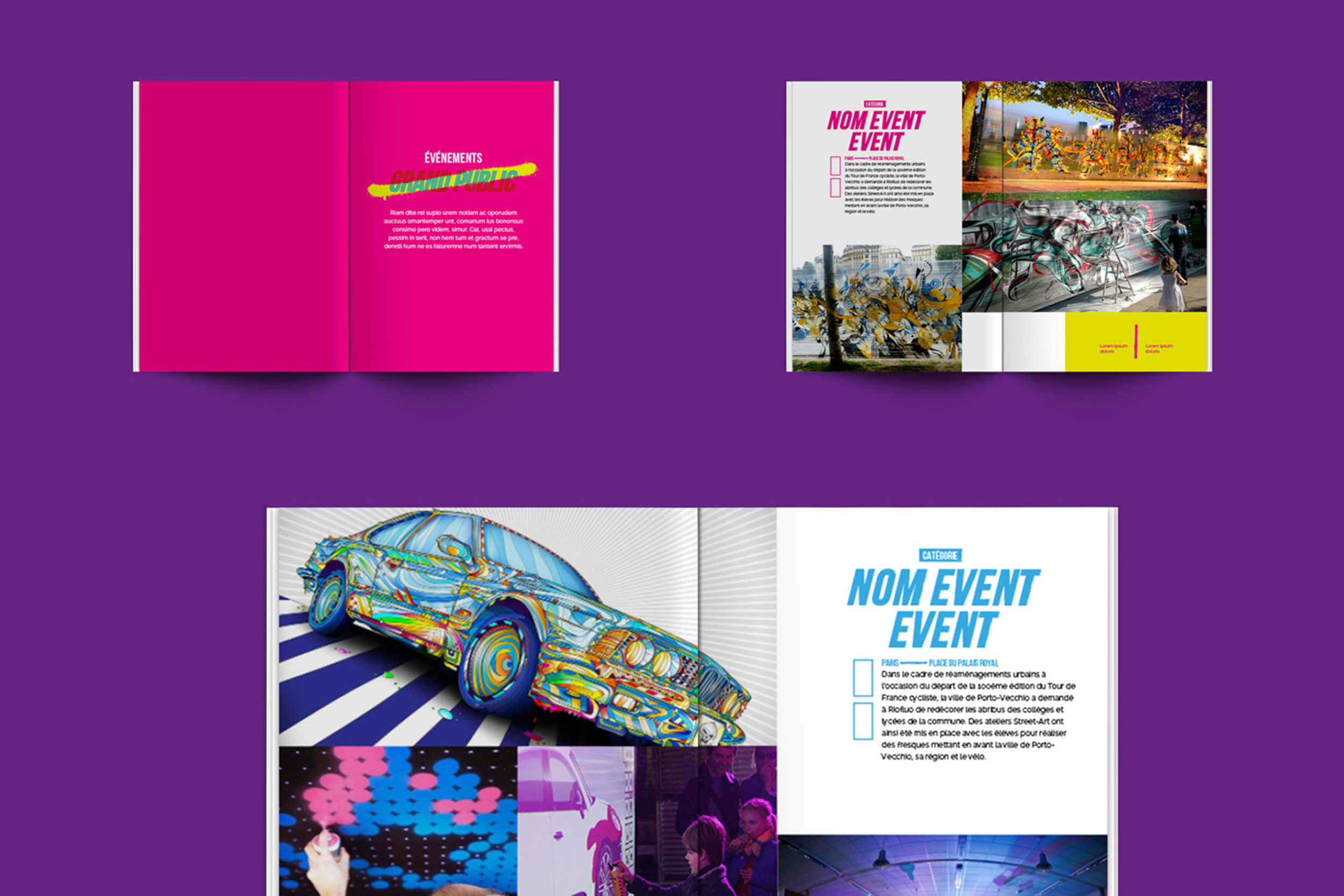
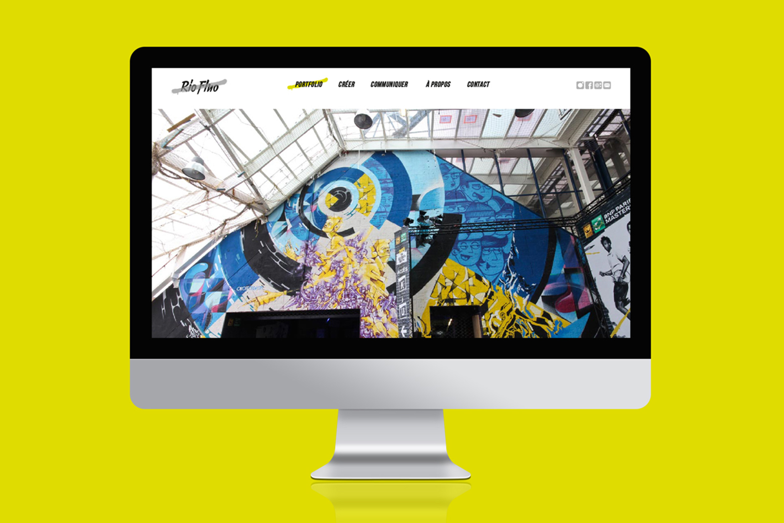
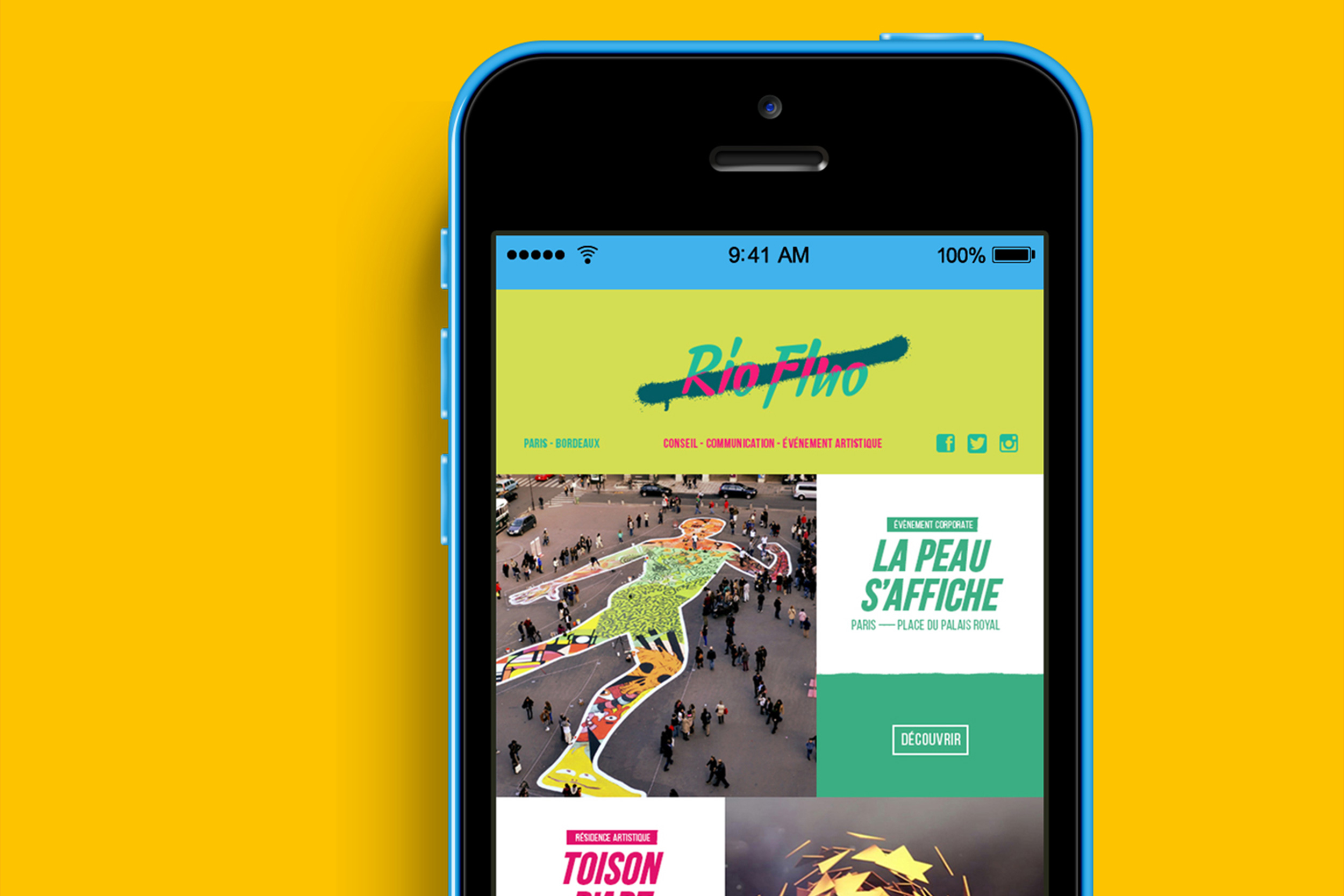
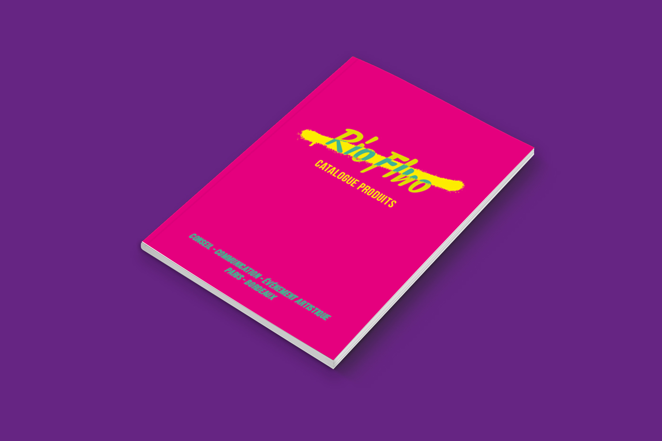
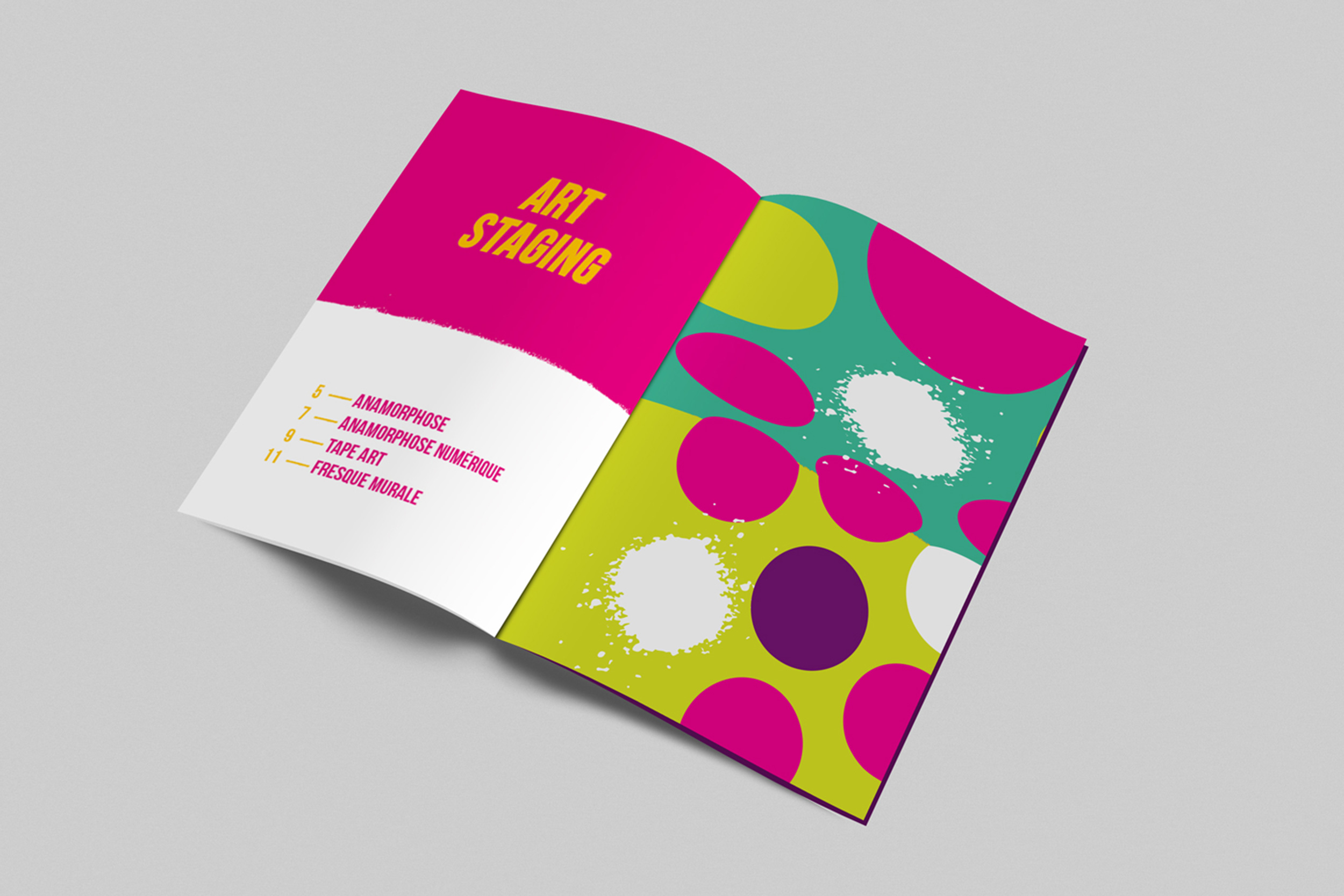
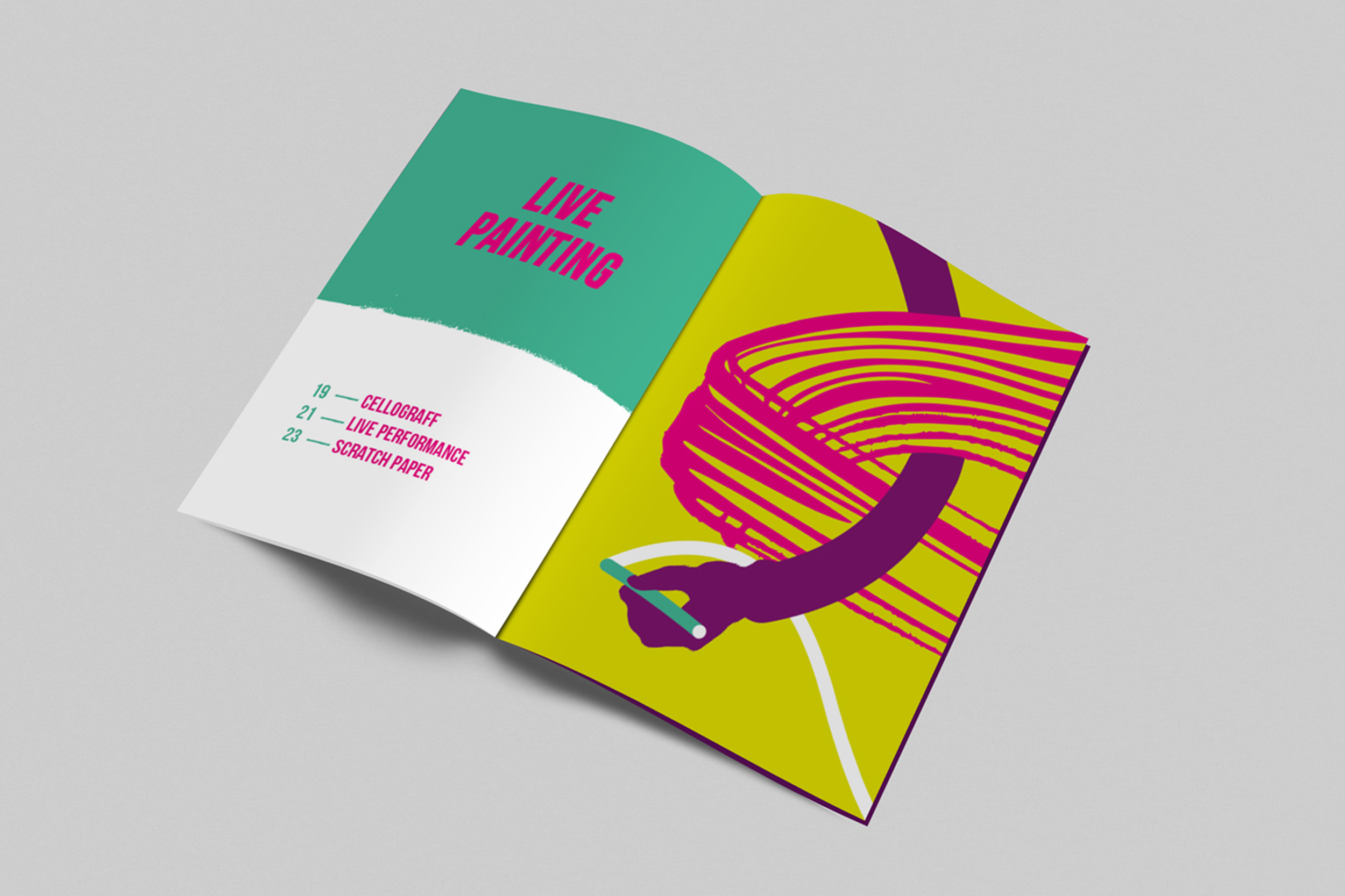
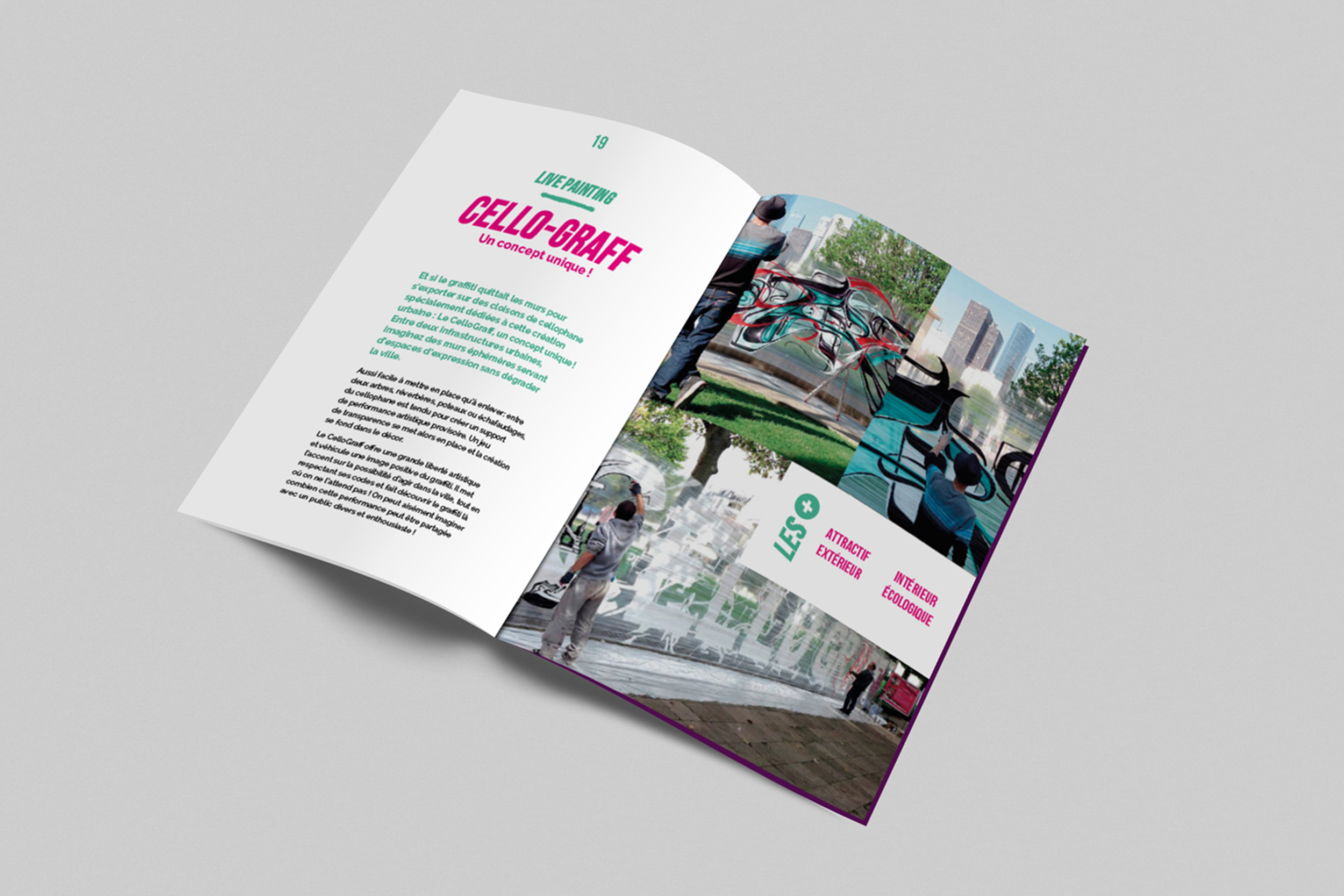
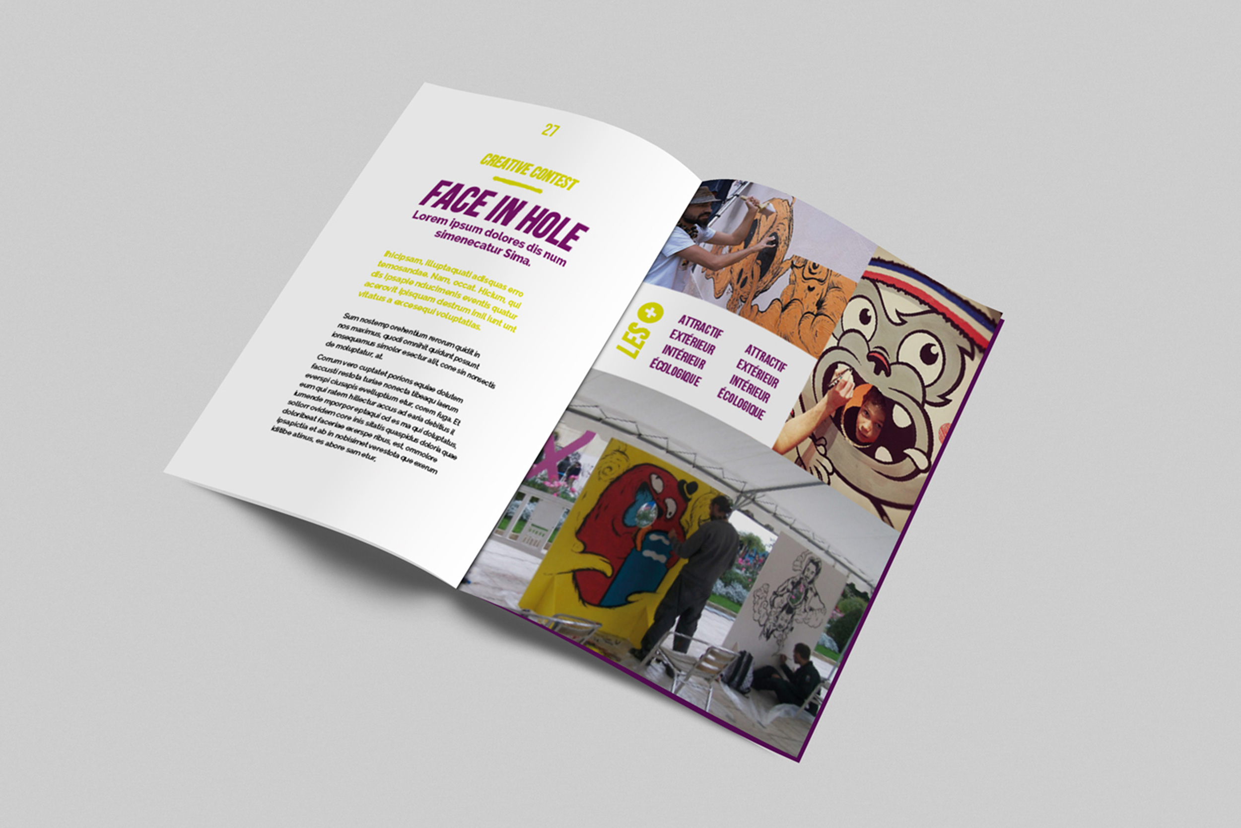
Riofluo
Visual Identity for Riofluo, an Urban artist agency. Vibrant colors and bold typeface customized. Art direction, print graphic design, illustration, catalogue, web design, newsletters.
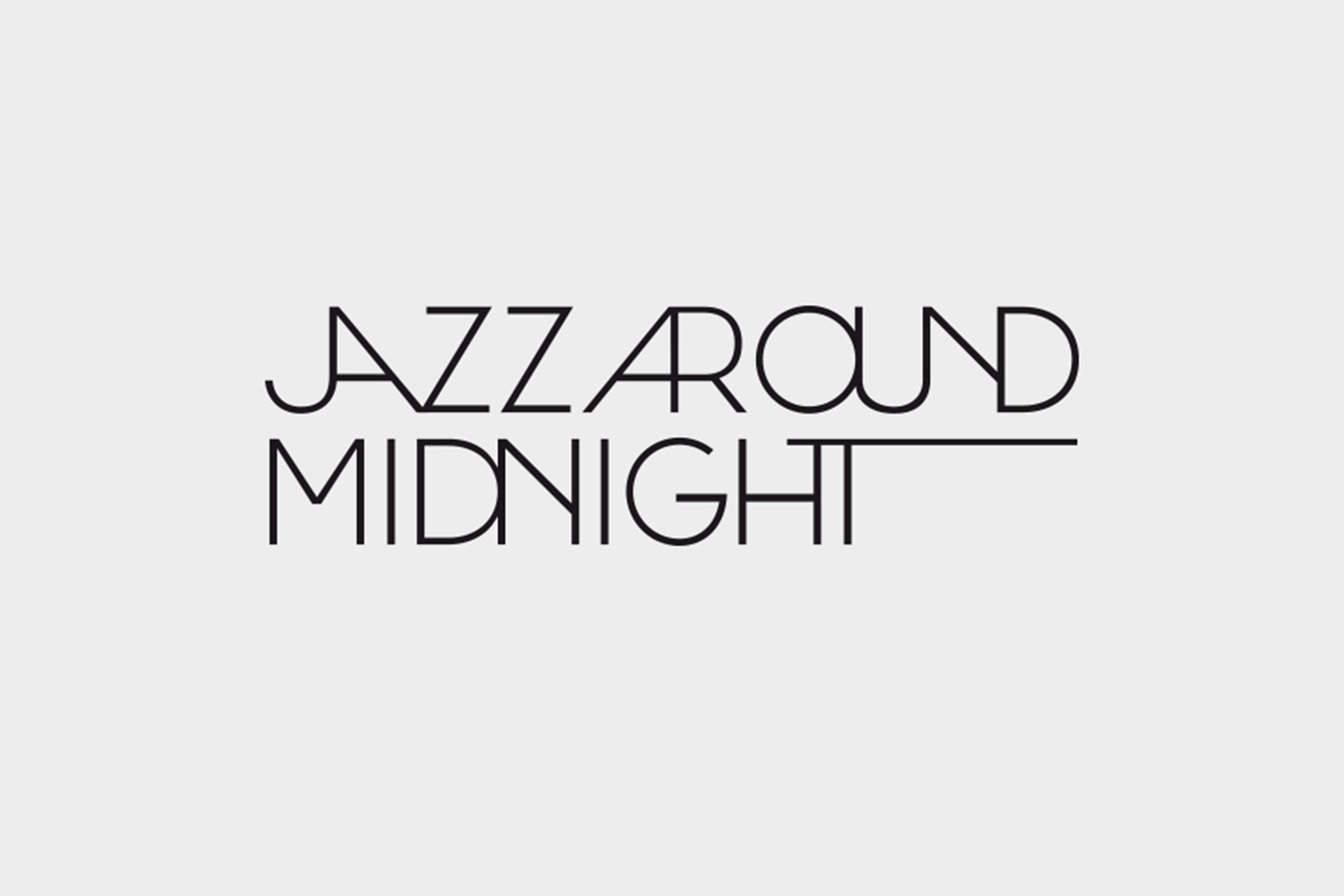
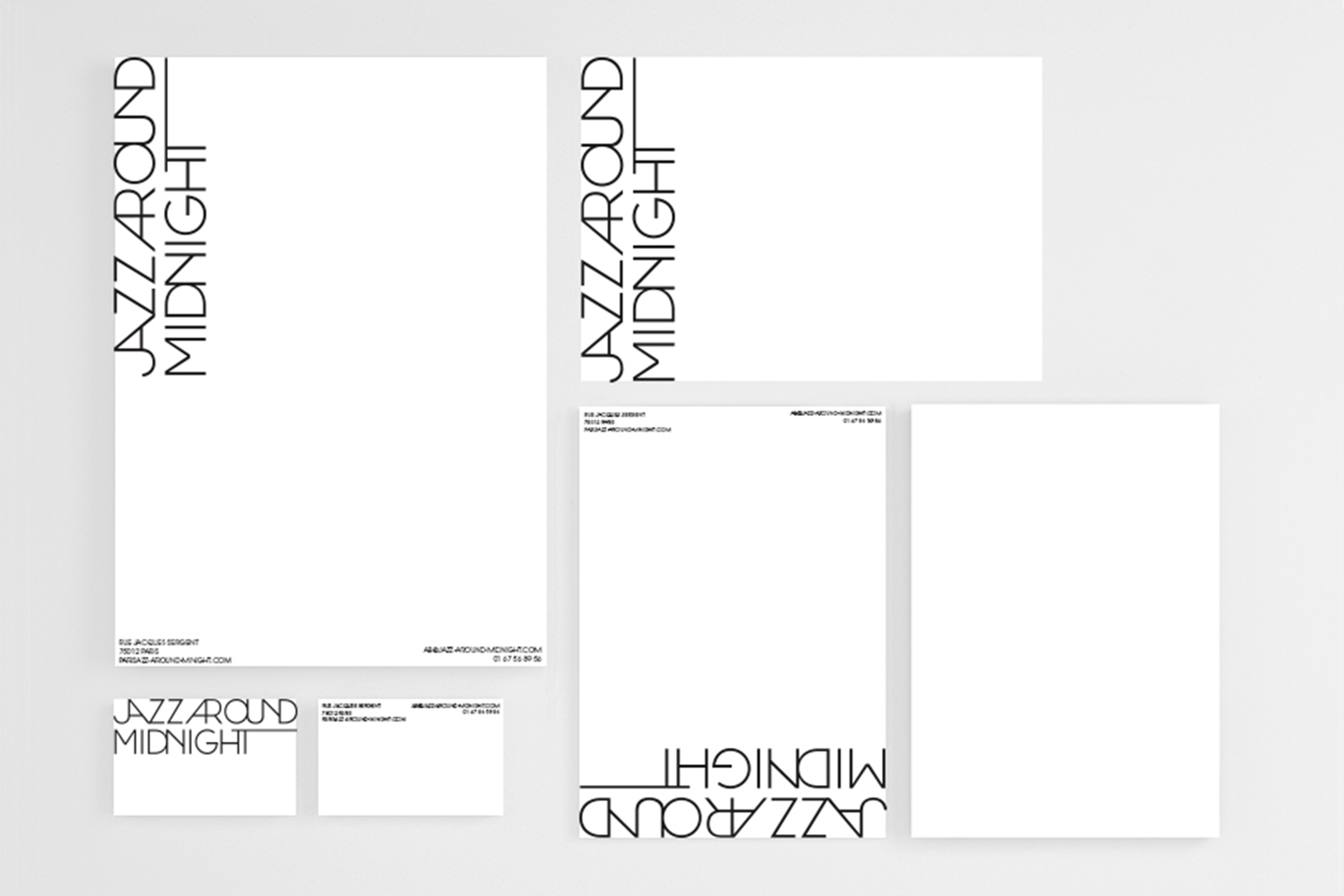
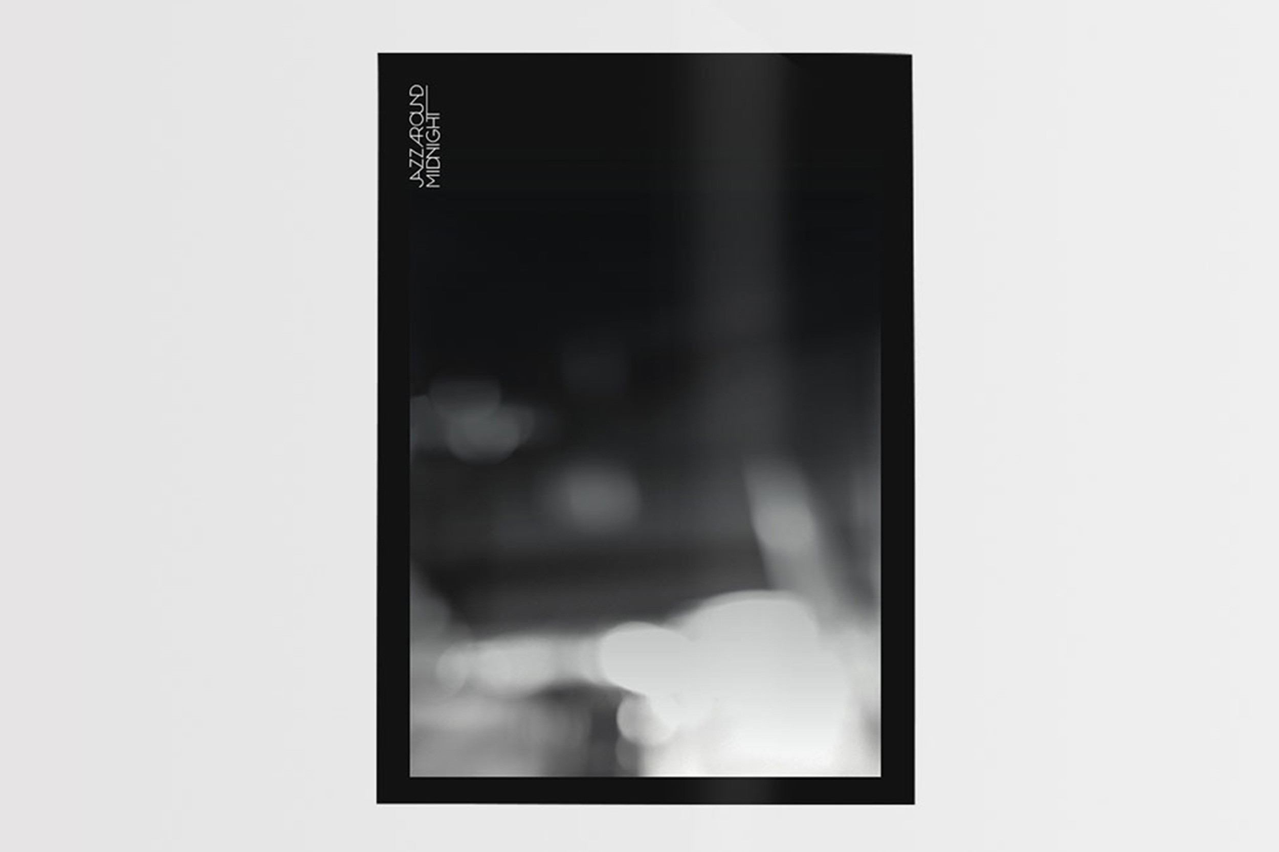
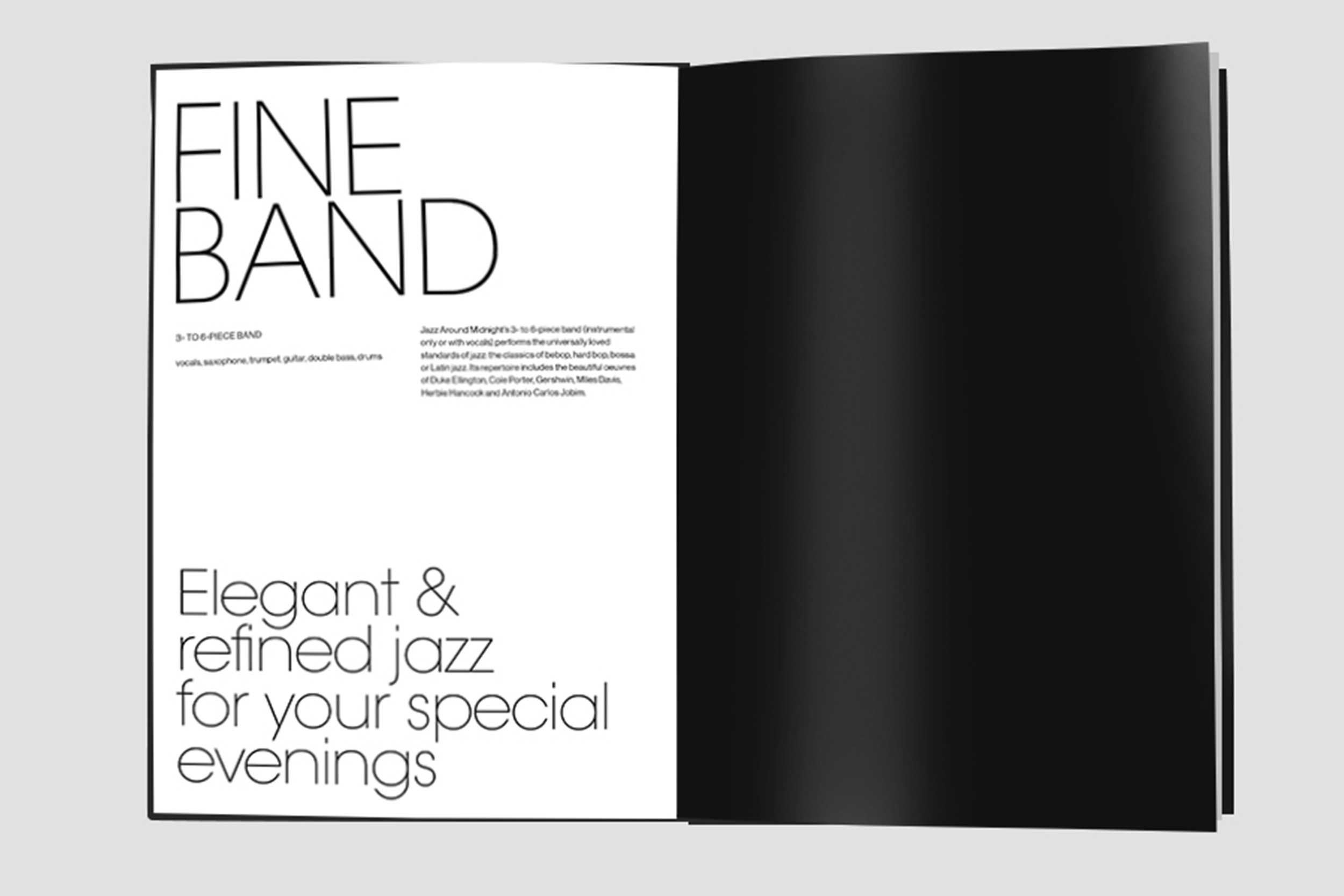
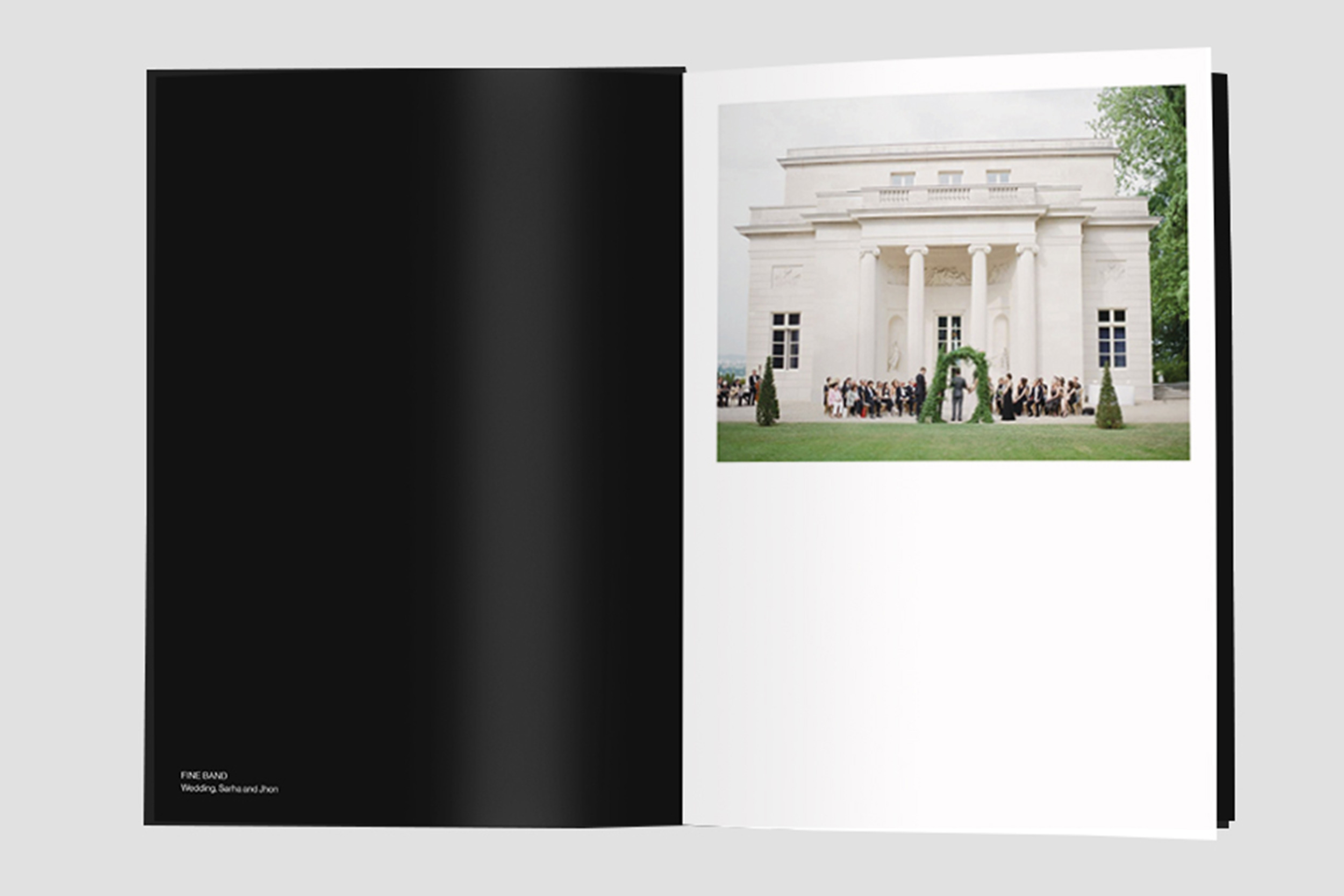
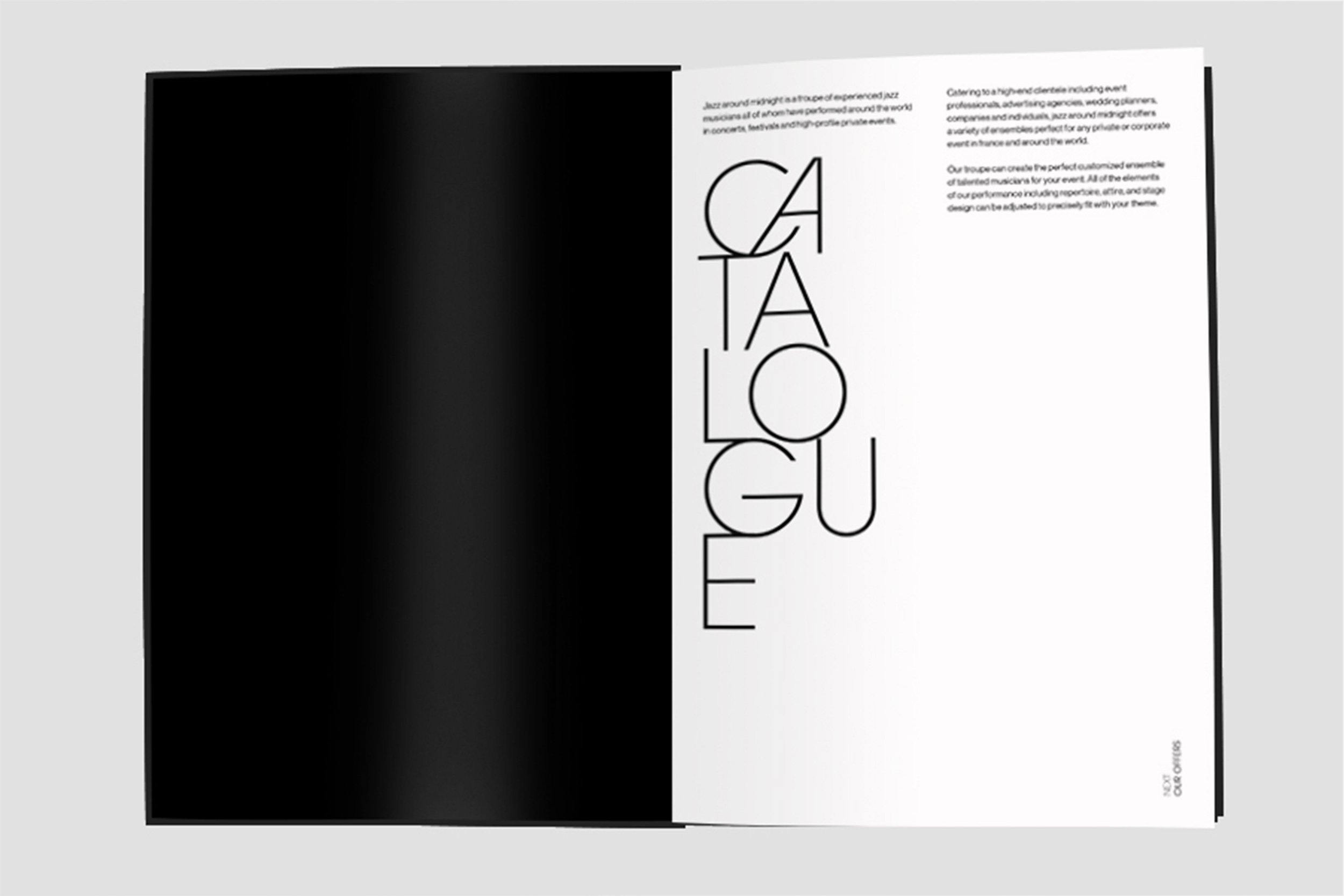
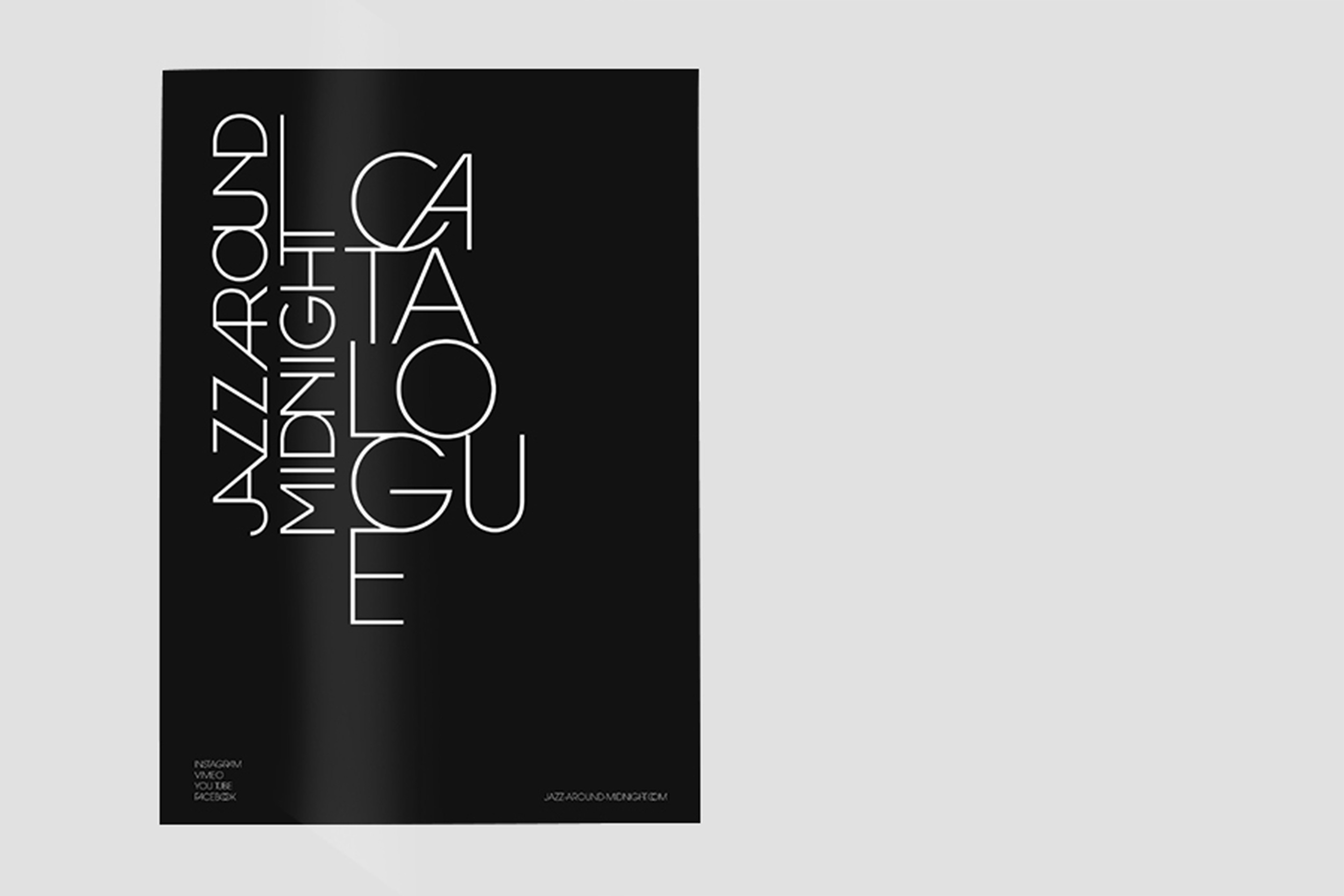
Jazz Around Midnight
Visual Identity for Jazz Around Mignight, a luxury event's jazz band. Logotype, Catalogue, Graphic design, Web design.